
.svg)


Key Takeaways
- First impressions happen fast. Clear and strong screenshots boost app download chances.
- Follow iOS and Android screenshot rules to avoid rejection or poor display.
- Show one feature per screen to keep the message simple and clear.
- Use real app moments, friendly text, and breathing space for impact.
- Test different cover screenshots to find what attracts more users.
Nobody taps a boring app. When someone scrolls through the App Store or Play Store, the first thing they notice is your app screenshots. These small images can decide if they tap or scroll away. If your screenshots are messy or unclear, people may ignore your app, even if it’s great.
A study by Google found that people form a first impression in just 17 to 50 milliseconds based on just visuals. That’s faster than a blink. This study shows how powerful design is. If your app screenshots don’t grab attention right away, you could lose a possible user before they even read your app name.
In this blog, you’ll learn how to design better app screenshots. The tips are simple and easy to follow. You don’t need to be a pro designer or learn any hard tools. Let’s begin.
App Screenshot Requirements for iOS & Android
Before you design your app screenshots, it’s important to know what each store allows. Both the Apple App Store and Google Play have their own rules. If you don’t follow them, your app might not get approved or shown properly.
Here’s a simple breakdown to help you stay on the right track.
iOS (Apple App Store)
Apple wants real screenshots that reflect your app’s actual look and feel. They prefer clean and device-specific images without mockups or fancy add-ons.

- File Type: PNG (flattened, RGB, no transparency) or JPEG.
- Screen Size: 1290 x 2796 pixels portrait, 2796 x 1290 pixels landscape
- Image Source: Must be captured from the app (no device frames or hands).
- Device Coverage: Cover the main device types your app supports.
- Number of Screenshots: You can upload up to 10 per device size.
- Orientation: Use portrait or landscape, match your app’s main layout.
Android (Google Play Store)
Google gives you more freedom in sizing, but still has key rules you must follow. Stick to real screenshots and the correct format.

- File Type: JPEG or 24-bit PNG (no alpha channel).
- Size Limits: From 320 px to 3840 px (width or height).
- Aspect Ratio: 9:16 for portrait or 16:9 for landscape.
- Number of Screenshots: At least 2, up to 8 per device (phone, tablet, TV, etc.).
- Resolution Tips: Use 1080p or higher on the shortest side for featured placement; for tablets, at least 600 x 1024 px.
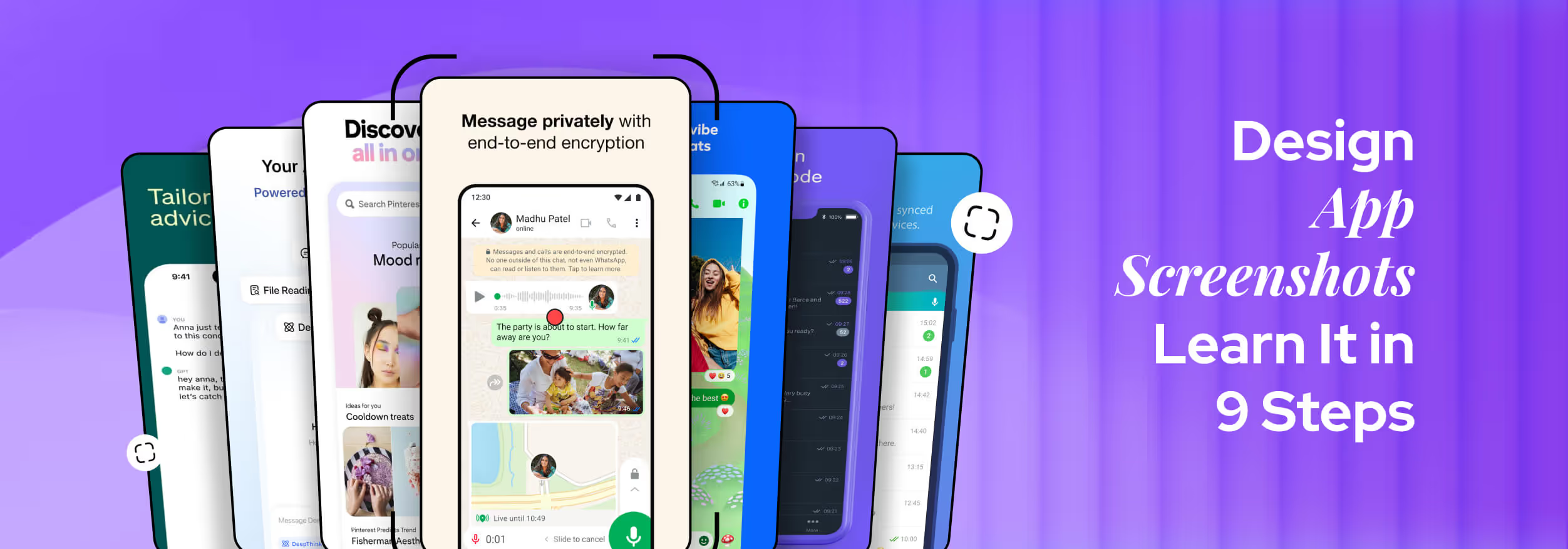
How to Design App Screenshots in 9 Easy Steps
Designing app screenshots may seem simple, but it takes more than just grabbing a few pictures. Your screenshots are like a mini-poster for your app. They help people understand what your app does, how it looks, and why they should care.
With the right steps, even beginners can create screenshots that look clean, professional, and convincing. Here are the easy steps to follow.
Step 1: Know What to Show
First, think about your app’s best features. Ask yourself: What makes my app special? Maybe it's fast, easy to use, or solves a big problem. Choose a few key things that you want new users to see first.
Also, think about your audience. Are they kids, adults, students, or business users? Knowing this will help you decide what style and tone your screenshots should have.
Step 2: Check Out the Competition
Go to the app stores and look at popular apps that are like yours. Notice what kind of screenshots they use. Do they use bold text? Do they show happy users? What colors or words do they use?

Checking competitors helps you learn what works. It also helps you avoid copying and instead find a unique style that fits your app.
Step 3: Plan the Order
Now, plan how your screenshots will appear. Each one should tell a part of your app’s story, like a slideshow. Here’s a simple layout you can follow:
- First Screenshot: Show your app’s biggest benefit.
- Second Screenshot: Show another useful feature.
- Next Few Screenshots: Show extra tools or screens.
- Final Screenshot: Add user reviews, ratings, or a call to action like “Download now!”
You can sketch the layout on paper or use sticky notes to plan it step by step.
Step 4: Pick a Style
Use the same colors, fonts, and tone as your app. This strategy keeps your branding strong. For example, if your app uses blue and white, your screenshots should match that.
Also, you should avoid using too many styles at once. Stick to one font, and make sure your background doesn’t make the text hard to read.
Step 5: Take Real Screenshots
Now, open your app and take screenshots on the actual devices it supports. Don’t add fake screens or features that don’t exist. Make sure the images are high quality, not blurry or stretched. If you want to show your app inside a phone frame, use one that looks clean and simple.
Step 6: Add Simple Text
On each screenshot, add short texts that explain what’s going on. These are called text overlays. For example, write “Track your steps daily” or “Easy food logging.” Keep the text big enough to read, even on small screens. Use just a few words. Avoid long sentences or technical terms.

Step 7: Use Smart Design Tricks
Use design rules that make your images look balanced. One tip is the rule of thirds. Divide the screen into three rows and columns and place your main content where the lines meet. This makes things look nicer to the eye.
Also, use colors that look good together. Don’t mix too many bright colors or put light text on a light background.
Step 8: Add Trust and Local Touch
If your app has good ratings or reviews, you can show them in the last screenshot. This strategy helps build trust. Also, if you want to reach people in other countries, make a version of your screenshots in their language. Change both the text and visuals if needed.
Step 9: Double-Check, Save, and Upload
Before you upload, go over your screenshots again. Make sure:
- Text is clear
- Images are the right size for each device
- Colors match your app
- There are no spelling mistakes
If possible, show them to a friend and ask if they understand what your app does just by looking at the screenshots. Now export the screenshots in the correct format (PNG or JPEG) and sizes based on iOS or Android rules.
Once you upload them, preview how they look in the app store. If something looks off, fix it right away.
By following these simple steps, your app screenshots will look clean, helpful, and ready to grab attention. Even if you’re just starting out, clear screenshots can help your app shine and get more downloads.
Pro Tips for Designing App Screenshots
Once your basic screenshots are ready, it’s time to make them even better. These pro tips are often missed but can take your design from okay to great. They focus on small details that have a big impact on how users feel when they see your app for the first time.

Let’s explore a few of these advanced tricks.
Show a Real Use Moment
Instead of just showing a blank screen with features, display a moment when the feature is actually doing something useful. For example, if your app tracks sleep, show a completed sleep report instead of just the settings page.
Image 5: Showcasing Real Use Moment
This approach helps people imagine the results they’ll get by using the app. It turns boring screens into real-life stories, making the app more relatable and useful.
Focus on One Idea Per Screen
Don’t try to show too many features in one screenshot. If a user sees multiple texts, buttons, and icons all at once, they might feel lost. Stick to one message per screenshot.
For example, if the screen is about tracking steps, don’t mix it with meal logs or calendar features. Keeping the focus sharp helps the user understand the value of your app quickly and clearly.
Use a Friendly Tone in Text
The words you use in the screenshots matter. Try speaking in a soft, helpful tone, just like you would talk to a friend. Instead of using boring labels like “Settings Page,” try “Customize Your App in Seconds.”
This type of text makes your app feel more human and friendly, and less like a machine. It also helps users feel more connected and welcome.
Leave Breathing Space
Many beginners try to fill every space in the screenshot with text or images. But too much stuff makes it look messy. Leave some empty space around your content.
Image 6: Breathing Space in App Screenshots
This space gives the text room to stand out and makes everything easier to read. This is especially important for small phone screens where clutter can quickly become confusing.
Match Store Theme
Always preview your screenshots inside the app store interface. Some users view app stores in dark mode, while others use light mode. If your screenshots blend into the background, they won’t stand out.
Also, remember to add shadows or color frames around the edges so your screenshots pop on any background. This small trick helps your app grab more attention.
Test Different Covers
Your first screenshot is the most important; it’s like a book cover. Try creating two or three versions that show different features or styles. Then test which one gets more clicks or downloads.
This is called A/B testing. It helps you understand what your users like best. With the winning screenshot, you can improve your app’s performance without changing the app itself.
FAQs
Can I use AI-generated App Store screenshots?
Yes, you can use AI-generated screenshots as long as they accurately show your real app experience. Avoid showing features that don’t exist. Your screenshots must follow App Store rules and stay true to what your app actually offers.
What format are App Store screenshots?
App Store screenshots must be in either PNG or JPEG format. PNG is best for sharp, clear images. While videos can be added as app previews, they do not replace screenshots and are used as separate media.
What is the best quality screenshot format?
PNG is the best format for app screenshots because it keeps the image sharp and clear without reducing quality. It works well for showing small text, clean icons, and detailed visuals, especially on high-resolution displays.
What's the best tool to design app screenshots?
The best tools to design app screenshots are Figma, Canva, and Photoshop. They let you add text, colors, and frames easily. Figma is great for teams, while Canva is beginner-friendly.
End Note
Designing strong app screenshots isn’t just about looks; it’s about winning attention in seconds. A good screenshot can turn a quick glance into a download.
Now that you know the steps and tips, it’s time to put them into action. Keep your message clear, your visuals clean, and your users in mind. You don’t need fancy tools, just focus on making each screenshot count.
With the right effort, your app can stand out and get the attention it truly deserves.

.avif)
.avif)
.avif)
.avif)


.avif)
.avif)
.avif)
.avif)


.avif)


