.svg)



Key Takeaways
- Keep forms simple by asking only for essential user information.
- Use clear labels, logical layouts, and helpful validation to reduce errors.
- Optimize forms for mobile with touch-friendly fields and autofill.
- Follow accessibility practices to make forms easier for everyone.
- Use specific CTAs and clear error messages to improve completion.
Every extra information field in a form gives users another reason to leave before they hit Submit. That's why Form Design UI isn't just about making a form look beautiful. It's about creating a smooth, stress-free experience that keeps users engaged and encourages them to complete the task.
Clear labels, smart validation, logical layouts, and mobile-friendly design remove friction at every step. These small improvements reduce errors, build confidence, and help turn more visitors into leads, customers, or subscribers.
Keep reading to discover the key principles of Form Design UI, along with practical examples and proven best practices for designing forms that people actually complete.
What Is Form Design UI?
Form design UI is the practice of designing the input fields, labels, buttons, and layout that make up a digital form. It is the part of a product where a user actually gives information back to you.
Every signup screen, checkout flow, contact page, and settings panel relies on a form interface to collect data. This interface is usually the most important touchpoint in the entire user journey.
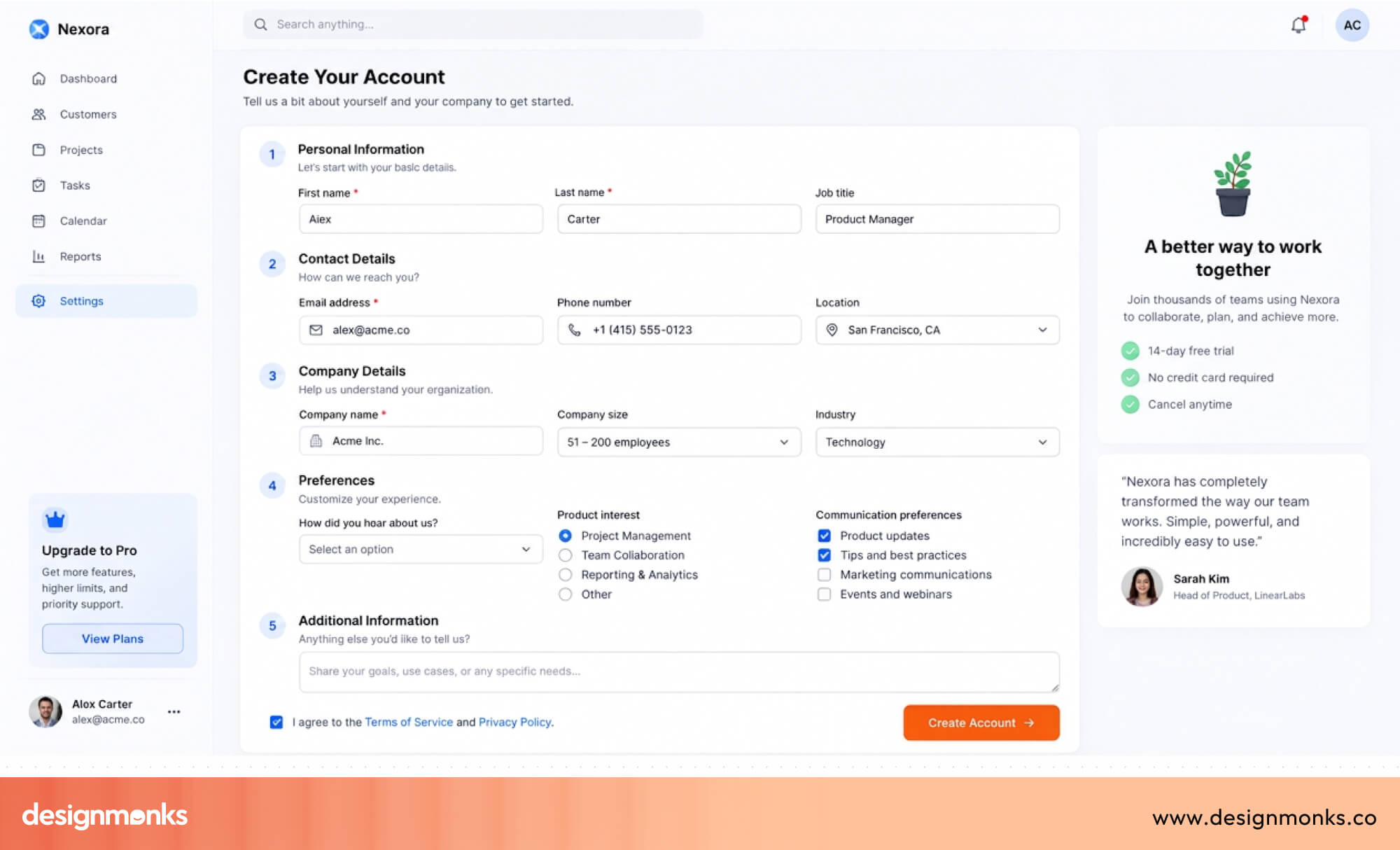
Forms sit at a strange intersection in UX. They ask the user to do work. Unlike browsing or scrolling, filling out a form requires typing, choosing, remembering, and correcting.
That means the quality of a form's design has an effect on whether a user finishes what they started. A cluttered form field, a confusing input interface, or a form that hides errors until the end will quietly cost you users. This type of damage rarely shows up as a visible complaint.
Good form design, by contrast, feels invisible. The user moves through it without friction and barely notices the form was there at all.
Why Good Form UI Design Matters
A form is often the final step before someone signs up, makes a purchase, or contacts your business. If the form is confusing or takes too much effort, many users will leave before they finish. This is called form abandonment, and it can lead to lost customers and fewer conversions.
Good Form Design UI helps remove these problems. Clear labels, simple layouts, and helpful validation make forms easier to complete. As a result, users make fewer mistakes, finish forms faster, and are more likely to hit the Submit button.
Better forms don't just improve completion rates. They also build trust and create a better user experience.
When a form feels simple and stress-free, users are more likely to have a positive impression of your website or product. Even small improvements can make a big difference in both user satisfaction and business results.
Core Principles of Effective Form UI Design
Great forms don't happen by accident. They follow a few simple design principles that make them easier to understand and complete:
Keep Forms Simple
The simpler your form is, the more likely users are to complete it. Only ask for the information you really need. Every extra field takes more time to fill out and gives users another reason to leave.
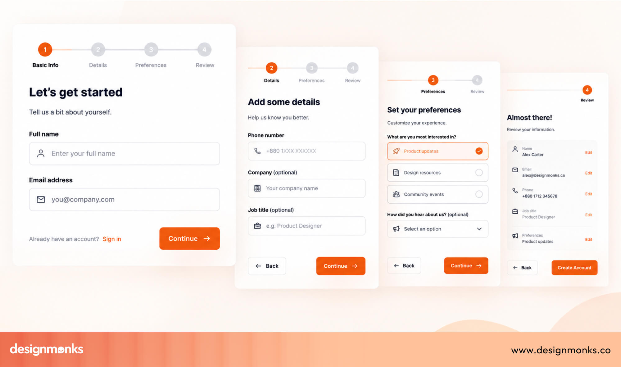
If you need more information later, use progressive disclosure. This means showing extra fields only when they become necessary instead of displaying everything at once. Shorter forms feel less overwhelming and usually have higher completion rates.
Create a Clear Visual Hierarchy
A form should be easy to scan before users even start typing. A clear visual hierarchy helps users understand where to look and what to do next.
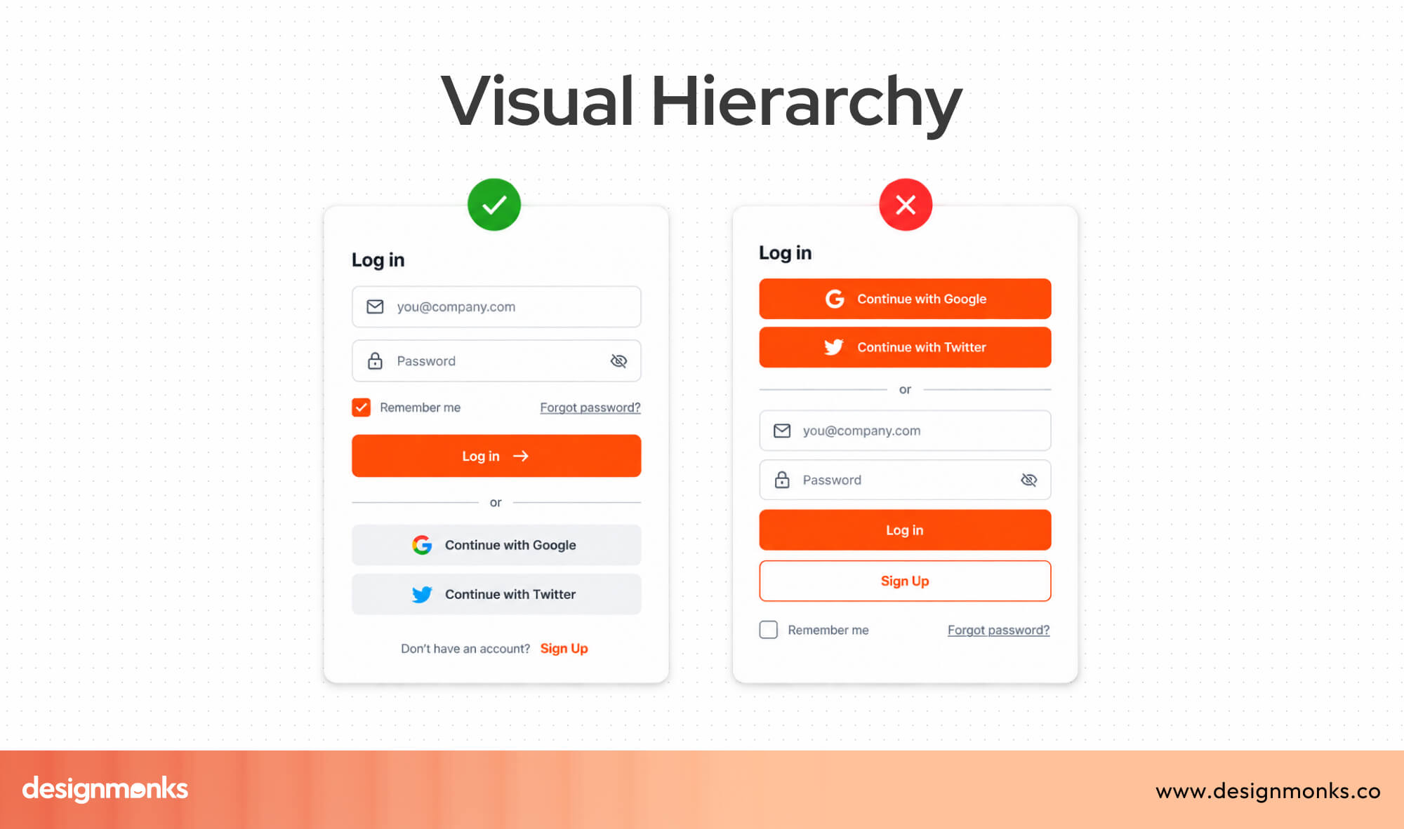
Group related fields together, leave enough space between sections, use easy-to-read text, and keep everything aligned. A clean layout makes the form feel more organized and helps users complete it faster with fewer mistakes.
Write Helpful Labels
Every form field should have a clear label that stays visible while users type. This makes it easier for users to remember what information each field needs.
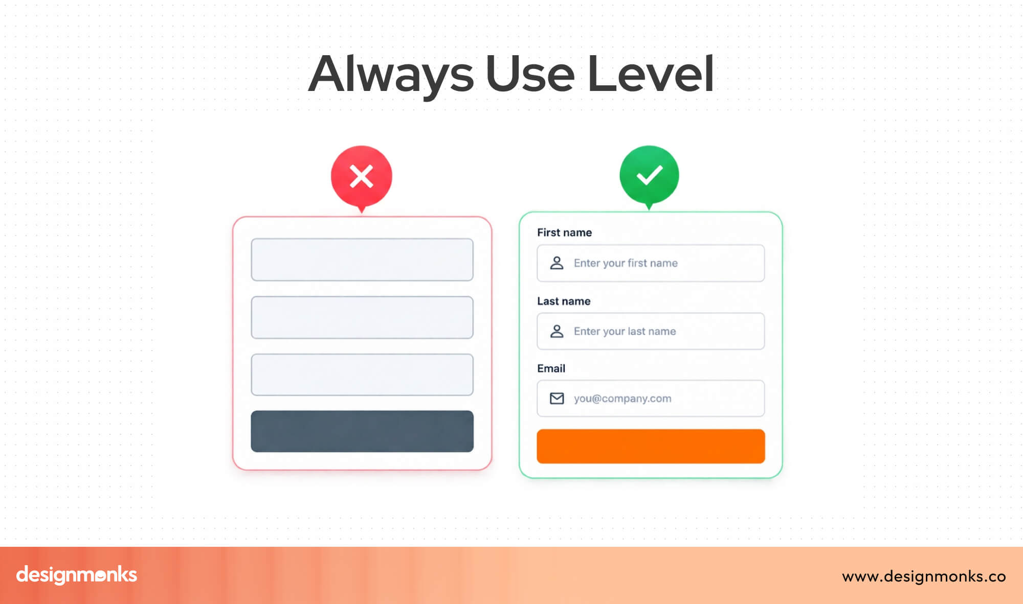
Avoid using placeholder text only in the input box. They are useful for giving examples, but they should never replace proper field labels. Once users start typing, the placeholder should disappear.
Design for Error Prevention
It's always better to prevent mistakes than fix them later. Good forms check for errors as users fill them out, rather than waiting until they click Submit.
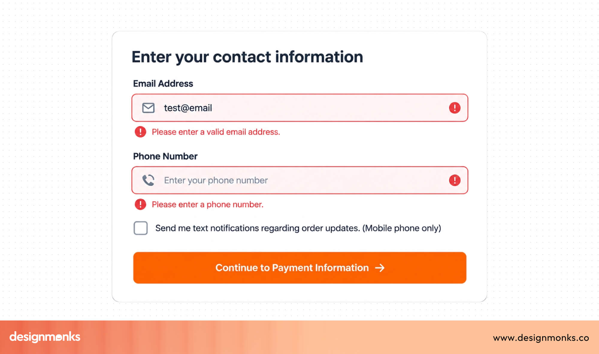
For example, if an email address is missing the @ symbol, the form can point it out immediately. This saves users time and makes the form feel more helpful instead of frustrating.
Make Required Fields Clear
Users should never have to guess which fields they must complete. Clearly mark required fields and identify optional ones when needed.
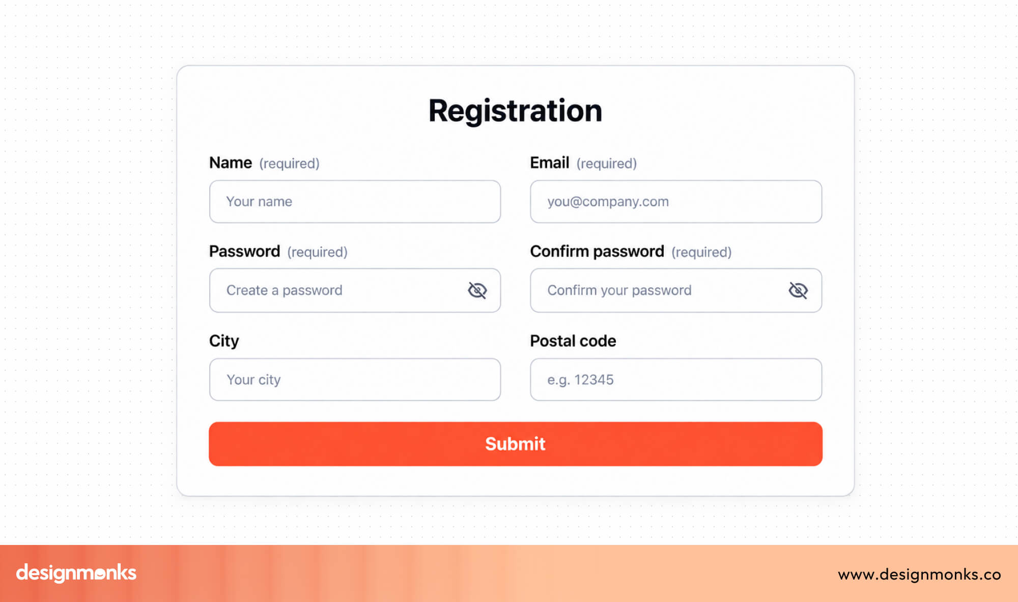
This helps users move through the form with confidence and avoids unnecessary errors. When expectations are clear from the beginning, people are more likely to complete the form successfully.
Essential UI Components of Modern Forms
Every form is made up of different UI components, also called form fields or input controls. Each one is designed for a specific type of information.
Choosing the right component makes a form easier to understand, faster to complete, and less likely to cause mistakes. Let's take a look at the components:
- Text Field: A text field is used for short answers, such as a name, email address, or job title. It's one of the most common form fields because it lets users type their own information.
- Text Area: A text area is similar to a text field but gives users more space to write. It's best for longer responses like comments, feedback, or support requests.
- Dropdown: A dropdown lets users choose one option from a list without taking up much space. It's useful when there are many choices, such as selecting a country or department.
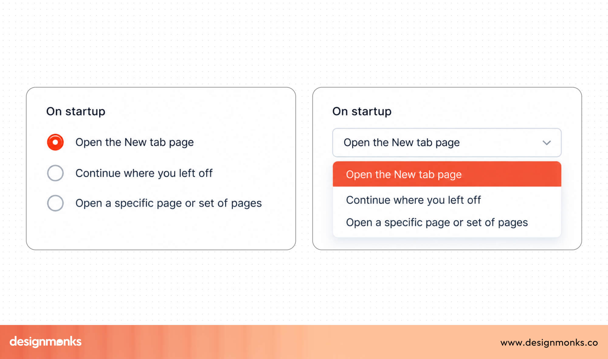
- Radio Button: Radio buttons allow users to select only one option from a small group. They're ideal for choices like Yes or No or selecting a payment method.
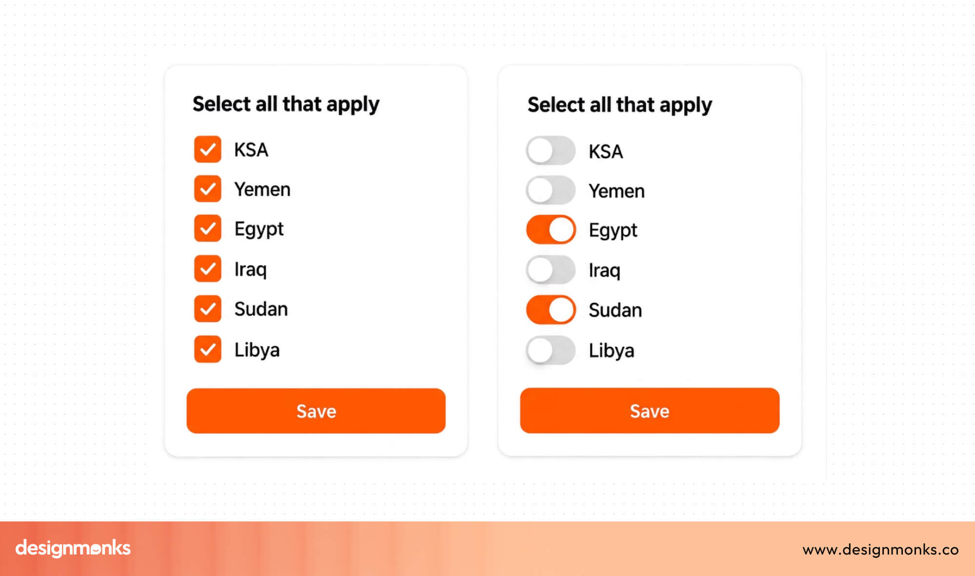
- Checkbox: Checkboxes let users select one or more options. They're commonly used for interests, preferences, or agreeing to terms and conditions.
- Toggle Switch: A toggle switch turns a setting on or off with a single tap or click. It's often used for features like notifications, dark mode, or email updates.
- Date Picker: A date picker helps users select a date from a calendar instead of typing it manually. This reduces formatting errors and makes date selection faster.
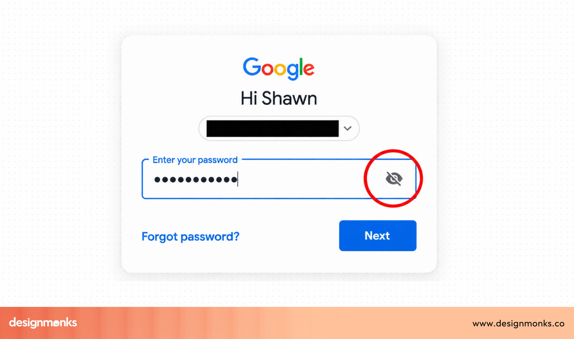
- Password Field: A password field hides the characters as users type to keep passwords private. Many forms also include a Show Password button so users can check what they've entered.
- File Upload: A file upload field allows users to attach documents, images, or other files. It's commonly used for resumes, profile photos, or supporting documents.
- Search Field: A search field helps users quickly find information by typing keywords. It's useful on websites with lots of products, articles, or records.
Using the right UI component for each field makes a form feel natural and easy to use. Instead of asking users to type everything, choose the control that best fits the information you're collecting. This simple decision improves usability, reduces errors, and helps users complete forms more quickly.
Form Layout Best Practices
The way you arrange a form is just as important as the fields inside it. A good layout helps users move through the form naturally without stopping to think. When information is organized well, users complete forms faster, make fewer mistakes, and are less likely to leave before clicking Submit. Here are some best practices to follow for form layout:
Single-Column vs Multi-Column Forms
For most forms, a single-column layout is the best choice. It guides users from top to bottom in a clear order and makes the form easier to read and complete. This layout also works well on both desktop and mobile devices.
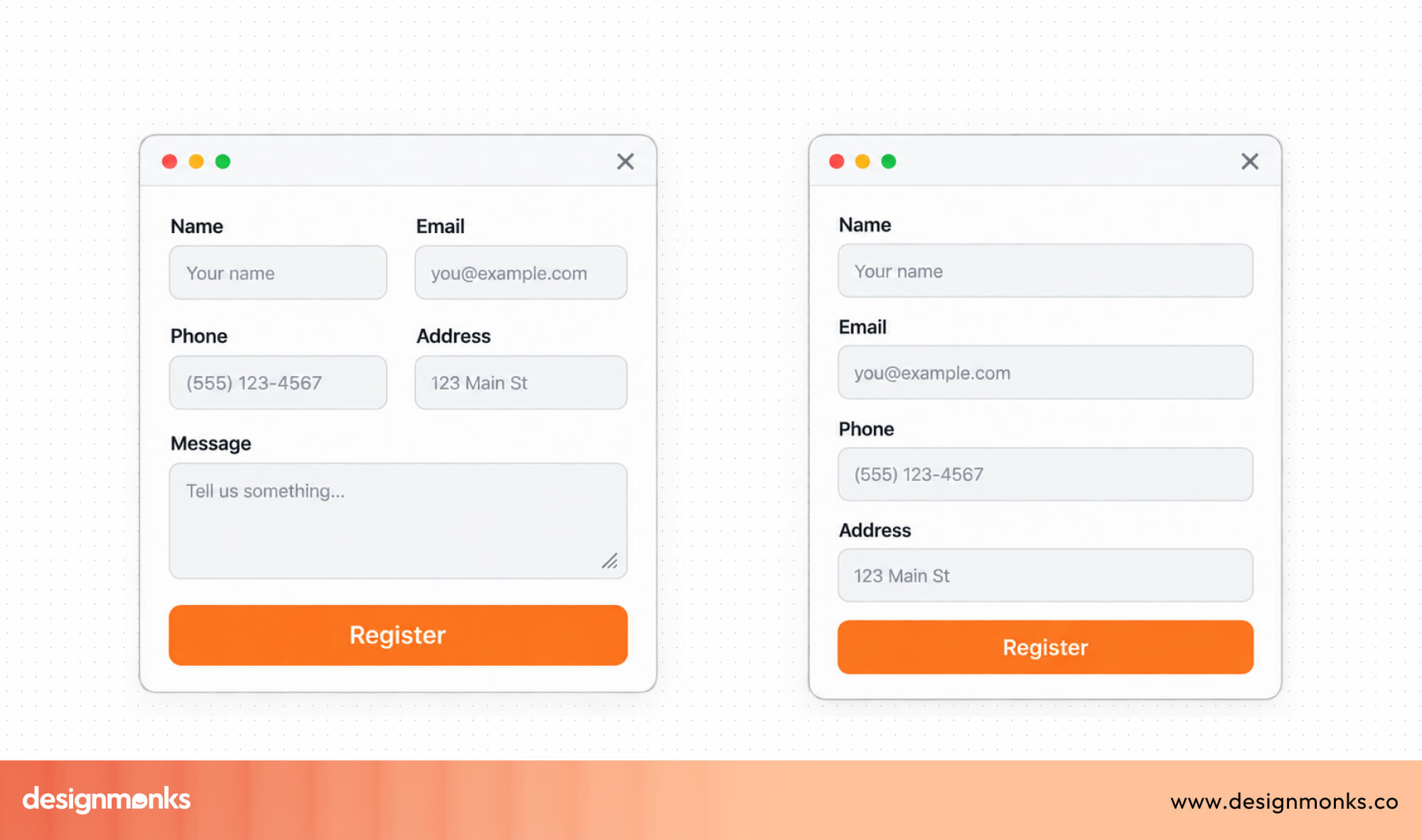
A multi-column layout can be useful when two or more related fields belong together, such as City, State, and ZIP Code. However, using too many columns can make forms harder to scan and increase the chance of users missing a field.
Logical Field Grouping
Users should never feel like they're filling out a random list of questions. Group related fields into clear sections so the form feels organized and easier to understand.
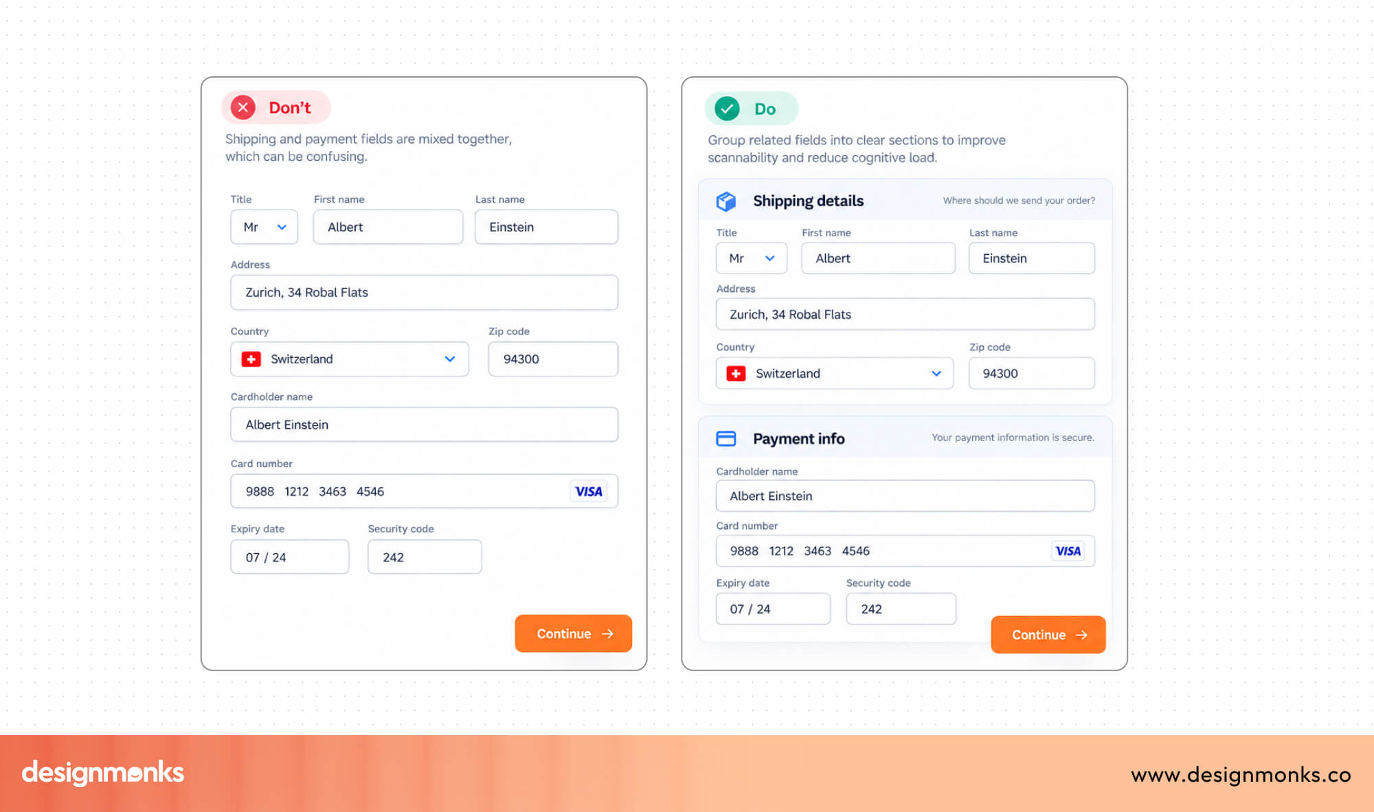
For example, keep personal information, shipping details, and payment information in separate groups. This makes long forms feel shorter because users can focus on one section at a time.
Proper Field Spacing
Spacing may seem like a small detail, but it has a big impact on usability. When fields are too close together, users can accidentally click or tap the wrong one.
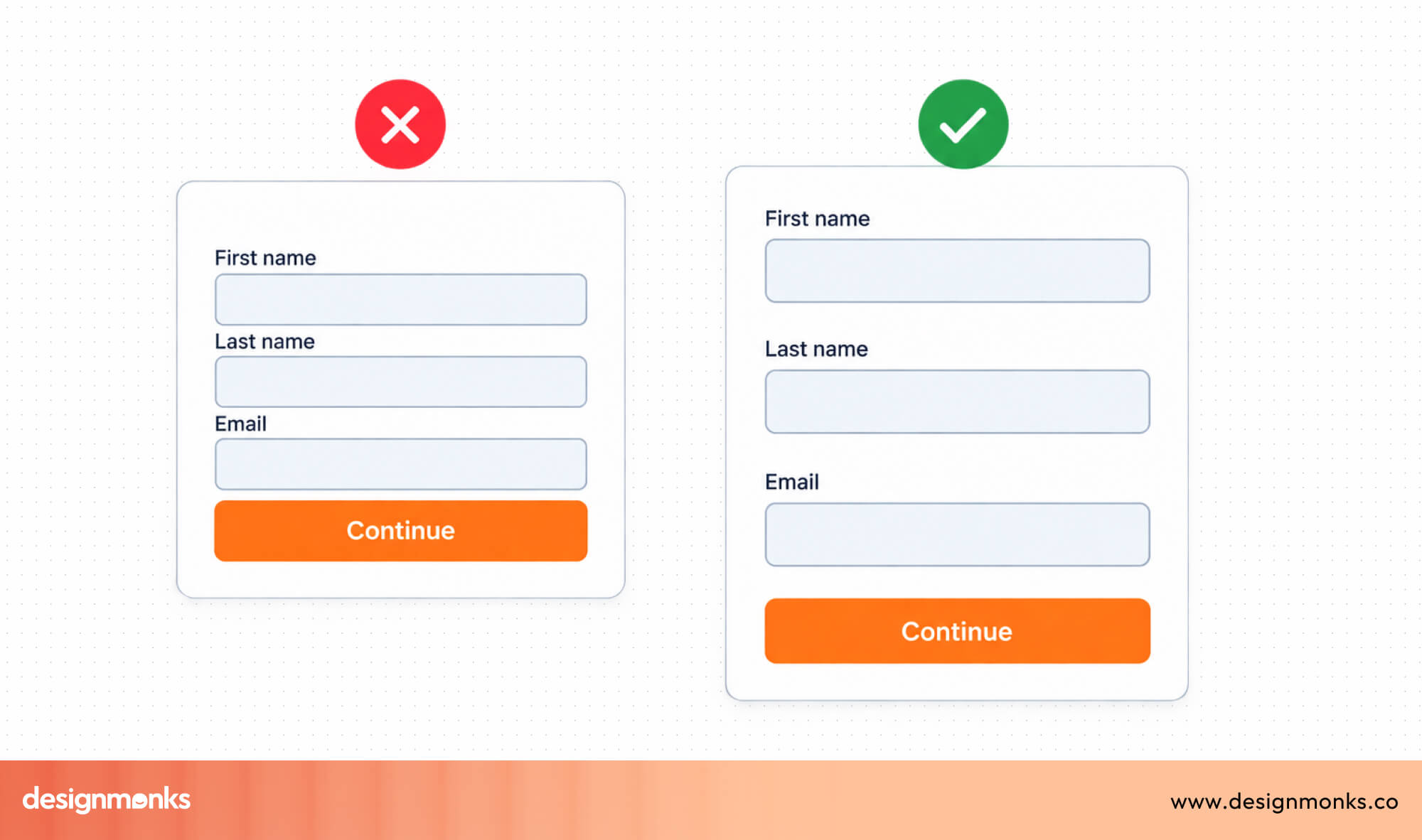
Leaving enough space between fields and sections makes the form easier to read and creates a cleaner, less overwhelming layout. This is especially important on mobile devices, where users interact with their fingers instead of a mouse.
Label Alignment
Labels should be easy to find and read. In most cases, placing labels above each field works better than placing them beside the field. Users can scan the form more quickly and move naturally from one question to the next.
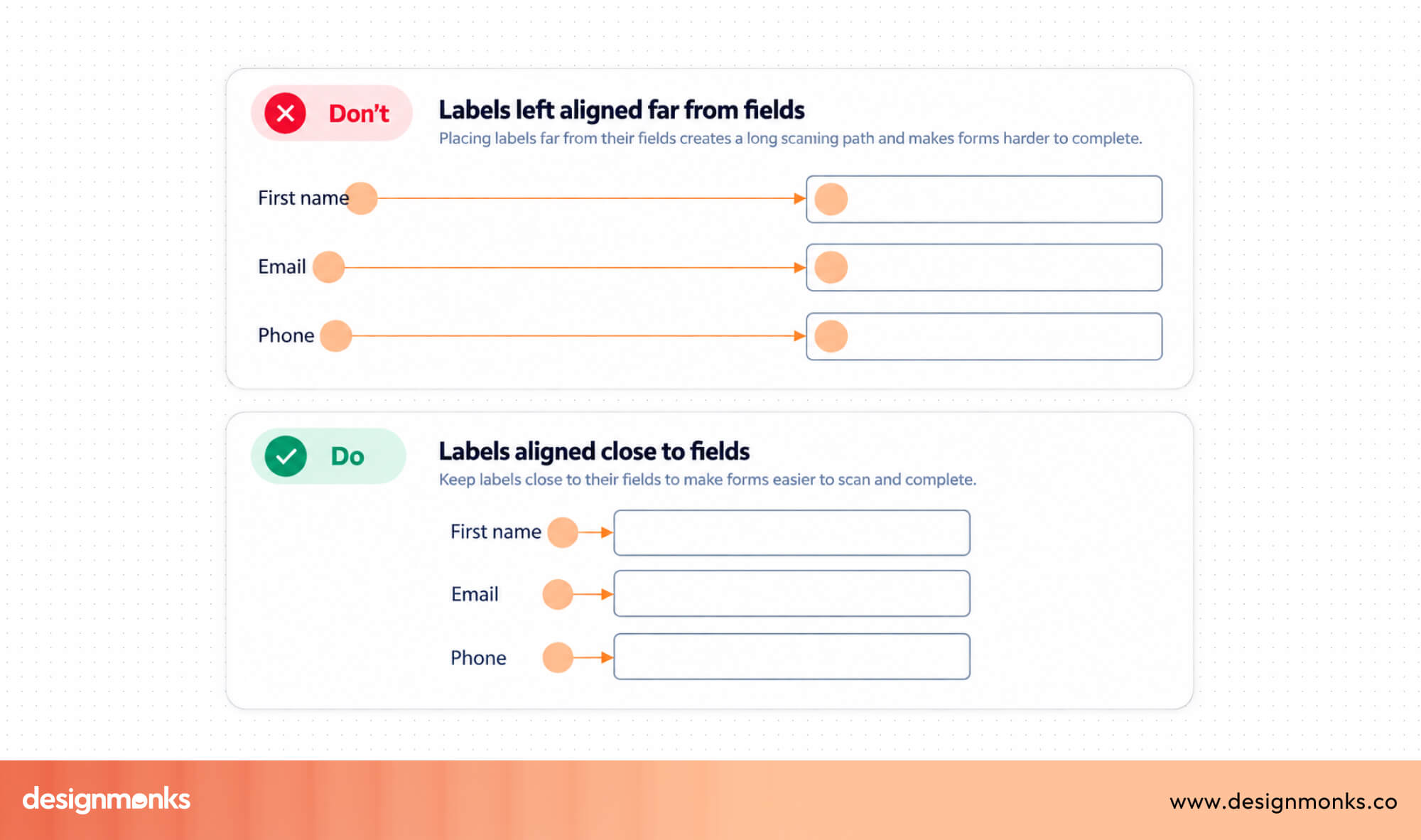
Keeping label placement consistent throughout the form also creates a smoother experience and reduces confusion.
Responsive Layout
People fill out forms on phones, tablets, laptops, and desktop computers. A responsive layout automatically adjusts to fit different screen sizes without making the form difficult to use.
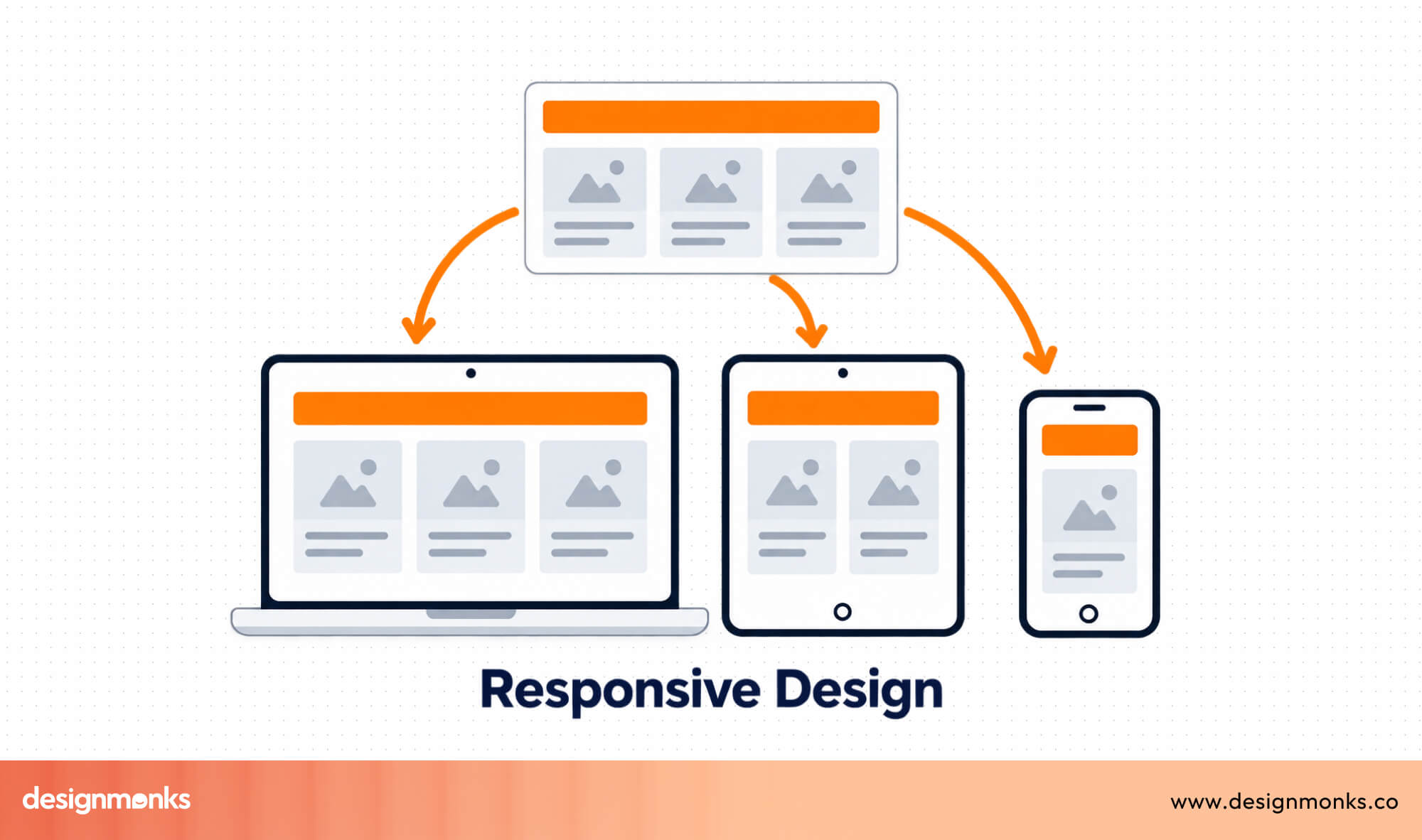
Buttons should stay easy to tap, text should remain readable, and fields should never feel cramped. Testing your form on multiple devices helps ensure every user has a smooth experience.
Form Validation Best Practices
Even the most well-designed form can't prevent every mistake. That's where form validation comes in. Instead of waiting until users click Submit, good validation helps them catch and fix errors along the way. Here's a couple of different ways you can do that:
Inline Validation
Inline validation checks each field while users are filling out the form. Instead of saving every error until the end, it gives feedback as soon as users finish a field.
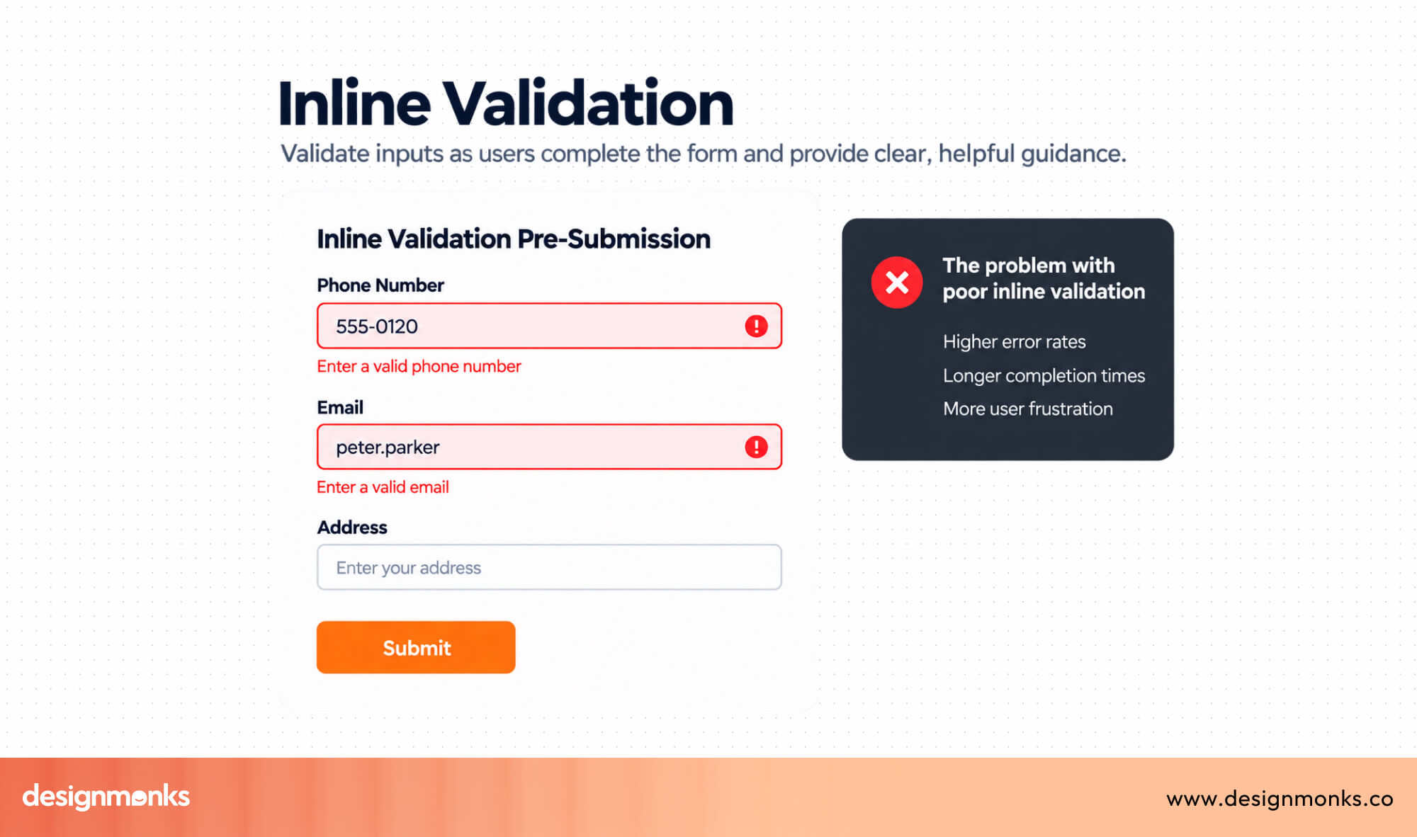
For example, if an email address is missing the @ symbol, the form can point it out immediately. Users can fix the mistake right away instead of searching through the entire form later.
Real-Time Feedback
Users shouldn't have to guess whether they're doing things correctly. Real-time feedback lets them know instantly when they've entered valid information.
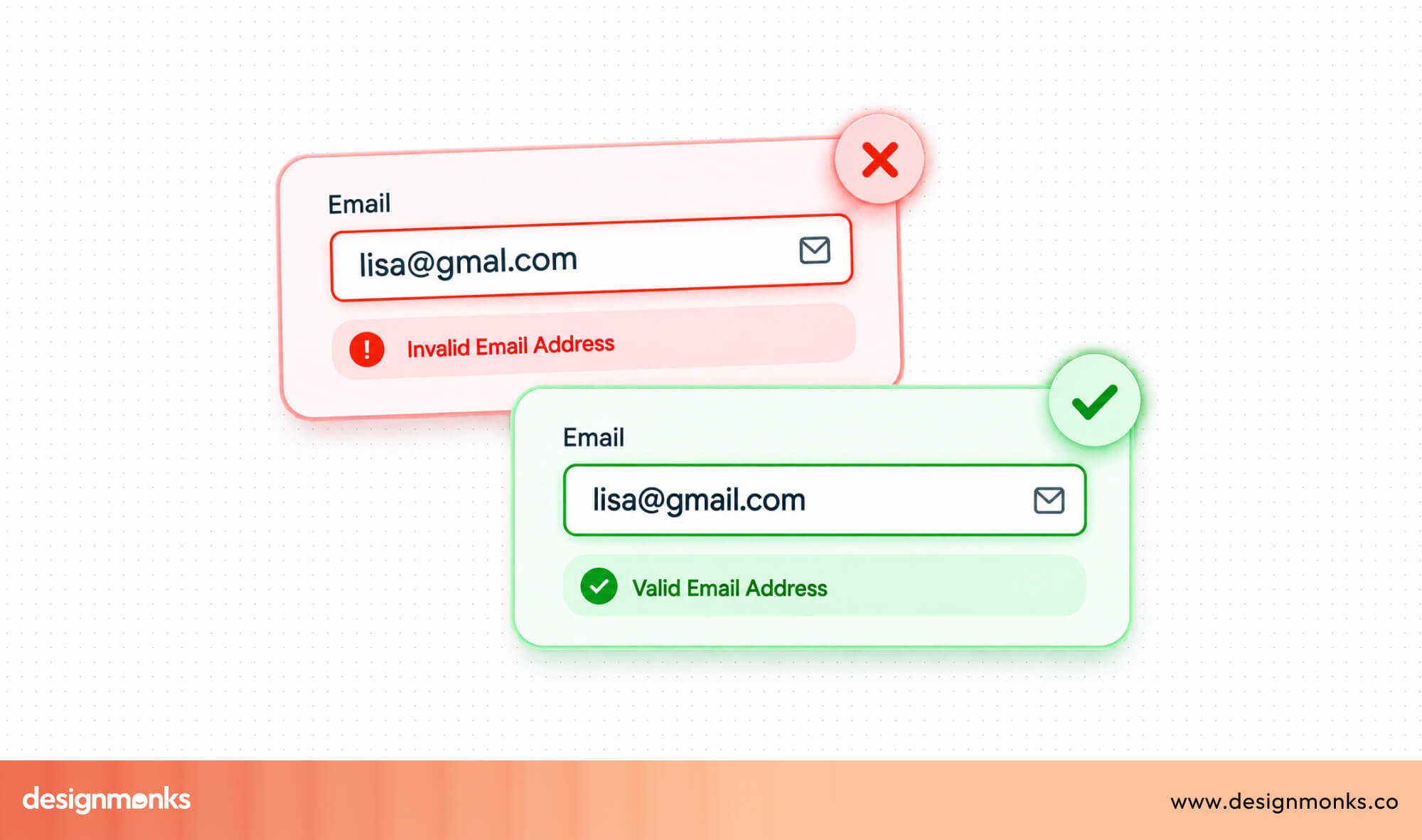
A simple green checkmark or a short confirmation message reassures users they're on the right track. This makes the form feel more responsive and keeps them moving forward with confidence.
Helpful Error Messages
When something goes wrong, tell users exactly what needs to be fixed. Avoid generic messages like "Invalid input" because they don't explain the problem.
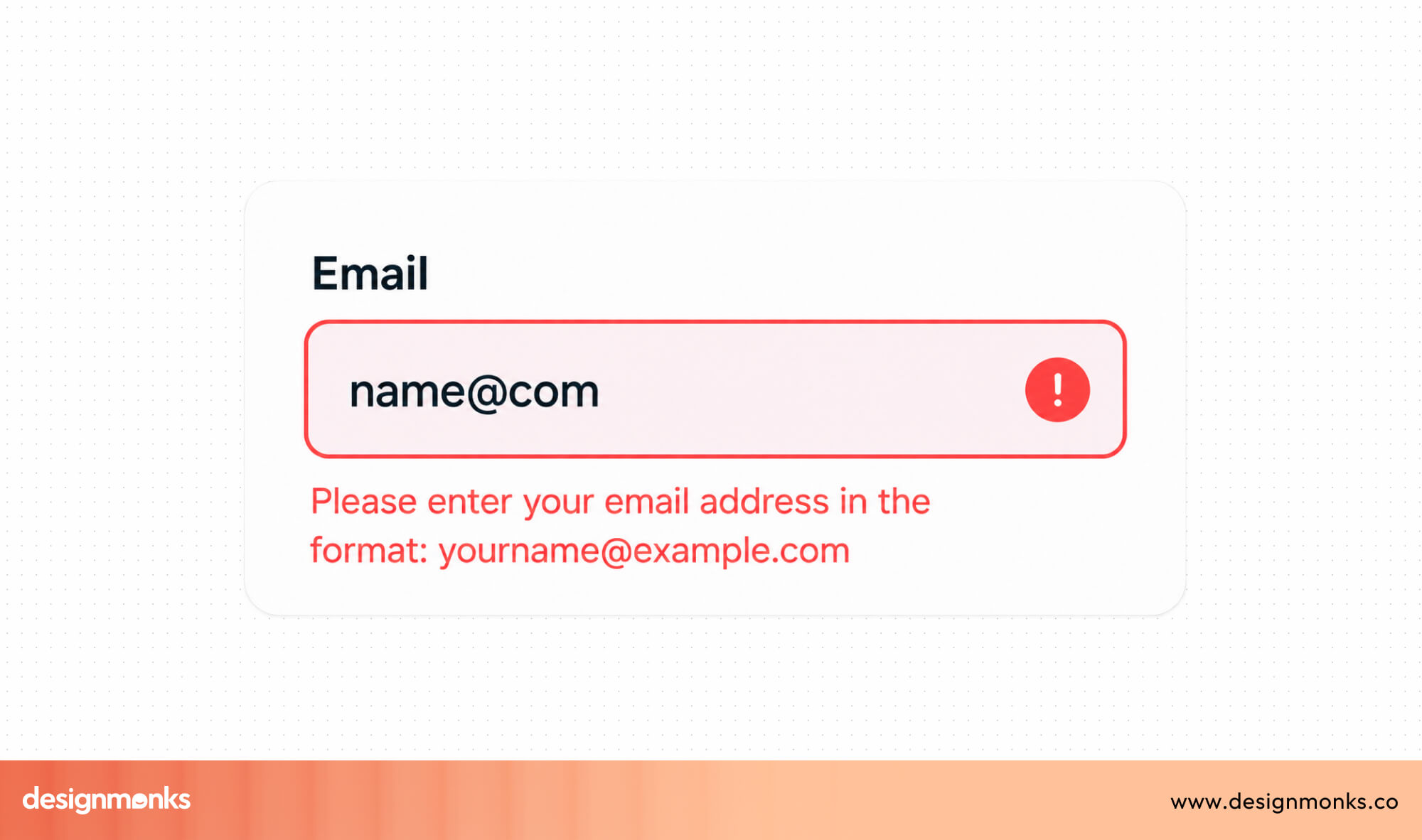
Instead, write messages such as "Please enter a valid email address." Clear instructions help users correct mistakes faster and reduce frustration.
Success States
Validation isn't only about showing errors. It's also important to let users know when they've completed a field successfully.
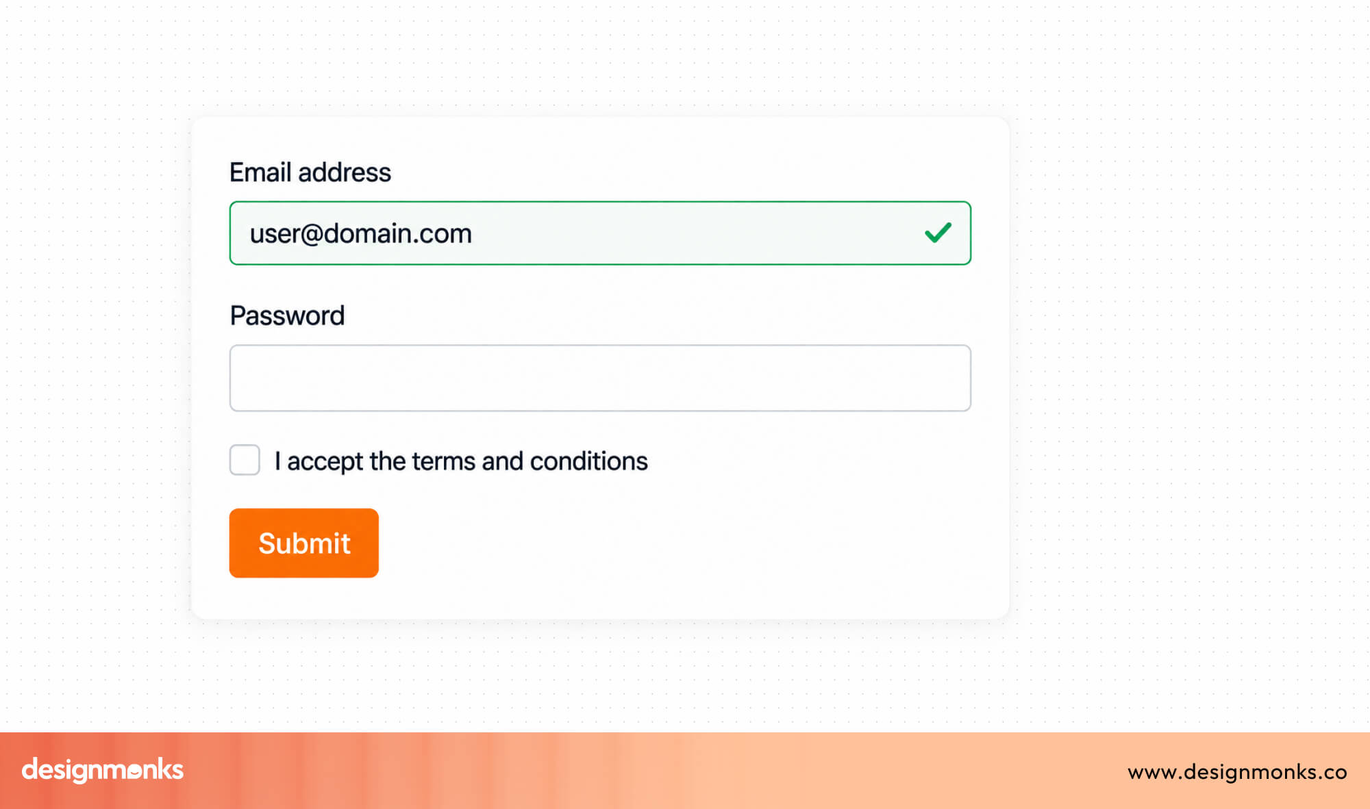
A green checkmark, highlighted border, or confirmation message shows that everything is correct. These small visual cues reassure users that they're making progress.
Password Strength Indicators
Creating a secure password can be difficult, especially if users don't know the requirements. A password strength indicator provides guidance as they type instead of rejecting the password after submission.
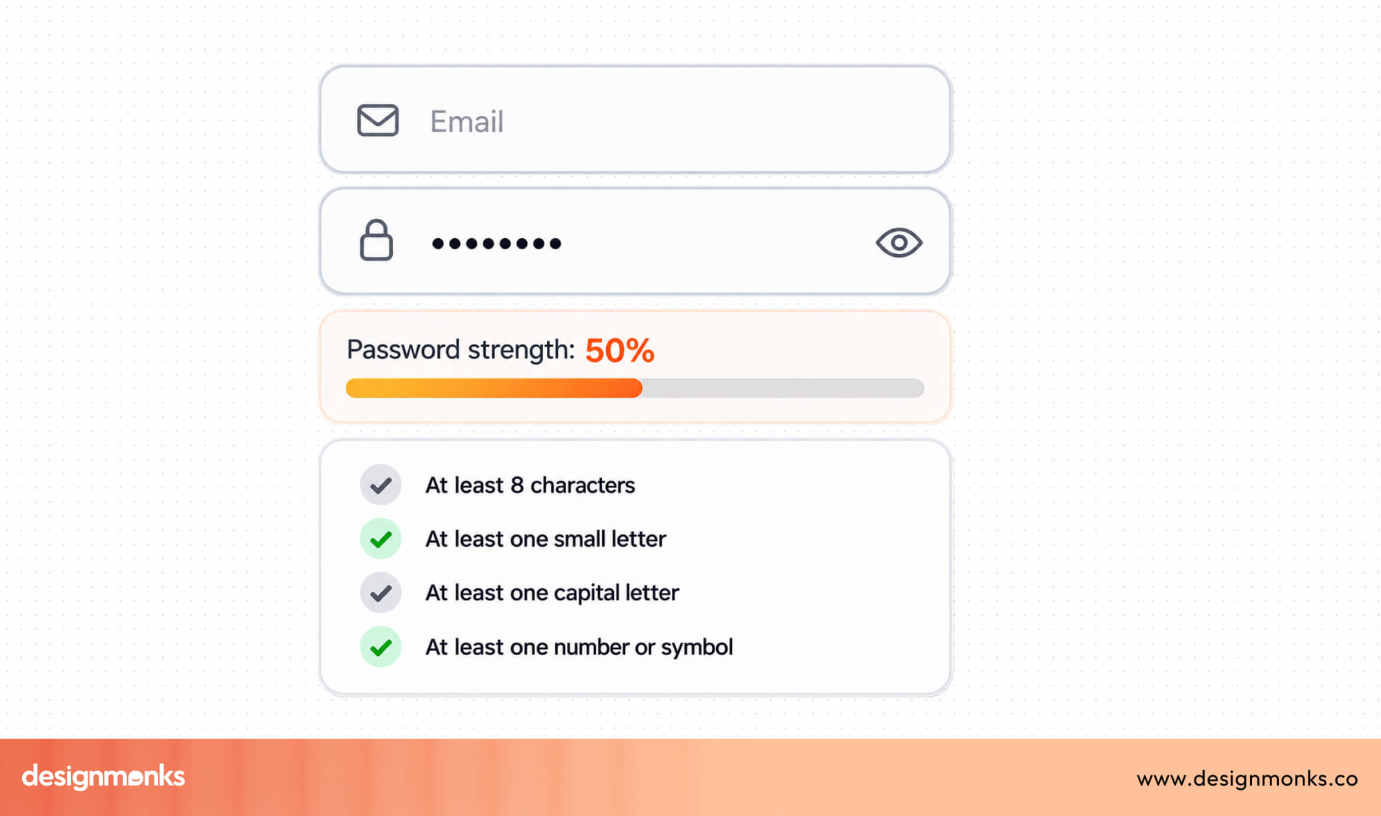
For example, it can suggest adding numbers, uppercase letters, or special characters to create a stronger password. This helps users create safer passwords while making the experience less frustrating.
Good validation should feel like a helpful guide, not another obstacle. The sooner users understand a mistake and know how to fix it, the smoother and faster the entire form becomes.
Mobile Form UI Best Practices
Mobile users have less screen space and often less patience. If a form is difficult to tap, read, or complete, many users will leave before they finish. A good mobile form should feel simple, fast, and comfortable to use.
The following best practices can help you create a better mobile experience:
Use Large Touch Targets
Unlike a mouse, users tap the screen with their fingers. If buttons, checkboxes, or input fields are too small, users can easily tap the wrong option. Make buttons and form fields large enough to tap comfortably. This reduces accidental taps and makes the form feel easier to use.
Optimize the Keyboard
Different fields need different keyboards. Showing the correct keyboard saves users time and makes typing easier. For example, display the numeric keyboard for phone numbers, and the regular keyboard for names or messages. This small change creates a much smoother experience.
Support Autofill
Typing on a phone can be slow, especially when users need to enter their name, address, or payment details.
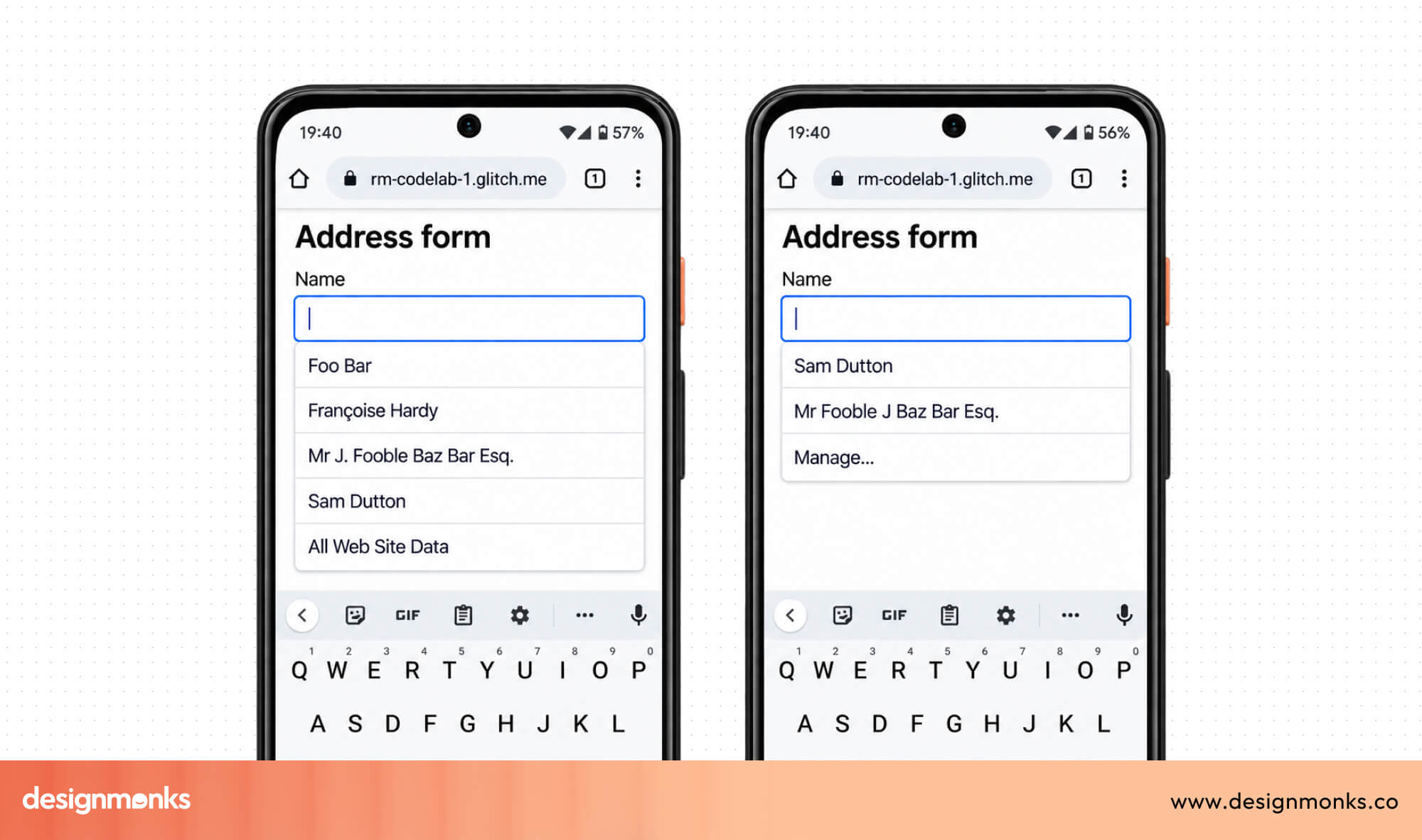
Autofill lets users complete these fields with just a few taps instead of typing everything manually. Supporting autofill makes forms faster and reduces typing errors.
Use Input Masks
An input mask automatically formats information while users type. This is especially useful for phone numbers, dates, credit card numbers, or postal codes.
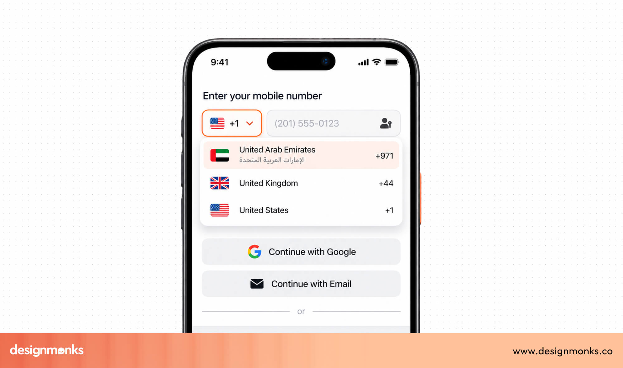
For example, instead of asking users to type 01012345678, the form can automatically display 010-1234-5678. This improves readability and helps users enter information correctly.
Leave Enough Spacing
Small screens have limited space, so good spacing becomes even more important. If fields and buttons are too close together, users may accidentally tap the wrong one.
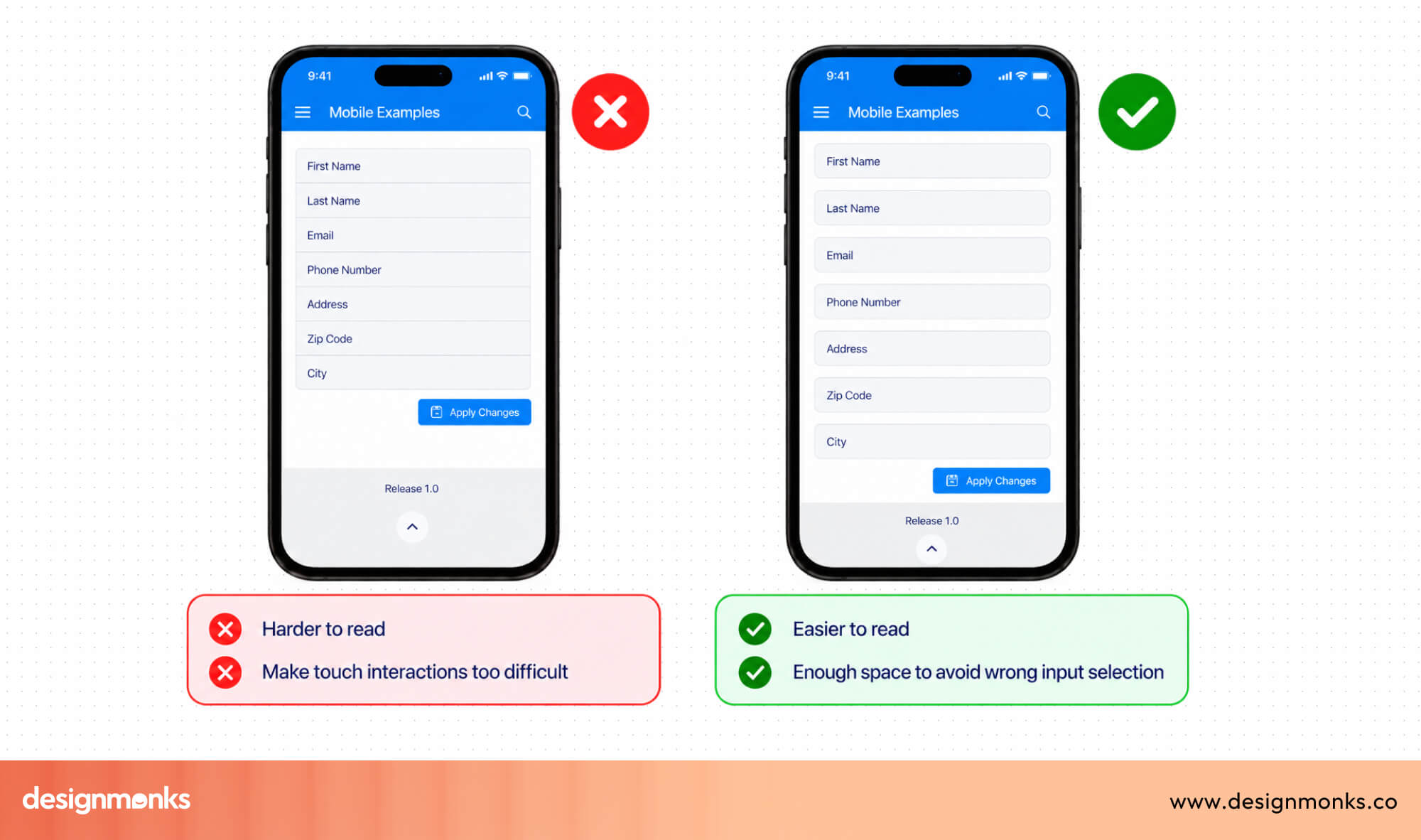
Leaving enough space between form elements makes the layout cleaner and reduces mistakes.
Design for One-Handed Use
Many people use their phones with one hand while walking, commuting, or carrying something. Important buttons and form fields should be easy to reach without forcing users to stretch their fingers.
Mobile users usually have less patience than desktop users. Making your forms fast, simple, and easy to use on smaller screens can greatly improve completion rates.
Accessibility Best Practices for Form UI
Accessible forms are easier for everyone to use, not just people with disabilities. They remove unnecessary barriers, help more people complete tasks successfully, and create a better experience for every visitor.
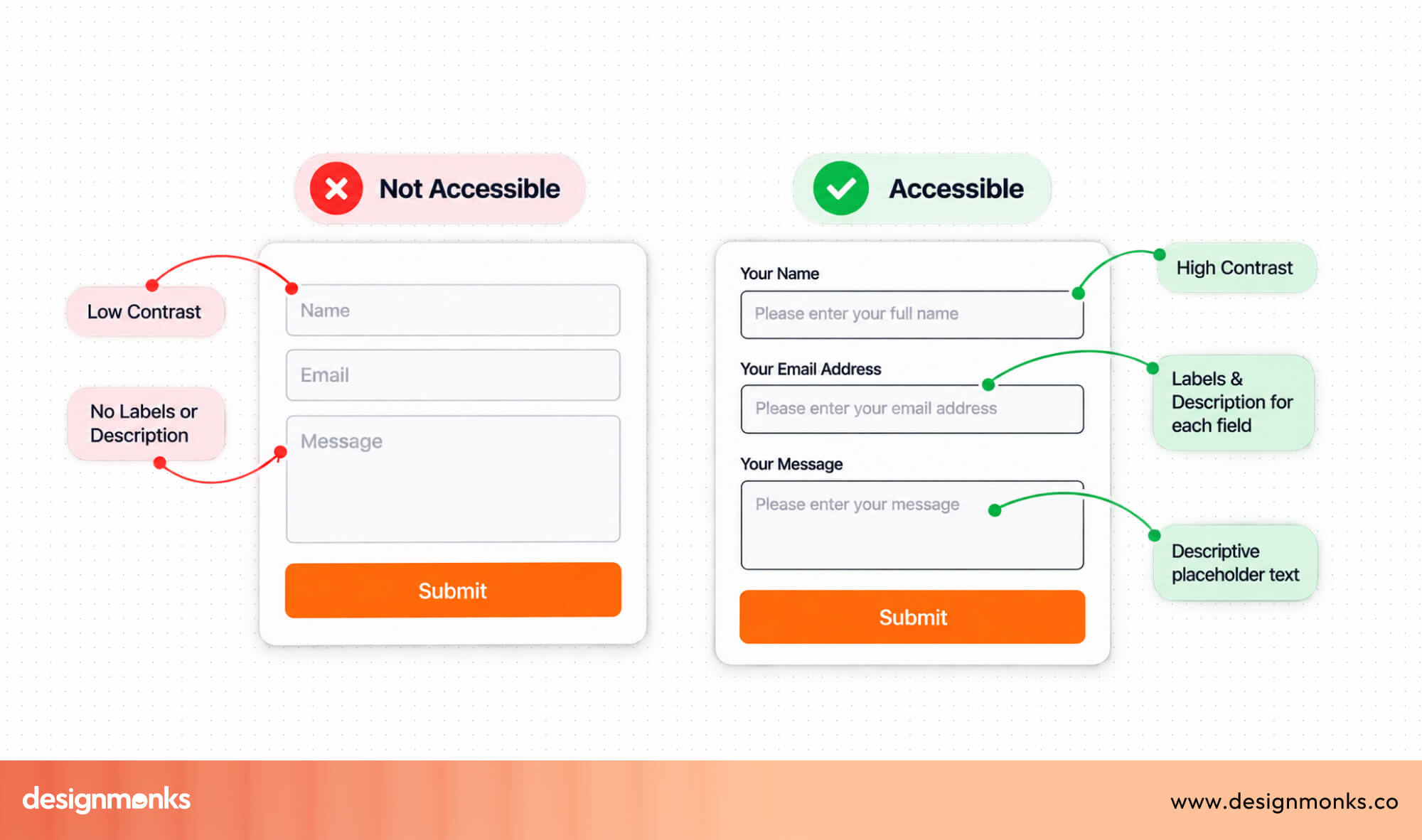
A good place to start is by following WCAG (Web Content Accessibility Guidelines), the international standard for accessible websites. These guidelines cover important areas such as readable text, keyboard support, clear navigation, and enough color contrast to make content easy to see.
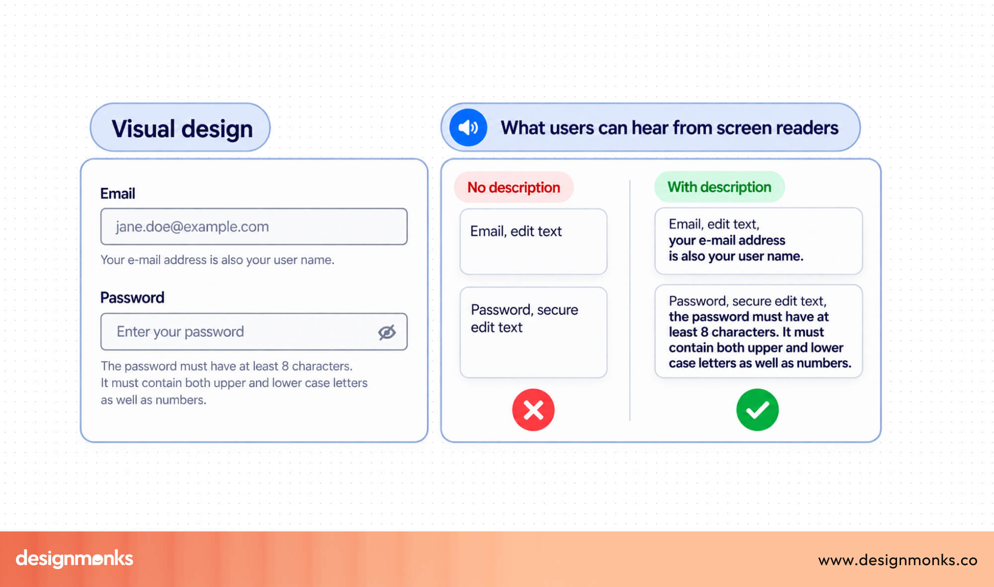
Some users rely on screen readers, which read website content aloud. So, every form field should have a clear label so screen readers can tell users exactly what information is needed. Without proper labels, users may not know what to enter.
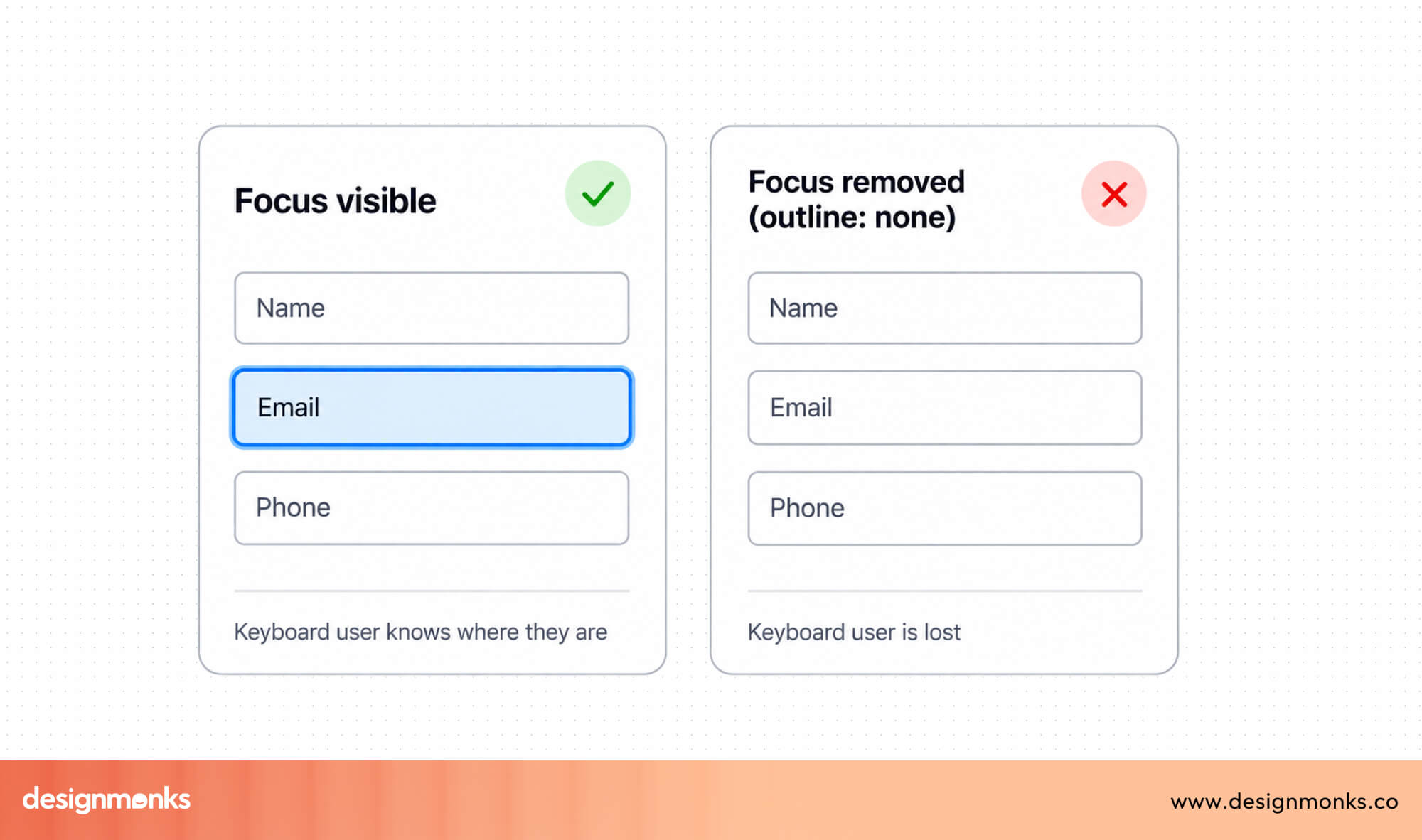
A focus state highlights the field users are currently interacting with. This is especially important for people who navigate using a keyboard instead of a mouse. A visible border or highlight helps users keep track of where they are in the form.
Moreover, your form needs to support Keyboard Navigation. Not everyone uses a mouse or touch screen. Some users move through forms using only the Tab, Shift + Tab, and Enter keys.
Every field, button, and dropdown should work properly with keyboard navigation so users can complete the entire form without using a mouse. At the same time, you need to maintain good color contrast in your forms. Text, buttons, and error messages should stand out clearly from the background.
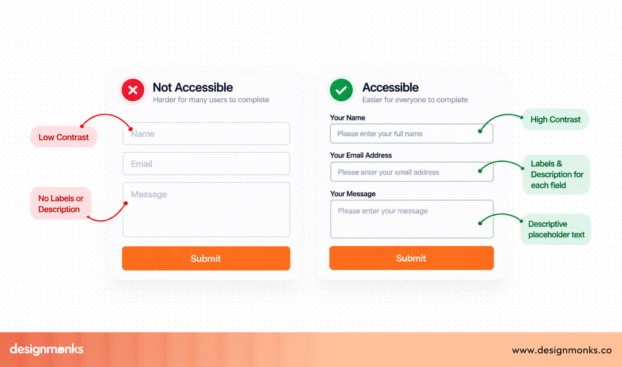
Poor color contrast can make forms difficult to read, especially for users with low vision or those using their devices outdoors. Using strong contrast improves readability for everyone.
Some form elements also need extra support for assistive technology. ARIA (Accessible Rich Internet Applications) labels provide additional information for screen readers when a visible label isn't enough.
For example, an icon-only search button may look clear to most users, but a screen reader relies on an ARIA label to announce that it is a Search button.
Designing accessible forms isn't just about following guidelines. It's about creating a Form Design UI that is clear, inclusive, and easy for everyone to complete, regardless of their abilities or the device they use.
Common Form UI Mistakes to Avoid
Even a well-designed website can lose potential customers because of a few small form design mistakes. The good news is that most of these issues are easy to fix. By knowing what to avoid, you can create forms that are simpler, easier to complete, and more likely to convert:
- Asking for too much information: Every extra field adds more work for users. Only ask for the information you need right now. If additional details can wait, collect them later in the user journey.
- Using placeholder-only labels: Placeholder text disappears as users start typing, making it harder to remember what each field is asking for. Always use clear, visible labels and use placeholders only as examples or formatting hints.
- Writing unclear error messages: Messages like "Invalid Input" don't explain what went wrong. Instead, tell users exactly what the problem is and how they can fix it.
- Showing validation only after submission: Don't wait until users click Submit to reveal every mistake. Inline validation helps users fix errors as they happen.
- Using weak CTA buttons: Your button should clearly describe the action. Replace generic text like Submit with action-focused labels such as Create Account, Start Free Trial, or Place Order.
- Poor spacing between fields: Crowded forms are harder to read and increase the chance of users clicking or tapping the wrong field. Good spacing creates a cleaner layout and improves usability.
- Confusing field order: Arrange questions in the order users naturally expect. For example, ask for First Name before Last Name, and collect Shipping Information before Payment Details.
Before publishing your form, review it from the user's perspective. Fixing even a few of these small issues can reduce form abandonment and increase your conversion rate.
Examples of Great Form UI Designs
Several well-known products are frequently cited as benchmarks for form design, each for different reasons:
Google Account Signup
The Google Account signup form is a great example of keeping things simple. It asks for only the information needed to create an account and guides users through the process one step at a time.
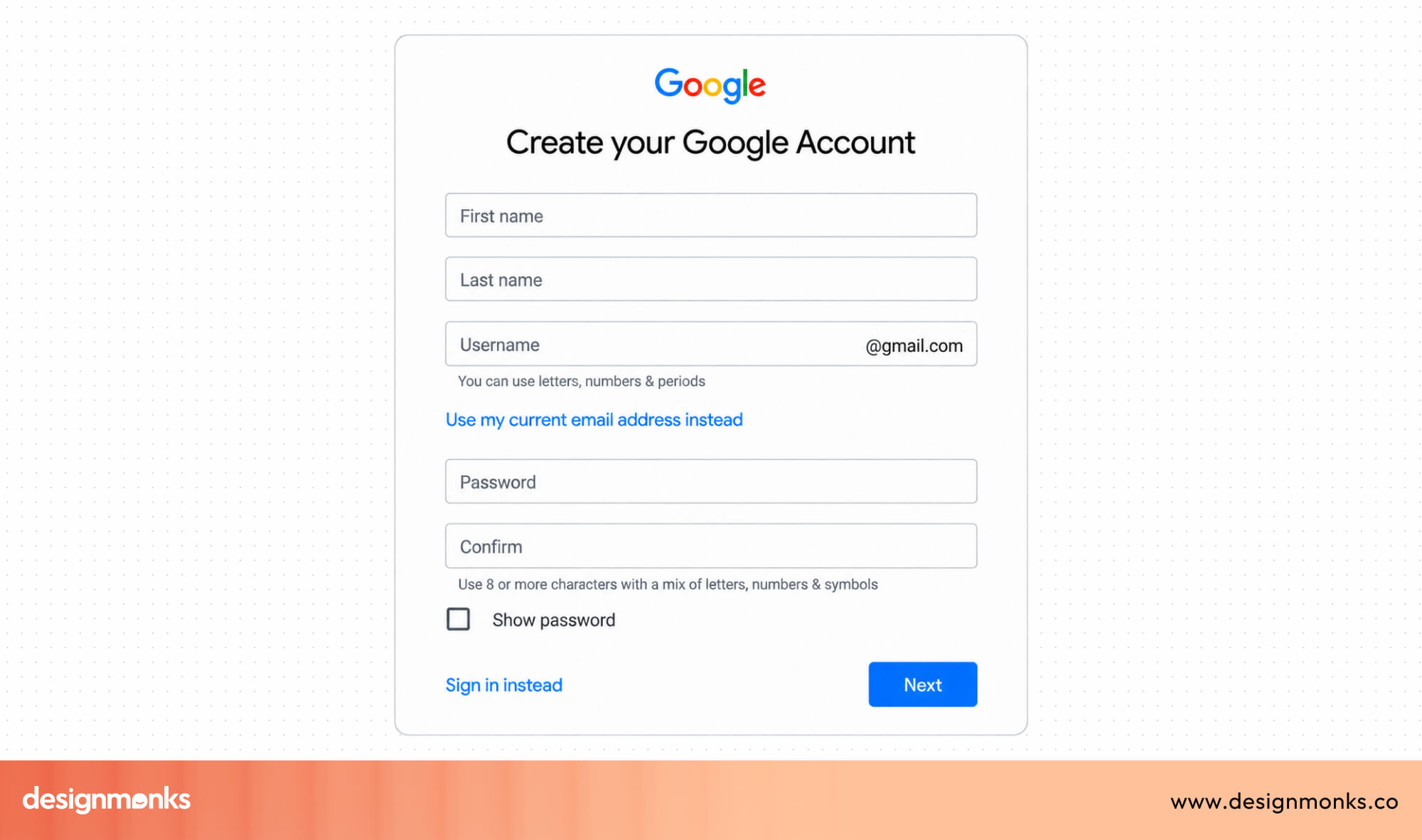
Clear labels, helpful validation, and plenty of spacing make the form easy to understand, even for first-time users.
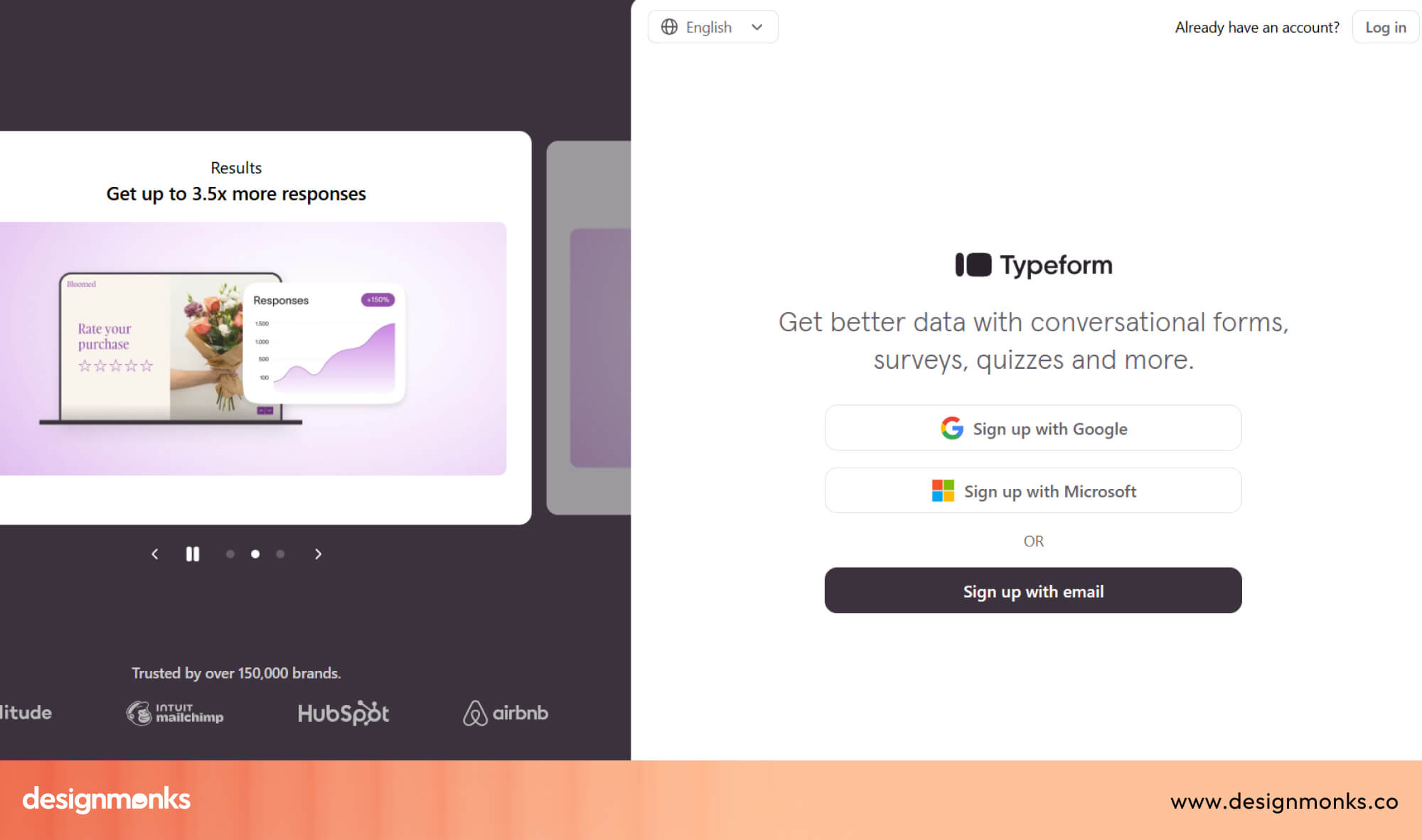
Typeform
Typeform uses a conversational style by showing one question at a time. Instead of displaying a long list of fields, users answer each question before moving to the next. This makes longer forms feel shorter and more engaging.
Stripe Checkout
The Stripe Checkout form is designed to help users finish payments quickly. Related fields are grouped together, errors are shown immediately, and the layout stays clean from start to finish.
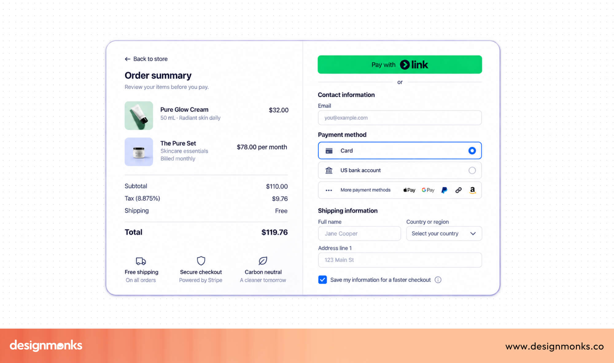
It reduces distractions and lets users focus on completing their purchase.
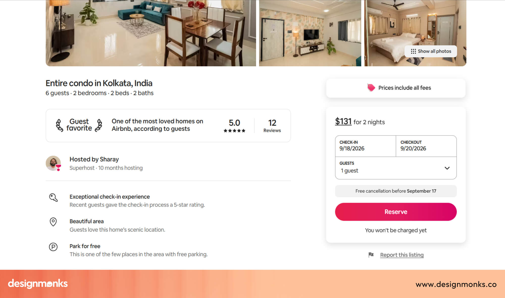
Airbnb Booking
The Airbnb booking flow breaks a complex process into smaller steps. Instead of showing everything on one page, it guides users through each decision one at a time. This makes the booking process feel much easier than it actually is.
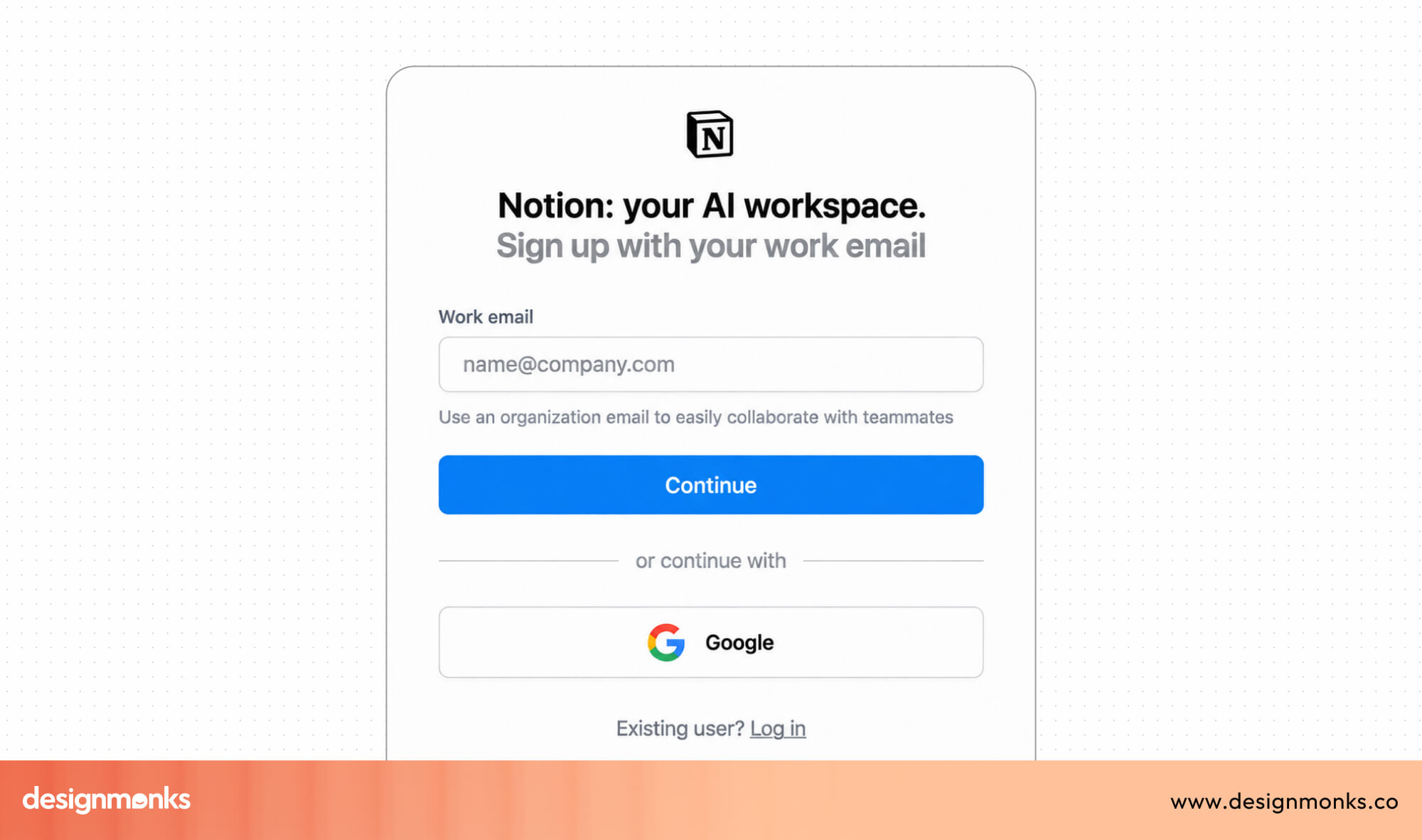
Notion Signup
Notion focuses on speed and simplicity. The signup form has very few fields, clean spacing, and a distraction-free layout. Users can create an account quickly without feeling overwhelmed.
Design Monks
The Health & Fitness Tracker App by Design Monks is a great example of how thoughtful Form Design UI can make onboarding feel quick and effortless. New users can sign up in just a few simple steps, set their fitness goals, and start using the app without working through long or confusing forms.
The clean layout, clear labels, and logical flow help users stay focused on getting started. This approach shows how good form design removes friction from the very first interaction.
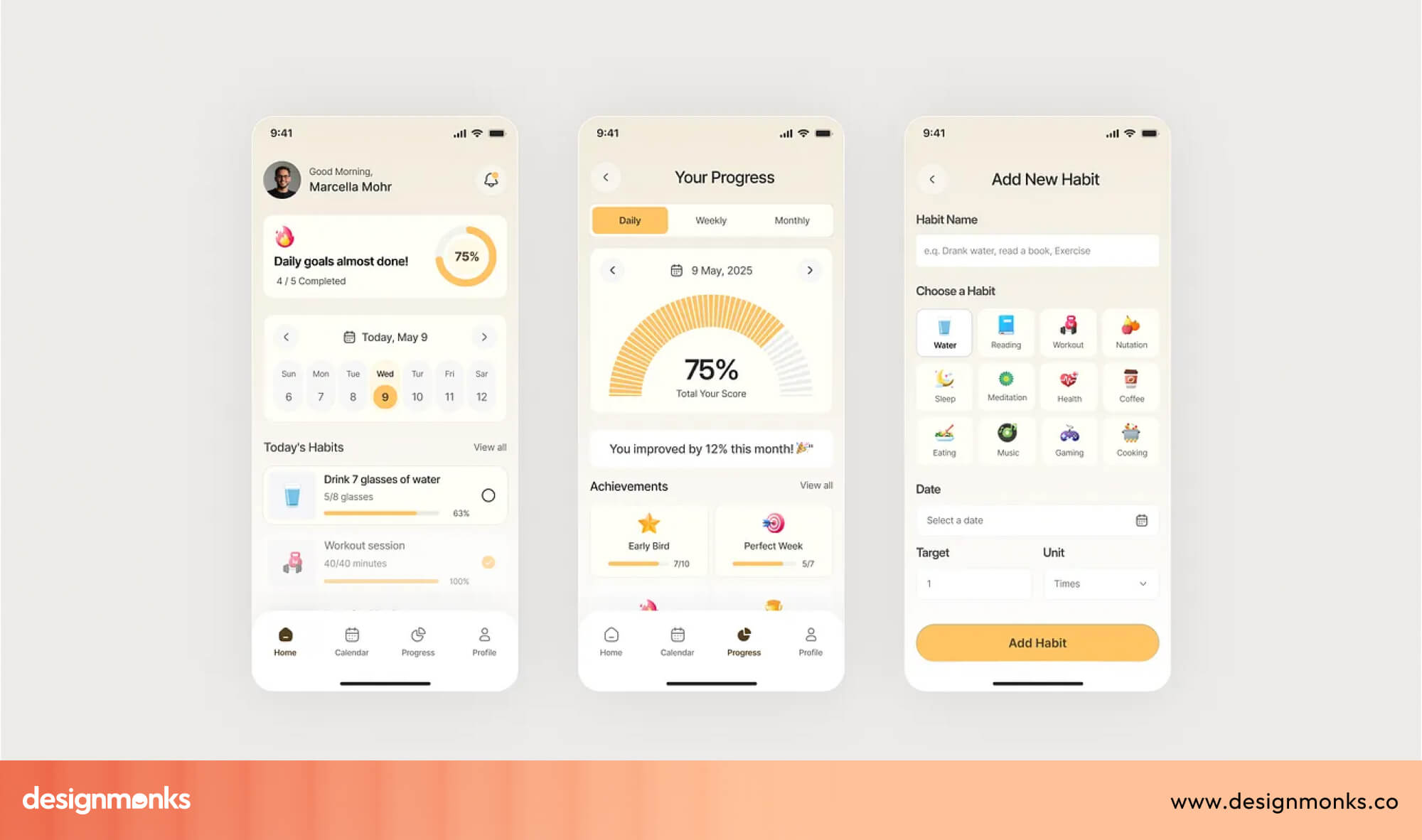
By asking only for essential information and guiding users through each step, the app creates a smooth experience that encourages users to complete the process with confidence.
If you're looking to build a product with the same focus on usability and conversions, Design Monks specializes in designing intuitive onboarding flows, high-converting forms, and user-friendly digital experiences.
Take a look at their work to see how thoughtful UI and UX design can turn complex interactions into simple, enjoyable experiences.
Form Design Checklist
Before shipping any form, it's worth running through a quick checklist:
- Labels are persistent and visible, not placeholder-only
- Validation happens inline, with clear, specific error messages
- The form meets basic accessibility standards (contrast, focus states, keyboard navigation, ARIA labels)
- The layout is optimized for mobile, including touch targets and keyboard types
- Visual hierarchy is clear through spacing, grouping, and alignment
- Required and optional fields are clearly distinguished
- The CTA button uses specific, action-oriented text
- Error states are visible immediately, not just on submission
Frequently Asked Questions
What makes a good form UI?
A good form UI asks for only the information that's needed, uses clear and persistent labels, and follows accessibility and mobile best practices throughout.
What is the ideal number of form fields?
There's no fixed number, but the general rule is to include only what's essential for the immediate task. Additional fields can often be deferred to a later step using progressive disclosure.
Why do users abandon forms?
Users often abandon forms because they take too much time or feel difficult to complete. Too many fields, confusing layouts, unclear error messages, and validation that only appears after clicking Submit usually force users to quit.


.avif)
.avif)
.avif)
.avif)


.avif)
.avif)
.avif)
.avif)







.avif)