
Key Takeaways
- Strong cybersecurity website design builds instant trust and drives user engagement.
- Clean layouts, calm colors, and clear CTAs turn visitors into leads.
- Consistent trust signals like SSL and certifications boost credibility and conversions.
- Mobile-first, fast-loading sites enhance reliability and improve SEO performance.
- Successful cybersecurity sites highlight how smart design builds user confidence.
Trust is everything online, especially when it comes to safety. A strong website can make people feel secure before they even read a single word. That’s why looking at great Cybersecurity company website examples is the best way to learn how design can build digital trust.
Cybersecurity companies protect people from hackers and online threats. But their websites must prove that safety starts right there on their homepage. According to studies, 95% of organizations do not fully trust their cybersecurity vendors andthesite design can enhance the trust issue.
In this blog, we’ll explore best cybersecurity website design that show how clear messages, smart visuals, and simple layouts can make anyone feel confident about sharing their data online.
Why Cybersecurity Website Design Matters for Trust & Conversions
A good cybersecurity website does more than just look nice, it helps people feel safe online.
When visitors see a clean design, easy words, and a simple layout, they start to believe that the company knows what it’s doing. This sense of trust often turns into real action, like signing up for a free trial, asking for a demo, or reaching out to learn more.
Visual design plays a big part in this. Good visual makes a site feel trustworthy and study says that 83% of consumers are more likely to share data with trusted companies. Calm colors, clear fonts, and familiar icons such as shields or padlocks quietly tell visitors, “You’re protected here.” These small details make a big difference in how people see your brand.
Good design also drives lead generation. A confusing or slow site can make users leave, but a smooth, mobile-friendly experience keeps them engaged. Since most people browse on phones, mobile-first design ensures your site looks sharp and builds trust everywhere.
Top 15 Cybersecurity Website Examples (Categorized by Design Style)
Here are some of the cyber security company website examplesthat blend clean design, smooth navigation, and strong messaging. Whether you’re designing for a large enterprise, a growing SMB, or a niche provider, studying these examples can help you understand what really works:
5 Large Enterprise Firm Examples
Enterprise cybersecurity companies set the standard for design and trust. Their websites use bold visuals, structured layouts, and strong messaging to communicate authority and reliability to global audiences.
Palo Alto Networks
Palo Alto Networks’ website features a clean homepage with a strong hero section that clearly communicates what they do and why it matters.
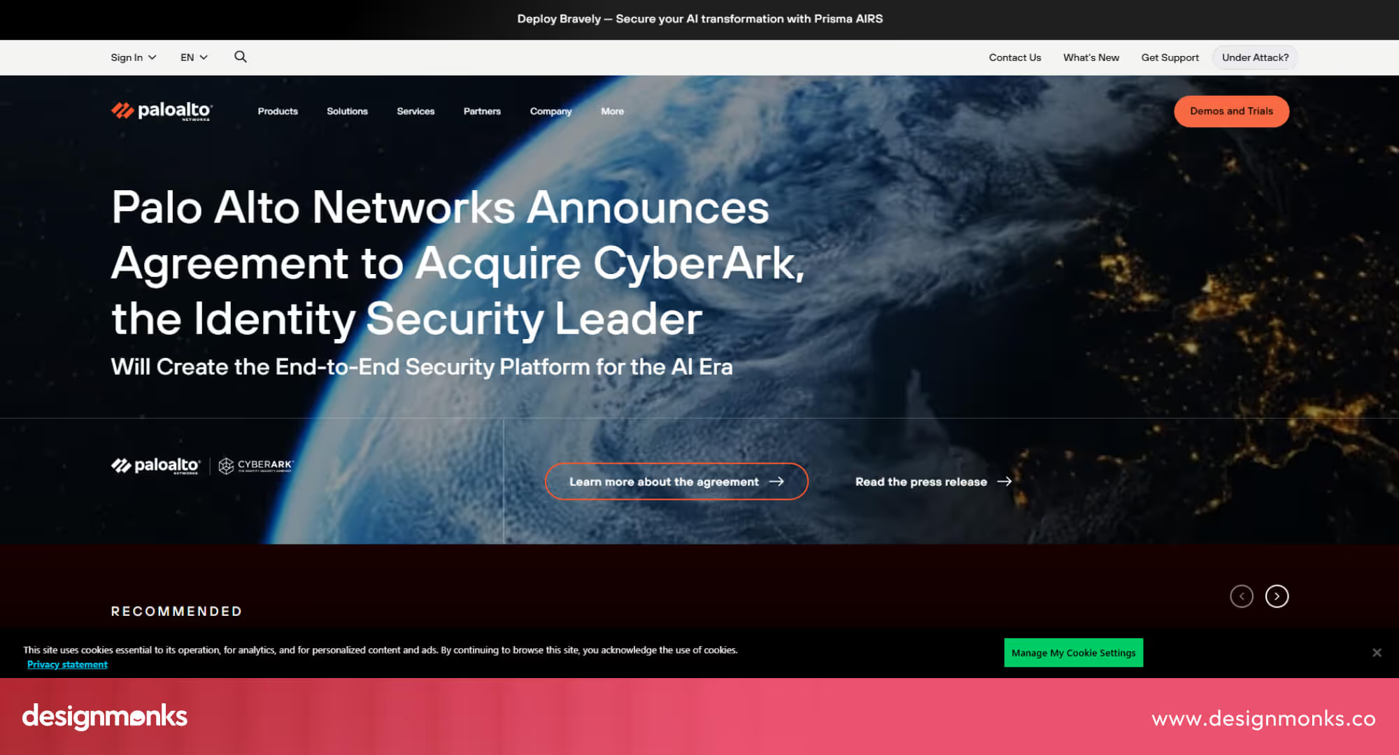
The messaging stands out with bold visuals and smooth animations. The navigation is simple, helping users easily find products, solutions, and resources. Service descriptions are concise and easy for everyone to understand, which builds trust and encourages action.
CrowdStrike
CrowdStrike’s website uses a palette of white, black, grey, and red to create a professional, high-tech look.
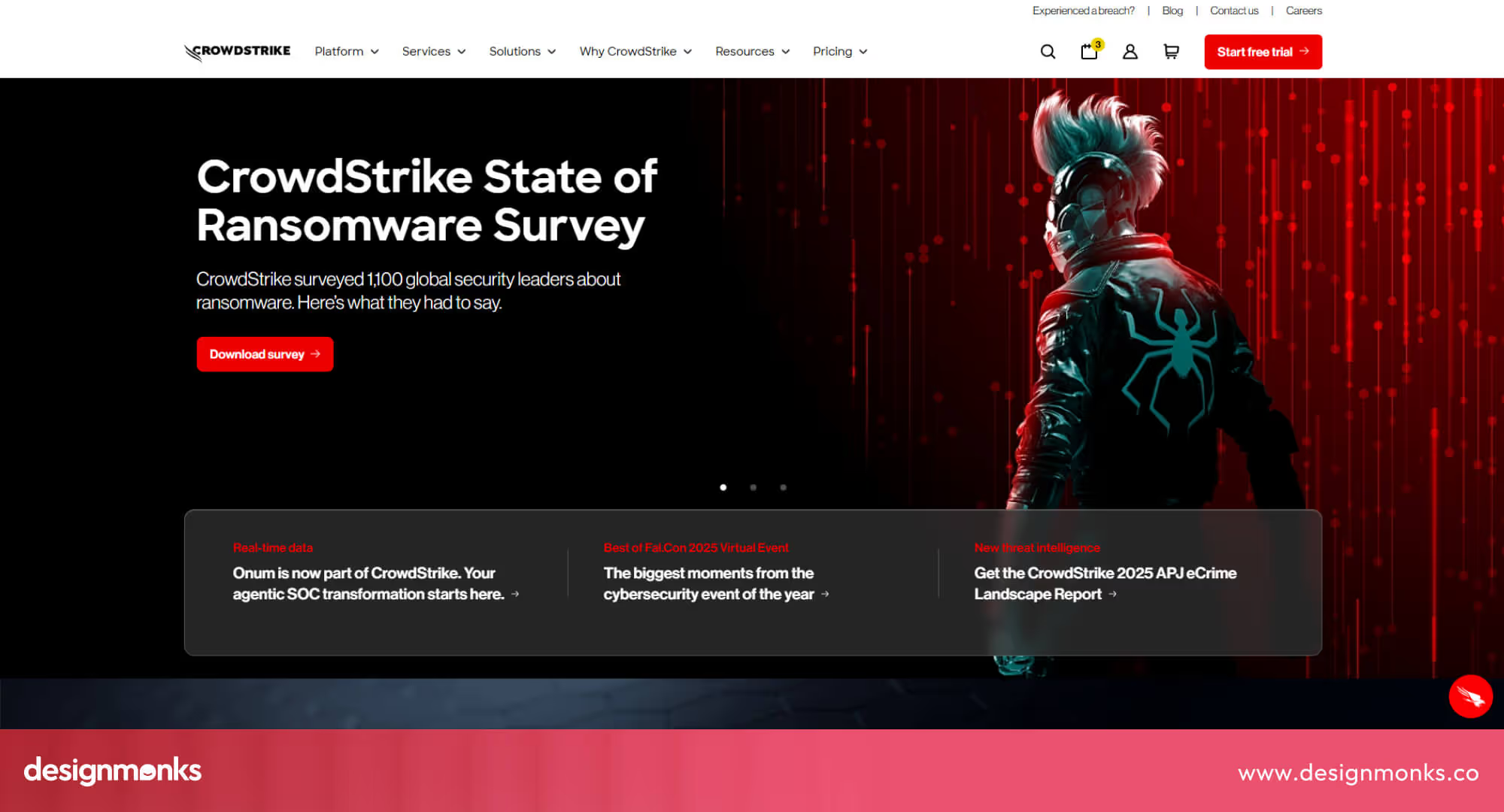
Navigation is straightforward, with sections for Solutions, Services, Resources, and Pricing. Customer stories, clear visuals, and strong CTAs make the design feel modern and transparent.
Fortinet
Fortinet’s website gives an immediate sense of credibility. From industry certifications to partner badges and customer logos, trust is visible throughout.
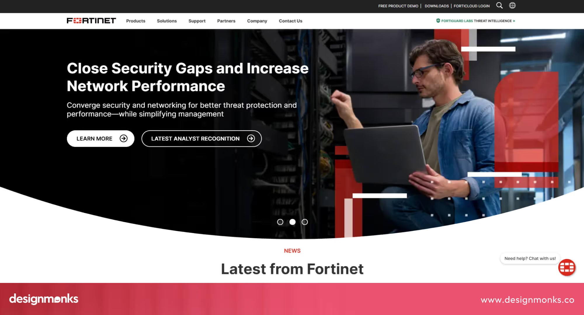
The homepage features simple messaging supported by bold CTAs. The design is organized and mobile-friendly, balancing visuals and text to keep things clear and professional.
CyberArk
CyberArk’s homepage starts with a focused headline and an introductory video that explains its identity security platform.
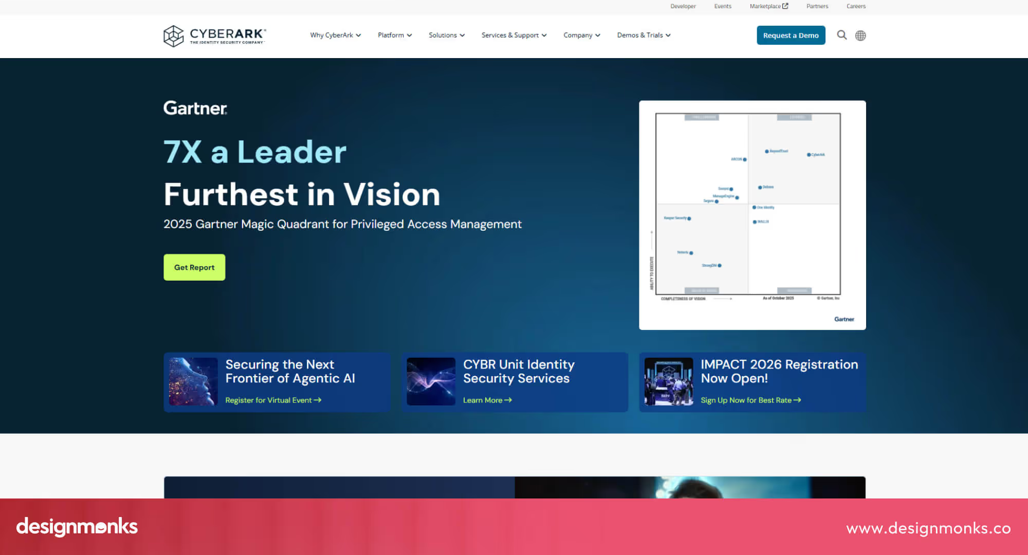
The color palette is a mix of blue, gray, and white, which builds calmness and authority. Navigation is easy, with options like “Solutions,” “Platforms,” and “Demos & Trials.” The layout is neat, the content is digestible, and even complex topics feel approachable for any visitor.
Trellix
Trellix’s website feels dynamic and innovative. The hero section features a smooth background with bold typography.
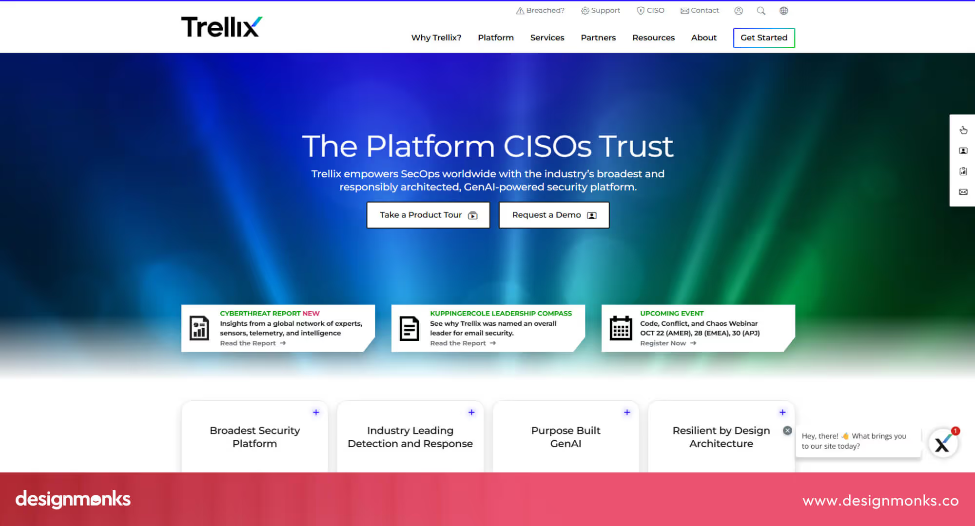
The site guides users through product categories, case studies, and events in a natural way. The color scheme combines deep blues and greens, creating a strong and futuristic identity. Every element feels consistent, from motion effects to clean CTAs.
4 Mid-market / SMB Cybersecurity Vendors
These cybersecurity vendors serve small to mid-sized businesses that need strong protection without enterprise-level complexity. Their websites focus on clarity, quick navigation, and easy-to-understand service details to help users make confident decisions.
Blumira
Blumira’s website is designed for clarity and friendliness. The use of white space, rounded shapes, and approachable fonts makes the experience smooth and inviting.
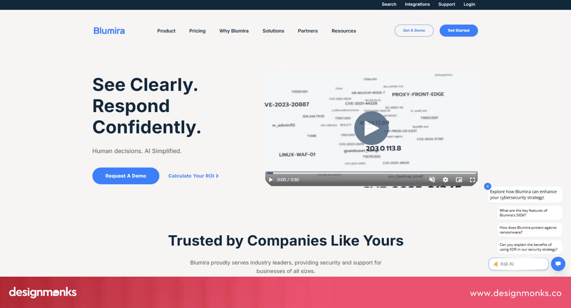
The pricing page is open, easy to read, and offers an option to calculate Security ROI. This is a strong plus for SMB clients who want straightforward information.
DataDome
DataDome’s homepage quickly communicates its purpose, protecting businesses from bot and AI attacks. Product visuals show dashboards and analytics, helping users understand the solution.
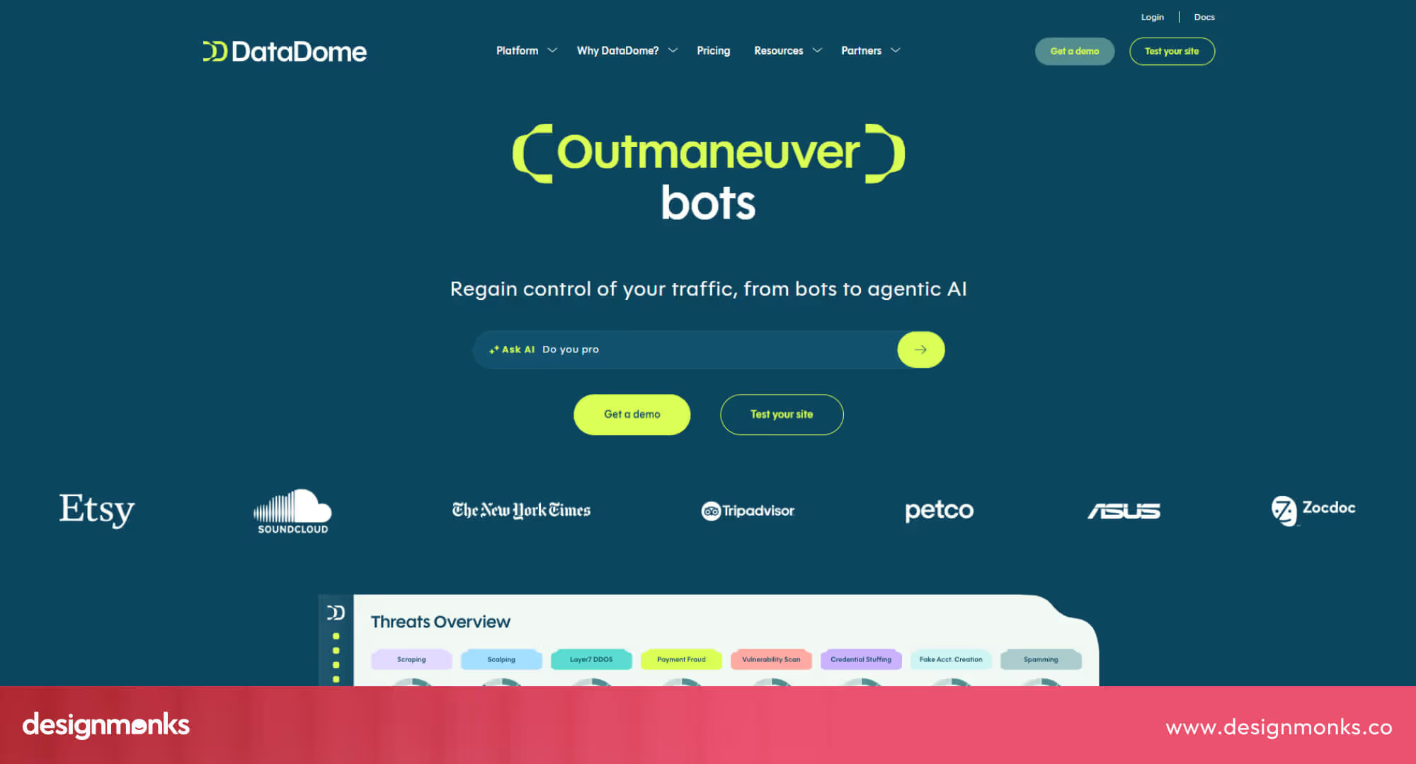
The site structure is simple, leading to key pages like “Platforms,” “Pricing,” and “Resources.” Case studies and success metrics appear throughout, adding credibility and proof of performance. They also have a Threat Overview in the Home to give you an overall idea.
Bugcrowd
Bugcrowd’s site combines bold colors and human-focused storytelling. The orange accent color brings energy, while real hacker community photos add authenticity.
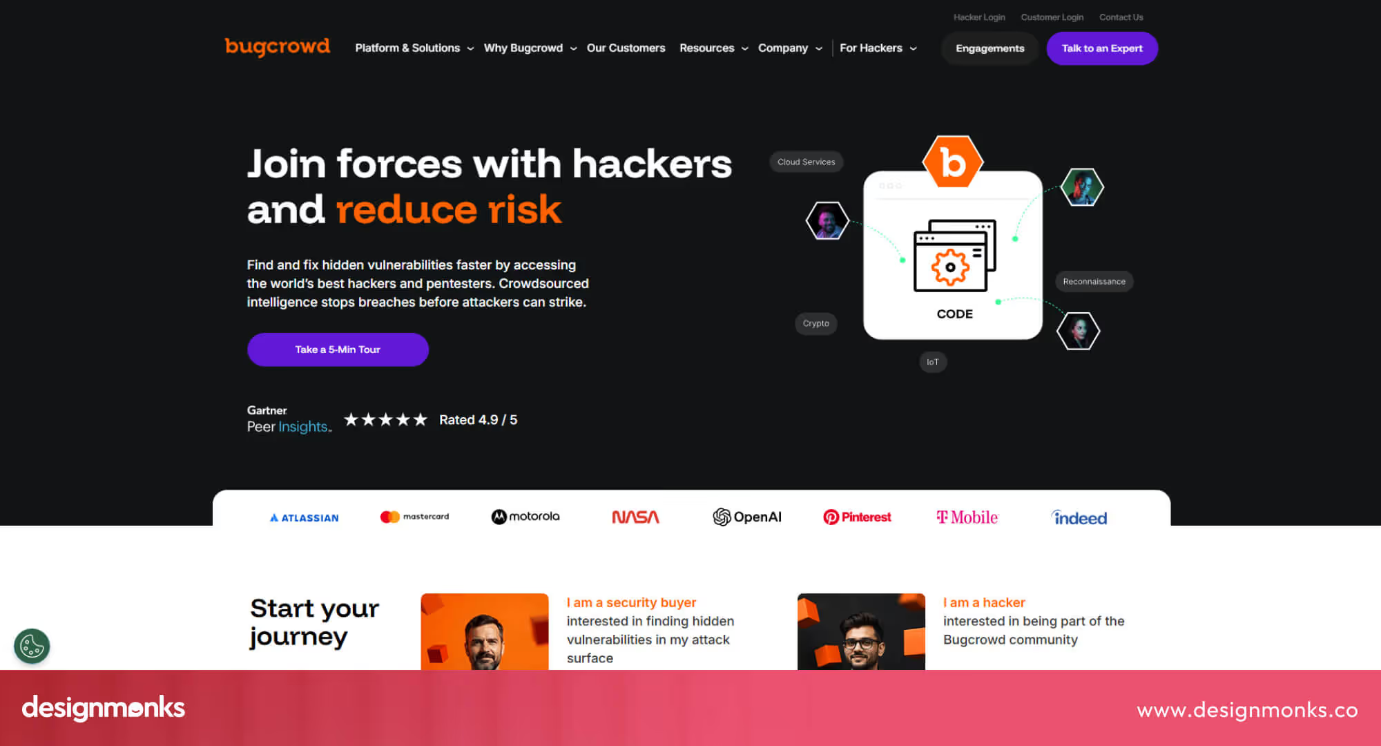
The homepage highlights major clients and community achievements. Navigation flows logically, with smooth animations guiding visitors from services to testimonials.
UpGuard
UpGuard’s design is sleek, quick, and conversion-focused. The homepage has subtle animations, trust badges, and recognizable customer logos that build instant confidence.
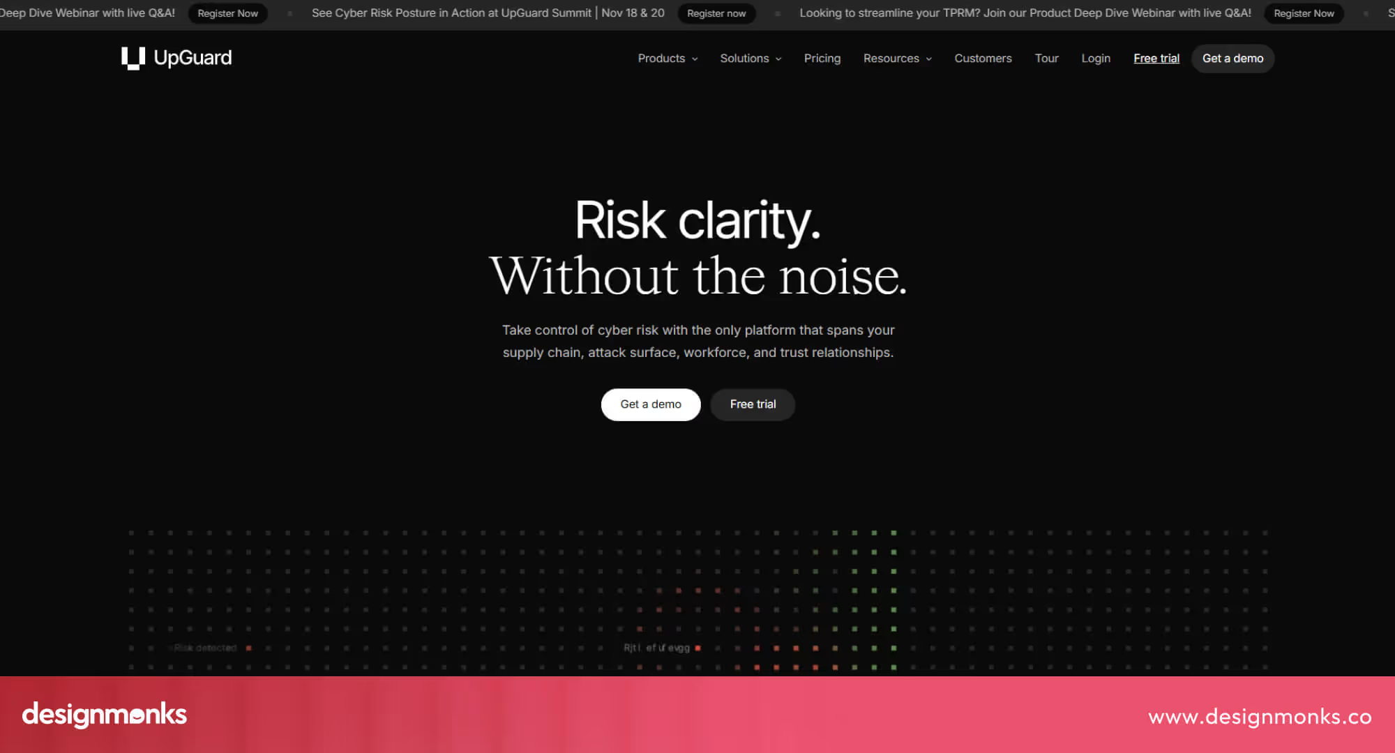
The Call to Action (CTA) for “Free Trial” and “Get a Demo” appears consistently, making the path to engagement simple and effective.
3 Niche Specialists
These cybersecurity companies focus on specific areas like cloud security, identity protection, or SaaS defense. Their websites reflect deep expertise, using clear visuals and focused messaging to explain complex solutions simply.
Snyk
Snyk’s site focuses on developer-first security with clean illustrations and vibrant purple tones. The content is easy to skim, using bold fonts and straightforward CTAs like “Sign up” or “Book a live demo”.
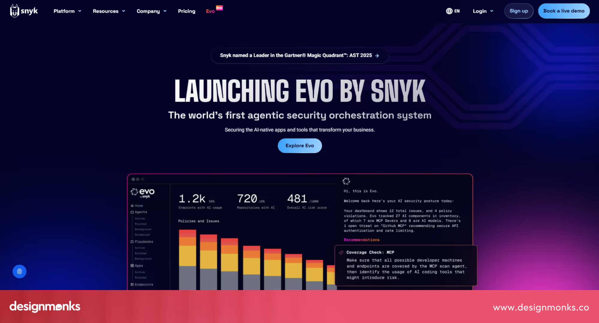
The homepage balances a tech-savvy feel with a friendly tone, making it accessible to both developers and business teams.
Cloudflare
Cloudflare’s design emphasizes speed, scale, and innovation. The site’s layout is well-organized, explaining complex network services with clarity.
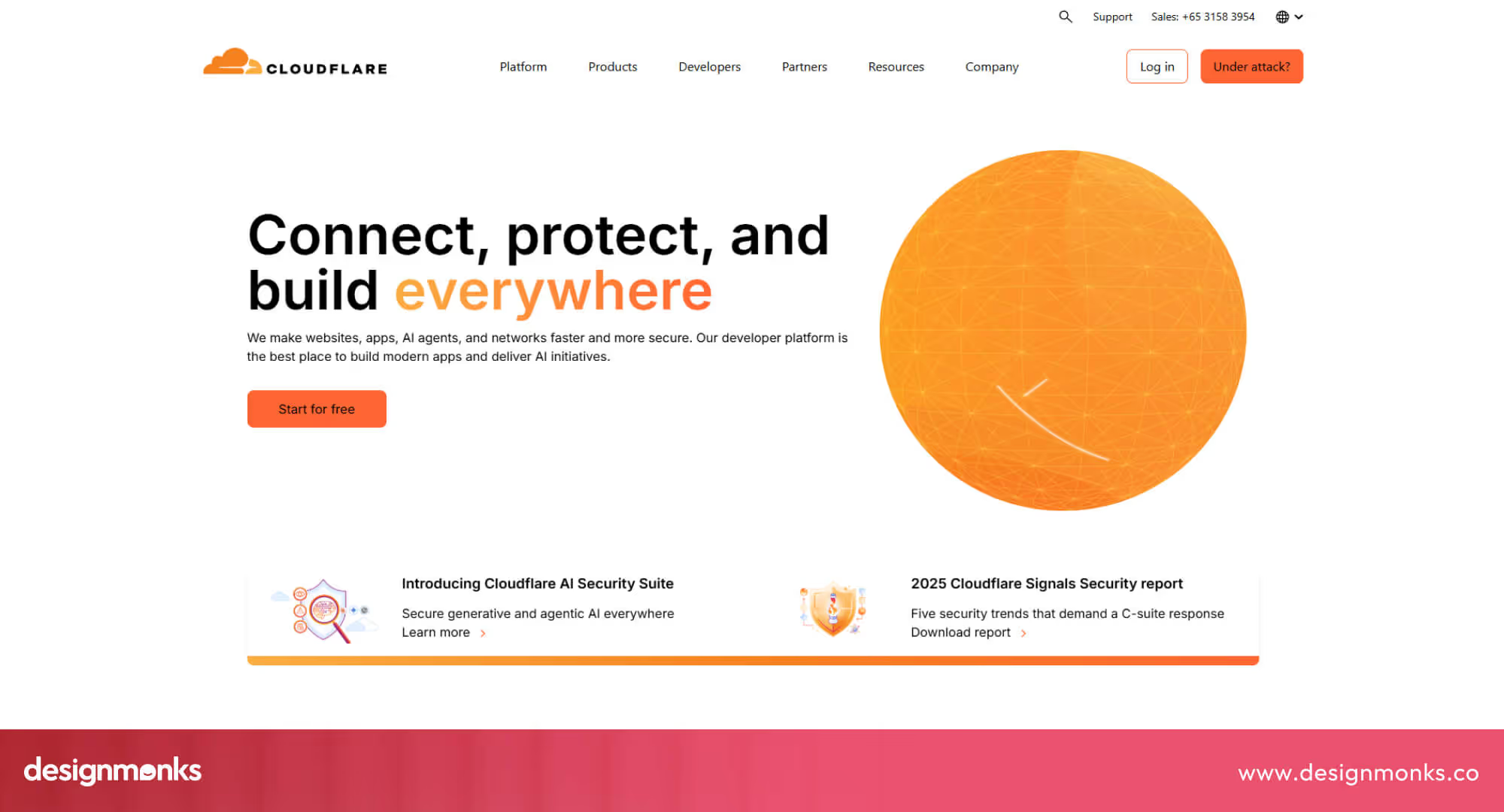
Animations illustrate how their protection layers work. The mix of dark and light sections adds visual rhythm, while trust badges and performance stats strengthen credibility.
Okta
Okta’s site focuses on identity and access management. The design is bright, simple, and easy to navigate.
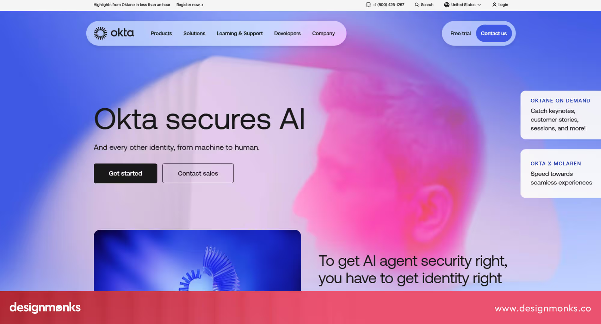
The homepage demonstrates the product’s use cases, while icons and short descriptions make the platform easy to understand. The site feels trustworthy and professional, just like the service it represents.
3 Agency or Design Studio Case Studies
Design agencies play a key role in shaping how cybersecurity brands appear online. These case studies highlight real projects where design studios improved branding, usability, and trust through smart visual and UX updates.
Windmill Strategy’s UNS Cybersecurity Consulting
Windmill Strategy’s UNS project stands out with a complete website redesign and refreshed branding.
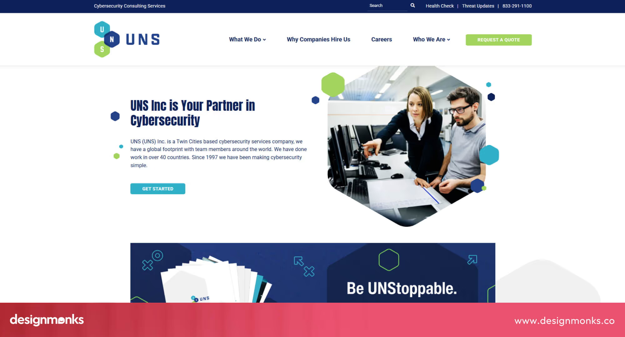
The team improved page layouts, added clear service sections, and optimized SEO to make the site easier to navigate. Bright CTAs and updated visuals guide visitors naturally through consulting offerings, enhancing trust and engagement.
Aumcore’s Comodo Cybersecurity Project
Aumcore’s redesign for Comodo emphasizes strategic rebranding with a full UX/UI update.
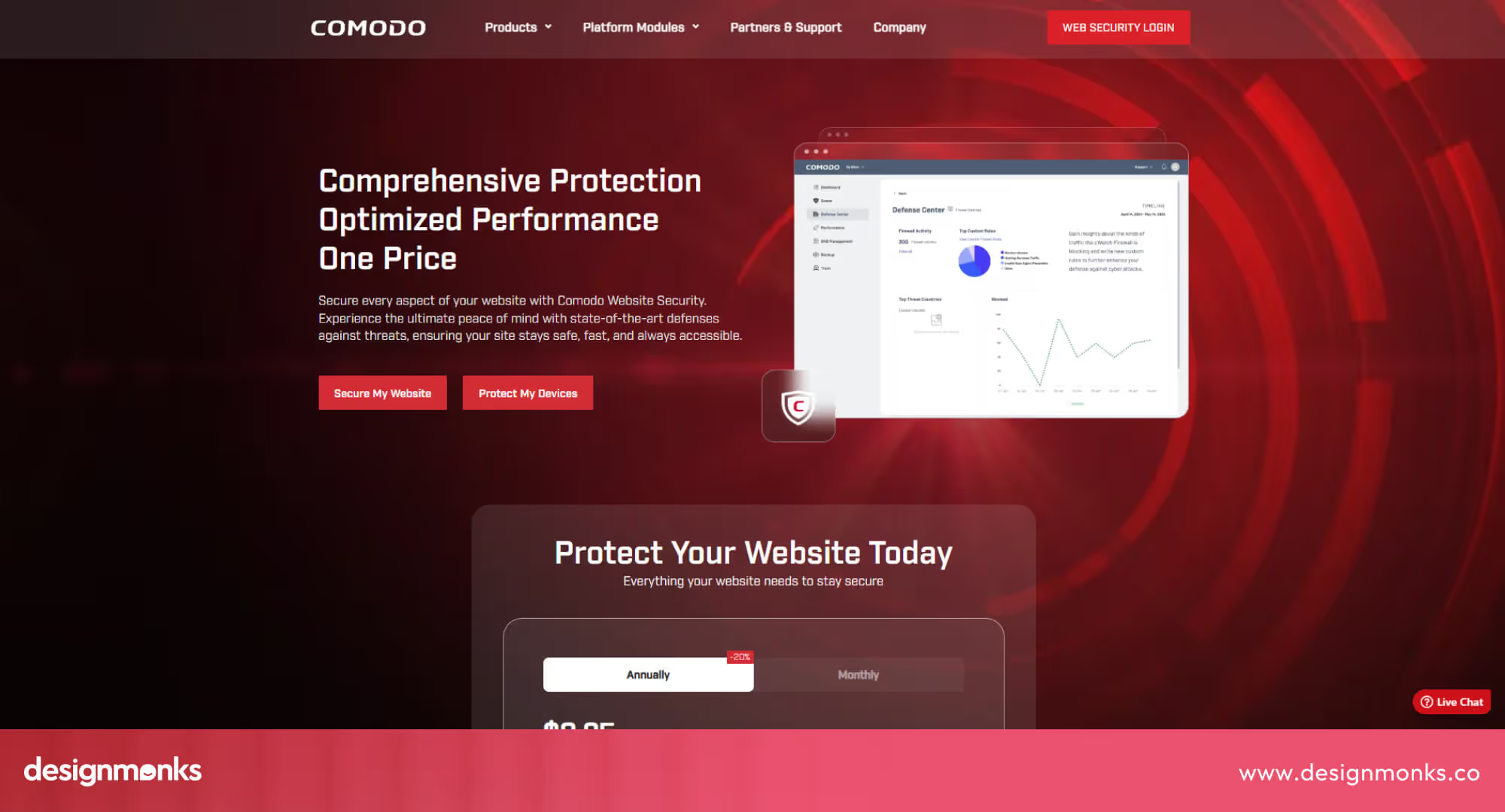
The site uses clear hero sections, intuitive navigation, and visual dashboards to explain services. Interactive elements and consistent color palettes make the user journey smoother while reinforcing brand authority.
Forge & Smith’s Secure Shield Project
Forge & Smith’s Secure Shield project focuses on professional visuals, responsive design, and fast-loading pages.
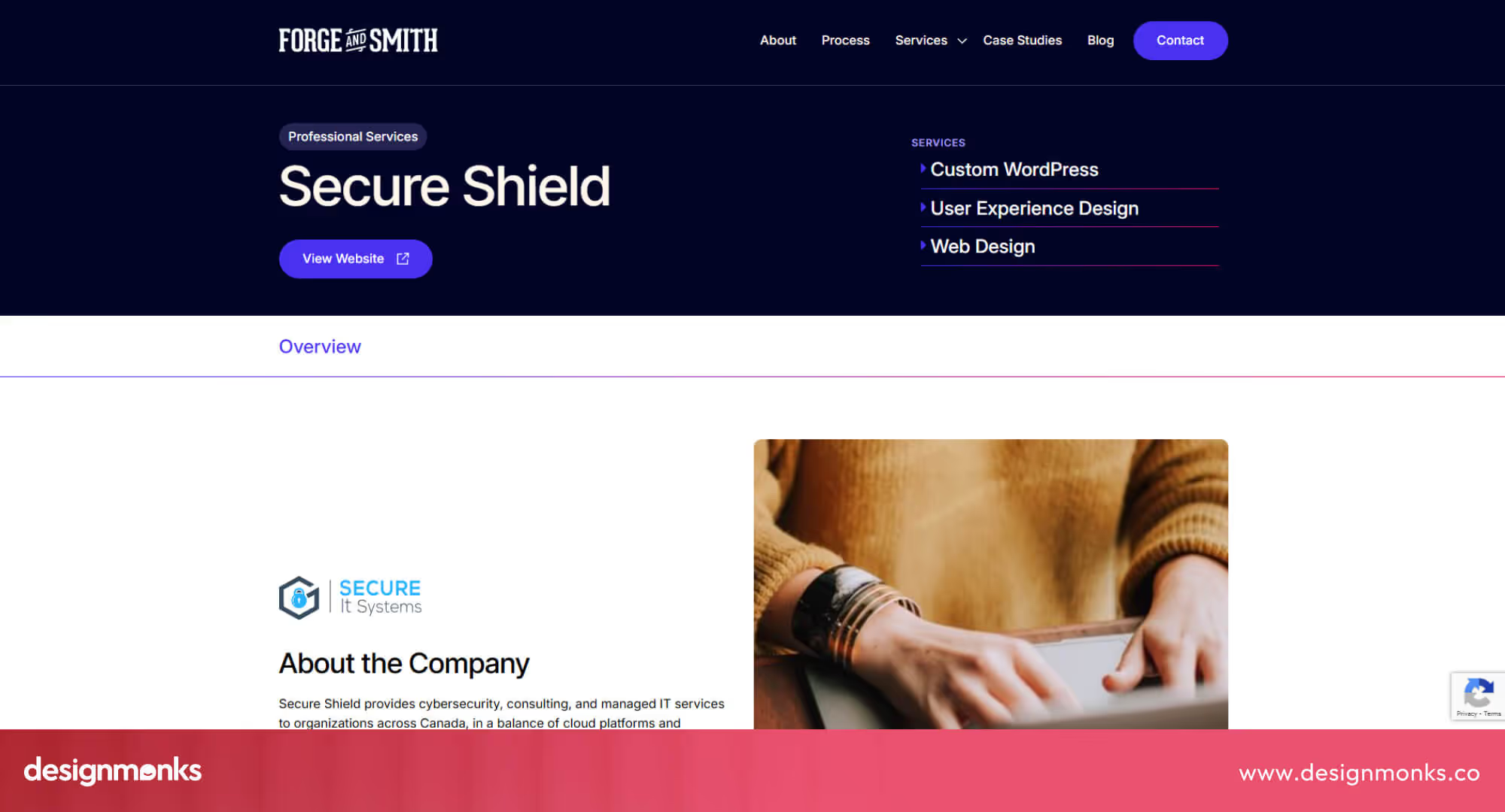
They restructured service pages, added prominent trust badges, and incorporated streamlined forms, making it easier for visitors to understand offerings and take action.
Key Design Elements of High-Converting Cybersecurity Websites
Successful cybersecurity websites focus on trust, clarity, and conversion. These design elements help visitors feel confident and guide them toward taking action, such as:
Essential Trust Signals (SSL Badges, Certifications, Social Proof)
Trust signals are critical for reassuring visitors. SSL certificates, security badges, and certifications like ISO 27001 or SOC 2 show that the company meets industry standards. Client logos, awards, and testimonials further enhance credibility.
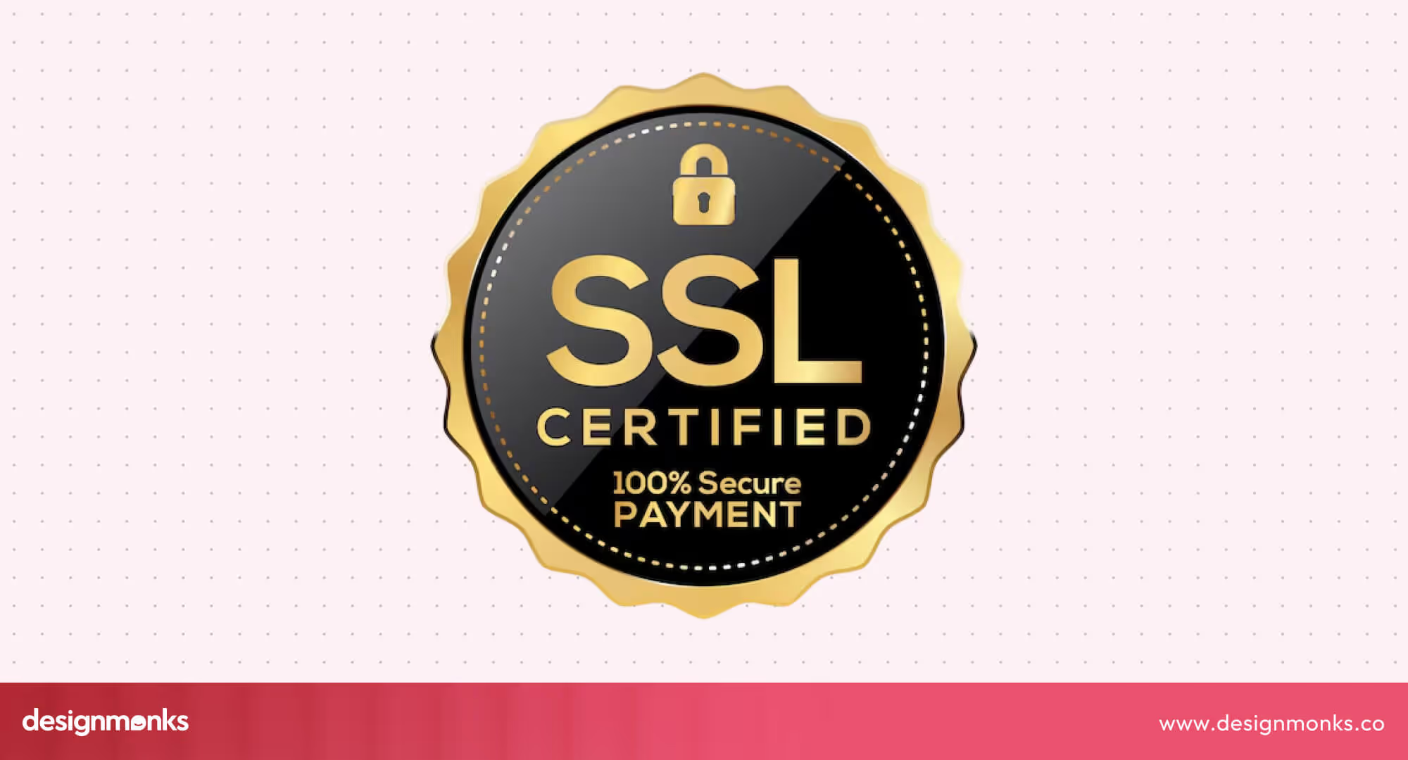
Research indicates that displaying security badges on forms can increase conversion rates by up to 30%, as users feel more confident sharing personal information. Including visible trust signals throughout the website, especially on landing pages and contact forms, reinforces a professional image.
Navigation & UX Best Practices for Security Companies
Clear and intuitive navigation improves usability and engagement. Group pages logically, use sticky navigation bars, and include search functions and well-labeled CTAs.
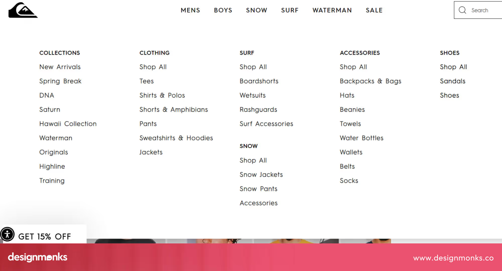
Streamlined menus reduce confusion and encourage visitors to explore services. Prioritize simplicity and accessibility to make it easy for users to find information quickly, which directly impacts lead generation.
Color Psychology: Blues, Blacks & Minimalist Palettes
Colors influence perception. Blue evokes trust, black conveys authority, and minimalist color schemes keep the focus on key content.
Many cybersecurity websites use consistent colors to enhance brand identity and ensure a professional, reliable appearance. Blue is especially effective because studies show it increases feelings of security and calmness.
Typography & Iconography That Convey Authority
Readable fonts, bold headings, and clear subheadings make information easy to scan. Security-related icons like shields, locks, or checkmarks provide immediate cues of safety and professionalism.
Using consistent typography and iconography strengthens credibility and helps visitors quickly understand the company’s services. Subtle icon animations can also enhance engagement without distracting from the content.
UI/UX & Developer-Focused Insights from the Examples
Looking closely at top cybersecurity websites, a few key UI and UX patterns stand out. These designs don’t just look professional, they’re built to build trust, improve performance, and guide users toward action.
Developers and designers can learn a lot by studying how these sites balance visuals, speed, and usability:
How the Hero Section Is Built
In cybersecurity websites, the hero section often makes the first impression. Most use smooth animations or subtle motion effects, like background fades or hover changes, to create a sense of depth without distraction.
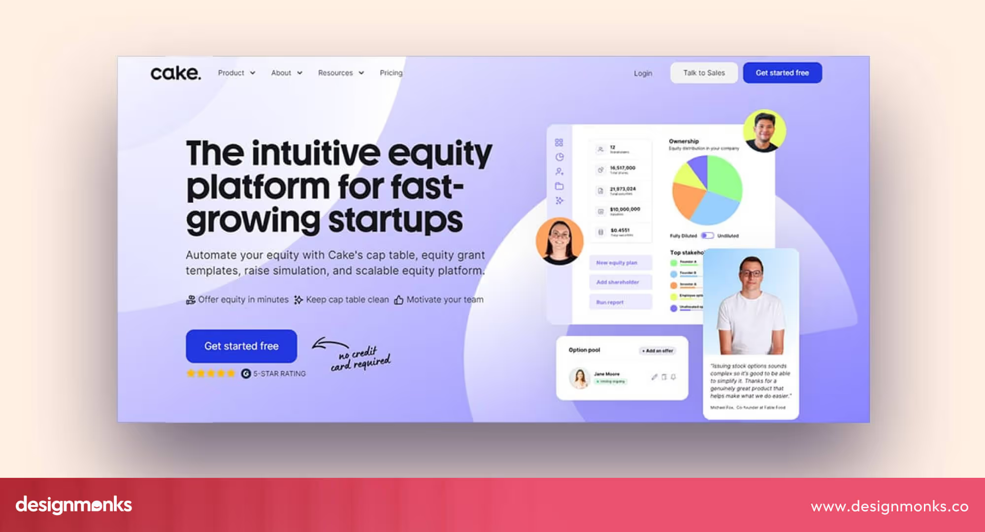
CrowdStrike and Trellix use animated visuals to show real-time data or movement, while others, like Palo Alto Networks, prefer clean static images with short, bold text. Micro-interactions such as buttons that light up or icons that shift slightly on hover make the experience feel modern and polished.
Components Developers Should Reuse
Certain design components appear repeatedly across high-performing cybersecurity websites. Clear, action-based CTAs (like “Request a Demo” or “Start Monitoring Now”) are usually placed above the fold.
Trust-badge modules showing certifications or partner logos reassure users instantly. Case-study sliders show social proof in a compact format. Developers can reuse these components to maintain consistency, improve engagement, and reduce development time.
Performance & Accessibility Considerations for Security-Brand Websites
Speed is a major trust factor. Slow websites make visitors doubt reliability. Most top websites compress large images, lazy-load videos, and use modern frameworks for fast rendering.
Accessibility is also key. Text contrast, readable font sizes, and keyboard-friendly navigation make sites usable for everyone. These small technical improvements send a big message that the company cares about safety, reliability, and user comfort.
Integrating Design Systems with Cybersecurity Themes
Many security websites follow a “techno-aesthetic” with clean lines, gradients, and dark backgrounds with bright highlights. Dark mode themes are popular because they project sophistication and professionalism while reducing eye strain.
Developers often use consistent design systems to ensure all colors, icons, and buttons follow one visual logic. This helps the site feel cohesive and makes future updates easier. Balancing a modern, tech-inspired look with clarity and accessibility keeps users focused and engaged.
Design Patterns That Drive Conversions for Cybersecurity Companies
Good design drives conversions for cybersecurity websites by building trust and guiding visitors to take action. Below, we explore key patterns used by top brands to engage users, showcase authority, and increase leads:
Hero Section Strategies
A strong hero section instantly communicates credibility. Cybersecurity brands like CrowdStrike and Palo Alto Networks use short motion graphics or animated threat maps that visualize their solutions in action. This keeps visitors engaged without overwhelming them.
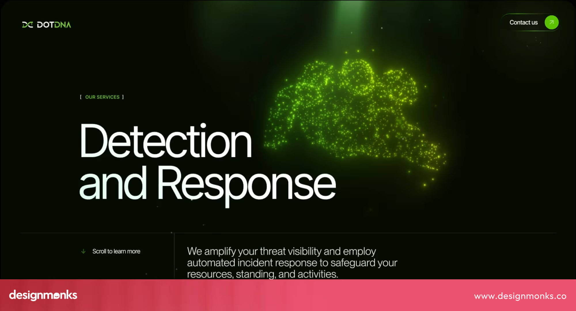
Subtle video backgrounds (e.g., blurred network animations) work well when paired with concise headlines that clearly describe the service. Interactivity, such as hover-based animations or “See How It Works” buttons, adds depth and prompts users to explore further. The key is to combine professional visuals with fast loading speeds to ensure trust and performance balance.
Effective CTA Placement & Messaging
Call-to-action (CTA) buttons on cybersecurity websites need to feel both secure and valuable. Enterprise brands often use “Request a Demo” to target decision-makers, while SMB-focused platforms like Blumira use softer CTAs such as “Start Free Trial” or “Get Your Free Security Audit.”
Placing CTAs above the fold ensures they’re visible instantly, while repeating them at logical points (after service descriptions or case studies) improves conversions. Clear, action-oriented language builds confidence. But avoid vague terms like “Learn More” that don’t communicate next steps.
Social Proof Integration
Trust is currency in cybersecurity. Brands like Fortinet feature client logos, certifications (ISO 27001, SOC 2), and testimonials prominently on their homepage. Case study sections showing measurable results, for example, “Reduced breach response time by 40%”.
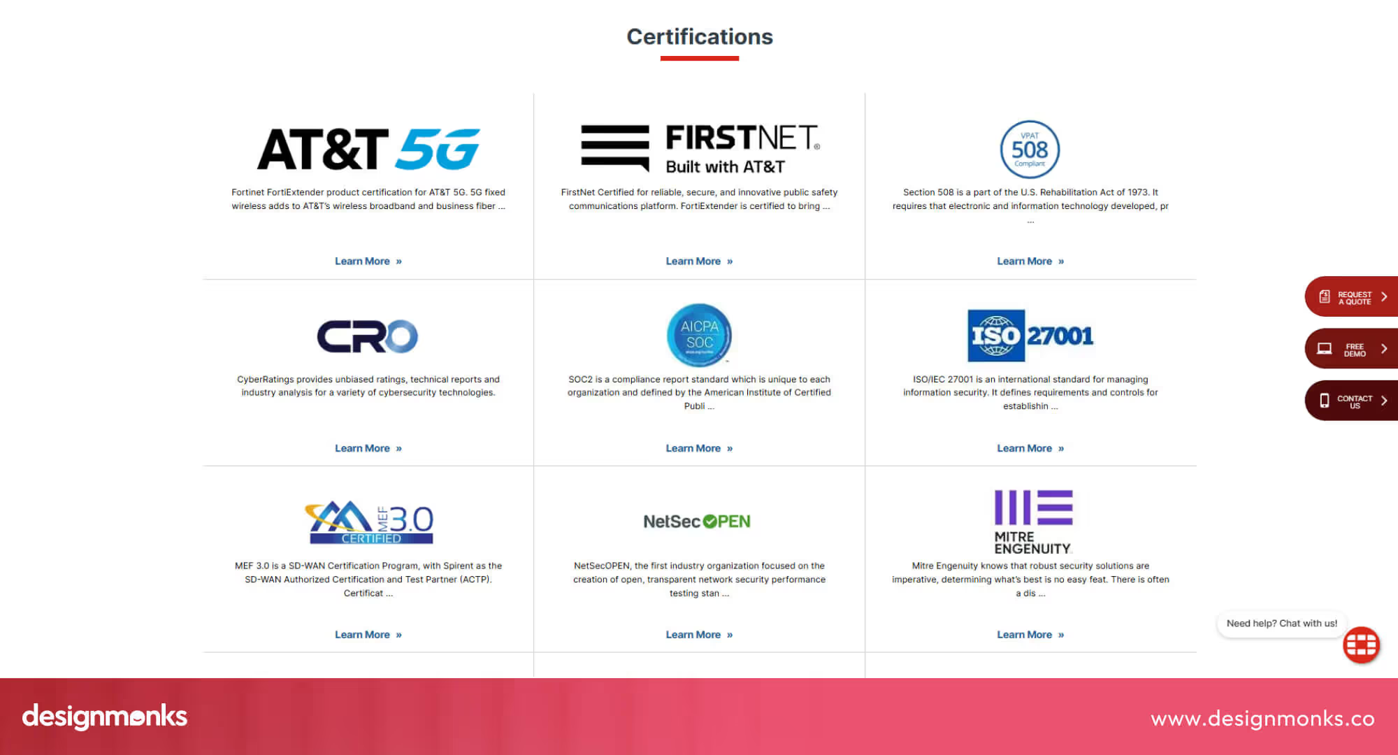
These enhance credibility far more than generic praise. Awards, media mentions, and integration partner logos also serve as social validation. The layout should remain clean, ensuring these trust signals don’t overwhelm the core message.
Product Demonstration Techniques
Showing rather than telling works best for complex cybersecurity tools. Okta demonstrates product features with short explainer videos and clear dashboard screenshots.
Interactive product tours allow visitors to test workflows safely within a sandbox environment, building familiarity and reducing sales friction. Use high-resolution images that display real interfaces (not mockups) and avoid unnecessary visual effects.
Simple tooltips or hover reveals can also highlight key benefits without forcing users to scroll endlessly.
Technical Implementation for Cybersecurity Website Design
Even the best-looking cybersecurity website is only as strong as its foundation. From the CMS you choose to how fast your pages load, every technical detail reflects your brand’s reliability. Here’s how to build a site that’s not just beautiful but bulletproof:
WordPress or Custom Build?
While WordPress powers 40% of the web, its flexibility can be both a strength and a risk. For smaller vendors, it’s ideal, especially when secured with managed hosting, hardened plugins, and frequent updates.
But enterprise-grade cybersecurity brands often opt for custom frameworks like React, Next.js, or headless CMS setups. These offer tighter control, advanced scalability, and performance.
Built-In Security Essentials
A cybersecurity company’s website must practice what it preaches. Beyond SSL encryption, features like secure lead forms, multi-factor authentication, and role-based access build immediate trust.
Visible indicators such as “secured form” badges, clear privacy notices, and reCAPTCHA integrations show users their data is safe from the moment they click “Submit.”
Speed, Performance & SEO
A fast site is a trusted site. With over half of visitors leaving after a 3-second delay, performance directly impacts conversions. Leading brands keep landing pages under 2 MB, using CDNs, optimized images, and lightweight code. Strong Core Web Vitals don’t just boost SEO, they prove your company values efficiency and reliability.
Responsive & Reliable Across Devices
With more than 60% of B2B traffic coming from mobile, responsive design isn’t optional. Every element from CTAs to forms should adapt smoothly across devices and browsers.
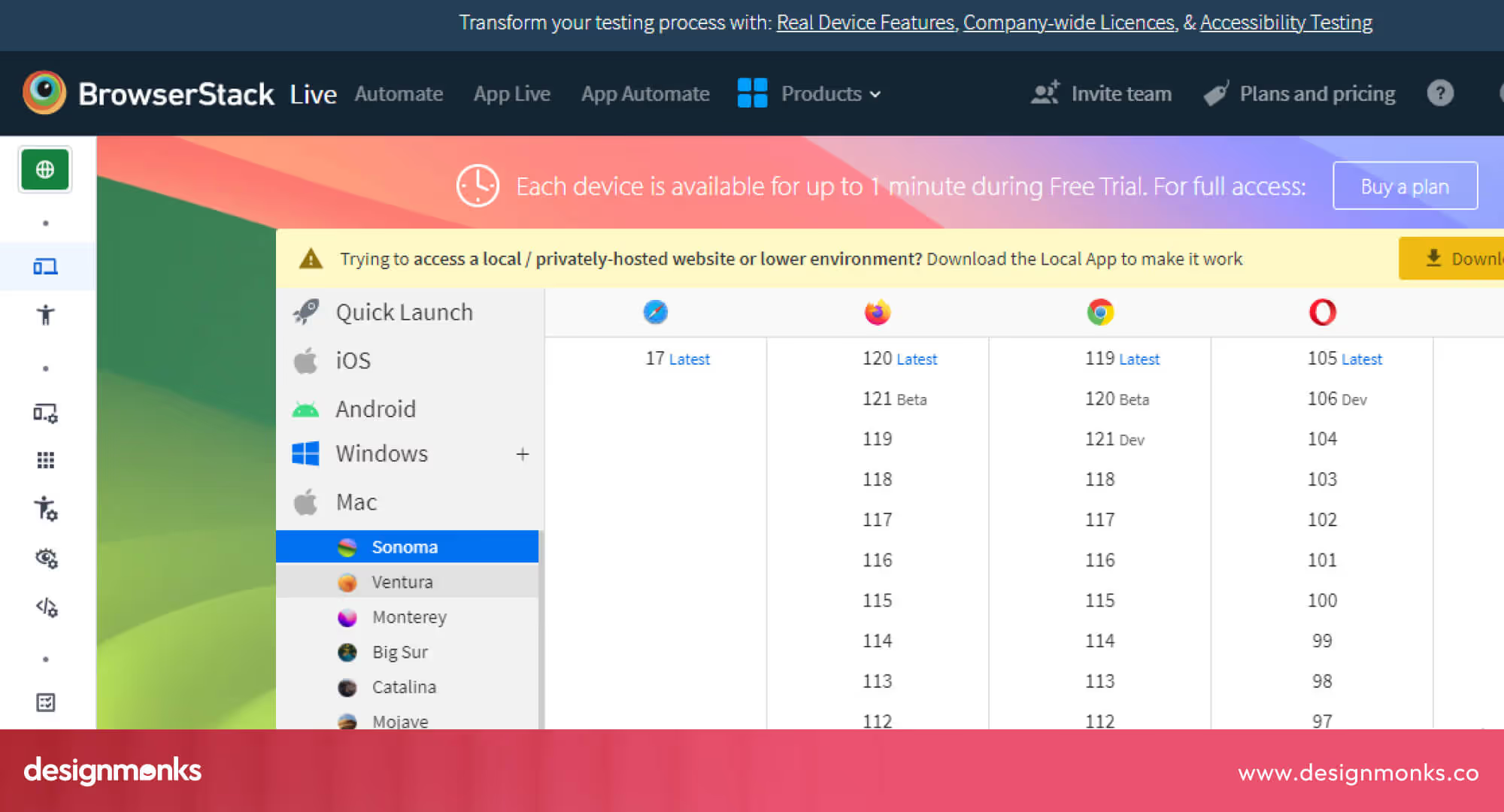
Testing tools like BrowserStack ensure consistent performance, while examples like Fortinet’s mobile site show how simplicity, readability, and speed enhance trust on every screen.
Industry-Specific Design Considerations
Cybersecurity isn’t one-size-fits-all, and neither is its design. Each niche demands a different tone, layout, and storytelling approach. Whether you’re selling cloud protection or compliance automation, the right visual language can make complex systems feel clear, credible, and actionable.
Cloud Security Platforms
Cloud leaders like Cloudflare keep things sharp and scalable. Their designs use interactive diagrams and product dashboards to visualize invisible processes like threat filtering or data routing.
Highlighting integrations with AWS, Azure, and Google Cloud reinforces legitimacy, while dynamic infographics make complex cloud layers easy to grasp, turning abstract protection into tangible trust.
Penetration Testing & Ethical Hacking Services
Brands such as Rapid7 and Bishop Fox lean on dark, minimal aesthetics to communicate precision and confidence.
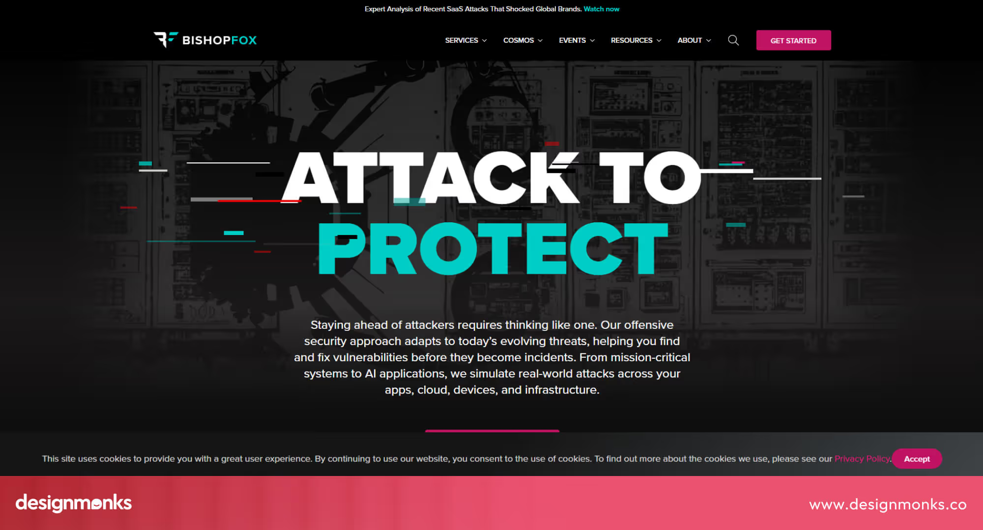
Real performance metrics like “Detected 98% of vulnerabilities before launch” turn technical success into proof points. The interface mirrors their service philosophy, which is lean, analytical, and laser-focused on results.
Identity & Access Management Solutions
Okta masters simplicity in complexity. Their sites use blue-and-pink variation palettes, short explainer videos, and clean infographics to make SSO, MFA, and Zero Trust approachable for every visitor. There’s no fluff, just clarity, structure, and an immediate sense that you’re in safe hands.
Threat Intelligence & Monitoring Services
Many brands choose to show threat maps, breach timelines, and real-time analytics dashboards to showcase ongoing expertise and transparency. Constantly refreshed visuals signal vigilance, proving these platforms are always on watch, even when users aren’t.
Compliance & Risk Management Platforms
Automation-first companies like Vanta and Drata make compliance look effortless. Their modular layouts, checklist-style graphics, and progress dashboards give visitors a sense of control and momentum.
Every visual from SOC 2 badges to audit timelines reinforces structure, trust, and readiness for the next certification.
Common Mistakes in Cybersecurity Website Design
Even well-intentioned security brands sometimes miss the mark. From overly technical copy to cluttered layouts, small design missteps can quietly erode user trust. Let’s look at the pitfalls that make great cybersecurity websites underperform and how to avoid them:
Overuse of Technical Jargon Without Explanation
Many cybersecurity companies assume their visitors are technically proficient. This can alienate decision-makers who aren’t. Clear explanations, glossaries, or hover-to-define elements help bridge this gap. You can do this by pairing plain-language summaries with optional deeper dives.
Cluttered Layouts That Undermine Trust
Too many animations, pop-ups, or banners can make a site feel unsafe. Visitors often equate clutter with scams or phishing pages.
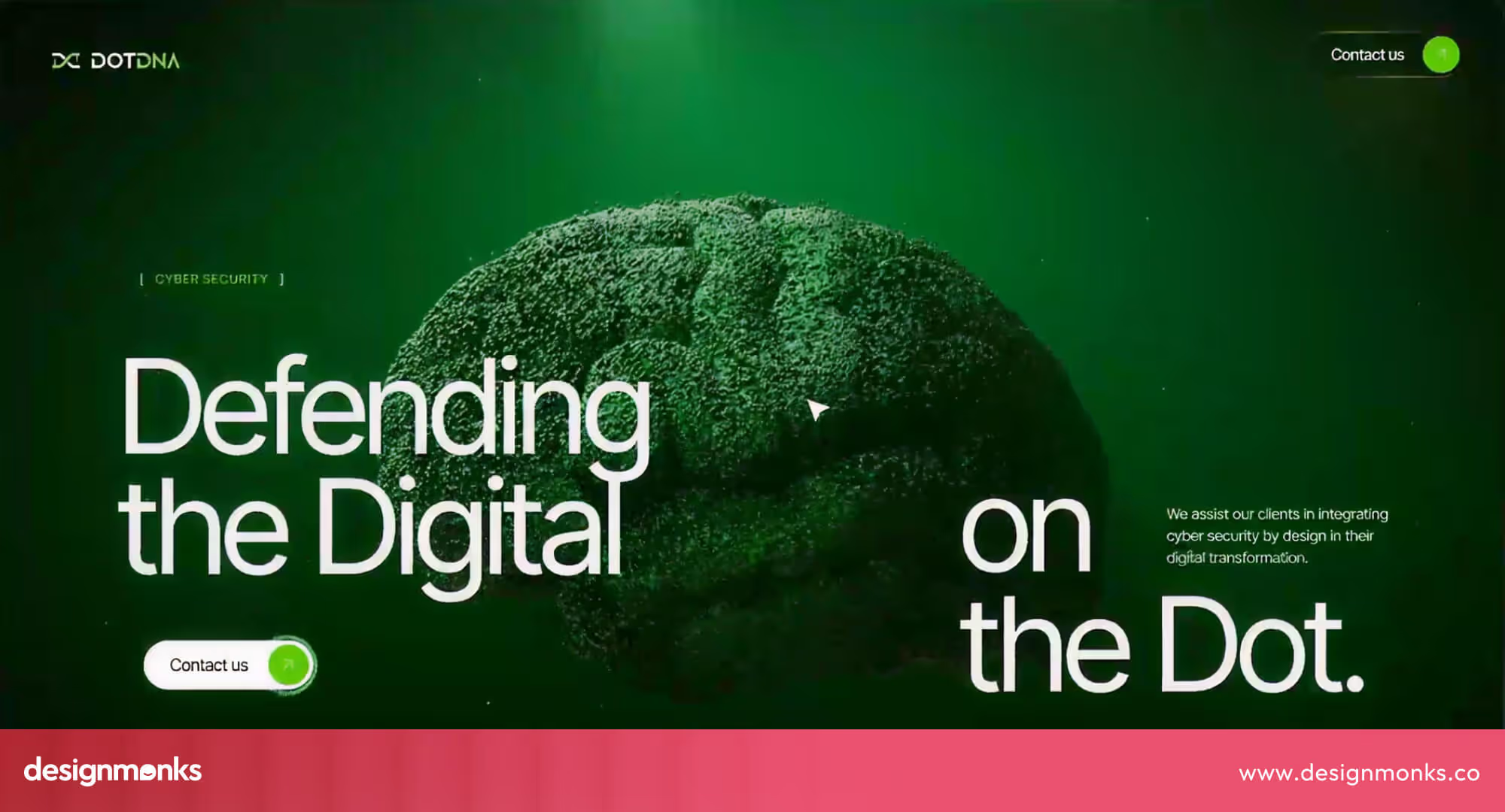
Clean layouts, ample whitespace, and limited motion design (as seen on Palo Alto Networks) keep focus on key messages.
Lack of Clear Value Propositions
If a visitor can’t tell what your company does within five seconds, you lose them. A strong headline like “Protect Your Cloud from Insider Threats” outperforms vague claims like “Advanced Security for All.” Use your hero section to convey value instantly.
Poor Mobile Experience
Unoptimized mobile UX, overlapping buttons, small fonts, and slow loads quickly kill conversions. With most SMB traffic coming from smartphones, brands must test mobile design extensively. Mobile-first indexing also directly affects Google rankings.
How to Choose the Right Design Style for Your Cybersecurity Company
Choosing the right design style depends on your audience, goals, and resources. The right balance between professionalism, usability, and trust can make your cybersecurity brand stand out while staying approachable.
Matching Design to Target Audience (Enterprise vs SMB)
Enterprise buyers usually prefer clean, data-focused designs like CrowdStrike’s, while SMBs respond better to friendly, straightforward visuals such as Blumira’s.
So you need to match your website’s tone and layout to what your audience values most. Enterprise pages can include whitepapers and case studies, while SMB pages should emphasize pricing and quick CTAs.
Budget Considerations for Custom vs Template Design
Your design approach depends on how much flexibility and brand uniqueness you need. A custom-built website offers a stronger brand identity and scalability but comes at a higher cost, usually between €10,000 and €50,000 for top agencies in Europe.
Templates, on the other hand, are affordable and ideal for early-stage startups, though they can feel limiting over time. Platforms like Webflow and Framer offer a smart middle ground between professional design, manageable budgets, and easy future updates.
Balancing Technical Authority with Approachability
A great cybersecurity website needs to look trustworthy without feeling intimidating. The goal is to project technical expertise while staying human and relatable. Consistent visuals, clear messaging, and supporting graphics like icons or charts help build credibility.
Pair that with conversational copy and a user-friendly layout, and you create a site that feels both professional and approachable, a brand users can trust and connect with.
Trends in Cybersecurity UI Design
Cybersecurity UI design is evolving to balance trust, clarity, and speed. Among all the industries, this oneis getting moreseriiousabout UX because Every $1 invested in UX returns up to $100. Modern interfaces focus on reducing fear, improving usability, and helping users understand complex security actions without confusion.
- Dark Mode with Purpose: Dark interfaces reduce visual strain and create a secure, focused feel, while highlighting critical alerts and actions more clearly.
- Data Visualization Dashboards: Clear charts and real-time graphs help users quickly understand threats, system status, and security performance without technical complexity.
- Minimal and Clean Interfaces: Simple layouts remove distractions, helping users focus on key actions like scanning, monitoring, or responding to threats quickly.
- Trust-Focused Microcopy: Short, clear messages explain security actions, reducing fear and helping users feel confident about what is happening in the system.
- Interactive Security Feedback: Real-time feedback like scanning progress, alerts, or system checks keeps users informed and builds confidence in system activity.
- AI-Powered Personalization: Interfaces adapt based on user behavior, showing relevant alerts, insights, and recommendations to improve usability and decision-making.
FAQs
What makes a cybersecurity website trustworthy?
Transparency, SSL security, professional visuals, certifications, and clear messaging make a cybersecurity website trustworthy. Visitors must see and feel that data protection is a top priority.
What colors work best for security company websites?
Blue and black usually work best for a security company website. These colors signify trust and authority. Other than that, minimal color palettes maintain clarity and professionalism.
How can I make my cybersecurity website stand out?
To make your cybersecurity website stand out, use interactive product demos, data-driven case studies, and consistent visual branding. Avoid generic stock imagery and focus on showing your product’s real interface.
What CTAs convert best for cybersecurity services?
CTAs like “Book a Demo,” “Request a Free Trial,” and “Start Your Security Check” convert best for cybersecurity websites. They feel valuable while remaining professional.
How important is mobile design for cybersecurity websites?
Mobile design is the most important part of a cybersecurity website. More than half of visitors access these sites on mobile. A poor mobile experience directly reduces conversions and trust levels.
Conclusions
Studying the best Cybersecurity company website examples shows how thoughtful design builds trust and drives action. Clear messaging, intuitive layouts, and visible security signals help visitors feel confident and protected.
Whether you’re creating a site for a large enterprise or a growing SMB, these examples prove that simplicity, credibility, and user-focused design matter most. By applying these lessons, your cybersecurity website can not only look professional but also inspire real confidence and increase conversions.

.svg)


.avif)

.avif)
.avif)
.avif)
.avif)


.avif)
.avif)
.avif)
.avif)


.avif)


