
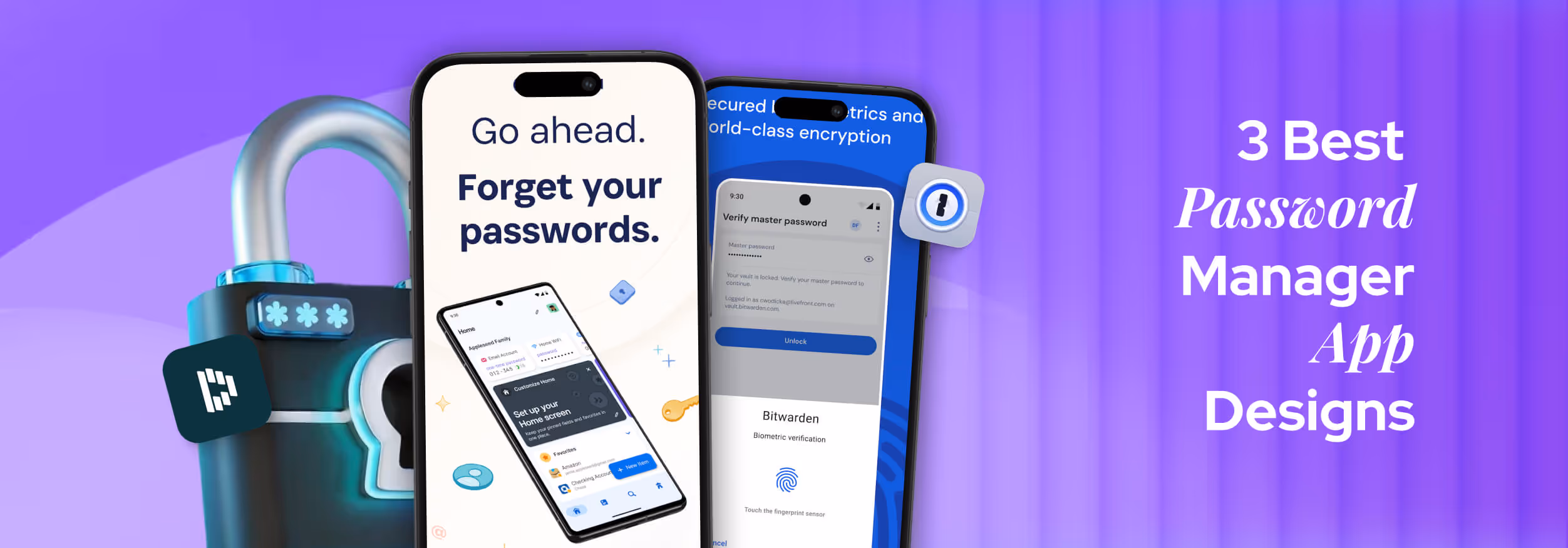
.svg)


Key Takeaways
- Keep vaults clean and clutter-free with clear labels and categories.
- Show security visually with icons, biometrics, and clear trust indicators.
- Make items easy to find using search, filters, and “recently used” sections.
- Give immediate feedback for actions like save, copy, or autofill.
- Balance simplicity for beginners with powerful features for advanced users.
- Design for both mobile and desktop with consistent, adaptable layouts.
Creating a password manager app design is pretty different from other projects. Here, you need to focus on so many factors with equal priority. From safety to dashboard design, you must look after everything and make it simple yet protected.
These apps don’t just store your passwords. The best ones are easy to use, look clean, and make you feel in control. When something is designed well, you don’t have to think twice; it just works. And that’s what great design does: it makes hard things feel simple.
However, in this discussion, I’ll show you 3 password manager apps that nailed their design. You’ll learn what they got right, and why it matters. So, let’s learn about them properly.
What Makes a Good Password Manager App Design?
When you open a password manager, you’re not just looking for your saved logins; you’re trusting it with your digital life. That’s why design matters so much. A good password manager should feel easy to use, look clean, and help you feel safe while using it.
Let’s break down the major things that make the design truly effective:
Visual Clarity & Layout
The app should be visually appealing and easy to understand. Information like website names, usernames, and passwords should be separated clearly. Icons, colors, and text sizes help guide your eyes to the right place. A messy screen can make users feel confused or unsure; a clean layout makes everything easier.
Security Feedback & Trust Indicators
You should always know you’re safe. Good apps show small but important signs, like a lock icon, strong password meters, or alerts when a password is weak or reused. These little signs build trust and help users feel secure without needing to know much about tech.
UX Flow (Adding, Editing, Accessing Passwords)
The flow should feel smooth. You tap to add a password, fill in a few things, and hit save. That’s it. Editing or finding a saved password should take only a few steps. If it takes too long or feels confusing, users will get frustrated and might stop using it.
Biometric or 2FA Integration UI
Logging in with a face scan, fingerprint, or code should feel fast and natural. The design must clearly indicate what's happening, such as displaying “Face ID active” or “Enter code.” It should also let users skip or change these options without confusion.
Mobile/Desktop Adaptability
A good design works well on both phones and computers. On mobile, buttons need to be touch-friendly. On a desktop, you should be able to drag, scroll, and see more details. The design should adjust without breaking.
Simplicity vs Power Balance
The app should be simple enough for beginners, but powerful for advanced users. Features like folders, tags, or password generators should be easy to find, but not in the way. A balanced design gives everyone what they need, without making it feel too heavy.
The Top 3 Password Manager UI Designs Reviewed
Not all password managers are created equal, especially when it comes to design. A well-crafted UI can turn a complex and security-heavy tool into something effortless and intuitive. In this section, I’ve picked three apps that stand out for their smart design decisions.
Let’s explore what makes their UI so effective.
1. 1Password
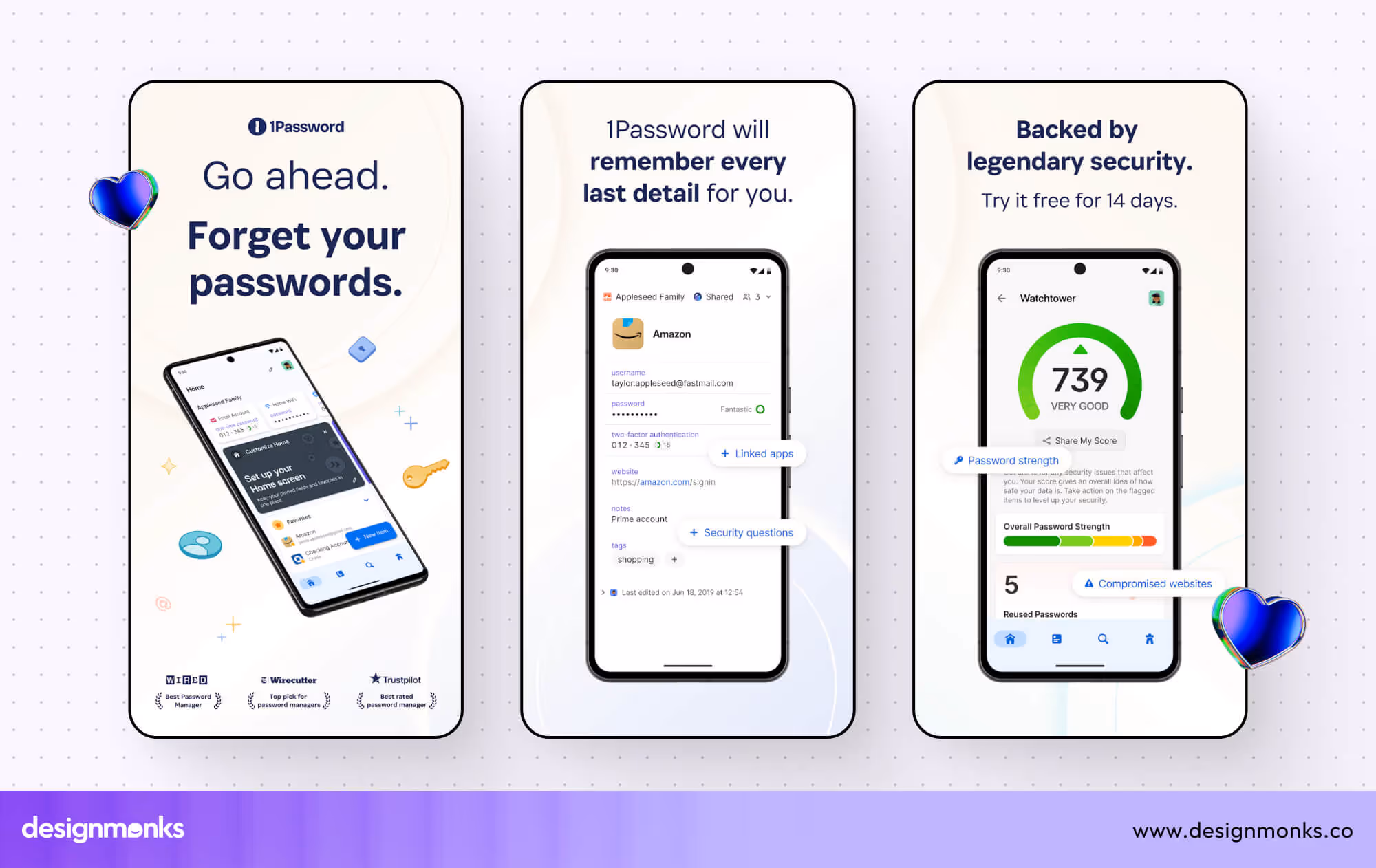
First of all, it’s 1Password. I chose this app because it consistently ranks among the best for usability and interface clarity. Its app design stands out; it looks clean and feels intuitive, yet handles serious security needs with ease.
The best part of this app design:
- Organized left-side navigation that divides vaults, Watchtower alerts, tags, and categories into neat sections.
- Fast search bar that makes finding passwords instant, no scrolling needed.
- Visually strong cues like highlighted alerts and password health badges for compromised items.
- Powerful autofill and form-filling that avoids typing errors and speeds up user flows.
- Design consistency across macOS, Windows, iOS, Android, web, and even command-line interfaces.
Areas to Improve
Even though the design is polished, the login process can feel a bit complex for new users. It needs both a master password and a “secret key,” which sometimes interrupts the flow. A simpler hint or a short on-screen prompt would ease this onboarding tension. Also, 1Password 8’s move to Electron seems to have annoyed some long-time users.
They report slower performance and changes from version 7’s faster, more streamlined UX. To improve, 1Password could offer a lightweight version or optimize the Electron build for better responsiveness without sacrificing functionality.
2. Dashlane
I picked Dashlane on the second spot because it delivers both sleek design and advanced features. Its interface is inviting, organized, and built to be accessible, even when packed with security tools. There are also some other facts that simply convinced me of picking this app. Let’s check them out:
- Large & well-spaced dashboard UI elements and readable menus make it feel open and easy to scan.
- Seamless cross-device use for mobile, web extension, and desktop all follow the same layout style.
- Autofill is powered by AI that balances accuracy with user privacy, all in a smooth flow.
- Dark web and VPN features are integrated without overwhelming the interface; it feels like extra power, not clutter.
Areas to Improve
Dashlane’s interface feels well-designed, but customization limits hold it back. Users can’t adjust layouts or hide features they don’t need. That leaves some feeling boxed in, especially at the free tier level. Giving users light theme tweaks or adjustable dashboard panels could help with personalization.
Also, the free version lacks many helpful tools, which makes the visual experience feel watered down. A more generous free layout or clearer upgrade prompts would improve trust and engagement right from the start.
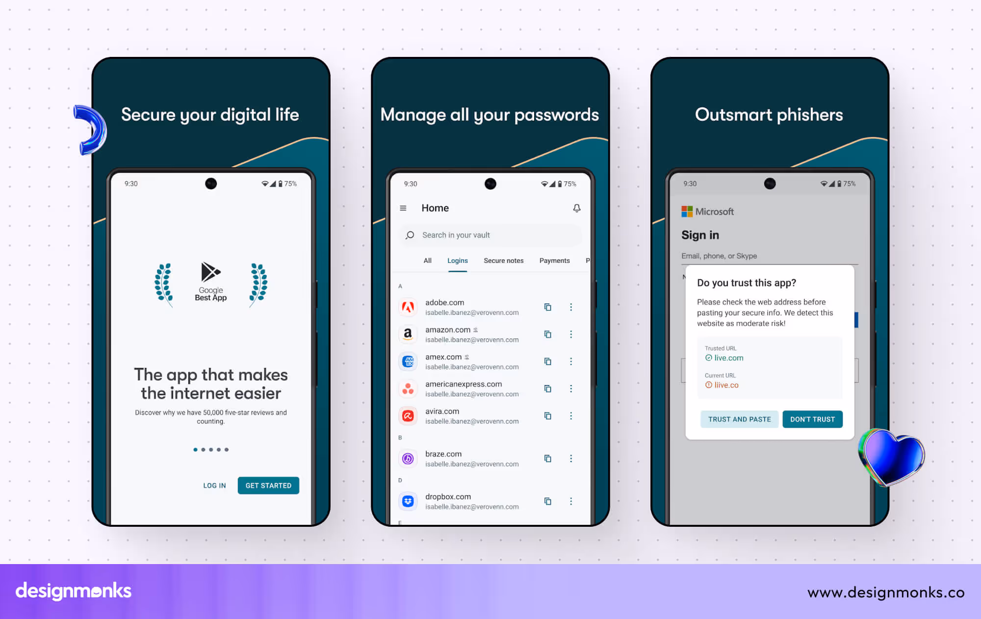
3. Bitwarden
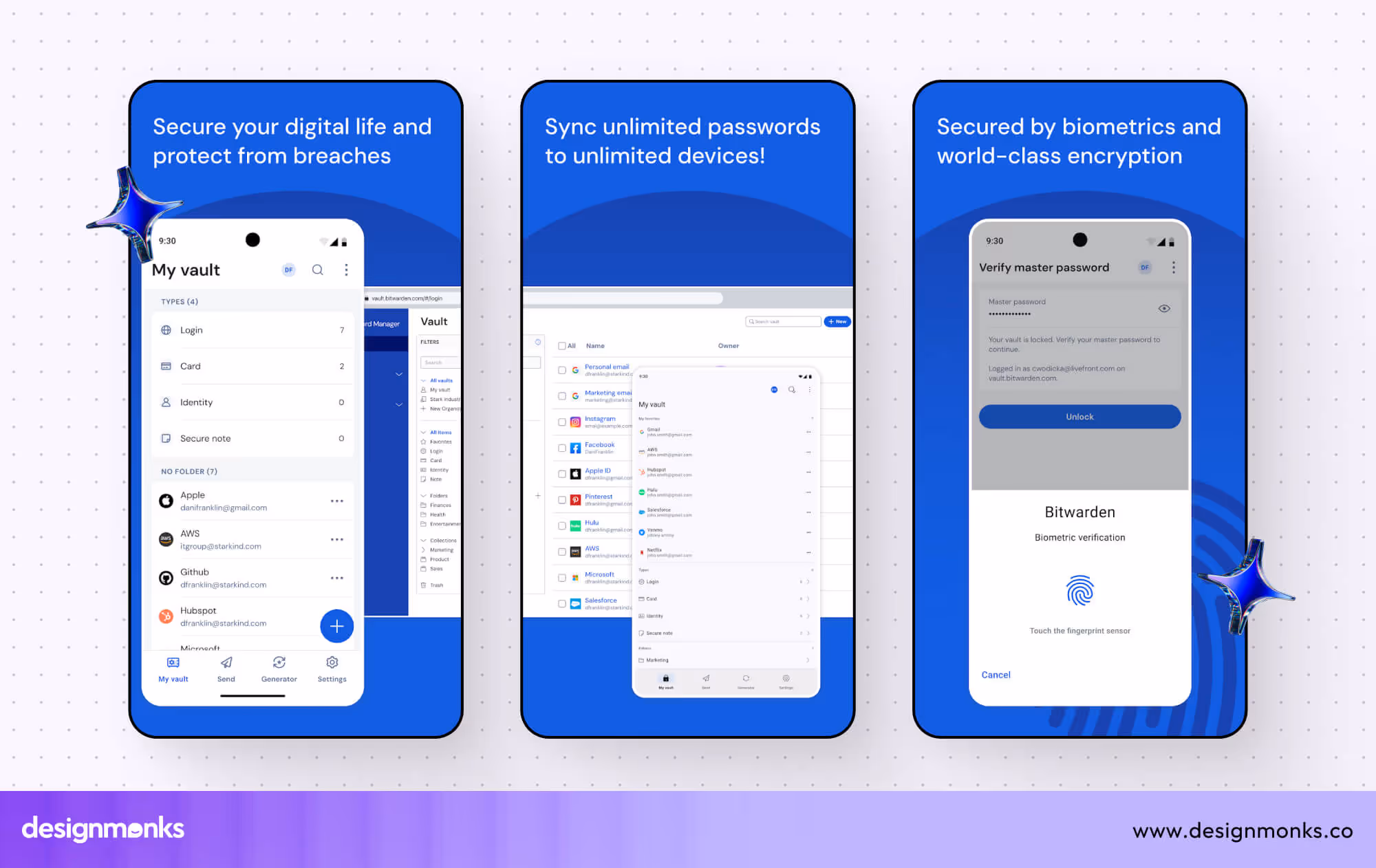
Next, I chose Bitwarden for its open‑source roots with a clean & no-fuss design. Even though it may look plainer than others, its clarity and reliability stood out as deliberate and user-first. Buy why? Let’s check out the design excellence they did for this app:
- The interface is simple and clear, making the security approachable and usable for beginners.
- Works consistently across web, mobile, desktop, extensions, and command line, same style everywhere.
- Unlimited sync and vault items even in the free plan, with a functional layout that remains stable under load.
- Autofill, password strength tool, and passkey support feel practical and are integrated neatly into the UI.
Areas to Improve
Bitwarden’s strength lies in its minimalism, but that also means some UI feels outdated or too sharp. Community feedback mentions blunt corners, large whitespace, and a lack of polish compared to newer apps. A smoother visual update and refined spacing could modernize the look without losing simplicity.
Additionally, occasional performance glitches, especially in newly released UI updates, hurt the experience. Some users discuss lag or a broken state when reopening panels. Updating the platform to be faster and more stable would strengthen its reliability and overall design appeal.
Comparing Onboarding Experiences in These Top 3 Apps
Onboarding sets the first impression for password managers, balancing security, ease of use, and guidance. The top three apps approach this differently, showing trade-offs between speed, clarity, and trust-building.
Integrated Analysis:
- Ease vs Security: 1Password prioritizes security with extra steps, which can slow beginners, while Bitwarden offers speed and simplicity at the cost of guidance. Dashlane strikes a middle ground, balancing security cues and friendly walkthroughs.
- Guidance & Learning Curve: Dashlane’s interactive tutorial helps users explore features confidently. 1Password provides visual hints but may overwhelm new users with the secret key. Bitwarden expects users to learn through exploration.
- Cross-Device Experience: Dashlane and Bitwarden offer smooth multi-platform experiences. 1Password’s secret key requirement adds friction but maintains high security.
- Visual Communication: 1Password excels at highlighting critical security info. Dashlane uses dashboard cues for workflow clarity, while Bitwarden keeps indicators minimal, supporting simplicity.
Takeaway: For designers, Dashlane demonstrates balanced onboarding, 1Password shows security-first onboarding, and Bitwarden exemplifies minimalist, fast onboarding. Understanding these trade-offs helps design more effective flows.
What We Can Learn as UI/UX Designers From These Designs
Looking at the best password manager app designs, one thing is clear: great design is not just about looking good, it’s about making users feel safe, in control, and understood.
These apps deal with sensitive personal data, so the design has to be clean, clear, and helpful. As designers, we can pick up a lot of practical lessons from how they solve everyday problems.
Avoid Clutter in Vaults
When users open their vaults (where all saved passwords are kept), they don’t want to scroll endlessly or feel lost. A well-organized layout with clear labels, folders, or categories makes a huge difference.
Keep only the necessary info visible at a glance, hide the extra stuff until needed. Clutter can create anxiety, especially when users are in a hurry.
Use Biometrics & Icons to Reinforce Security
A fingerprint icon or a lock symbol may seem small, but it gives users a sense of safety. Adding Face ID, fingerprint login, or two-factor authentication (2FA) in a smooth, well-designed way helps users feel like the app takes security seriously. It also saves time and builds trust instantly.
Help Users Recover or Find Items Easily
Everyone forgets where they saved something. That’s why a helpful search bar, filters, or recently used list is essential. The user shouldn’t feel stuck or start over. Good design always offers a way back, and that makes people feel supported.
Feedback Is Key: Success States, Autofill, Copy-to-Clipboard
When users copy a password or save something, they need to know it worked. A checkmark, a green flash, or a tiny message saying “Copied!” or “Saved successfully” goes a long way. These small touches make the app feel alive and responsive.
Reduce Thinking, Increase Doing
The best designs don’t make users think too hard. Clear labels, helpful hints, and simple steps mean users can act quickly and confidently, exactly what they need when dealing with security.
Designing for Security: How UI Builds User Trust
A password manager’s success depends on trust. Effective UI communicates security without overwhelming users with trust feedback indicators. Thoughtful visual cues, consistent layouts, and clear interactions make complex security understandable and build confidence from the first interaction.
Clear Visual Security Indicators
Using locks, badges, and alerts in password manager design helps users immediately identify secure areas and risky items. Color-coded cues, highlighted warnings, and password health indicators make security transparent, guiding users to safer actions intuitively.
Consistent and Predictable Layouts
A well-organized password manager UI reduces confusion and builds confidence. Consistency across dashboards, menus, and forms ensures users know where to find information, reinforcing trust while making security workflows easier to follow.
Informative Feedback and Microcopy
Interactive feedback, such as success messages for saved passwords or warnings for weak entries, strengthens reliability. Proper wording, hints, and tooltips in password manager UI design clarify actions and reduce mistakes without alarming users.
Smooth and Intuitive Interactions
Seamless flows for login, password generation, and autofill in the password manager app UI design reassure users that sensitive data is handled correctly. Microinteractions, animations, and progress indicators make security processes feel controlled and transparent.
Trust Through Minimal Clutter
A clean, simple interface in a password manager app ensures critical security elements stand out. Avoiding visual noise prevents users from overlooking alerts or warnings, reinforcing confidence in both the design and the app’s reliability.
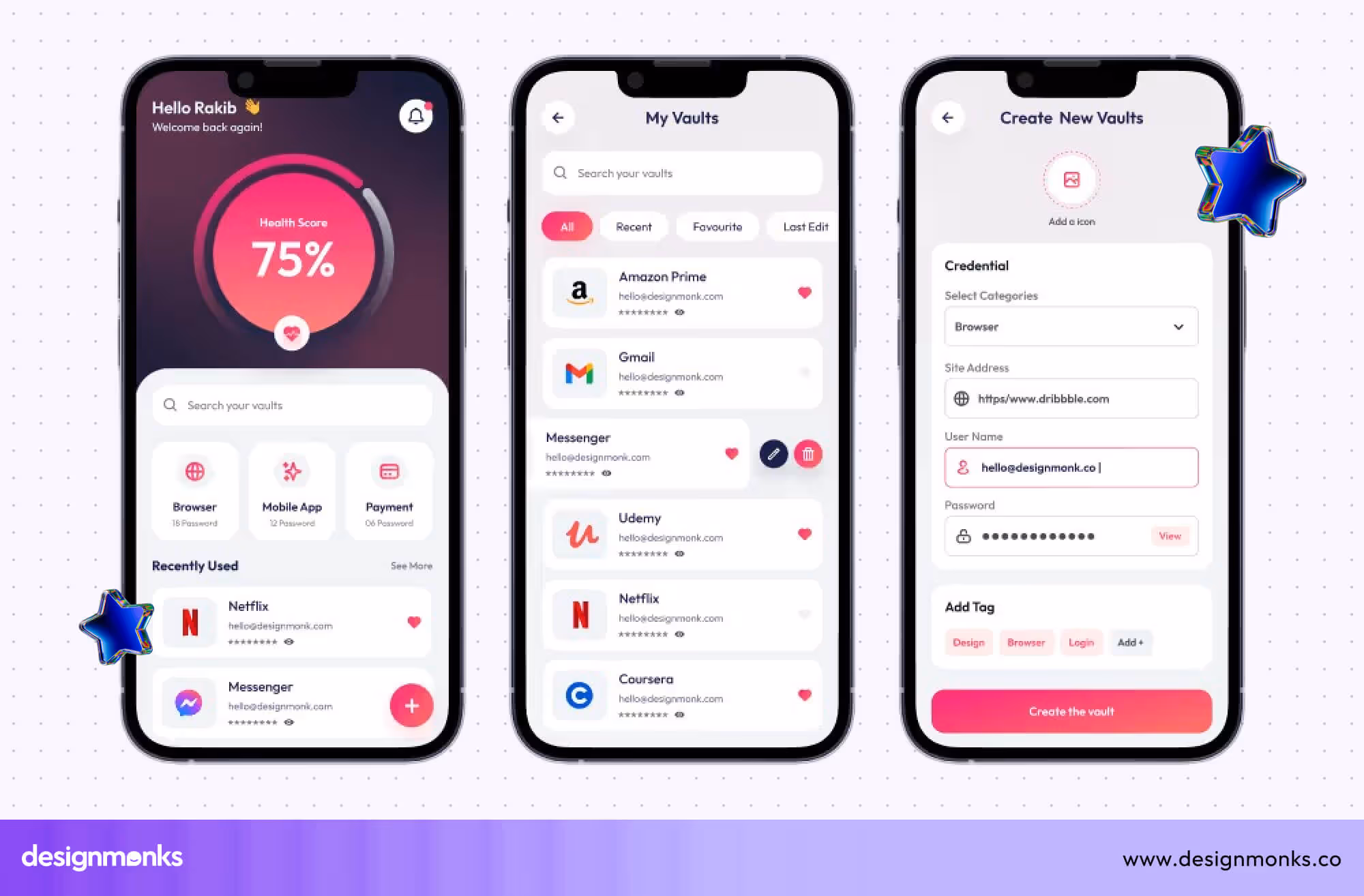
Bonus: Our Take on Password Manager UI
We worked on a password manager UI concept not too long ago, and honestly, it pushed us to think differently. Designing something that deals with people’s most private data is not just about making it look nice; it’s about earning trust through every screen, every button, every message.
Explore our product: Password Manager UI Concept.
One of the first challenges we ran into was making security feel simple. We didn’t want the app to look scary or too technical. At the same time, it had to feel serious enough to handle sensitive information.
So we played with tones, used calm colors, minimal shadows, and just the right amount of space to keep things breathable.
Another big area was handling the login and onboarding flow. We realized that asking for too many permissions or steps upfront made users uncomfortable.
So we broke it down. We introduced things like biometric login gradually, rather than all at once. That small change made a big difference in how smooth the experience felt.
Then came the vault design. This part was tricky. Too much data in one place can make people feel lost. We tested a few layouts until we found something that felt right: grouped items, clean icons, and just enough labels.
Search was a must, but we also added a “last used” section, because people usually come back to the same few items again and again.
We also spent time thinking about the little things, what happens when a user copies a password? Do they get a message? A sound? A visual blink? These tiny moments made the app feel responsive and alive.
So, what we finally did:
- Used soft, calm visuals to avoid overwhelming users.
- Broke onboarding into simple, non-scary steps.
- Gradually introduced biometric login.
- Added “last used” and search features for quick access.
- Focused on micro-feedback like copy alerts and save messages.
- Built the whole UI thinking about first-time users.
Looking back, the biggest takeaway was; keep the design calm, keep it clear, and always imagine a user who's never used a password manager before. That mindset helped us shape something we were genuinely proud of.
FAQs
How can UX improve security in password manager apps?
UX can improve security by providing clear feedback on password strength, visual trust indicators, secure onboarding flows, and error messaging. Intuitive layouts and microinteractions guide users to create and manage strong, unique passwords safely.
What are the essential UI elements for a password manager?
Essential UI elements include a clean dashboard, password generation tools, easy credential entry forms, visual trust cues, clear navigation menus, and feedback notifications. These elements ensure usability while maintaining user confidence in security.
What are common mistakes in password manager UX design?
Common mistakes include confusing navigation, unclear security feedback, cluttered dashboards, weak onboarding, poor error messages, unstructured password manager UI patterns, and a lack of accessibility. These issues reduce trust, increase user errors, and negatively impact adoption.
End Note
Password manager app designs play a big role in keeping your online life secure and easy. The three apps we looked at show how smart design can make managing passwords simple and trustworthy.
Good design isn’t just about looks, it’s about making users feel safe and confident every step of the way. If you’re creating or using a password manager, remember: great design turns something complex into a smooth, stress-free experience.

.avif)
.avif)
.avif)
.avif)


.avif)
.avif)
.avif)
.avif)


.avif)


