
Key Takeaways
- Popular apps can still frustrate users with small but poorly planned design decisions.
- Too many upgrade prompts can distract users from an app's main purpose.
- Hiding familiar features makes everyday tasks harder and increases user frustration.
- Optional features should remain optional, giving users control over their experience.
- Regular usability testing helps catch frustrating design mistakes before users complain.
Have you ever noticed how some of the world's most popular apps, used by billions of people, make silly design mistakes that people can't stop talking about? Yes, it happens. Even familiar apps have frustrating flaws, yet we rarely stop using them because we already depend on their services.
Their popularity gives them room to make mistakes. A new app doesn't have that advantage. One confusing screen or frustrating feature could send potential users elsewhere.
Tinder's endless upgrade prompts, WhatsApp's unremovable Meta AI button, and YouTube's hidden Subscriptions tab show how small design decisions can frustrate users.
Let's look at these bad mobile app design examples, understand how they affect the user experience, and check the possible solutions we've included for each one.
10 Bad Mobile App Design Examples That Frustrate Users
A popular app can have millions of downloads and still leave people scratching their heads. A misplaced button, an unexpected charge, or a screen that never seems to end can turn a simple task into an annoying experience.
The following examples show how some of the world's most popular apps have made design decisions that frustrated their users. More importantly, each case offers a practical lesson on how designers could make everyday app experiences easier.
1. Google Photos Made Dates Disappear
Google Photos introduced an Android redesign in July 2026 that removed date labels above individual groups of photos. Instead, users now see a floating date indicator that changes as they scroll through the grid.
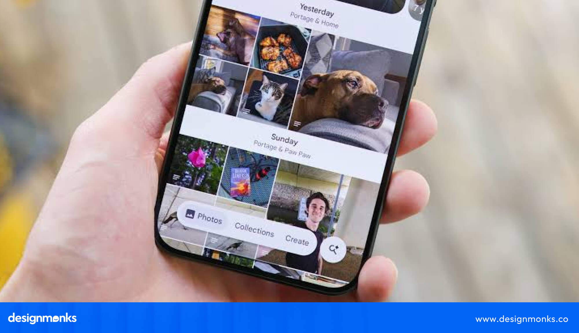
The problem? Photos from different days can look like one continuous stream. Someone looking for pictures from last Friday may have to scroll through dozens of images before reaching the right ones.
Google does offer a way to restore the date labels, but the setting isn't easy to spot. Users must visit Photos settings, open Preferences, and then access Photos view to turn it on.
Effects on Users
People lose an easy way to recognize when they took their pictures. Browsing old memories takes more scrolling, especially when they remember the date but not the photo itself.
Possible Solutions
- Keep date labels visible by default, just as they were before.
- Ask users about their preferred photo grid during the first launch.
- Mention important changes in update notes so users know where features went.
- Add a visible shortcut to restore the previous grid layout.
2. Tinder Turned Simple Swipes Into Sales Pitches
Tinder started with a simple idea: swipe right to like someone, match, and start chatting. Over time, the app added several paid options, including Plus, Gold, Platinum, Boosts, Super Likes, and Top Picks.

A mobile app design service should keep an app's main purpose at the center of the experience. Tinder can offer premium extras without letting subscription prompts interrupt the basic process of swiping, matching, and chatting.
These extras can offer useful benefits, but their growing presence can make the basic experience feel like a sales funnel. Users may encounter upgrade prompts while trying to get more visibility or access features they expected to use freely.
The business model clearly works for Tinder. Match Group reported $1.94 billion in Tinder direct revenue in 2024, with 9.6 million paying subscribers. However, revenue doesn't tell us how happy people feel about the experience.
Effects on Users
People can feel pressured to pay for better visibility and more opportunities. Too many upgrade prompts also distract from the simple reason they opened the app.
Possible Solutions
- Keep swiping, matching, and basic conversations free of unnecessary interruptions.
- Explain the benefits of each subscription without hiding basic features.
- Present paid extras as optional conveniences rather than essential requirements.
- Limit upgrade prompts while users are actively browsing profiles.
3. Reddit Puts a Wall Between Readers and Posts
Reddit began testing a frustrating pop-up for some logged-out iPhone visitors in late April 2026. The message asked people to get the app to continue using Reddit, but some users couldn't find a close button.
Reddit described the change as a limited test. However, by late May, some visitors reported seeing a similar "View in Reddit App" prompt repeatedly while browsing different pages.

The biggest problem wasn't the suggestion to install Reddit. It was the lack of a clear way to dismiss it. Someone who simply wanted to read a discussion in their mobile browser had to deal with an obstacle before accessing the content.
Effects on Users
Casual readers felt pushed into installing an app or creating an account. Some tried clearing cookies to escape repeated prompts, while others threatened to leave the platform.
Possible Solutions
- Always include a visible close button on app-installation prompts.
- Let visitors read public discussions without forcing an app download.
- Show installation suggestions occasionally instead of repeating them on every page.
- Give users control over when promotional messages appear.
4. WhatsApp Added an AI Button Nobody Could Hide
In spring 2025, WhatsApp introduced a blue-ringed Meta AI button and an "Ask Meta AI or Search" bar in its chat list. The feature offered another way to ask questions, but not everyone wanted an AI assistant inside their messaging app.

Meta described the feature as optional. However, users couldn't completely turn it off or hide the button. They could delete their Meta AI conversation, but the shortcut remained on the screen.
The issue with AI mobile app design isn't simply adding an AI feature. It's giving people control over how they use it. WhatsApp could let users hide the Meta AI shortcut without affecting their regular chats.
That created a mismatch between what the company called optional and what users could actually control. Someone who opens WhatsApp simply to message friends shouldn't have to keep seeing a feature they never asked for.
Effects on Users
The permanent shortcut takes up attention and can lead to accidental taps. Users who prefer a simple messaging experience also lose control over what appears in their chat list.
Possible Solutions
- Add a clear switch to disable Meta AI across WhatsApp.
- Let users hide the AI shortcut without deleting their account.
- Keep the regular search bar available as a separate option.
- Ask users before adding new shortcuts to their main chat screen.
5. YouTube Moved Subscriptions Out of Reach
In November 2026, YouTube introduced a mobile redesign that removed the dedicated Subscriptions tab from its bottom navigation bar. After nearly a decade in the same familiar position, users had to access subscriptions through a swipe-down gesture from the top header.

The redesign also removed familiar filters such as Unwatched, Today, and Live. Meanwhile, Shorts and the Upload button received more attention in the main interface.
For regular viewers, this was a frustrating trade-off. Many people open YouTube specifically to watch creators they already follow. Moving that feature behind a gesture gives more screen space to other options but adds effort to a common task.
Effects on Users
Longtime viewers lose their familiar shortcut and must change their browsing habits. The feed also feels more focused on algorithmic recommendations than updates from subscribed channels.
Possible Solutions
- Keep Subscriptions in the bottom bar as a primary destination.
- Restore useful filters such as Unwatched, Today, and Live.
- Let users customize the main navigation based on their habits.
- Test the new layout with regular viewers before removing familiar shortcuts.
6. Spotify's Disco Ball Made Its Icon Look Broken
In May 2026, Spotify replaced its familiar green app icon with a glittery disco-ball design to celebrate its 20th anniversary. The temporary makeover was meant to mark a special occasion, but the result didn't receive the warm welcome the company might have expected.

Some iPhone users complained that the icon looked pixelated or unfinished. Others thought their app had become stuck during an update or that something was wrong with their phones.
An app icon may look like a small design detail, but people use it to recognize and open an app every day. Changing such a familiar symbol without warning can create unnecessary confusion, even when the app itself works perfectly.
Effects on Users
Some users questioned whether Spotify had malfunctioned or been compromised. Others simply disliked the new appearance and wanted their familiar green icon back.
Possible Solutions
- Let users opt into anniversary icons instead of replacing the default.
- Explain temporary icon changes before rolling them out.
- Keep the original design available as a simple alternative.
- Test new icons at actual phone screen sizes before release.
7. Apple Photos Turned Familiar Tabs Into One Long Scroll
Apple redesigned its Photos app with iOS 18 in September 2024. The familiar tab-based layout gave way to a single scrolling screen filled with collections, carousels, and different content sections.
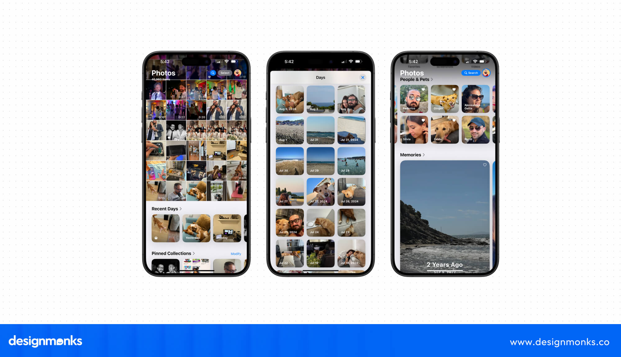
The idea was to bring more photo collections into one place, but the result felt cluttered to many longtime users. Albums and familiar browsing options no longer appeared where people expected them.
Apple made several adjustments in iOS 18.2 and later restored separate Library and Collections tabs in iOS 26. These changes showed that even a well-known brand can get a familiar everyday experience wrong when it changes too much at once.
Effects on Users
People struggled to reach their albums and locate specific pictures in an app they had used for years. The redesign also forced longtime users to relearn familiar actions.
Possible Solutions
- Keep commonly used tabs visible instead of placing everything in one scroll.
- Test major layout changes with everyday users before releasing them.
- Offer a familiar navigation option during major redesigns.
- Give users clear access to albums and collections from the main screen.
8. Instagram's Bottom Bar Started Playing Hide-and-Seek
In June 2026, Instagram began rolling out an iPhone redesign with a glass-style bottom navigation bar that shrinks as users scroll. The visual effect may look modern, but it changes the size and appearance of familiar navigation buttons while people use the app.

Meta used server-side switches to release the update gradually, so only some users received the new interface at first. This also meant people using the same app could have different navigation experiences.
A bottom bar should help users move around without thinking too much. When its appearance keeps changing during scrolling, people may have to pause and check where familiar buttons have gone.
Effects on Users
Regular users can lose track of navigation buttons as they move around the feed. The changing bar also makes familiar actions feel less predictable and can interrupt browsing.
Possible Solutions
- Keep the bottom navigation bar at a consistent size.
- Avoid shrinking frequently used buttons while people scroll.
- Let users switch back to the classic navigation style.
- Test visual effects with regular users before making them permanent.
9. TikTok's Next Video Never Takes a Break
TikTok's For You feed automatically plays videos and loads another one whenever users swipe up. There's no natural endpoint, so watching one short clip can easily turn into a much longer session.
Personalized recommendations add another layer to the experience. TikTok keeps suggesting videos based on what people watch, like, and interact with, making it tempting to stay for another clip.
The European Commission raised concerns about these features in February 2026. Its preliminary findings identified infinite scrolling, autoplay, notifications, and personalized recommendations as potential risks linked to compulsive use. The investigation also questioned the effectiveness of existing screen-time controls.
Effects on Users
Users can lose track of time, struggle to put their phones away, and spend longer watching videos than they originally planned. Younger users may face additional difficulty managing their screen time.
Possible Solutions
- Add natural stopping points after a reasonable number of videos.
- Let users disable autoplay instead of making it automatic.
- Place screen-time controls somewhere people can access easily.
- Introduce break reminders that encourage users to pause.
- Give viewers more control over recommendation frequency.
10. Google Maps Changed Colors and Confused Familiar Eyes
In 2023, Google Maps introduced a new color palette that changed how roads, parks, water, and other map elements appeared. The update received criticism from users who preferred the older, more familiar look.
Elizabeth Laraki, a former Google Maps designer, also criticized the redesign. She argued that the new colors made the map feel colder and less accurate. She also pointed out that some interface elements competed for attention instead of helping users navigate.
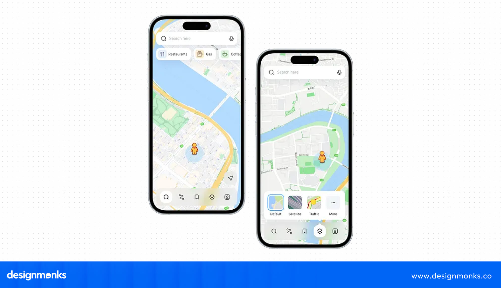
In mobile app UX design, color choices affect more than an app's appearance. They help people recognize important details quickly. Google Maps needed a palette that kept roads, parks, and water easy to distinguish at a glance.
A map has a practical job. People open it to check a route, recognize nearby places, or understand an unfamiliar area. When familiar visual cues become harder to distinguish, even a small design change can make navigation less comfortable.
Effects on Users
Some users found familiar map elements less recognizable and disliked the new color combinations. The visual changes also raised concerns about readability during everyday navigation.
Possible Solutions
- Maintain clear color differences between roads, buildings, parks, and water.
- Test new color combinations with different groups of users.
- Give essential navigation details more visual priority than decorative elements.
- Remove unnecessary buttons and information that clutter the map.
- Check readability in real-world conditions before releasing visual updates.
Some useful mobile app UX design tips are simple: keep familiar controls accessible, make optional features genuinely optional, and test major updates with real users. Small decisions like these can prevent everyday frustrations from becoming reasons to leave an app.
End Note
These bad mobile app design examples can teach new designers and business owners who plan to launch an app soon. Not just these mistakes; you all should focus on fixing the mistakes that simply irritate users.
That’s why it’s essential to think like a user, instead of a designer or business owner, in the first place. Well, if you want to make an app that doesn’t have any of these kinds of silly mistakes, you can talk to Design Monks. They have app design experts, and a short meeting with the team will instantly give you very clear details. Best wishes.