.svg)


Key Takeaways
- A clear search bar improves app navigation and user satisfaction significantly.
- Correct placement at the top ensures users notice the search immediately.
- Simple shape and easy tap area reduce user errors and frustration.
- Material rules keep the search bar consistent across Android apps.
- Search hints and clean results make finding content faster and easier.
People open an app and then feel lost. They tap many buttons, but still do not reach the desired page. A weak search system makes things slow and frustrating. Some users even leave the app due to this issue. This is the exact problem that the Android Material Design search bar tries to solve.
A good search bar solves this problem in a simple way. It stays in a clear place and shows users what to do. In Android apps, the Material Design search bar follows clear rules that keep things clean and easy.
If you design or build apps, you must learn about this term. In this blog, we will explain how it works and how to use it correctly. Read the full blog to learn step by step.
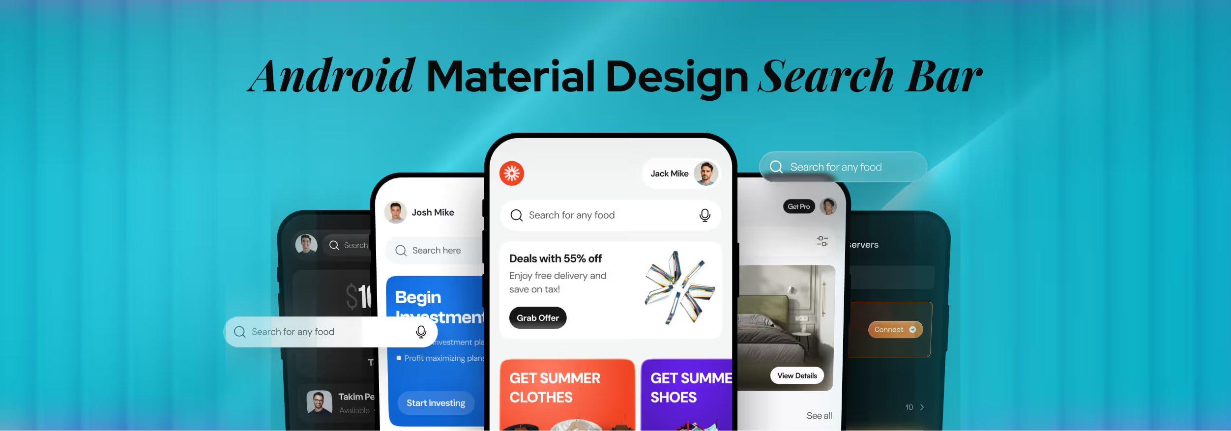
What Is the Android Material Design Search Bar?
The Android Material Design search bar is a search box made for Android apps by Google. It follows Material Design, which is Google’s design system. This search bar has a clear shape, a fixed place on the screen, and opens in a smooth and simple way.
You can see this search bar in apps like Google Play, Gmail, and YouTube. The bar usually stays at the top of the screen. When someone taps it, the screen changes into a full search view and may show recent searches or helpful hints.
In Android UI, this search bar helps people reach content without confusion. It keeps the layout clean and easy to use. It also makes many apps feel familiar, so users do not need to learn a new search style each time.
Material Design Search Components in Android
Android does not use random search boxes. Google gives clear search components in Material Design. These parts follow fixed rules and fixed behavior. If you use the right one, your app feels clean and easy. If you choose the wrong one, the search feels broken and confusing.
Search Bar vs Search View in Material Design
In Material Design, SearchBar and SearchView are two different parts, but they work together. The SearchBar stays on the screen and shows the search entry point. When someone taps it, the SearchView opens and shows the full search screen.
You should use SearchBar to start a search and SearchView to show results and suggestions. The SearchBar is like the door, and SearchView is the room behind that door. Both have clear jobs, and neither should replace the other.
Material 2 vs Material 3 Search Patterns
Material Design 2 and Material You (Material 3 expressive) do not treat search in the same way. In Material 2, the search bar often looks flatter and simpler. In Material, the search bar feels more alive, with better shape, motion, and space.
Material 3 also uses color and shape in a smarter way. The behavior stays similar, but the look and feel become more modern and more friendly in newer Android apps.
Official Material Design Guidelines for Search Bars
Google Material Guidelines explain how a search bar should look and behave in Android apps. These rules help keep apps clean and familiar. When developers follow them, users do not feel lost. The search bar stays easy to see, easy to tap, and easy to trust.
These rules also control where the search bar sits and how it opens. They explain size, space, and motion. This keeps the search clear and predictable. When apps follow these rules, people move faster and make fewer mistakes while using search inside the app.
Main rules you must follow:
- Top Placement: The search bar should stay at the top of the screen so users can see it fast.
- Clear Tap Area: The bar must be easy to tap, even on small screens.
- Strong Visual Order: The search bar should stand out from other items on the screen.
- Smooth Open Action: The search view should open in a calm and clear way.
- Proper Back Action: The back button should close the search, not exit the app.
- Clean Hint Text: The text inside the bar should tell users what they can search.
Android Material Search Bar UI Anatomy
A Material search bar is not just one flat box. It is a group of small UI parts that work together. Each part has a clear job. When these parts stay in the right place and act in the right way, the search bar feels clean, easy, and safe to use in any Android app.
Core UI Elements of a Material Search Bar
A Material search bar is built from small UI parts. Each part has one clear job. When these parts stay simple and visible, users understand where to tap, where to type, and how to clear or control search.
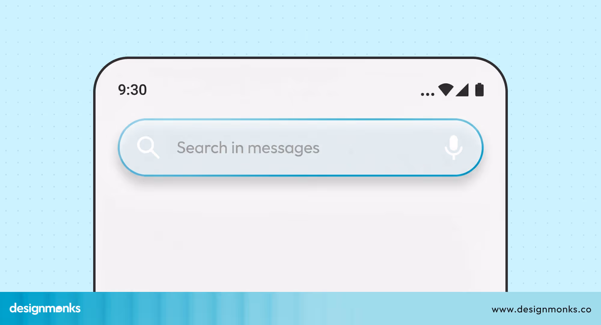
Leading Icon
The leading icon usually shows a search symbol. It tells users that this area is for search. It also helps the bar look familiar and easy to notice at the top of the screen.
Input Field (TextField)
The input field is the main typing area. This is where users write their search words. It should stay wide, clear, and easy to tap, so users do not miss or struggle to start typing.
Placeholder Text
The placeholder text sits inside the input field before typing starts. It gives a small hint about what users can search. This text should stay short, helpful, and easy to understand.
Trailing Actions (IconButton)
Trailing actions appear on the right side of the bar. These are small icon buttons like clear or voice search. They help users fix or change their search without extra steps or screens.
States & Interactions
A Material search bar does not look the same all the time. It changes based on user action. These changes use motion, color, and space to show what is happening without any extra text or messages.
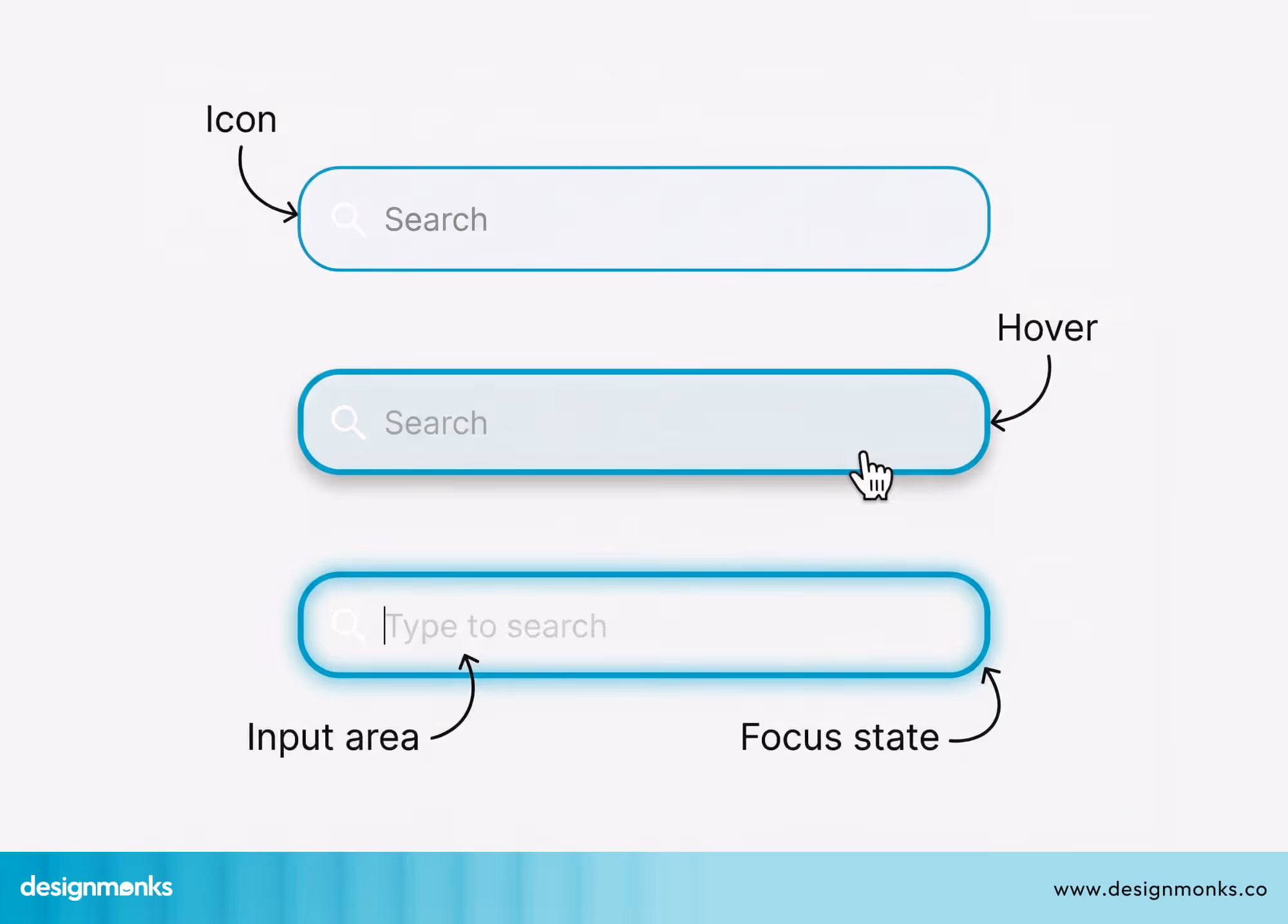
Idle State
The idle state is the default look of the search bar. It stays quiet and simple. It does not demand attention, but it is easy to see and ready for use.
Focused State
The focused state starts when someone taps the bar. The bar becomes clearer and more active. The cursor appears, and the design shows that the bar is ready for typing.
Active State
The active state begins when users start typing. The screen may show results, suggestions, or filters. The search bar now becomes the main part of the screen and guides the full search flow.
Motion, Color, and Elevation Changes
During state changes, the Motion System adds small animations, soft color changes, and light shadow. These changes help users feel the action without surprise or confusion. Everything feels smooth and natural.
Implementing a Material Design Search Bar in Android
Adding a Material search bar is not hard, but it needs the right method. Android supports two main ways to build UI. One uses XML files. The other uses Jetpack Compose. Both follow Material rules, but the setup steps look different.
Search Bar Implementation Using XML
The XML method uses layout files to build screens. This method works well in older and mixed projects. You place the search bar in the layout and control its look with attributes and theme settings.
Adding the Search Bar in XML Layout
In Android XML, the search bar is added inside a layout file. You set its width, position, and style there. The app theme controls colors, shape, and motion, so the search bar matches other screens.
Important Attributes to Set
Some attributes control hint text, icons, and behavior. These settings decide how the bar looks and acts. When these values stay clear and simple, the search bar becomes easy to use and easy to understand.
Theme and Style Compatibility
The search bar must follow the app’s Material theme. If the theme is wrong, the colors and shapes may look broken. A correct theme keeps the search bar clean, modern, and consistent across all screens.
Search Bar Implementation Using Jetpack Compose
Jetpack Compose builds UI using code instead of XML. It uses Material 3 APIs and feels more direct. This method fits new projects better and gives more control over motion, state, and screen behavior.
Using Material 3 Search Components
Compose offers ready search components from Material 3. You place them inside your screen and control them with the state. These components already follow Material rules, so you do not need extra setup work.
Handling Search State in Compose
In Compose, the search text and open state stay in code. When the state changes, the UI updates on its own. This keeps the search flow smooth and removes many manual update steps.
Styling and Theme in Compose
Compose reads colors and shape from the Material theme. If the theme is set right, the search bar looks correct everywhere. This keeps the design clean and saves time during UI work.
UX Best Practices for Android Material Search Bars
A good search bar does not happen by luck. It follows clear UX rules. These rules help users notice search faster, tap it without trouble, and get results without stress. When you follow these search UX best practices, search feels simple and safe.
Clear Placement
The search bar should stay at the top of the screen where users expect it. It should not hide between other buttons. When placement stays clear and fixed, users can start search without thinking or wasting time.
Simple Shape
The search bar should use a clean and simple shape. Avoid sharp or strange designs. A simple shape helps users recognize it as a search field. This also keeps the screen calm and easy on the eyes.
Easy Tap Area
The search bar must be easy to tap, even with one hand. The height and padding should feel comfortable. Small tap areas cause mistakes and make users feel annoyed before they even start searching.
Fast Open Action
When users tap the search bar, it should open without delay. Slow or heavy animation makes the app feel weak. A fast and smooth open action gives users confidence and keeps the search flow natural.
Helpful Search Hints
The hint text inside the search bar should guide users. It should tell what they can search. A good hint saves time and removes doubt, especially for new users who do not know the app well.
Clean Results View
The results screen should look clean and focused. Do not mix too many items or buttons. A clean results view helps users scan faster and pick the right item without confusion or extra effort.
Common Mistakes in Android Material Search Bar Design
Many apps use a search bar, but many do not use it in the right way. Small search bar UX design mistakes can slowly break the user experience. Users may not notice the reason, but they feel the app is hard or annoying to use.
Poor Placement
Some apps place the search bar in a corner or hide it inside a menu. Users then need to look around before they can search. This wastes time and makes the app feel confusing from the very first screen.
Too Small Tap Area
When the search bar or its icons are too small, users often tap the wrong place. This feels frustrating, especially on small phones. A search bar should feel easy and safe to tap with one thumb.
Unclear Hint Text
If the hint text does not explain what users can search, people feel unsure. They may type the wrong thing or stop using search altogether. Good hint text helps users understand the content of the app.
Slow or Heavy Animation
A search bar should open fast and smoothly. If the animation feels slow or too fancy, users feel the app is heavy. This breaks the flow and makes simple actions feel longer than needed.
Messy Results Screen
When the results screen shows too many items, buttons, or colors, users feel lost. They cannot scan the list fast. A clean layout helps users find the right result without extra thinking.
Breaking Material Rules
Some apps ignore Material Design rules and change shape, color, or motion in strange ways. This makes the search bar look different from other apps. Users then feel the app is less safe or less polished.
When to Use a Material Search Bar (and When Not To)
A search bar is useful only in the right situations. Using it correctly improves user experience. Choosing poorly can confuse users or waste screen space. Knowing when to use it makes apps faster, clearer, and easier to navigate.
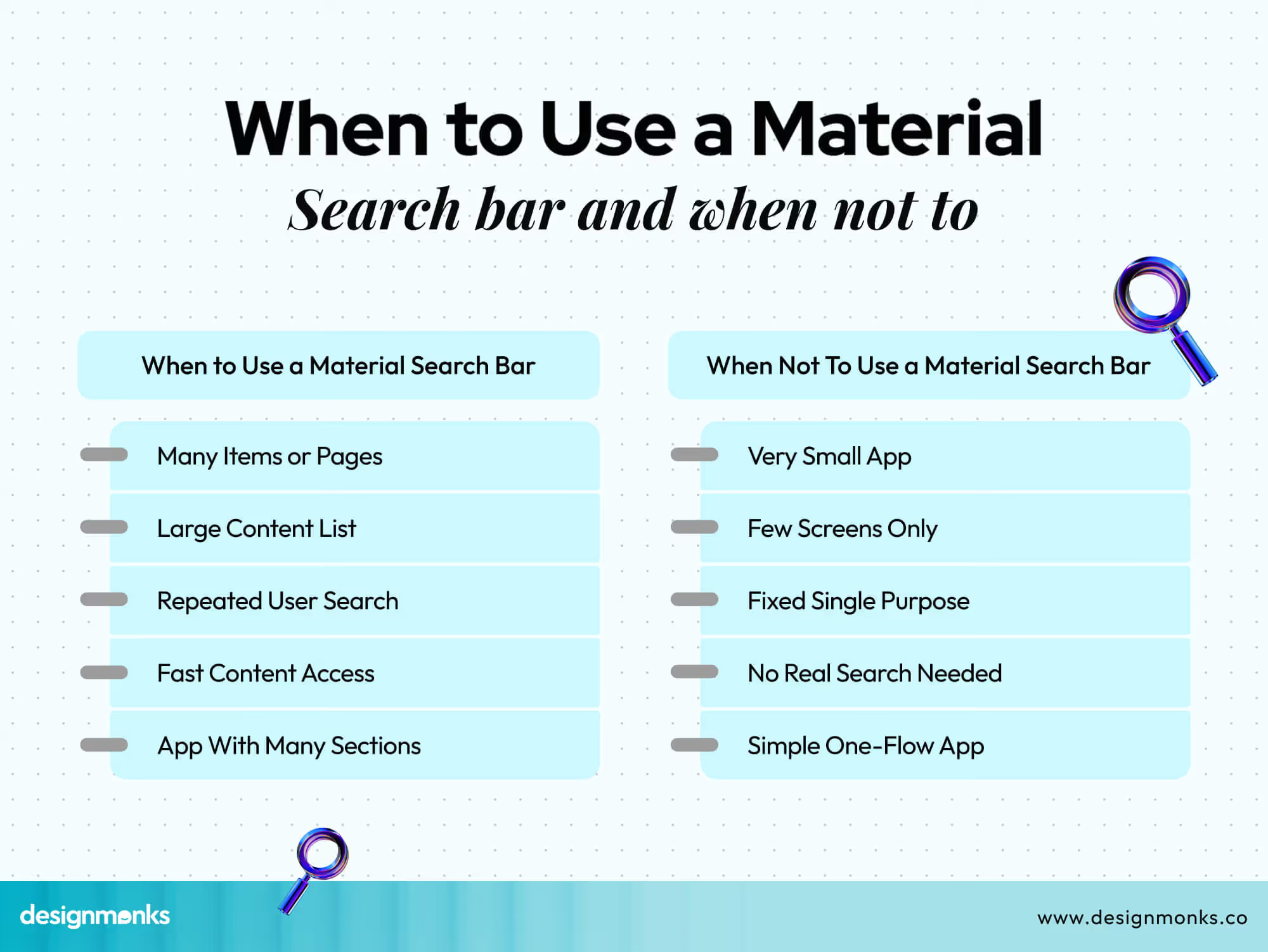
When to Use a Material Search Bar
Some apps really need a search bar. It works best when users have many choices or need fast access. A clear search field makes navigation smooth and helps users find content quickly.
- Many Items or Pages: If the app has many pages or items, a search bar saves users from scrolling through everything to find what they want.
- Large Content List: Long lists of products, posts, or files can overwhelm users. A search bar lets them jump directly to the right item.
- Repeated User Search: If users search often, the search bar remembers hints or recent searches. This reduces effort and improves speed.
- Fast Content Access: Apps that prioritize speed, like e-commerce or news, need search to let users reach content in seconds.
- App With Many Sections: When an app has multiple categories or screens, a search bar connects them and avoids unnecessary navigation.
When Not To Use a Material Search Bar
Some apps do not need a search bar. Adding one can confuse users or waste space. A small or single-purpose app works better without extra search complexity.
- Very Small App: Apps with only a few features or screens do not need search. Users can tap directly to reach what they want.
- Few Screens Only: If the app has very few pages, search adds no value. Navigation is already fast and simple.
- Fixed Single Purpose: Apps built for one task, like a calculator or timer, do not need search at all.
- No Real Search Needed: If content does not need discovery or selection, a search bar is unnecessary and clutters the UI.
- Simple One-Flow App: Apps where users follow a single flow, like onboarding or forms, work better without a search bar.
End Note
A well-designed Android Material Design search bar makes apps easier and faster to use. It guides users, saves time, and keeps the app layout clean. Following Material rules ensures consistency and builds trust with your audience.
Knowing when and how to use a search bar avoids confusion and wasted space. Small details like placement, shape, and hints make a big difference. Apply these practices, and your app search will feel smooth, clear, and friendly to every user.

.avif)
.avif)
.avif)
.avif)


.avif)
.avif)
.avif)
.avif)


.avif)
