.svg)


Key Takeaways
- Drag and drop simplifies tasks by enabling direct visual interaction.
- Clear feedback and drop zones improve usability and reduce user confusion.
- Common patterns include builders, file uploads, layout editors, and Kanban boards.
- Good design ensures accessibility with keyboard support and mobile-friendly interactions.
- AI and no-code tools are shaping the future of drag-and-drop interfaces.
Click, drag, and done, no learning curve, no confusion. That’s why drag and drop UI design has become a core part of modern digital products. It lets users move elements visually instead of dealing with complex steps or instructions.
From tools like Figma to website builders like Webflow, this approach makes powerful features feel simple. Users don’t need technical skills, they just interact directly with what they see.
As digital experiences become more visual, understanding drag-and-drop UI design is essential. So how do you design a drag-and-drop UI that users instantly understand? Let's find out!
What Is Drag and Drop UI Design?
Drag and drop UI design is a type of interface where users interact with digital elements by moving them directly on the screen. Instead of typing commands or filling out forms, users can manipulate objects visually.
This interaction style is based on the concept of direct manipulation, where actions are immediate, visible, and reversible. It is a core principle of modern graphical user interface design and is widely supported by standards like Apple Human Interface Guidelines.
In a drag-and-drop interface, users can:
- Select an element
- Drag it to a new location
- Drop it into a specific position or container
This creates a more engaging and intuitive experience compared to traditional UI models.
Another important aspect is that drag-and-drop interfaces rely on visual editing interfaces and interactive UI elements. This makes them especially powerful for non-technical users, as they remove the need for coding or complex instructions.
How Drag and Drop Interaction Works
To create an effective drag-and-drop interface, it is important to understand how the interaction works. Drag-and-drop involves a few key elements that define how users move and place items on a screen.
Each element has a specific role in making the interaction clear, precise, and user-friendly:
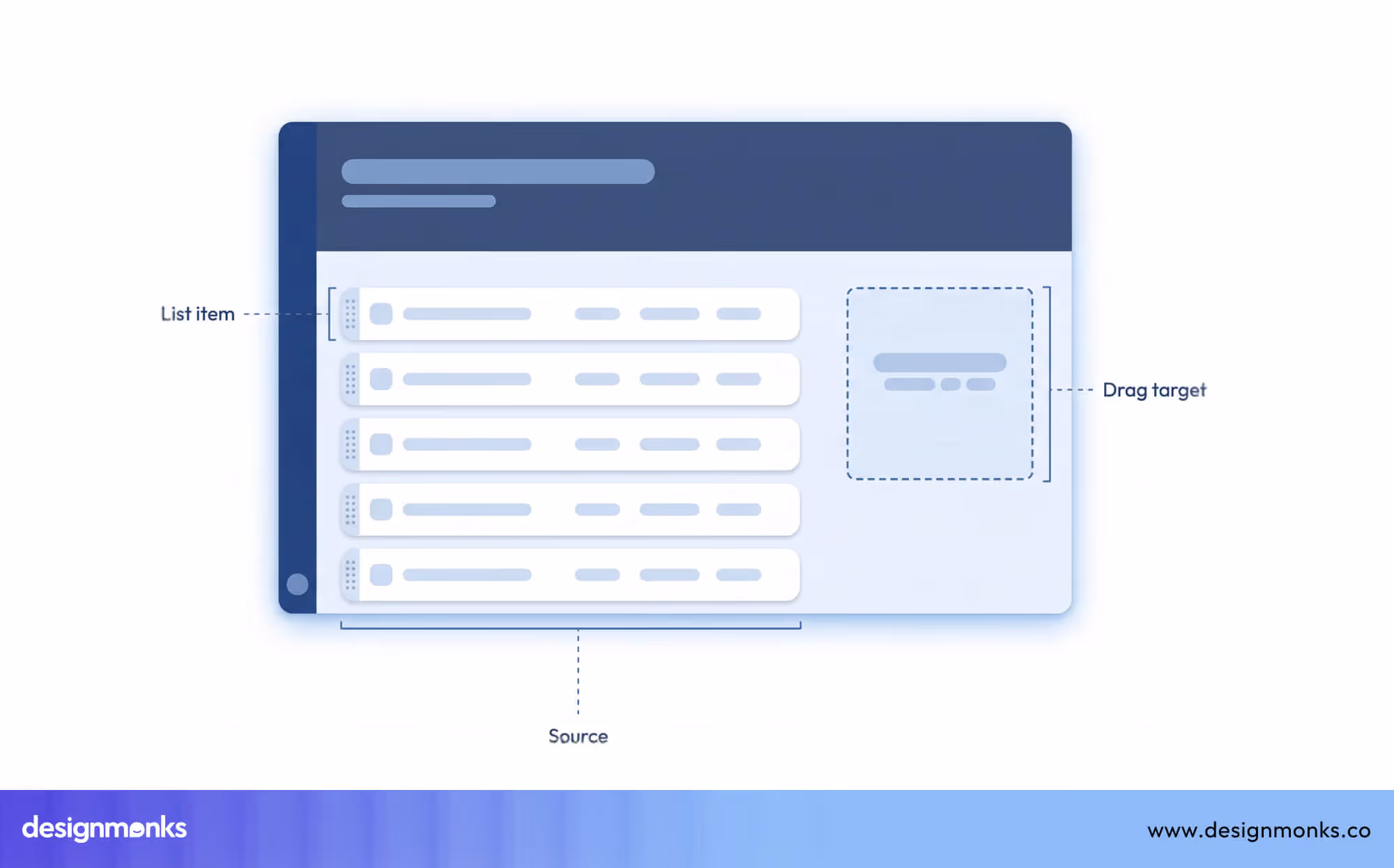
1. Drag Source
The drag source is the item or element that a user can pick up and move. This can be anything that needs to be rearranged or positioned.

This could be a file in a storage system, a card in a task board, a button, an image, or a component in a design tool. The drag source must be easy to identify, so users know which items can be moved.
2. Drop Target
The drop target is the area where the dragged element can be placed. Drop targets must be clearly visible and distinct so that users understand where an item can go.
A well-defined drop target prevents mistakes and confusion. Without clear drop zones, users may drop items in the wrong place or feel uncertain about whether their action was successful.
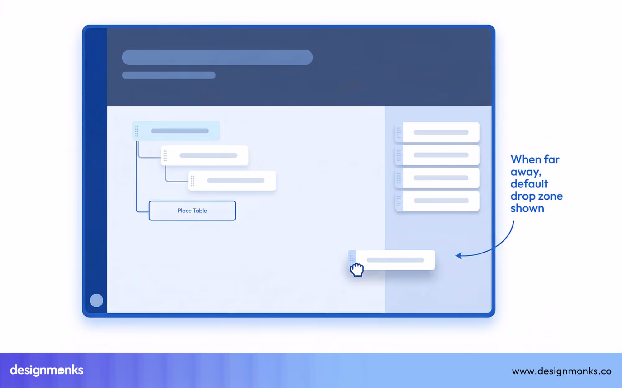
3. Visual Feedback
Visual feedback is essential for guiding users during drag-and-drop actions. Feedback can include changes in color, shadows, highlights, or subtle animations that appear when an element is being dragged.
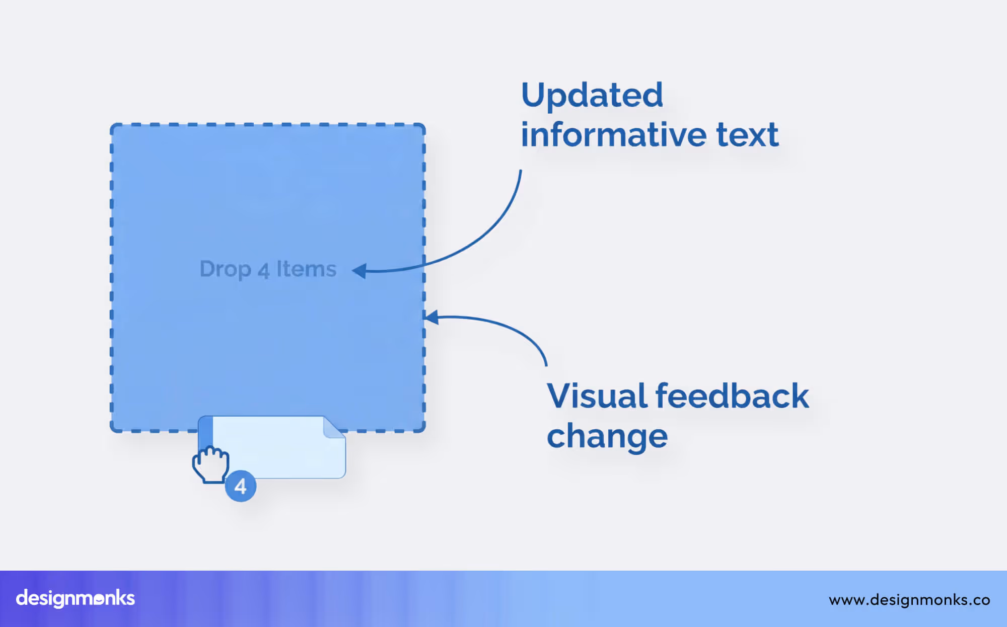
This real-time response helps users know that the system has recognized their action and shows whether the element can be dropped in a particular location.
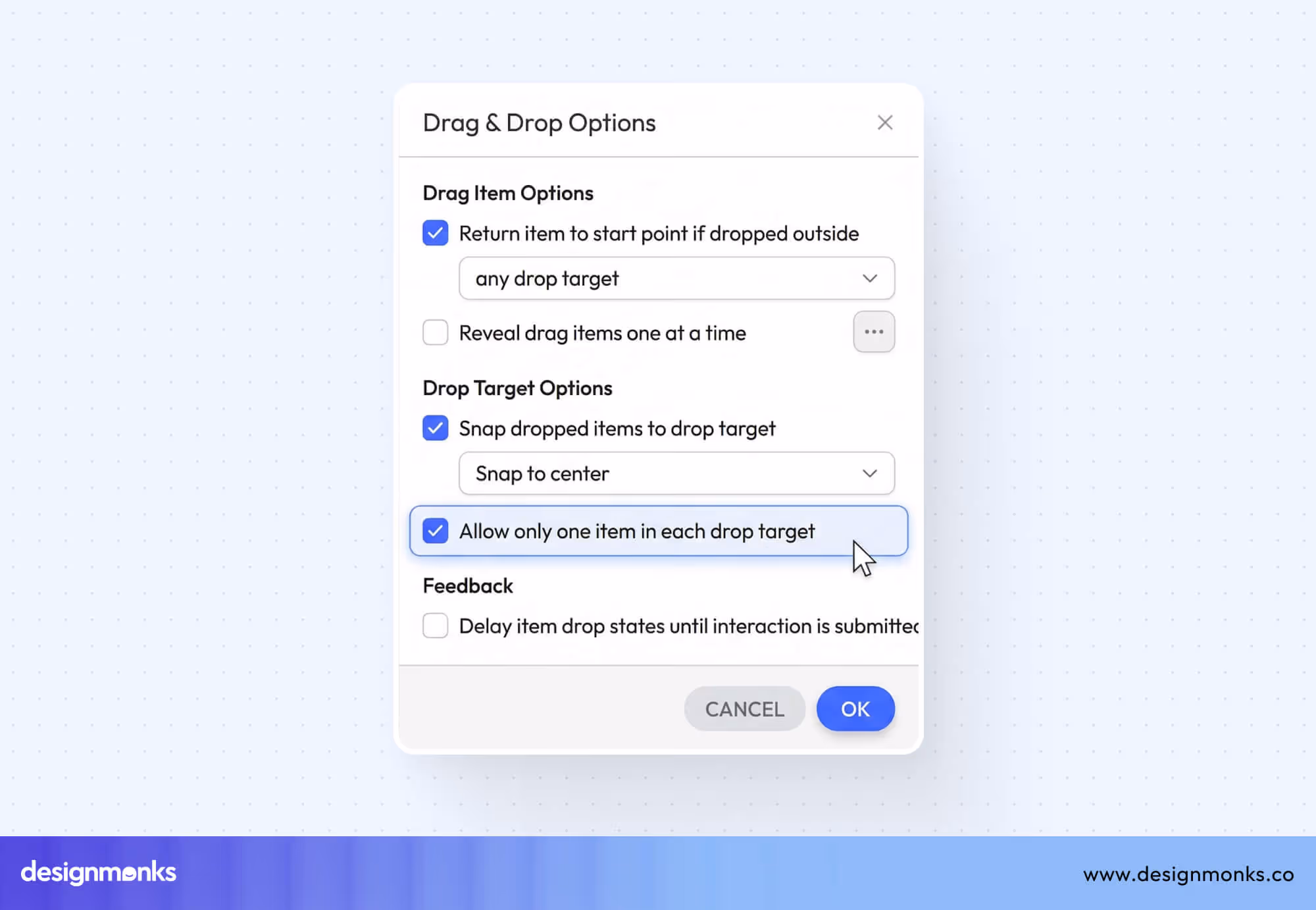
4. Snapping and Alignment
Snapping ensures that items automatically align with grids, guides, or other elements in the interface. This feature is especially useful in design tools and layout editors, where precision is important. Snapping makes the layout neat and organized and reduces errors caused by placing items slightly off position.
These four mechanics, drag source, drop target, feedback, and snapping, are the foundation of drag-and-drop interaction. They are essential concepts in interaction design and are widely used in modern UI patterns to create clear, intuitive, and effective interfaces.
Proper implementation ensures that users can interact with digital elements efficiently and without frustration.
Drag and Drop UI vs Traditional Interface Design
To understand how user experience changes between old and modern interface systems, it’s important to look at how users interact with them in real situations. Here’s a simple comparison to understand how drag-and-drop interfaces differ from traditional interface design:
Common Drag and Drop UI Design Patterns
Drag-and-drop interactions are used in many types of applications today. Different products use this interaction in different ways based on their purpose. Below are the most common patterns used in modern digital products:
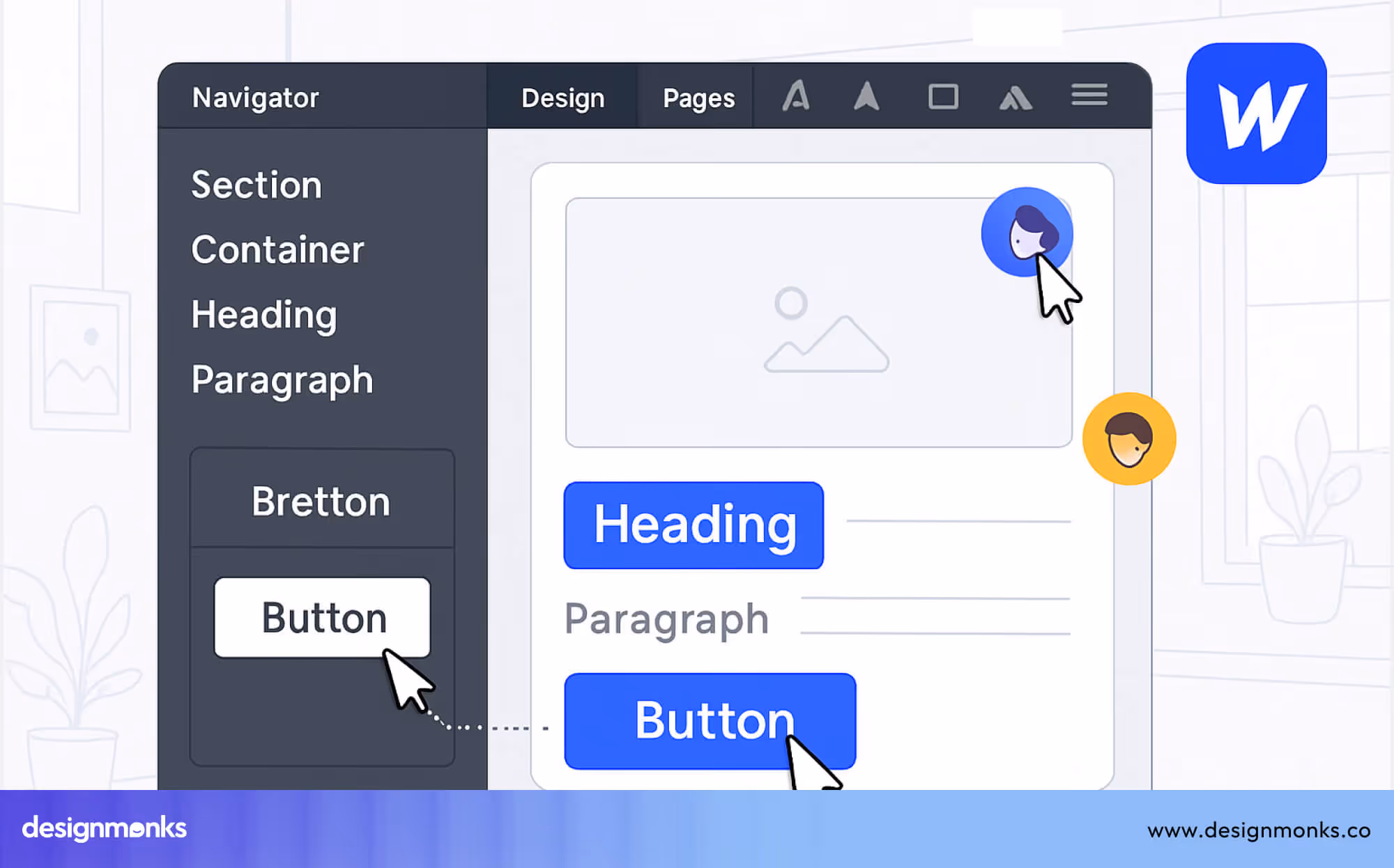
Drag and Drop Builders
Drag and drop builders are tools that let users create layouts by placing elements directly on a page. Instead of writing code, users can select components like text blocks, images, buttons, or sections and move them into position.
These builders are mainly used for creating websites, landing pages, and applications. Users can control structure, spacing, and content visually, which makes the process faster and easier, especially for beginners.
Platforms like Webflow use drag-and-drop to let users build full websites with precise control. Users can drag elements into sections, adjust layouts, and style components while still having access to advanced settings like spacing, grids, and responsive design.
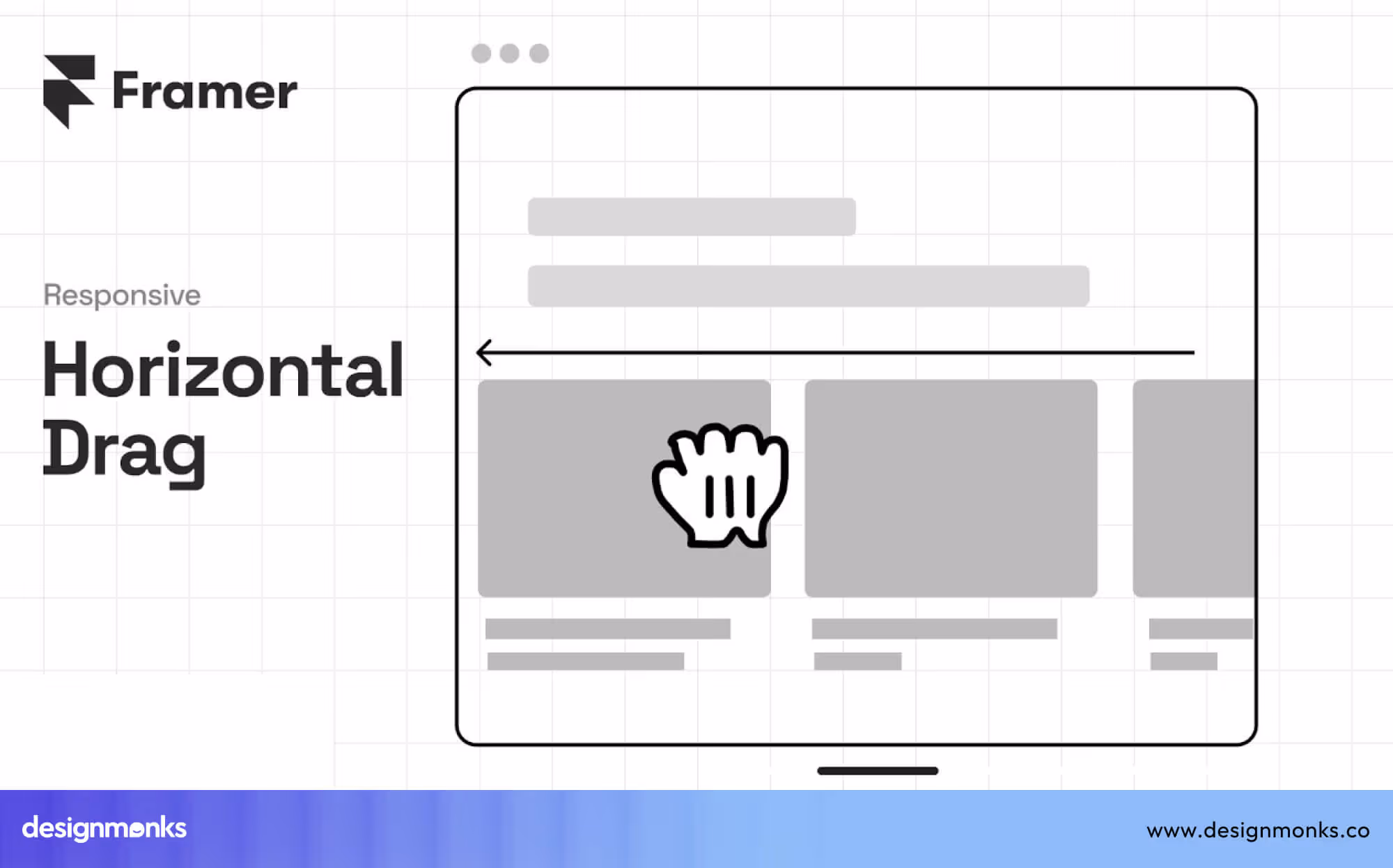
Framer uses drag-and-drop in a more flexible way. Users can place elements freely on the canvas, rearrange layouts, and create interactive designs. It also allows users to combine visual editing with animations and responsive behavior. This makes it useful for both design and development.
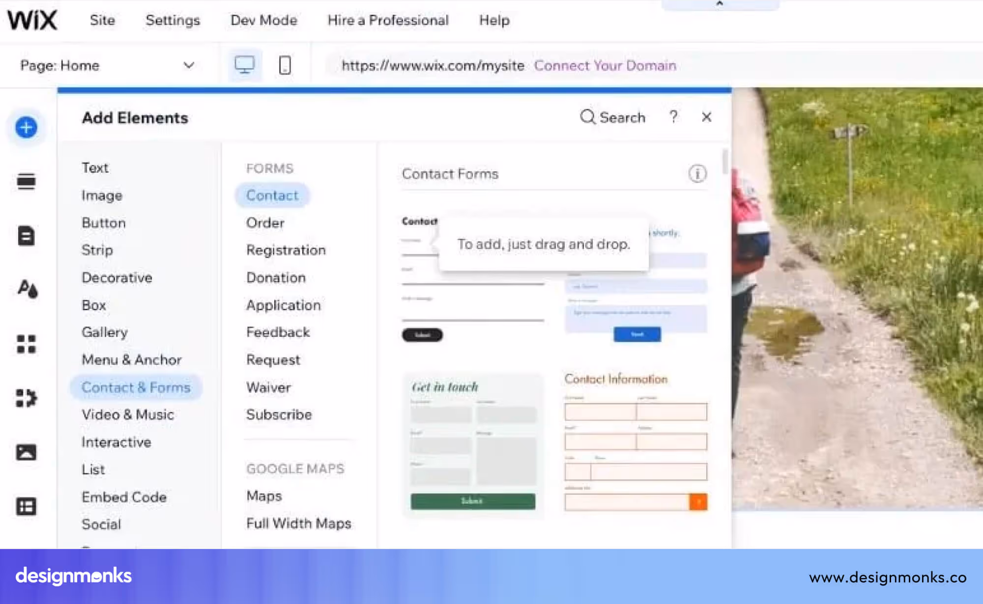
Wix focuses on simplicity. Users can drag elements anywhere on the page without a strict structure. This makes it easy for beginners to quickly build and customize websites without worrying about technical details.
These platforms are often called no-code builders or visual builders because they allow users to create complete designs without programming. Drag-and-drop interaction is the main reason these tools feel easy to use while still offering powerful features.
This pattern is widely used because it gives users full control over layout and content, while keeping the process simple and accessible.
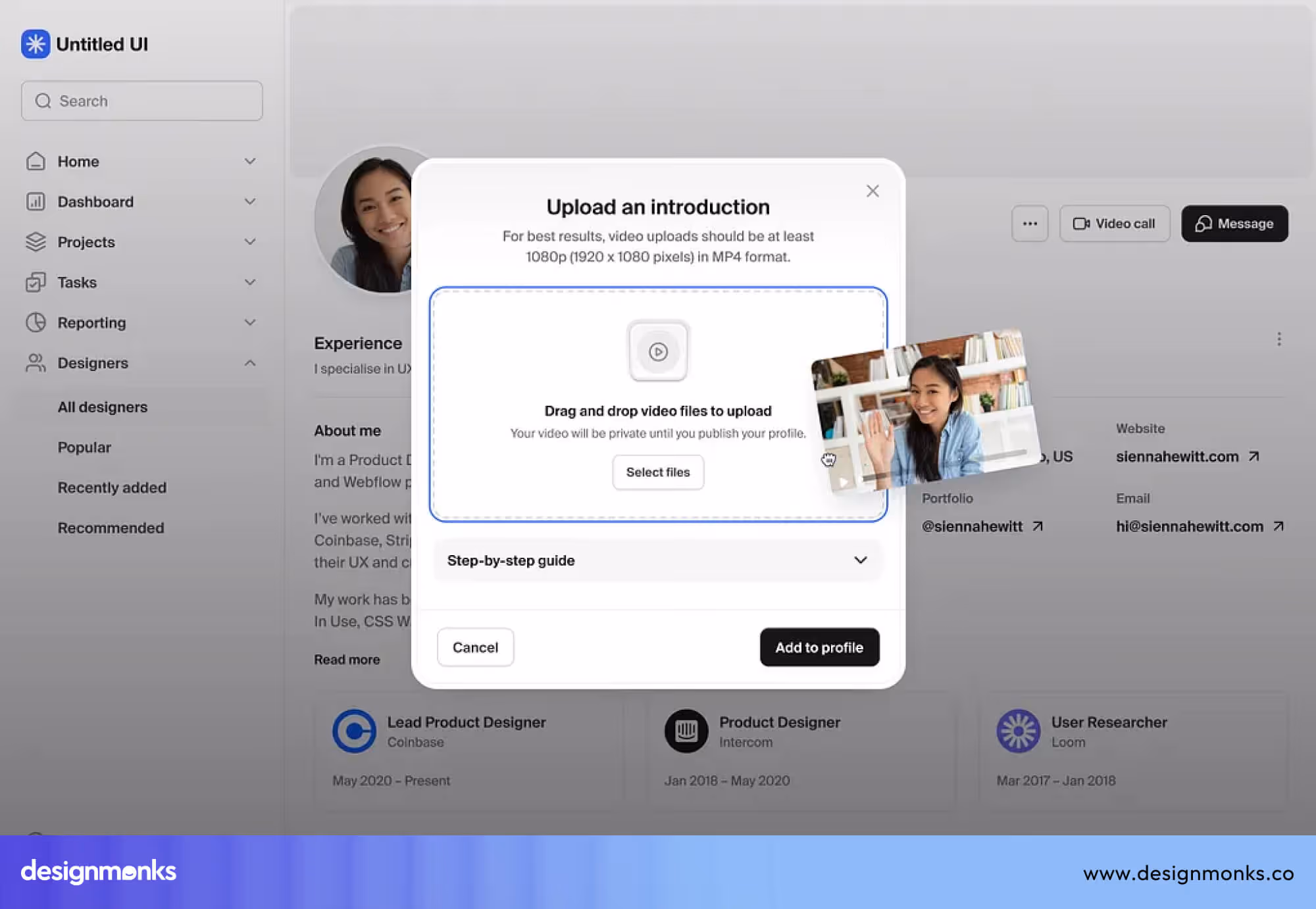
File Upload Drag and Drop
File upload drag and drop allows users to upload files by dragging them into a specific area on the screen. Instead of clicking an upload button, opening a file window, and selecting files, users can move files directly from their device and drop them into the interface.
In most interfaces, there is a visible upload area or drop zone. When users drag a file over this area, the system usually highlights it or changes its appearance. This visual feedback shows that the file can be dropped there. Once the user releases the file, the upload process starts automatically.
This pattern is widely used in storage platforms and SaaS applications because it reduces the number of steps required. It also makes the process faster, especially when users need to upload multiple files at once.
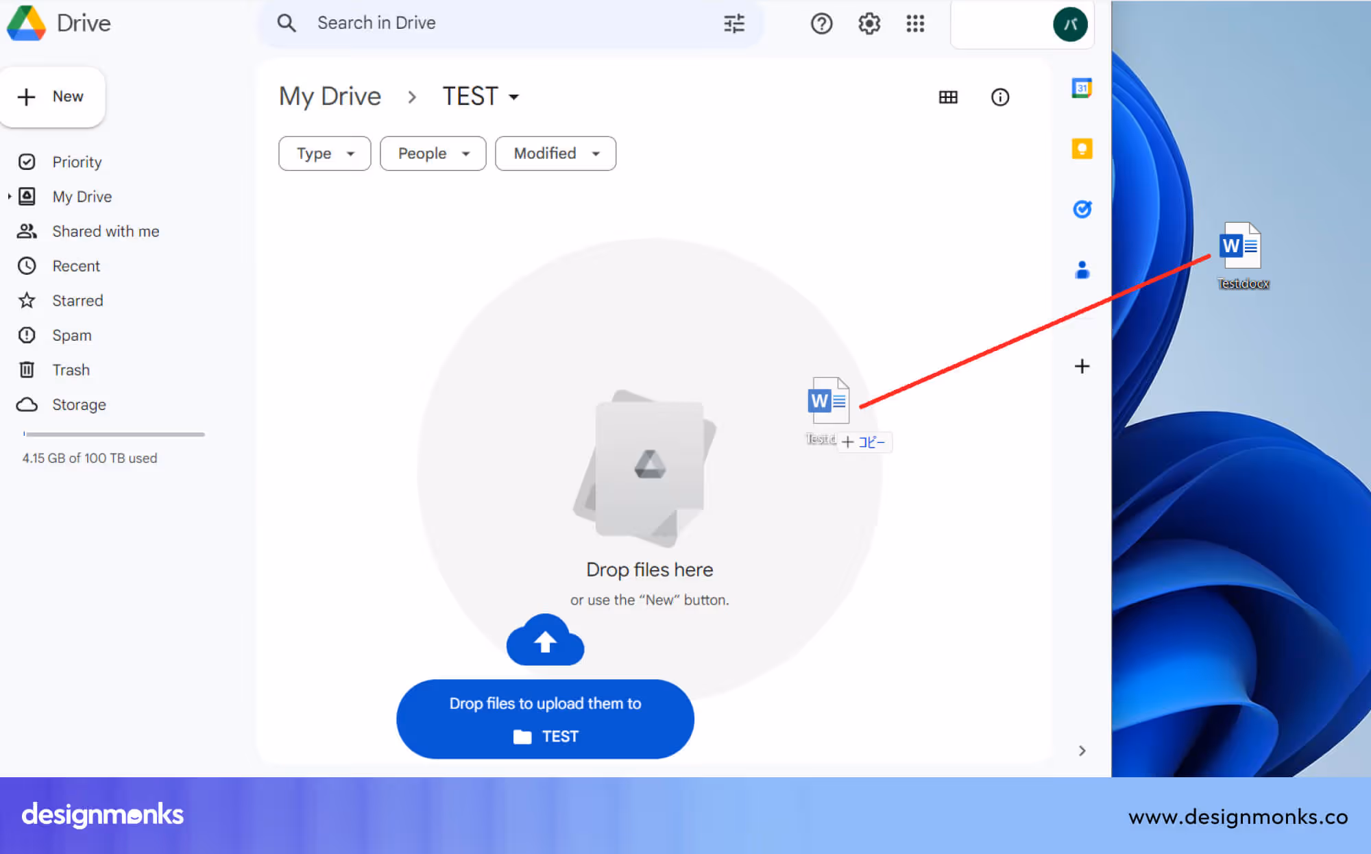
For example, in Google Drive, users can drag files or entire folders directly into the browser. The system immediately starts uploading and shows progress indicators, so users know the status of each file. It also organizes the files into the current folder automatically.
In Dropbox, drag-and-drop upload works in a similar way. Users can drop files into folders, and the platform syncs them across devices. It also handles background uploads, so users can continue working while files are being uploaded.
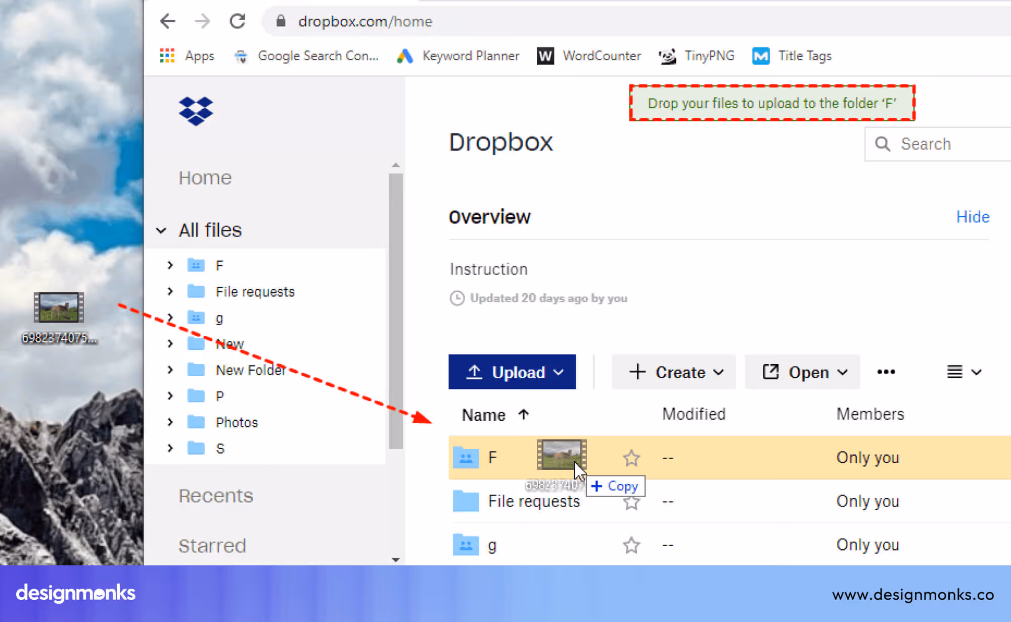
Another important part of this pattern is error handling and feedback. If a file is too large or not supported, the system should show a clear message. Good implementations also show upload progress, success states, and allow users to cancel or retry uploads.
This pattern improves usability because it simplifies a frequent task, reduces effort, and gives users a faster and more direct way to manage files.
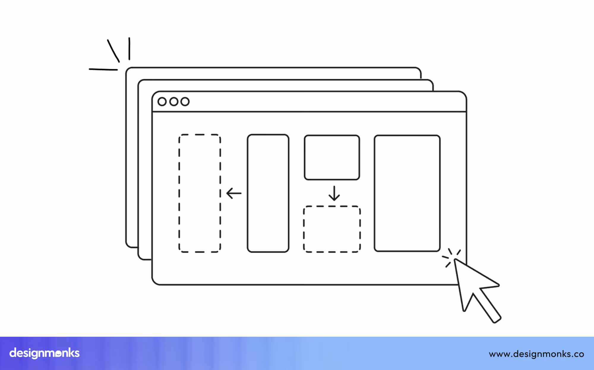
Layout Editors
Layout editors allow users to arrange visual elements such as text, images, shapes, and components within a design. Users can select elements and move them freely on a canvas. They can also resize, align, and organize elements based on their needs.
This pattern is mainly used in design tools where layout and positioning are important. It gives users full control over how content is placed and structured.
Figma and Canva depend heavily on drag-and-drop interactions to support fast and efficient design workflows. This pattern is important because it allows precise control over layout while keeping the process simple and visual.
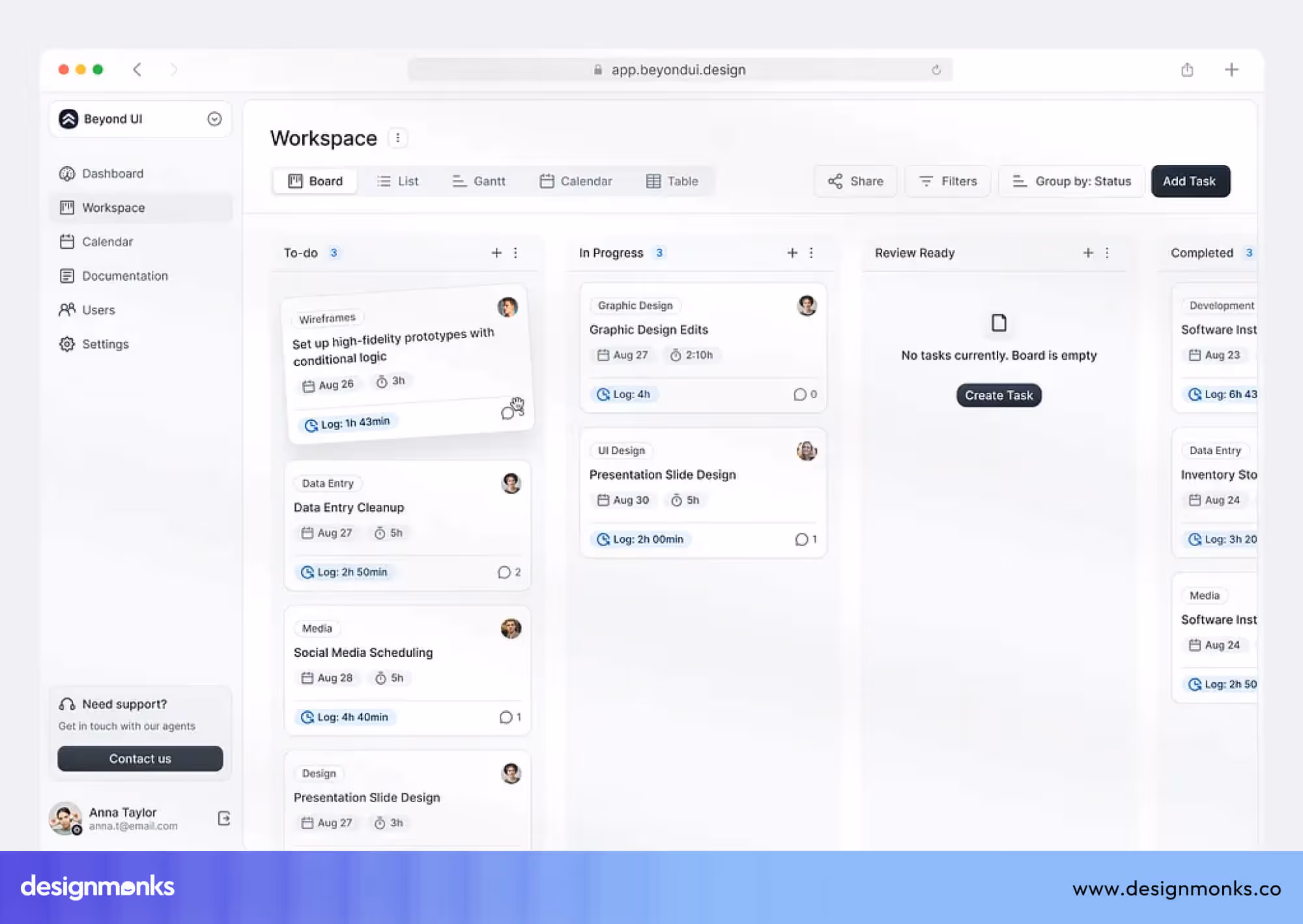
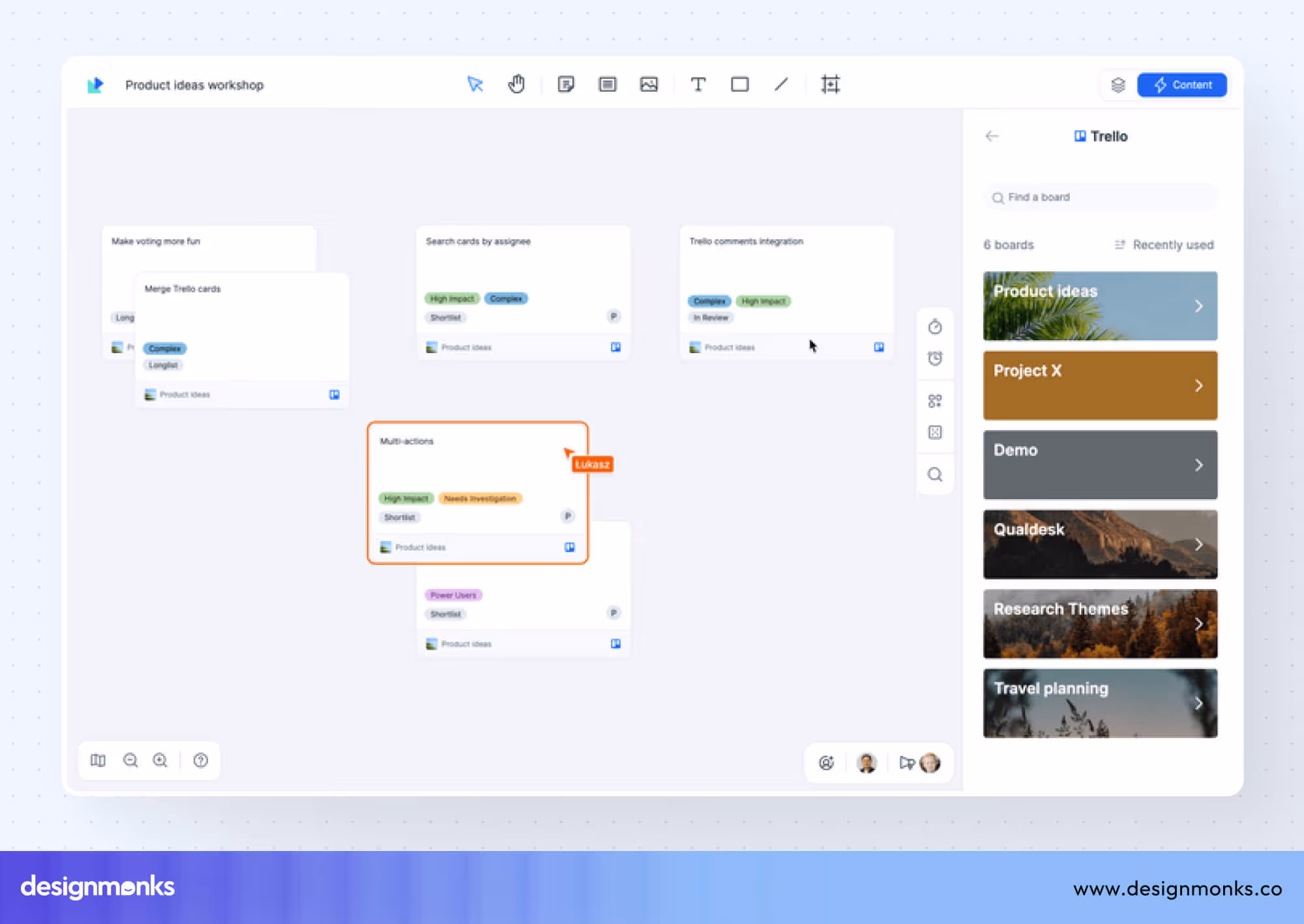
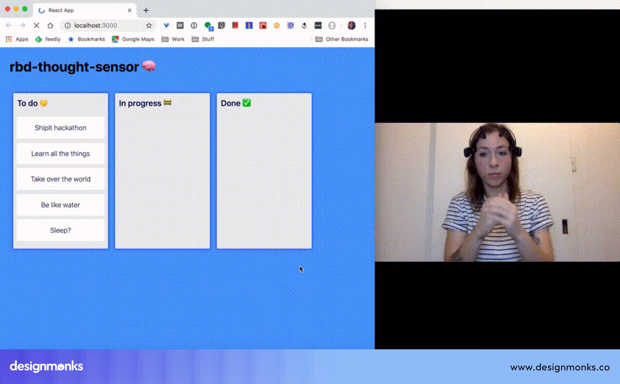
Kanban Boards
Kanban boards use drag-and-drop interaction to manage tasks and workflows. Tasks are usually displayed as cards, and users can move these cards between different columns that represent stages of work, such as “To Do,” “In Progress,” and “Done.”
This pattern helps users organize work visually and track progress clearly. It is especially useful for teams and project management.
In tools like Trello, users can create cards, add descriptions, attach files, and assign team members. When a task moves forward, users simply drag the card to the next column. The system keeps everything updated in real time.
Jira uses a similar approach, but it is often used for software development teams. Teams can move tasks across stages like backlog, development, testing, and completion. It also connects drag-and-drop actions with workflows, permissions, and automation rules.
Kanban boards support prioritization and organization. Users can reorder cards within a column to set priority. They can group tasks, filter them, and manage workloads visually. This pattern is effective because it makes workflows clear, reduces confusion, and allows teams to manage tasks quickly without complex steps.
Key Principles for Designing Drag and Drop Interfaces
Designing drag-and-drop interfaces is not just about moving elements. It is about making interactions clear, predictable, and easy to control. These principles help improve usability and reduce user mistakes in real products:
Clear Visual Feedback
Clear visual feedback means the system must always show what is happening during drag-and-drop actions. When a user picks up an element, the interface should respond instantly. This includes hover states, highlights, shadows, and visible drop zones.
%2C%20On%20Drag%20(right).avif)
When an item is dragged over a valid area, that area should change visually. If it is not valid, the system should also indicate it clearly. This helps users understand where to drop items and reduces confusion during interactions.
Predictable Behavior
Predictable behavior means drag-and-drop actions should always work in a consistent way across the system. If a user moves an item, it should behave the same way in all sections.
Sudden changes in movement or rules can confuse users and slow down tasks. When behavior is predictable, users feel more confident because they know what will happen before they perform an action.
Snap and Alignment Systems
Snap and alignment systems help keep layouts structured and visually clean. When users move elements, the system automatically aligns them with grids, guides, or nearby objects. This prevents elements from being placed unevenly or misaligned.
Grid snapping is widely used in design tools and layout editors to maintain accuracy. This feature helps users create balanced layouts easily, even if they do not have design experience or technical skills in spacing and alignment.
Undo and Error Prevention
Undo and error prevention help users fix mistakes easily while using drag-and-drop systems. Users often move items by mistake, so they need a way to reverse actions quickly. Undo and redo options allow users to go back or forward in their actions without losing work.
Some systems also prevent errors by blocking invalid drop areas or showing warnings. These features follow usability principles defined by Jakob Nielsen. They improve control, reduce frustration, and make users feel safe while interacting.
How to Design a Drag and Drop UI (Step-by-Step)
Designing a drag-and-drop interface requires a clear and structured workflow. Each step focuses on making the interaction easy to understand for users:
Step 1: Define Draggable Elements
Define draggable elements by deciding which items users can move. These can include cards, files, components, or content blocks.
Not every element should be draggable. Clearly identifying these elements helps users understand what actions are possible and avoids confusion during interaction.
Step 2: Define Drop Targets
Define drop targets by specifying where elements can be placed. These areas should be clearly visible or indicated during interaction.

Users shouldn't have to guess where items can go. Clear drop zones improve accuracy and make the interface easier to use.
Step 3: Provide Visual Feedback
Provide visual feedback to guide users while dragging elements. Use highlights, animations, or shadows to show movement and valid drop areas. This helps users understand what is happening in real time and reduces mistakes during interaction.
Step 4: Implement Constraints
Implement constraints to control how elements can be moved. For example, restrict movement within a container or align items to a grid. Constraints prevent errors and keep layouts organized, especially in complex interfaces.
Step 5: Test Usability
Test usability by observing real users interacting with the interface. Identify where users struggle or get confused. Use feedback to improve the design and make interactions smoother and more intuitive.
Drag and Drop UI Accessibility Considerations
While drag-and-drop interfaces are powerful, they can create accessibility challenges if not designed properly. Good design should ensure all users can interact with the system easily, regardless of their abilities:
Keyboard Alternatives
Keyboard alternatives allow users to move elements without a mouse. This can include using arrow keys to move items or keyboard shortcuts to select and place elements.
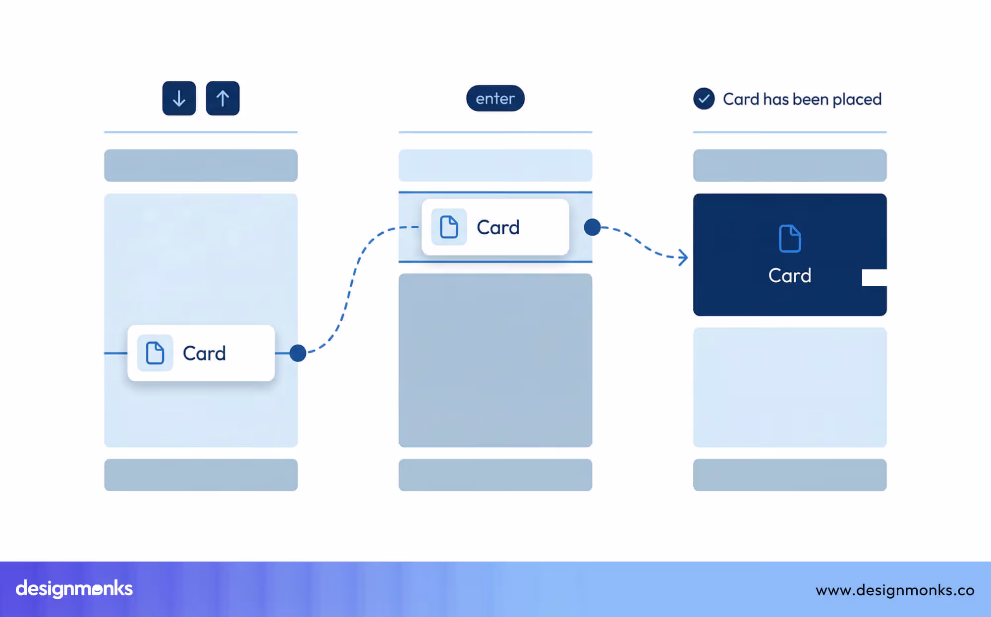
This is important for users with motor disabilities. It also improves usability for power users who prefer keyboards.
Screen Reader Compatibility
Screen reader compatibility means draggable elements must be properly labeled so assistive tools can describe them. Users should know what the element is, where it can be moved, and what action will happen.
Without this, users relying on screen readers cannot understand or use the interface effectively, which creates a major usability barrier.
Touch Interaction
Touch interaction ensures drag-and-drop works well on mobile devices. Elements should be large and easy to move. Feedback should be clear since hover states are not available on touch screens.
Spacing should prevent accidental actions. Gestures should be simple and responsive. This ensures users can interact smoothly on phones and tablets.
Drag and Drop UI Design Examples
Many modern tools rely heavily on drag-and-drop UI design to make complex tasks easier. Instead of using commands or manual setup, users can interact with elements directly. This reduces effort, saves time, and improves overall usability.
These tools use drag-and-drop as a core interaction, not just an extra feature. It allows users to control layouts, manage content, and complete tasks in a more direct way.
Design Tools
Design tools use drag-and-drop to help users create layouts, visuals, and interfaces quickly. Figma, Canva, and Framer use drag-and-drop to build layouts and design interfaces. Users can move elements on a canvas easily. They can resize, align, and adjust spacing without complex steps.
These tools also include grids, guides, and reusable components for better structure. Users can quickly test ideas and make changes. This makes the design process faster, more flexible, and easier for beginners as well as professionals working on visual projects.
Website Builders
Webflow, Wix, and Squarespace allow users to build websites by dragging elements into place. Users can place elements into sections and arrange page layouts visually. They can edit text, images, and styles without coding.

These platforms also provide templates and responsive design support. This helps websites work well on all devices. Users can build and manage websites quickly.
As a result, these tools have become very useful for beginners, businesses, and anyone who wants a simple website creation process.
Productivity Tools
Notion and Trello use drag-and-drop to organize tasks and information. Users can move cards, reorder lists, and structure content easily. They can update progress with simple actions instead of complex steps.

These tools also support collaboration, allowing teams to work together in real time. Changes appear instantly for all users. This helps improve workflow clarity, task tracking, and overall productivity for individuals and teams managing daily work and projects.
Common Drag and Drop UX Mistakes
Even well-designed drag-and-drop interfaces can fail if common issues are ignored. These mistakes can confuse users and reduce usability.
- Unclear Drop Zones: When drop areas are not clearly visible, users do not know where elements can be placed. This leads to confusion and errors.
- Lack of Visual Feedback: Without feedback, users cannot understand what is happening during interaction. No highlights or movement cues make the interface feel unresponsive.
- Accidental Movement of Elements: If elements are too easy to drag, users may move them by mistake. This often happens while clicking or scrolling.
- Poor Mobile Support: Drag-and-drop can be difficult on mobile devices if not designed properly. Small touch targets and a lack of feedback can cause serious issues.
- Overly Complex Interactions: Too many rules or hidden behaviors make drag-and-drop hard to use. Users may get confused or frustrated.
Future of Drag and Drop UI Design
The future of drag-and-drop UI design is rapidly changing as new technologies reshape how users build and interact with digital products. What was once a simple interface feature is now becoming a core part of modern design systems, making creation faster, smarter, and more accessible:
AI-Assisted Design
AI is redefining how drag-and-drop works. Instead of building everything manually, AI design tools now suggest layouts, structure, and spacing automatically. With innovations from OpenAI and tools like Figma AI, users can design faster with less effort and better results.
Spatial and 3D Interfaces
The next stage of drag-and-drop is spatial design. Users will no longer be limited to 2D screens. With AR and VR, interfaces will allow objects to be placed, moved, and edited in 3D environments for more immersive experiences.
Growth of No-Code Platforms
The rise of no-code platforms is making drag-and-drop more important than ever. Users can now build full websites, apps, and digital products without coding. Drag-and-drop is the key interaction powering this shift toward fast and scalable digital creation.
Conclusion
Drag and drop UI design has become a cornerstone of modern digital experiences. By enabling direct manipulation, it simplifies complex tasks, improves usability, and makes powerful tools accessible to a wider audience.
From website builders to productivity tools, this interaction model continues to shape how users interact with technology. By following best practices and avoiding common mistakes, designers can create intuitive and engaging interfaces that stand the test of time.

.avif)
.avif)
.avif)
.avif)


.avif)
.avif)
.avif)
.avif)


.avif)
