
.svg)


Key Takeaways
- Strong app screenshots influence install decisions before users read any app details.
- Clear, focused layouts help users quickly understand features and real benefits.
- Different screenshot styles work best when matched to each app’s purpose.
- Using templates and tools speeds up creating polished, store-ready screenshot designs.
- Modern screenshot trends boost engagement, but must fit each app’s identity.
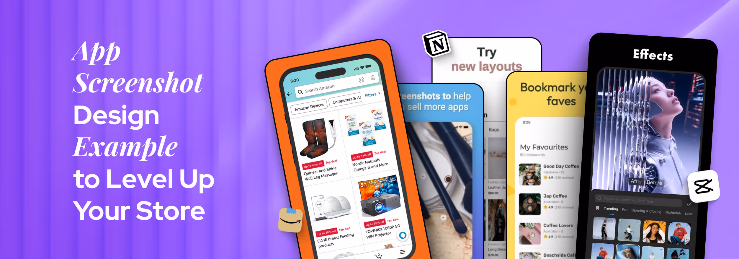
Your app screenshots are the first thing people notice before they read a single word about your app. They’re not just pictures; they decide whether someone installs your app or scrolls past it.
Clear and eye-catching screenshots show what your app does and why it matters. If they look cluttered or confusing, users won’t bother exploring further. Good screenshots build trust and drive downloads by giving users a quick and strong reason to click install.
That’s why checking great app screenshot designs for inspiration is so important. They don’t just give you ideas; they help you create visuals that convince users to download your app confidently.
Today, I'll show you some inspiring app screenshot design examples that will guide you in creating screenshots that stand out and attract more users.
Types of App Screenshots That Work Well
Not all app screenshots are the same, and they shouldn’t be. Different styles work for different apps. Some focus on features, some highlight benefits, while others tell a story. So, it’s important to choose a type that fits your app and connects with your users.
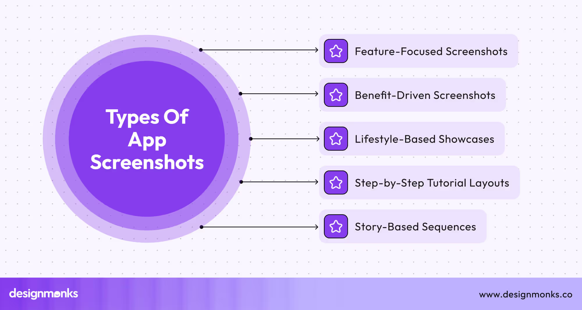
Let’s check out the common types that work well:
Feature-Focused Screenshots
These screenshots show what your app can do. For example, if it’s a photo editing app, one screenshot could show filters, another could show cropping tools. Each screen focuses on one feature. Keep the background clean so the feature stands out.
Benefit-Driven Captions
Here, the image shows the app, but the text explains why it’s helpful. They are like “Track your sleep easily” or “Save more with one tap.” This style works well for people who want to know “what’s in it for me?”
Lifestyle-Based Showcases
This type usually shows the app being used in real-life situations. For example, a fitness app might show someone working out with the app open. It helps users imagine themselves using the app. It adds emotion and builds trust.
Step-by-Step Tutorial Layouts
This layout walks users through a process.
- Slide 1: Open the app
- Slide 2: Choose a task
- Slide 3: Get the result.
It’s great for apps that have a clear flow. It also reduces fear by showing how easy it is to use.
Animated or Story-Based Sequences
Some apps use short and fun stories in their screenshots. Each slide connects with the next. It could be a cartoon or a user journey that simply makes users swipe through all screenshots, which helps keep their interest.
App Screenshot Design Example (With Real Examples)
When someone lands on your app page, they only take a few seconds to decide if they’ll scroll or swipe, let alone download. That’s where strong screenshot design helps. But how do you know what “strong” looks like? The best way to learn is by looking at real examples.
Productivity & Tools Apps
These apps help users stay organized, so their screenshots need to feel just as organized. The design is clean, with lots of white space. The focus is on features that make life easier, like task lists, calendars, or project boards.
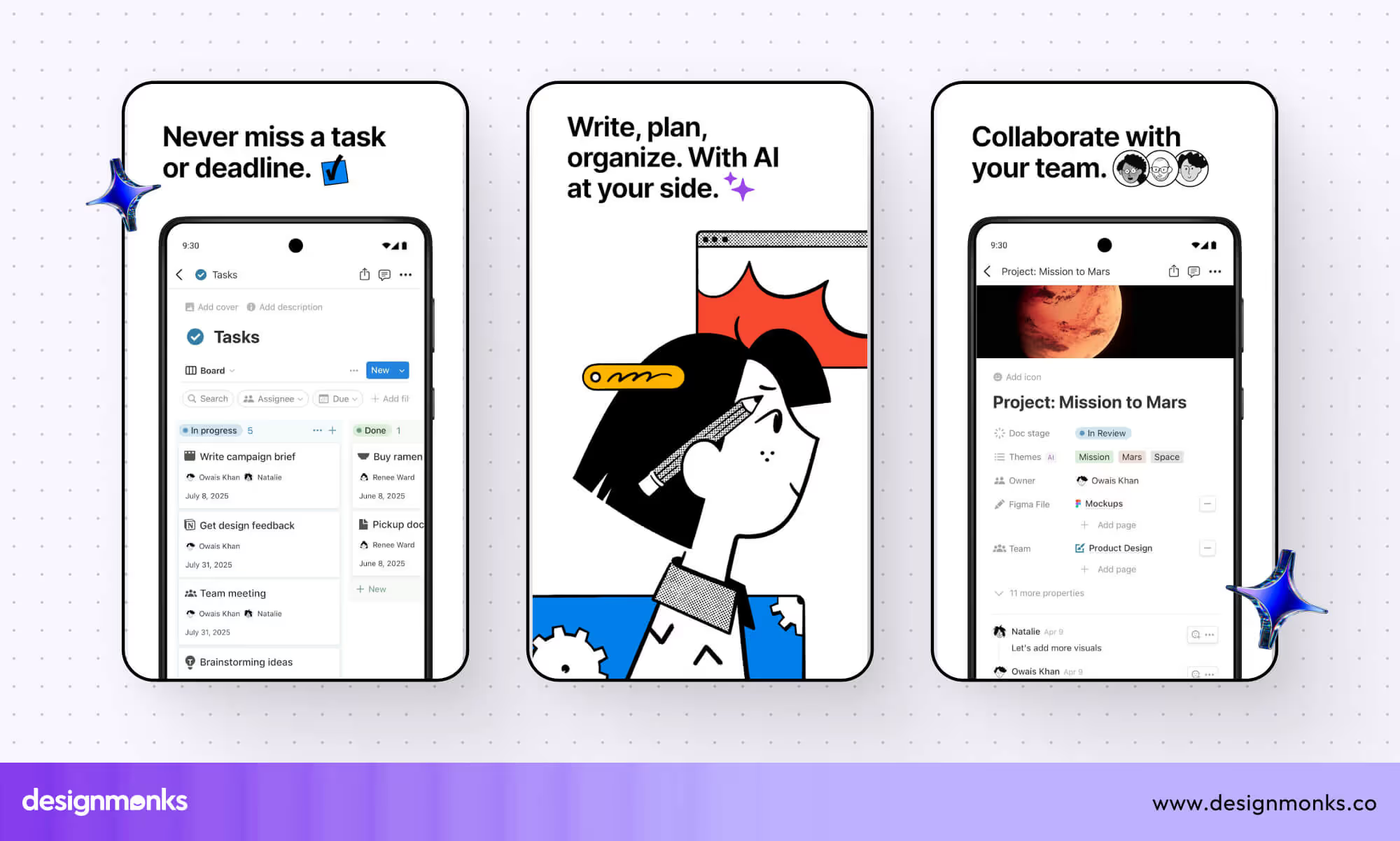
Example: Notion, Todoist, Trello
These apps show one tool per screen, like a drag-and-drop board or daily checklist. The captions are simple and clear, like “Plan your week in one place.” No clutter, no distractions, just pure focus.
Wellness & Fitness Apps
These apps usually aim to calm, inspire, or energize. The screenshots reflect this with soft colors, gradients, and emotional visuals. You’ll often see peaceful faces, soft lighting, or motivational quotes.
Example: Calm, Headspace, Fitbit
Calm uses images of peaceful nature and captions like “Sleep better, feel better.” Fitbit helps people track their progress while working out. Headspace uses soft illustrations to reduce stress just by looking at the screen. It’s all about emotions.
E-commerce Apps
Selling products means showing products. These screenshots highlight real items and how easy it is to browse, search, and buy. The layout is usually image-heavy with minimal text.
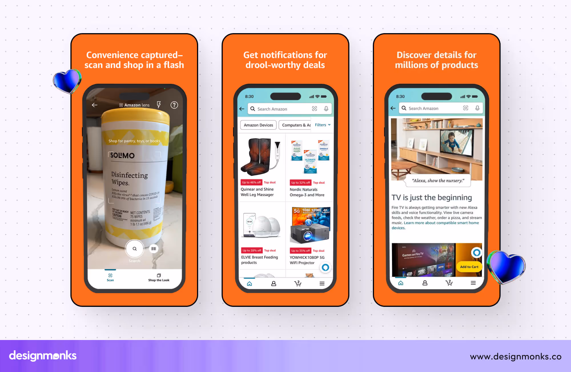
Example: Amazon, Etsy, Zara
Amazon keeps it practical, showing how you can search, filter, and check out fast. Etsy focuses on handmade product photos with cozy, warm colors. Zara keeps things stylish and bold with fashion-forward layouts. The goal is clear: make users want to shop.
Game Apps
Games need to grab attention instantly. These screenshots are usually loud and fun, with bright colors, cool characters, and action scenes. They often show what playing the game actually feels like.
Example: Clash Royale, Monument Valley
Clash Royale shows battles, rewards, and main characters in the middle of action. Monument Valley uses beautiful, surreal designs to show off the game world. These screenshots are built to wow, and they do.
Photo/Video Editing Apps
People want to know how their photos will look after using the app. So these screenshots are often used before and after shots or real user images. Simple icons and short labels explain each tool.
CapCut App screenshot
Example: VSCO, CapCut, Lensa
VSCO shows color filters with clear differences between original and edited photos. CapCut uses real clips with labels like “Cut,” “Add Music,” or “Subtitles.” Lensa mixes fun effects with clean design, making editing feel quick and easy.
Fintech Apps
Money apps need to look clean and trustworthy. Screenshots often show charts, balances, or payment steps. The colors are calm (like blue or white), and the text focuses on clarity.
Example: Revolut, Robinhood, Wise
Revolut shows how to send money or track spending in a simple and modern layout. Robinhood shows clean graphs and investing steps without clutter. Wise highlights low fees and fast transfers using easy numbers and calm tones.
Unique App Screenshot Templates
If you’re short on time or design skills, app screenshot templates can be a lifesaver. These ready-made layouts make things easier for you to learn design app screenshots.
Whether you're launching a game, a productivity app, or a wellness platform, the right template can make your app stand out in the crowded App Store or Play Store. Here are six unique templates worth checking out:
1. GlowFit Showcase
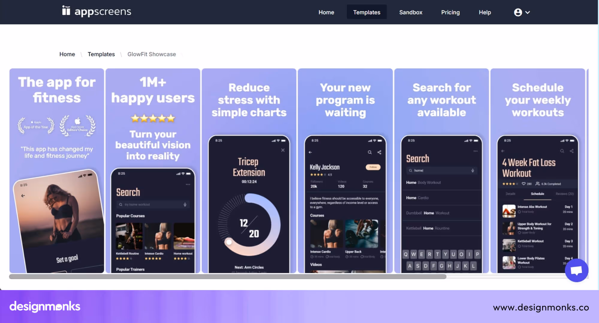
GlowFit makes screenshot design quick and painless. It supports different devices and screen sizes, so you don’t have to make a new design for each one. You can also create versions for other languages easily, helping you reach more people.
This template is great if you want a clean, professional look that meets platform rules and saves time.
2. Bubble Besties
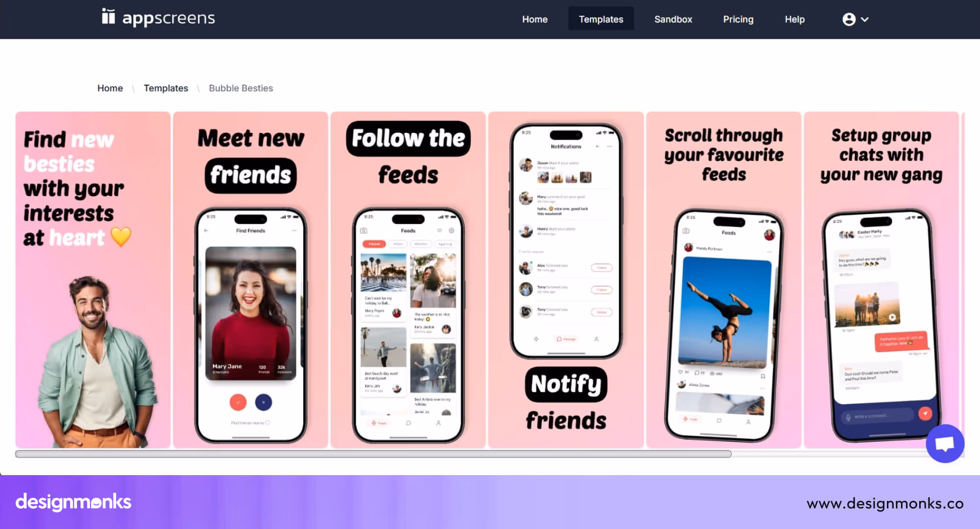
Designed for fun and colorful apps, Bubble Besties has playful layouts that still feel neat and user-friendly. It’s perfect for casual games or apps with a friendly tone. The flexible design supports different orientations and screen sizes. It’s easy to build a full set of screenshots in minutes with this template.
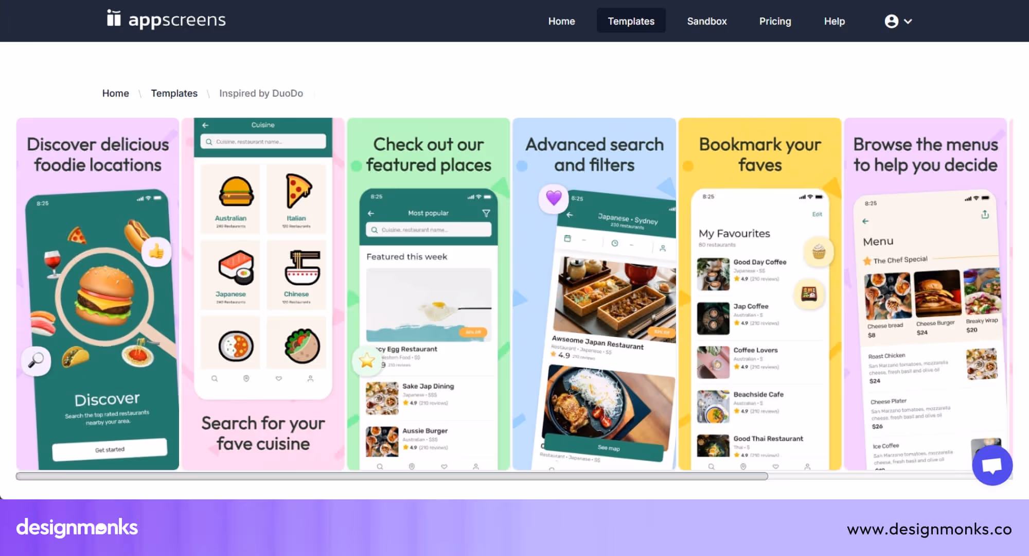
3. Inspired by DuoDo
This template is inspired by DouDo. It blends minimal style with bold captions to help your main features shine. It keeps your app screenshots focused and clean while still looking fresh.
It’s built for busy creators who want fast results. With localization options and multi-device support, it’s both smart and simple to use.
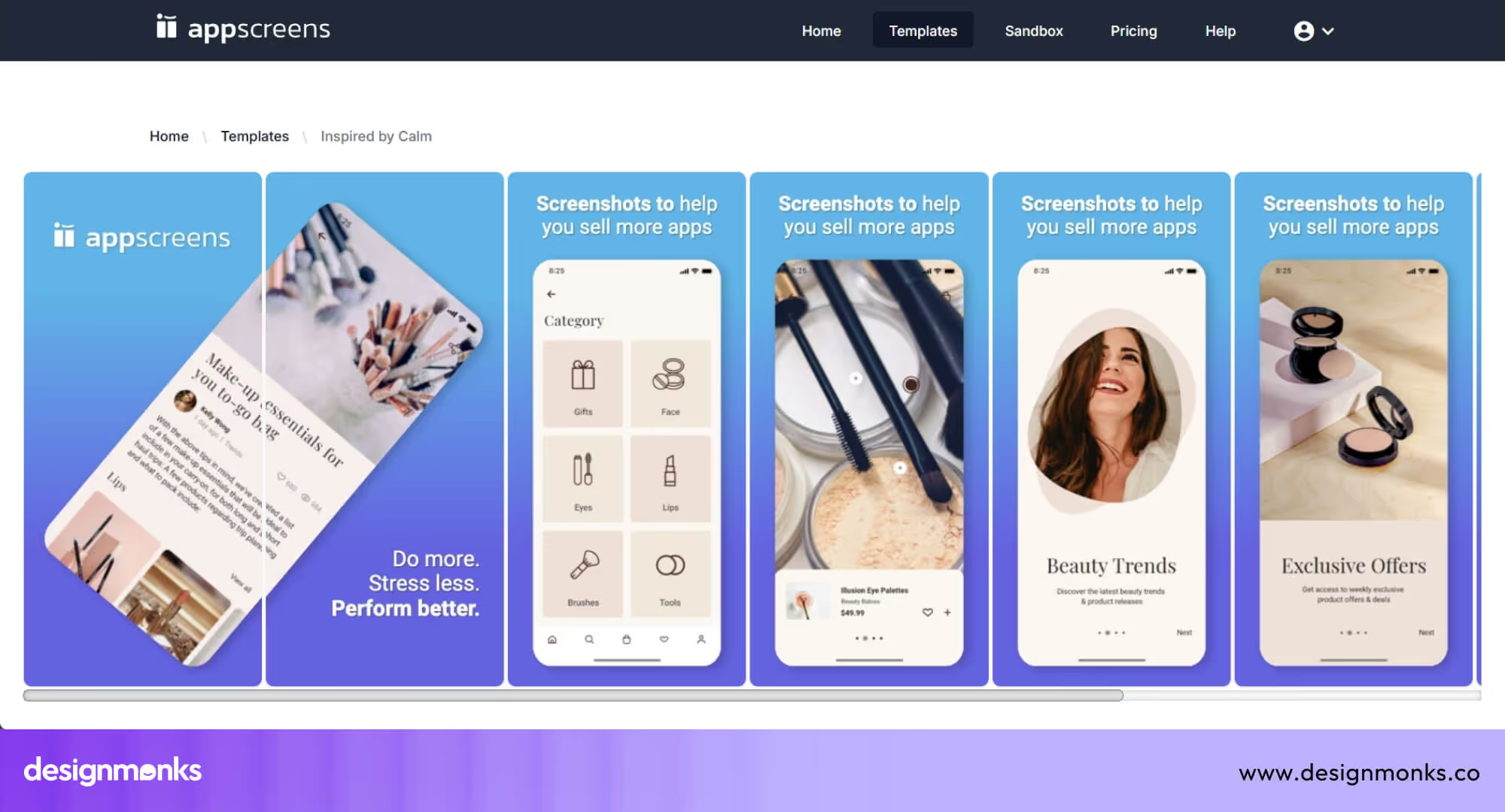
4. Inspired by Calm
This one is inspired by Calm, features soft gradients and balanced layouts, ideal for meditation or self-care apps. Screens are shown in both vertical and rotated angles, giving a peaceful, modern vibe.
Also, in this template, the text is easy to read, and the soft colors help create a calming look. It’s perfect if you want your app to feel soothing and stylish.
5. Inspired by Duolingo
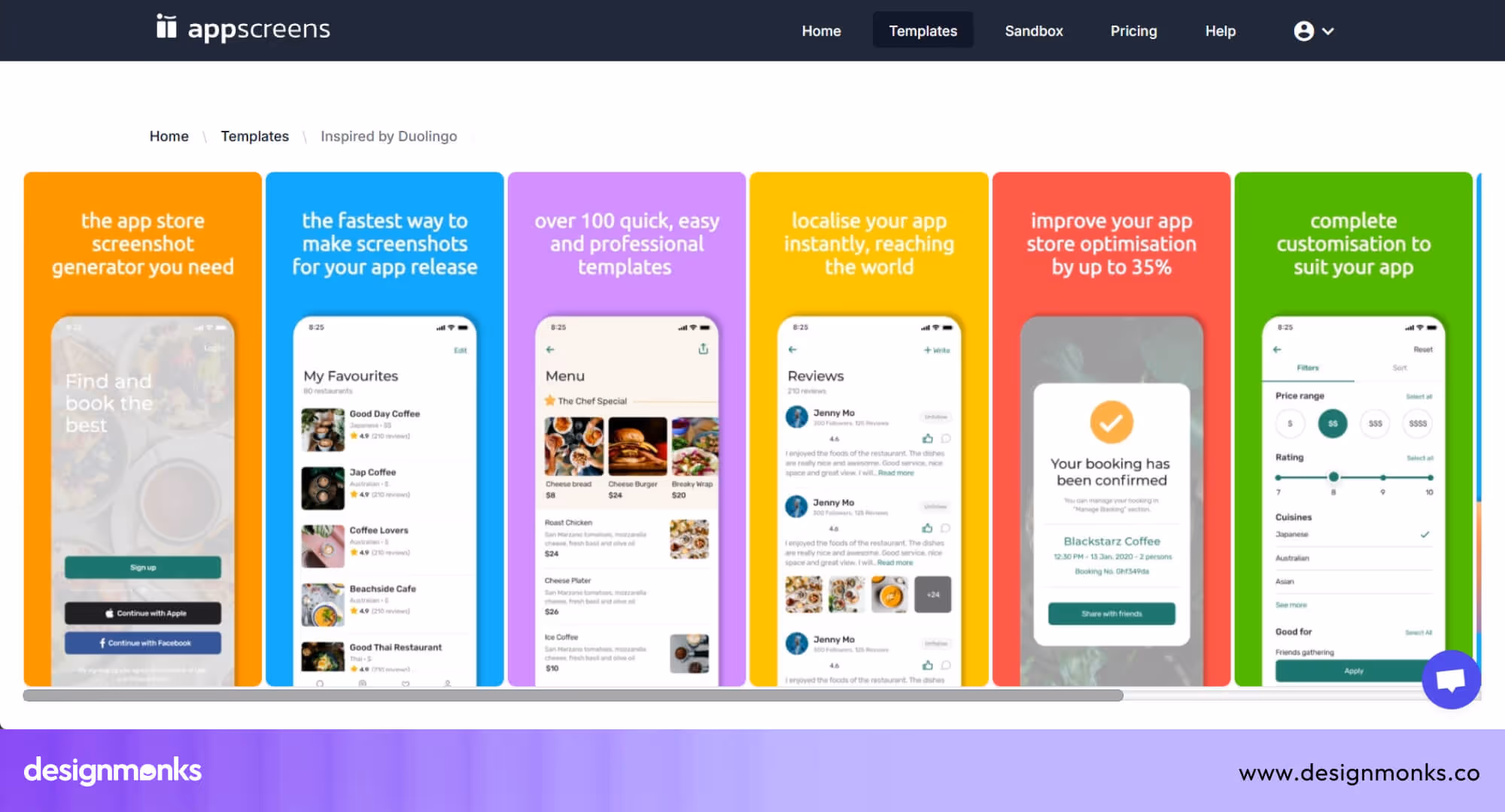
This template is inspired by Duolingo. It’s energetic and full of character, just like the popular learning app it’s based on. Bold headings and colorful visuals help guide users through your app’s features.
If your app is interactive, educational, or playful, this layout adds a lively touch while staying organized.
6. Inspired by Pinterest
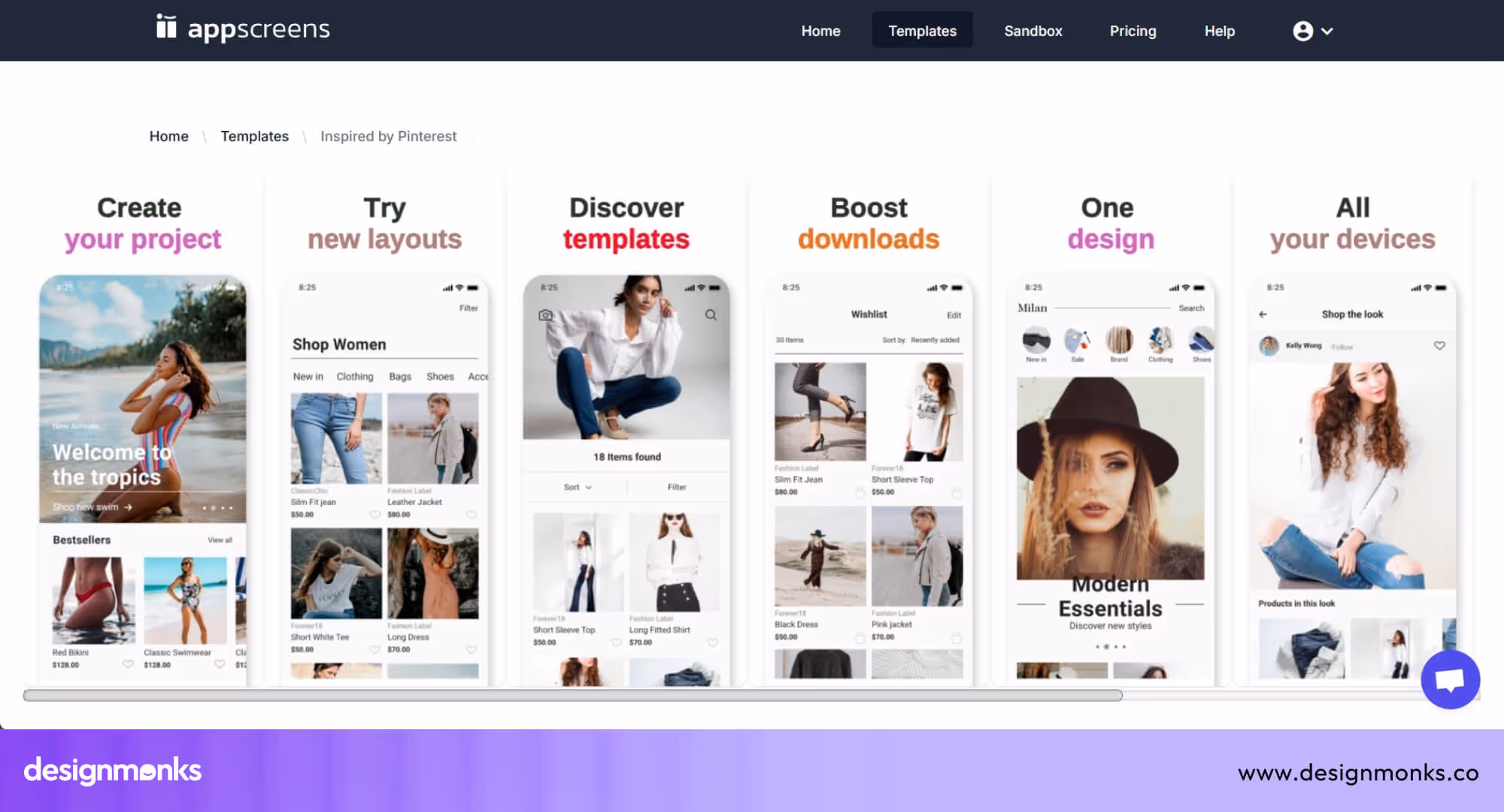
A clean and classy layout that works best for content-heavy apps. This one is inspired by Pinterest. It allows your visuals to do most of the talking, making it ideal for image-sharing or creative tools.
Its modern design gives a polished look, while smart positioning makes it easy for users to follow the story of your app.
Tools to Design App Screenshots Easily
Designing eye-catching app screenshots doesn’t have to be hard. Today, many app screenshot design tools make it simple to create clean, professional, and store-ready screenshots, no advanced skills needed. Whether you're a designer or a solo app creator, these tools can save you hours and help your app look its best.
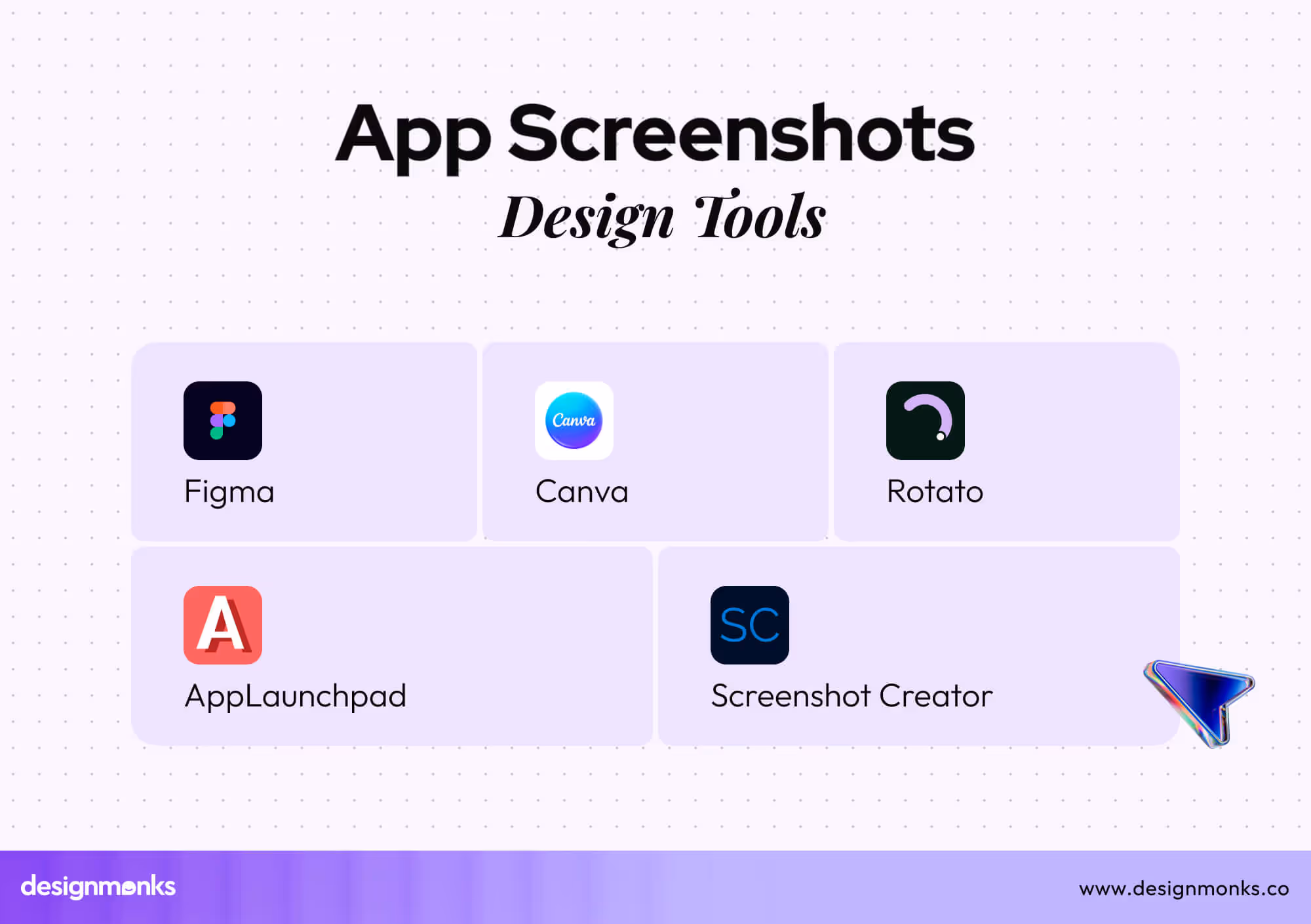
Figma
Figma is a free design tool that works in your browser. You can use it to build custom screenshot layouts with full control over colors, fonts, and layout. Many free templates are also available.
Pros:
- Works online with team collaboration
- Lots of plugins and templates
- Easy to duplicate and reuse designs
- Supports all device frames
Cons:
- Takes time to learn for beginners
- Not fully automated for screenshots
Screenshot Creator
Screenshot Creator is built for quick app store image creation. It offers ready-to-use layouts and lets you drag and drop your app screens directly into the design.
Pros:
- Simple and beginner-friendly
- Fast setup with smart layout options
- Supports different device frames
- No design skills needed
Cons:
- Limited customization
- Fewer styling options than design tools
AppLaunchpad
AppLaunchpad is made for creating screenshots for the App Store and Google Play. It includes a big collection of device frames, text styles, and backgrounds.
Pros:
- Made for app screenshot use
- Includes real-time preview
- Supports localization
- Exports in high resolution
Cons:
- Requires account login
- Some templates need a paid plan
Canva
Canva is known for easy drag-and-drop design. It also works well for app screenshots, thanks to its templates and text tools.
Pros:
- Very beginner-friendly
- Free templates for mobile screens
- Works in browser or app
- Easy text and background control
Cons:
- Device frames are limited
- Less advanced for detailed UI design
Rotato
Rotato is a 3D mockup tool that helps you make animated screenshots. It’s great for showing your app in motion or from creative angles.
Pros:
- Adds 3D and animation effects
- Looks premium and unique
- Easy video exports
- Good for marketing visuals
Cons:
- Mac-only app
- Not ideal for flat, static screenshots
Latest Design Trends in App Screenshots (2026)
App screenshot design is changing fast. In 2026, trends are shifting toward more natural, user-friendly, and attention-grabbing styles. If you want your app to stand out, following these trends can give your screenshots a modern edge. Here are the top screenshot design trends you’ll see more of this year:
Vertical Storytelling
Instead of showing random screens, designers now tell a story across multiple screenshots. Each one continues from the last, just like flipping through a comic or guide. This keeps users scrolling and helps them understand the app flow easily.
Rounded Mockups & Organic Shapes
Square edges are fading out. Rounded corners, soft blobs, and wave-like shapes are replacing sharp boxes. These styles look more human and calm, giving screenshots a smooth and friendly feeling.
AI-Generated Avatars / Stock
AI tools now create custom avatars and scenes that match your app's style. Instead of using the same old stock photos, designers are turning to AI for unique, diverse, and brand-matching visuals. It saves time and feels fresh.
Dark Mode Previews
More apps now support dark mode, and their screenshots show it proudly. A mix of light and dark mode screens in the same set gives users a better idea of how the app will really look in use, day or night.
Minimal vs Colorful Trends
Some apps go for a soft, clean look with lots of white space and small icons. Others grab attention with bold colors and big text. Both styles work, but the trend is to keep it either very clean or very bold, nothing in between.
Even though following trends are good, but following them blindly is one of the major App screenshot design mistakes. So, check the trends well, understand them properly, and think if they go with your project well or not before using them.
Hire a Pro for App Screenshot Design
Designing screenshots isn’t just about adding images; it’s about strategy, flow, and first impressions. A professional knows how to guide users visually and highlight their app’s strengths clearly.
At Design Monks, we create screenshot designs that not only look great but also boost downloads. From layout planning to multi-language versions, we handle everything with care. You get clean visuals, storytelling, and ASO-friendly designs that match your app’s purpose.

.avif)
.avif)
.avif)
.avif)


.avif)
.avif)
.avif)
.avif)


.avif)


