
.svg)


Key Takeaways
- Mobile password managers focus on biometrics, quick access, and thumb-friendly navigation.
- Desktop password managers deliver detailed layouts, large vaults, and advanced search.
- Core features: vault browsing, autofill, credential storage, and security preferences.
- Mobile layouts use vertical lists; desktops rely on sidebars and split views.
- Security differs: mobile uses biometrics, desktop relies on dialogs and tooltips.
- Consistency requires reusing branding while adapting navigation, spacing, and forms.
- Design Monks UI Kit ensures secure, consistent, cross-platform password manager design.
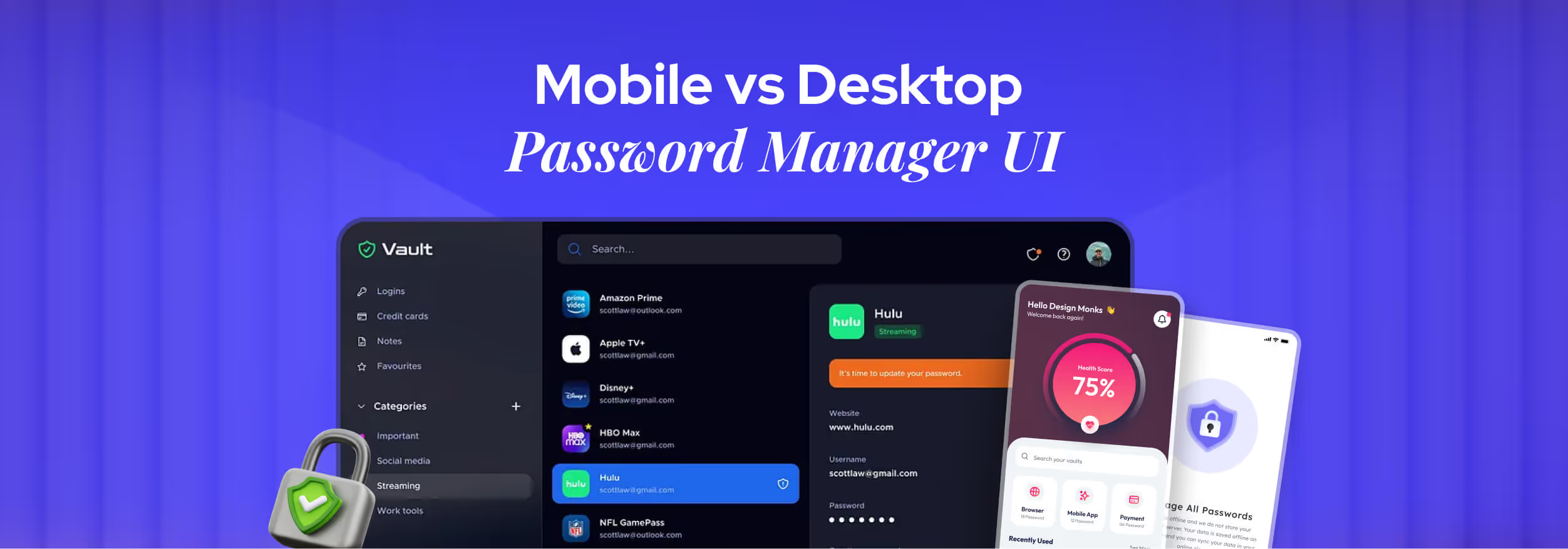
Password managers make it easy to store and remember all your passwords safely in one place. It gets even easier when the UI is stunning and user-friendly. The comparison of Mobile vs Desktop Password Manager UI shows how design directly impacts usability and trust.
On mobile, users need quick and simple access. Features like Face ID, fingerprint login, and large tap targets make it easy to use on smaller screens, often with just one hand. On desktop, the larger screen supports more detailed layouts, bigger vaults, and advanced settings for power users.
So, what specific design choices make mobile and desktop experiences unique? Let’s take a closer look.
The Core Functionalities of Password Manager (Across Devices)
Before we look at differences, let’s see the basics. Whether on mobile or desktop, a password manager usually offers the same core features.
Account Creation/login: You sign up or log in with your master password.
Vault Browsing: The “vault” is your secure storage where all your passwords are saved. You can open it to see entries.
Adding or editing Credentials: You can save a new password (say, for a new Gmail account) or update an old one.
Autofill/browser Extension: The app can automatically fill in your saved usernames and passwords when you log into websites.
Settings & Preferences: This includes things like turning on biometrics (fingerprint, Face ID), enabling dark mode, or adjusting timeout locks.
So the features are the same, but the design is not. Here’s a quick mini-table to show the overlap:

Notice this? Mobile apps skip browser extensions and use system-wide autofill, while desktops usually rely on extensions for password management.
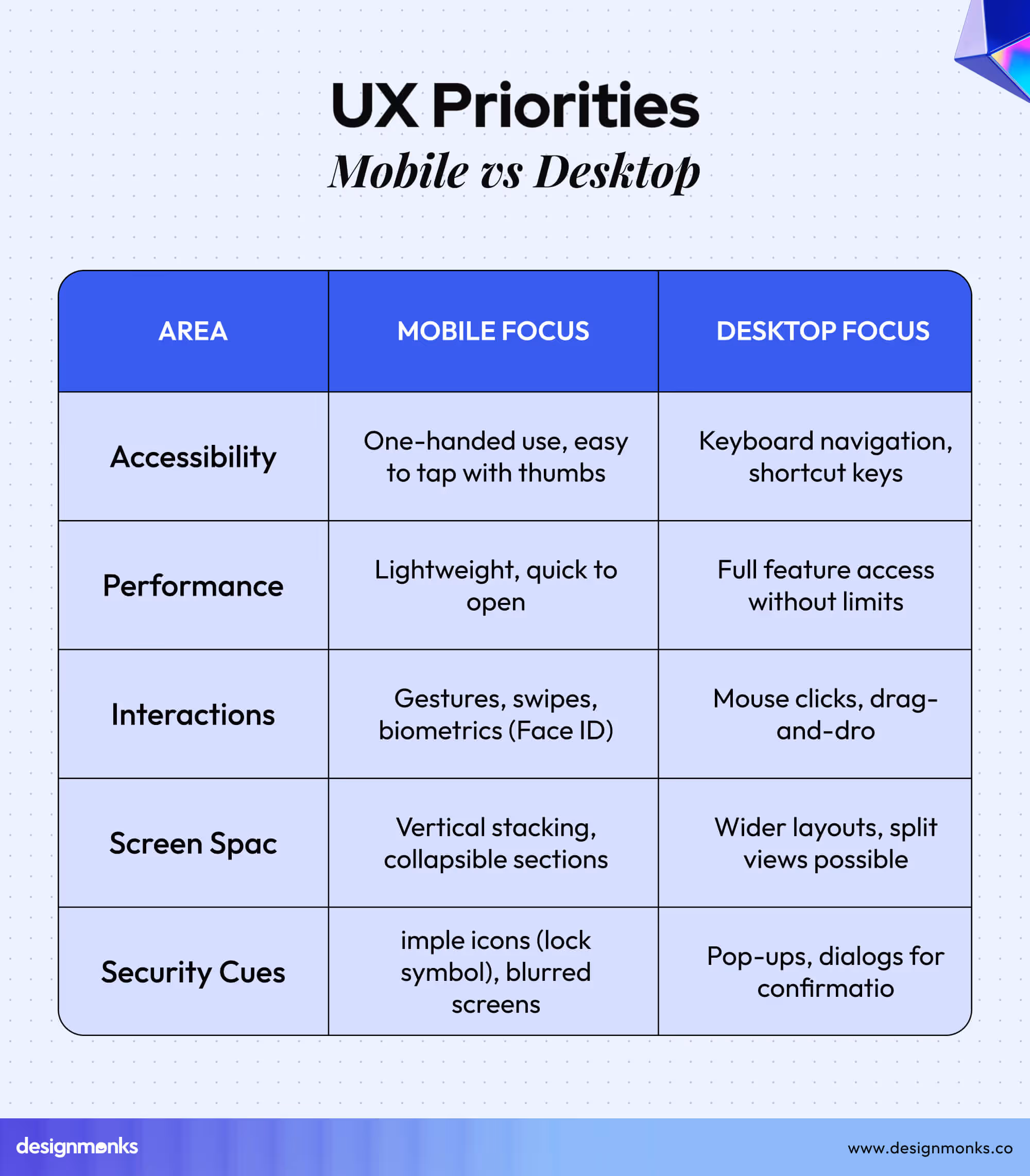
UX Priorities: Mobile vs Desktop
Even though mobile and desktop password managers offer the same core features, the user experience (UX) changes depending on the device. Mobile screens are smaller and often used on the go, while desktops have larger screens and more precise input tools like a keyboard and mouse. Because of this, designers prioritize different aspects on each platform.
Here’s a side-by-side look at the main UX priorities:
Here’s how 1Password handles these UX priorities differently on mobile and desktop to make the experience secure and user-friendly on both platforms:
Accessibility: On mobile, 1Password makes buttons large enough for easy tapping and allows users to unlock the app with Face ID or Touch ID. On desktop, the app supports keyboard shortcuts for quickly searching vault items or copying passwords.
Performance: The mobile app is lightweight and opens quickly, even if your connection is slow. On desktop, 1Password can handle large vaults with detailed filters and categories without slowing down.
Interactions: Mobile users swipe to reveal options, tap to copy passwords, and use biometrics for quick login. Desktop users click items, drag-and-drop logins into browser windows, or use right-click menus to manage entries.
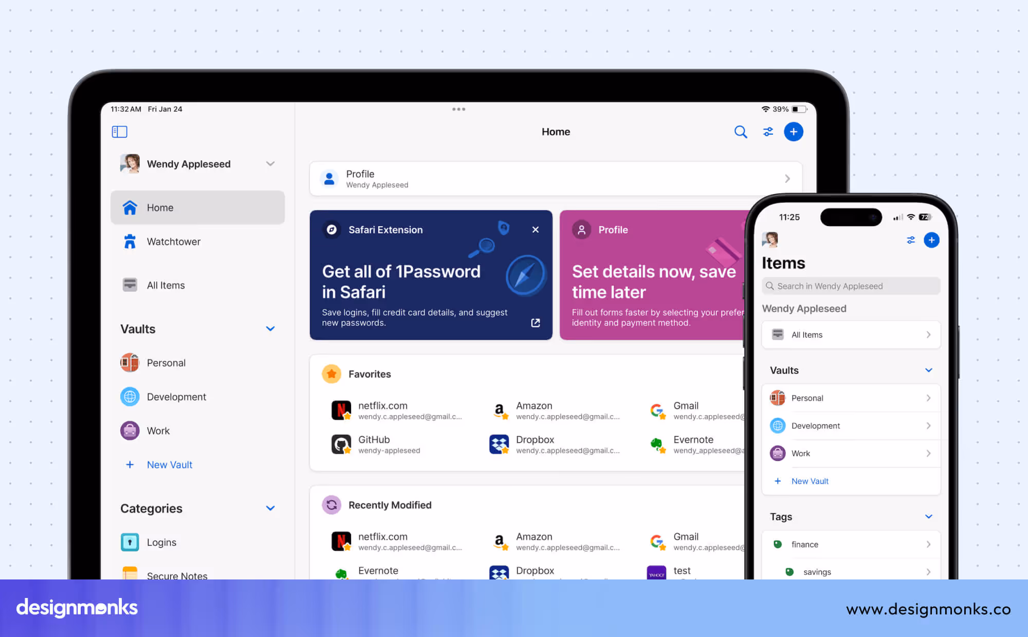
Screen space: Mobile layouts stack items vertically, often with collapsible sections to save space. Desktop layouts can show a sidebar with folders and a full vault view simultaneously. This makes it easier to manage many entries at once.
Security cues: On mobile, 1Password blurs the screen when switching apps or locking, and uses lock icons for vaults. On the desktop, pop-up dialogs confirm actions like revealing a password or adding a new item.
Layout Considerations of Mobile & Desktop Password Manager UI
One of the biggest differences between mobile and desktop password manager UIs is how the layout is organized. Layout affects how quickly users can find, add, and manage their passwords, and it also shapes the overall experience of using the password manager app.
Let’s explore the main layout considerations for both platforms:
Vault Display
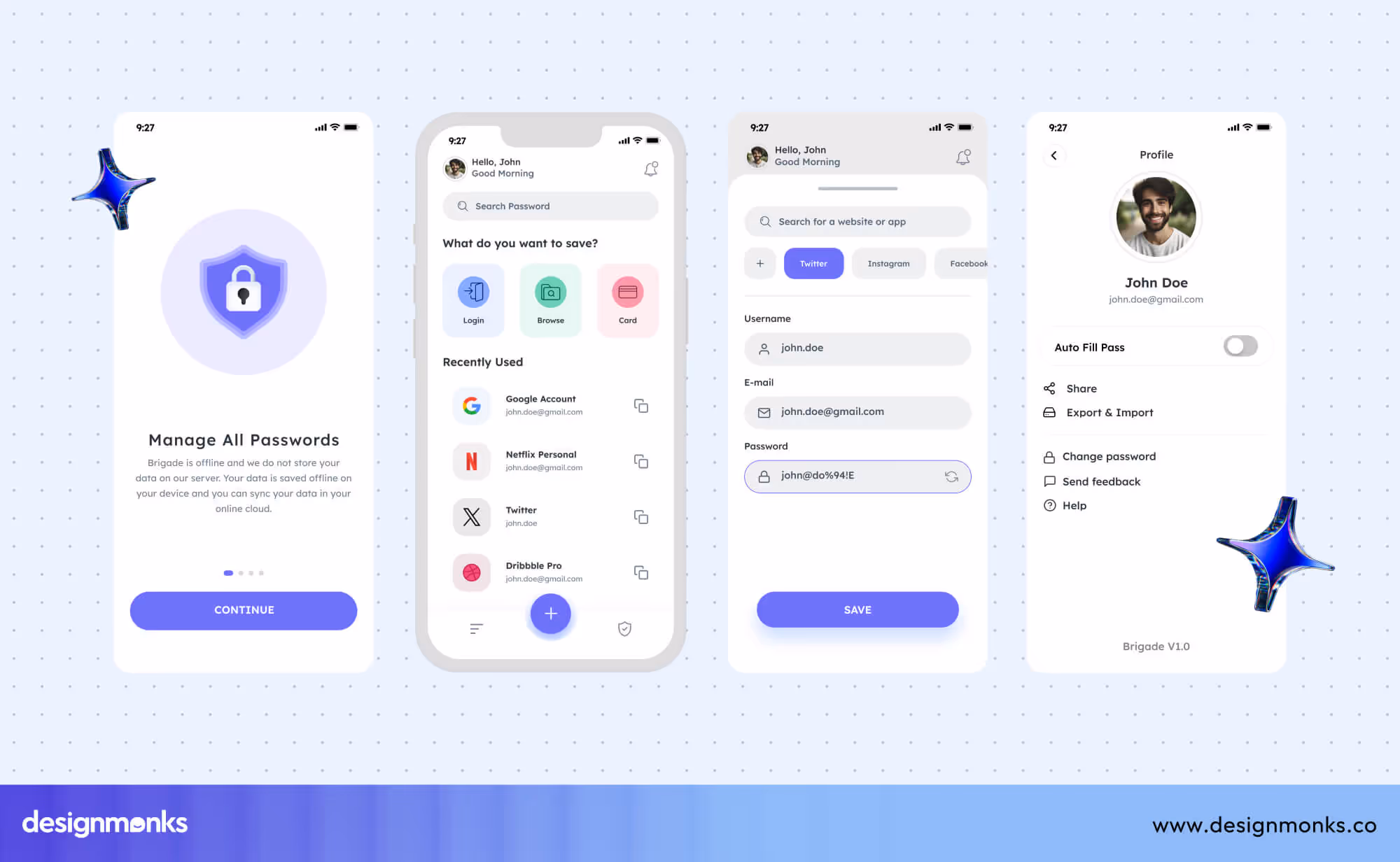
On mobile devices, the vault is usually shown as a simple vertical list. This lets you scroll through entries easily with your thumb.
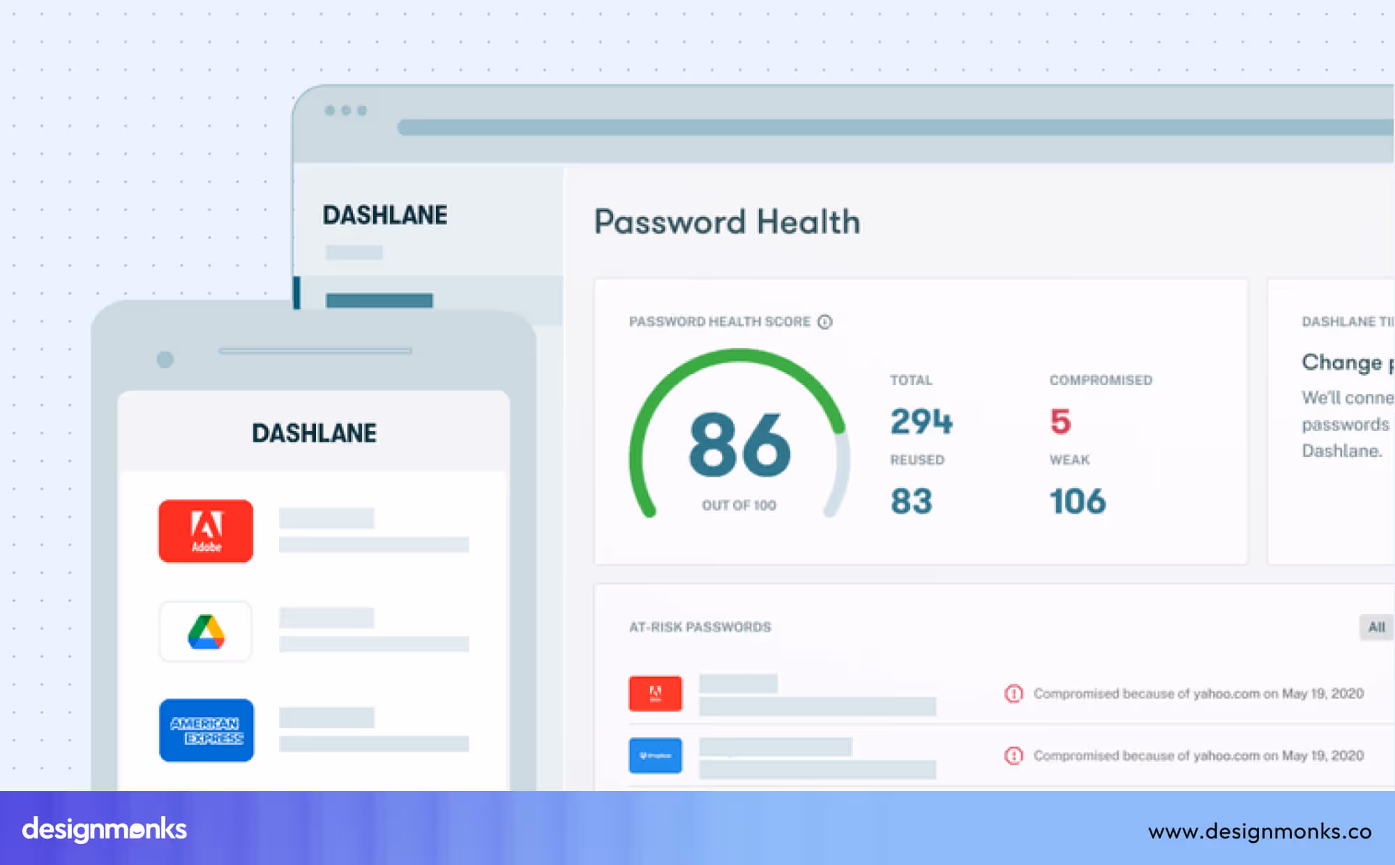
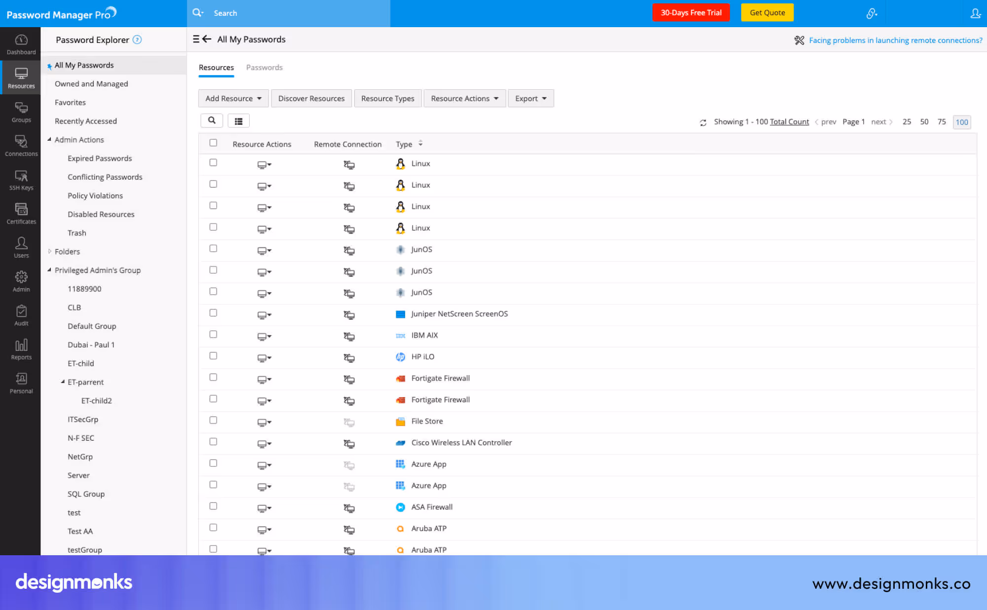
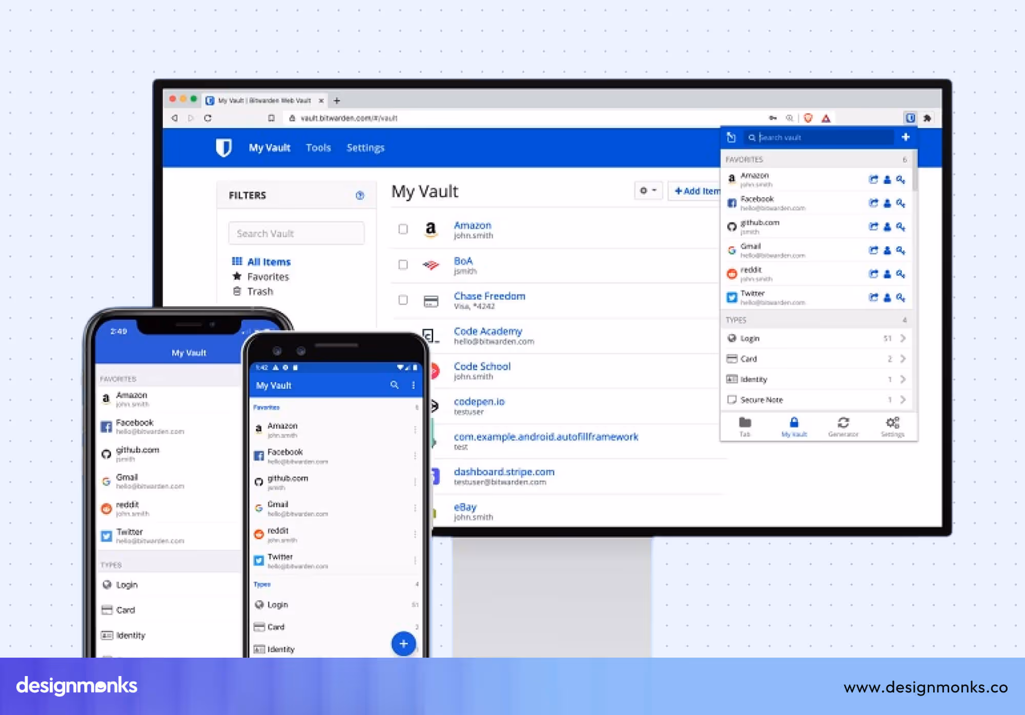
On desktop, apps like Dashlane use a grid or split view, where categories appear on the left and detailed information shows on the right. This makes it easier to manage multiple accounts at once.
Navigation
Mobile apps typically rely on a bottom navigation bar. In Bitwarden’s mobile app, you’ll see Home, Vault, and Settings tabs at the bottom. This keeps everything reachable with your thumb.
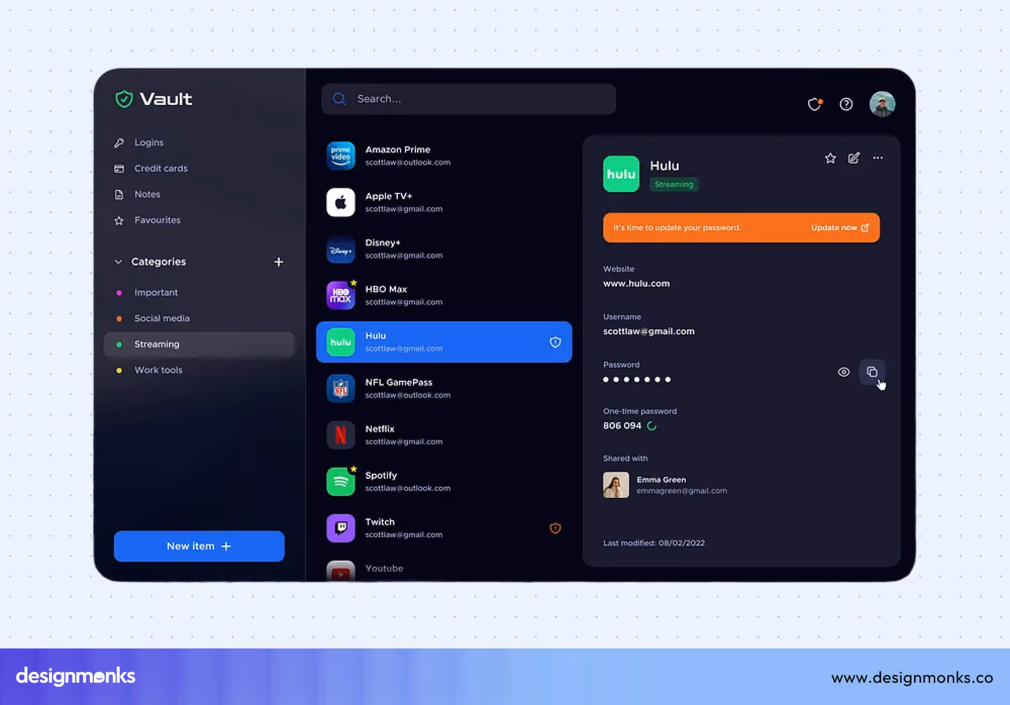
On a desktop, the same app uses a sidebar with folders, filters, and settings. So users can access multiple sections quickly without leaving the main vault view.
Forms (adding credentials)
When adding a new login, mobile apps often guide users step-by-step, showing one field per screen (website, username, password, notes). This prevents clutter on smaller screens and keeps the process simple.
Desktop apps, with more space, allow users to fill out all fields in a single window, which can speed up the workflow for users managing multiple accounts.
Search Experience
Searching for a password also differs by platform. On mobile devices, the search bar is typically located at the top of the screen, and some apps even offer voice search for added convenience.
On desktop, search is often more advanced to provide instant results as you type, filtering by category, or even allowing batch actions. This is ideal for power users with large vaults.
Security Interactions & Feedback of Mobile & Desktop Password Manager UI
Security is the core purpose of any password manager, but the way users interact with security features and receive feedback differs between mobile and desktop platforms. These interactions help users feel confident that their sensitive information is protected while keeping the experience smooth and intuitive.
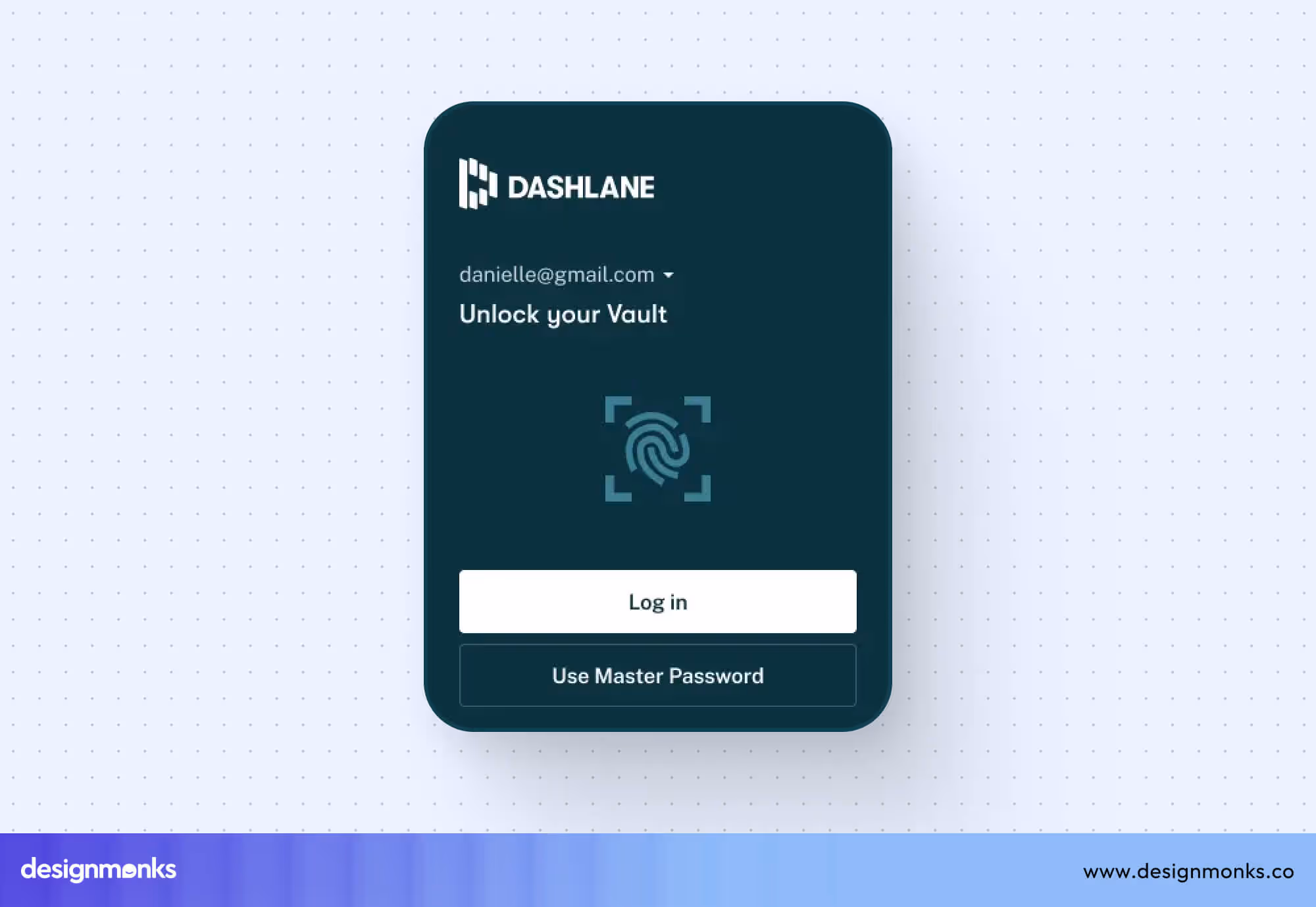
Mobile: On phones, password managers like 1Password or Dashlane often use biometric authentication, such as fingerprints or Face ID, for fast and secure access. If the app is left idle, it locks automatically to prevent unauthorized access.
Notifications for successful actions or errors usually appear as slide-up messages at the bottom of the screen. This provides quick feedback without interrupting the workflow.
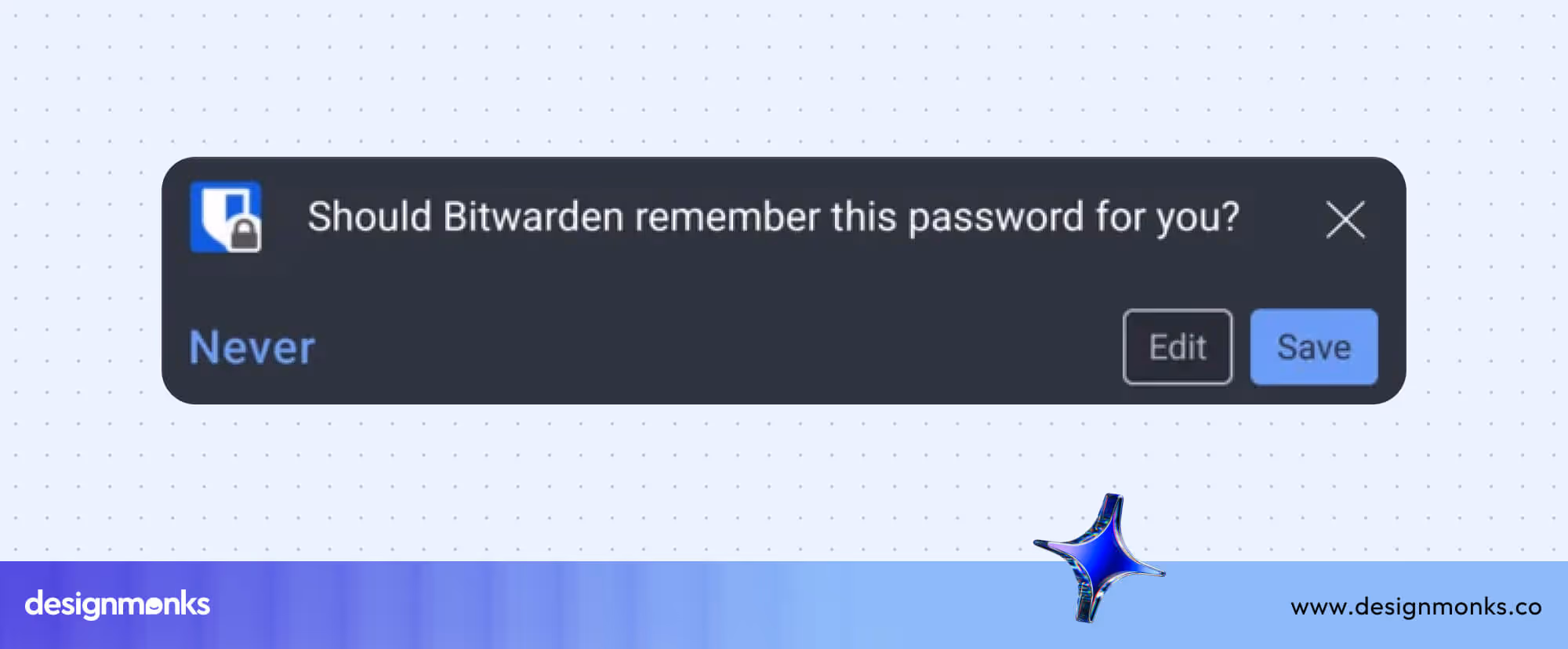
Desktop: On computers, unlocking usually requires typing your master password again. Many apps, such as Bitwarden, use confirmation dialogs or pop-up windows when you reveal a password or perform sensitive actions.
Feedback is commonly shown as tooltips, banners, or inline messages and helps users understand whether an action succeeded or if there was an error.
Responsiveness & Consistency of Mobile & Desktop Password Manager UI
Once we look at UX priorities and layout differences, the next important aspect is how the app adapts and stays consistent across devices. A password manager should not only be secure and functional but also feel familiar, whether you’re using it on a phone or a computer.
Font sizes & icons: On mobile, buttons and text need to be larger for easy tapping. For example, in 1Password’s mobile app, icons are sized for thumb reach, while on desktop, the same icons are smaller because users navigate with a mouse.
Padding & Spacing: Mobile layouts include extra space between buttons and fields to prevent accidental taps. Desktop layouts can afford tighter spacing since clicks are more precise.
Dark mode & Accessibility: Both platforms support dark mode, screen readers, and accessibility features. Mobile apps may simplify elements for clarity, while desktop apps can show more information without cluttering the interface.
Animation & Feedback: Subtle animations help users understand actions. On mobile, screens slide or fade to indicate transitions. But desktop apps use hover effects, pop-ups, or small notifications to give feedback.
Orientation & layout adaptation: Mobile apps adjust for portrait and landscape modes so content stays readable and buttons reachable. Desktop apps, meanwhile, support resizable windows and flexible layouts for multitasking or multiple monitors.
Consistency tip: Elements like icons, colors, and typography should remain familiar across platforms, even if their size, placement, or layout adapts to the device. This balance keeps the app intuitive without sacrificing usability.
When to Reuse vs Redesign UI Components
Designing for both mobile and desktop doesn’t mean starting from scratch every time. Some elements can be reused across platforms, while others need to be adapted to fit the device. Knowing what to reuse and what to redesign helps maintain consistency while optimizing usability.
What to Reuse
Core elements like colors, typography, icons, and branding should stay the same. This ensures your app feels familiar whether users switch from mobile to desktop. For example, the lock icon or the main “Add Password” button should look the same across devices.
What to Redesign
Components that depend on screen size or interaction type should be adjusted. Navigation menus, forms, and touch targets often need redesigning. On mobile, forms may be broken into step-by-step screens, while on desktop, the same form can appear inline. Navigation bars may shift from bottom tabs on mobile to sidebars on desktop.
Practical tip: Think about user behavior and context. Mobile users may need quick, one-handed access. But desktop users often want to see more information at once and perform multiple actions. Use this understanding to decide where to adapt your UI without losing the overall design consistency.
Tools & Resources for Password Manager UI
Designing an effective password manager UI requires the right tools and guidance. Whether you’re a designer or a developer, these resources can help you create interfaces that are secure, user-friendly, and consistent across devices.
Figma Responsive Layout
Figma is a popular design tool that makes it easy to create screens that adapt to different screen sizes, from mobile phones to large desktop monitors.
Using Figma’s auto-layout and responsive constraints, you can quickly test how your UI behaves on different devices without recreating it from scratch.
Biometric & Secure Design Principles
Implementing biometrics like Face ID or fingerprint login requires following established security and ethical guidelines. NIST SP 800-63B provides standards for secure digital identity. CISA’s Identity and Access Management Best Practices guide safe deployment and privacy of biometric systems.
The Biometrics Institute Good Practice Guides focus on ethical use and obtaining user consent. These resources cover secure data storage, encryption, timeouts, and feedback. Following them helps ensure biometric authentication is both safe and easy for users to navigate.
DesignMonks Password Manager UI Concept
Our ready-to-use password manager UI kit showcases both mobile and desktop layouts for password managers. It includes pre-designed screens, components, and interactions that follow modern UI trends.
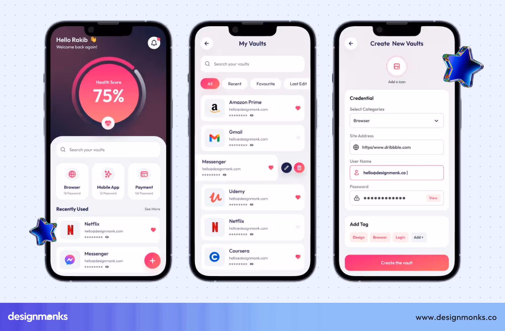
Using this kit can save designers hours of work and ensure design consistency across platforms. It also provides a solid foundation for building or testing your own password manager app.
By combining the right tools, design principles, and ready-made resources, you can create a password manager UI that’s not only visually appealing but also practical and secure for users on any device.
Conclusion
In summary, Mobile vs Desktop Password Manager UI highlights why customizing design to each platform is crucial. Mobile users need fast, intuitive access, while desktop users benefit from detailed layouts and advanced features.
Designers should think beyond screen size and consider context, usability, and security. At Design Monks, we make this easier. Explore our Pass Manager UI Design Kit to create seamless, engaging experiences for both mobile and desktop platforms.

.avif)
.avif)
.avif)
.avif)


.avif)
.avif)
.avif)
.avif)


.avif)


