.svg)


Key Takeaways
- Tags label and organize content, while buttons trigger specific user actions.
- Clear visual cues like color and size prevent user confusion effectively.
- Tags are passive indicators, buttons are interactive elements requiring input.
- Consistent styling and placement improve clarity, usability, and accessibility.
- Distinguishing tags from buttons builds trust and enhances overall UX design.
Ever clicked something thinking it was a button, only to realize it was just a tag? This common mix-up shows why knowing how to distinguish between tags and buttons in UI design is essential for creating clear and user-friendly interfaces.
When users can’t easily tell the difference, it creates frustration and weakens the overall experience. Tags and buttons may share similar shapes or styles, but they serve very different purposes. Tags are used to label and organize content, but buttons exist to trigger actions.
If designers blur this line, users end up confused, unsure of what to click, and tasks take longer than they should. Designers can avoid this by using clear cues like color, size, and placement. This guide will walk you through practical ways to make tags and buttons unmistakable in your UI projects.
Understanding UI Tags and Buttons
Before you can design effectively, it’s important to understand the difference between tags and buttons. Both are common UI elements, but they serve distinct roles in helping users navigate and interact with an interface. Knowing their purpose makes it easier to design interfaces that are clear, intuitive, and user-friendly:
What Are Tags?
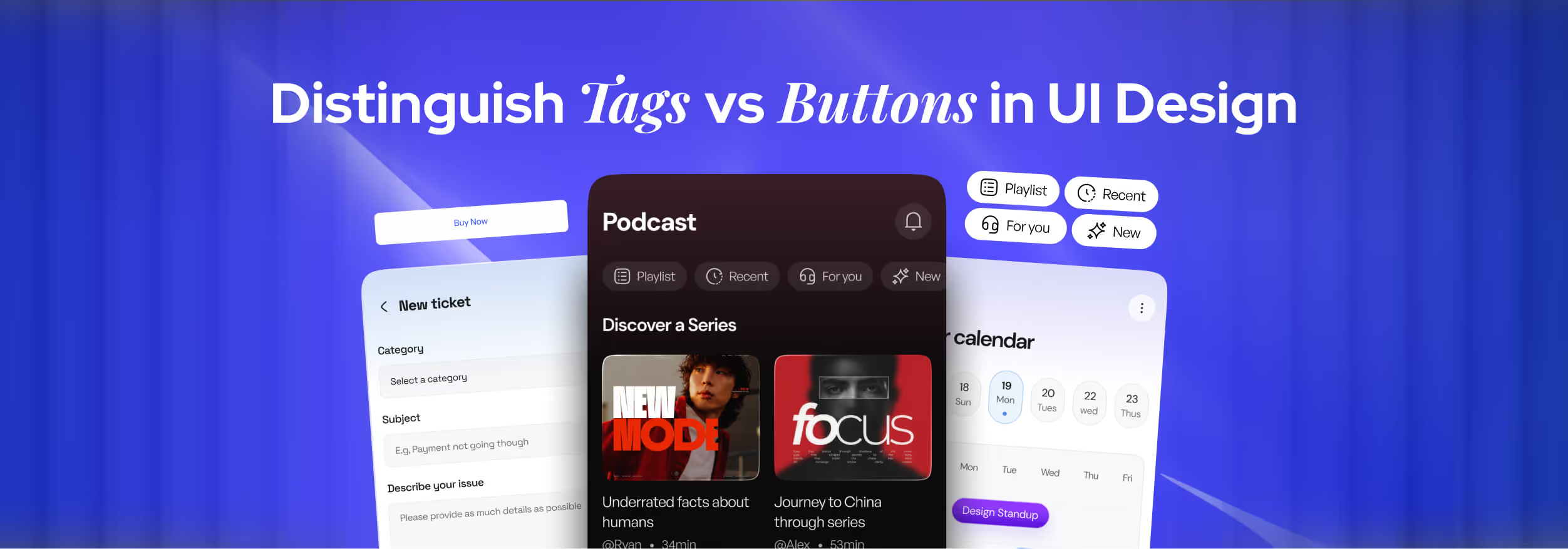
Tags are small, simple pieces of text used to categorize, describe, or organize content. You’ll often see them on blogs, e-commerce sites, dashboards, or even apps that rely on filtering information.
For example, on a blog, a recipe post might have tags like “Nutrition,” “Easy Meals,” or “Vegetarian.” In a dashboard, tags might indicate status like “Pending,” “Completed,” or “Urgent”.
The main purpose of tags is to give quick context and help users filter or group content. This makes it easier to find what they’re looking for. Most of the time, tags are not interactive. They are visual cues rather than action points.
What Are Buttons?
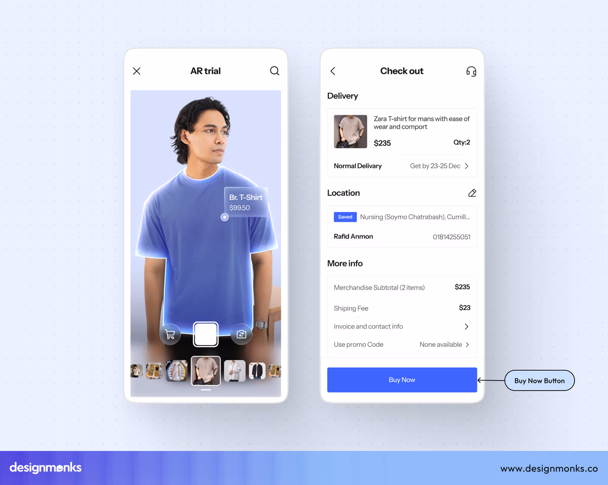
Buttons, on the other hand, are interactive elements designed to trigger actions. Their primary purpose is to let users perform tasks or initiate changes in the interface. Every time a user clicks or taps a button, something happens. It could be submitting a form, deleting an item, or starting a download.
Examples of buttons in UI design: “Submit” on a contact or feedback form or “Add to Cart” on an online shopping site.
Buttons are active elements, meaning they exist specifically to let users interact with the system. Without buttons, users wouldn’t be able to take meaningful actions. It would make the interface static and less functional.
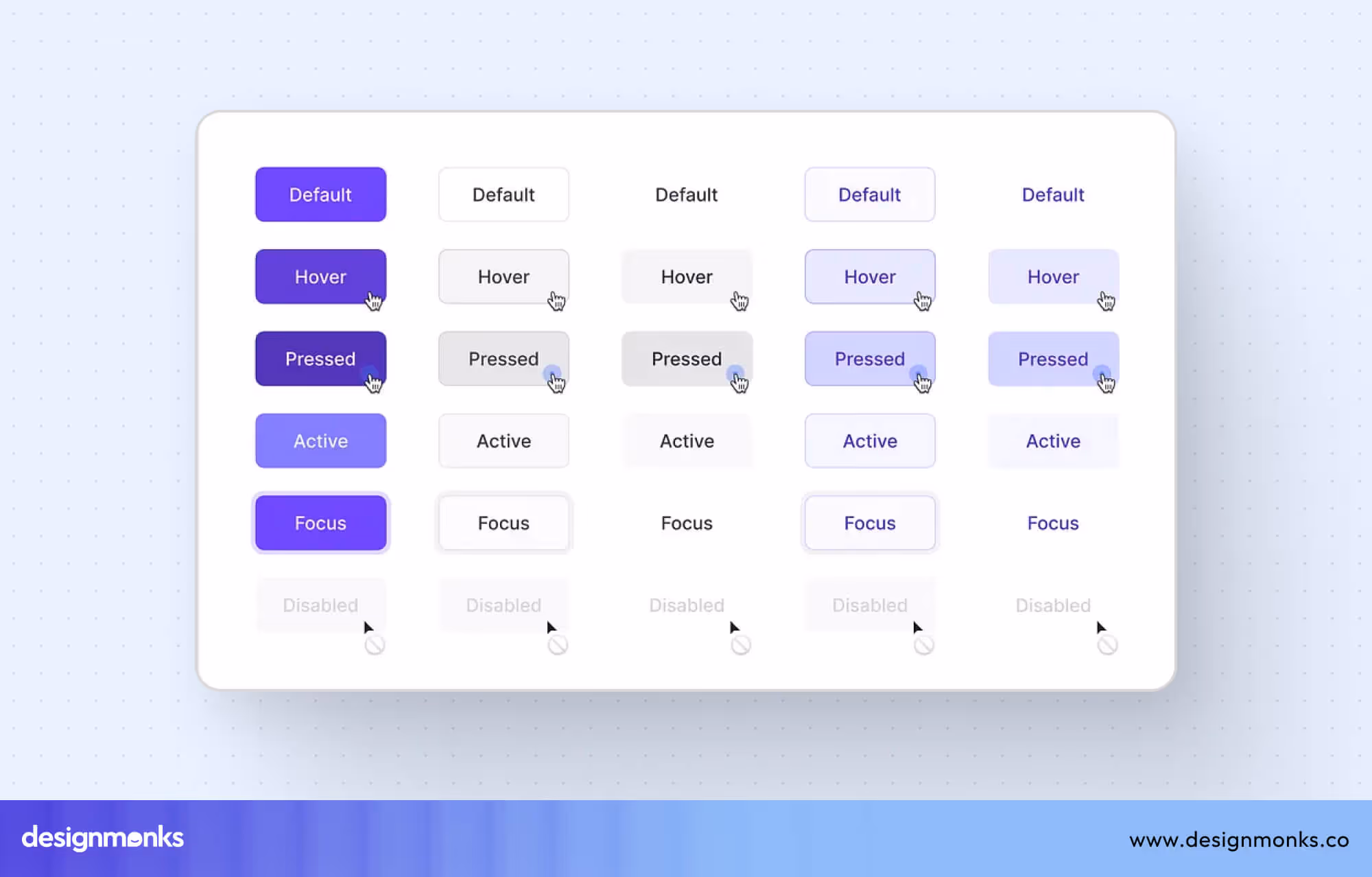
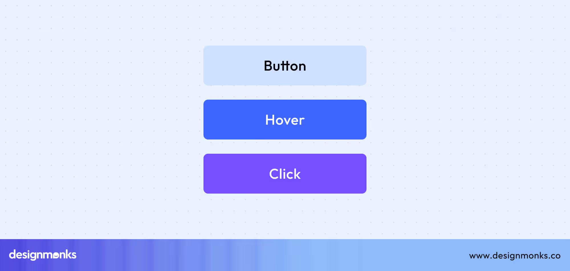
Designers typically make buttons stand out using size, color, placement, and hover/active states to ensure they are easy to identify and use.
Key Differences Between Tags and Buttons
While tags and buttons might look similar at first glance, they serve very different purposes in UI design. Let's take a quick look at the differences:
Understanding these differences helps designers create interfaces that are clear, intuitive, and easy to use. Let’s break down the key distinctions in detail:
Functionality
Tags act as labels or identifiers. They categorize content and provide context. For example, a blog post tagged with “Travel” or “Photography” tells the user what the content is about. Tags rarely perform an action themselves, they are mostly informative.
Buttons are action-oriented. Clicking a button triggers a specific event, such as submitting a form, saving settings, or navigating to another page. In short, tags inform, while buttons do.
User Interaction
Tags are mostly passive. Users glance at them to understand content, filter items, or see metadata. While some tags can be clickable (like filter tags), their primary purpose is to communicate information, not drive action.
Buttons, on the other hand, require user engagement. A user interacts with a button by clicking, tapping, or pressing it. They provide immediate feedback to confirm an action. This makes them essential for interactive experiences.
Design and Styling
Tags are typically small, minimalistic, and subtle. They often use neutral colors, simple shapes, and text-based labels to blend with content rather than stand out. Their design emphasizes supporting content, not drawing attention away from it.
Buttons are designed to attract attention. They are often larger, brightly colored, or outlined to make it obvious that they are clickable. Buttons may include hover effects, shadows, or icons to signal interactivity. This helps users understand that an action will occur when clicked.
Visual Distinctions: Making Tags and Buttons Unmistakable
To prevent confusion, designers must use visual cues that clearly separate tags from buttons. Let’s break it down:
Shape and Size
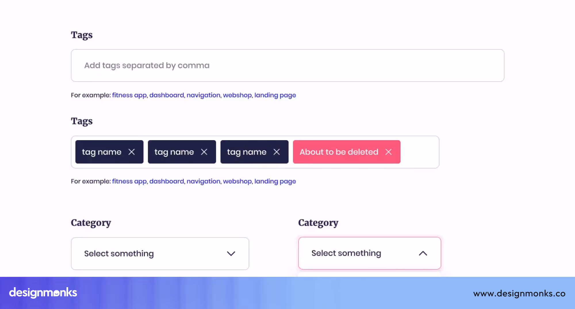
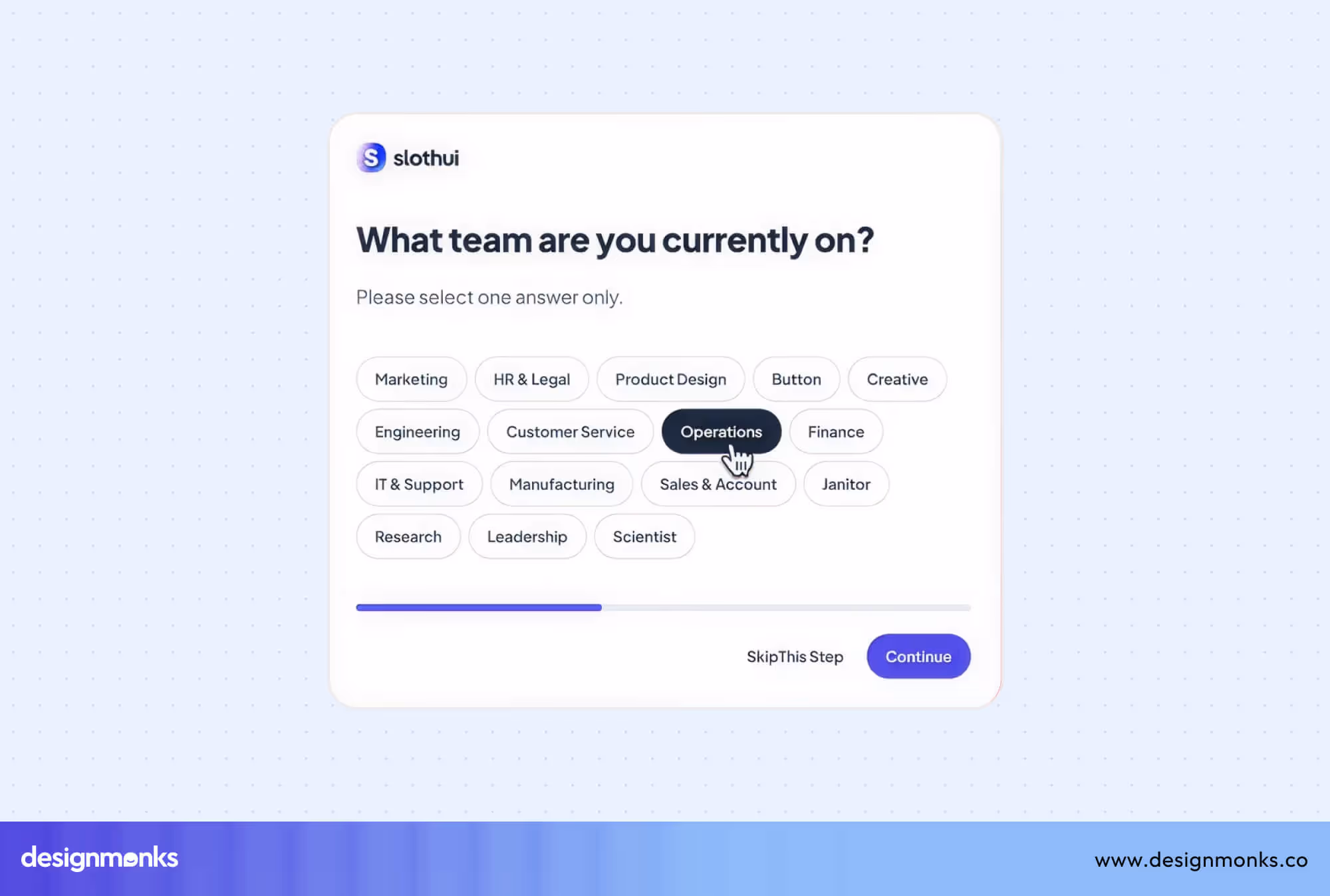
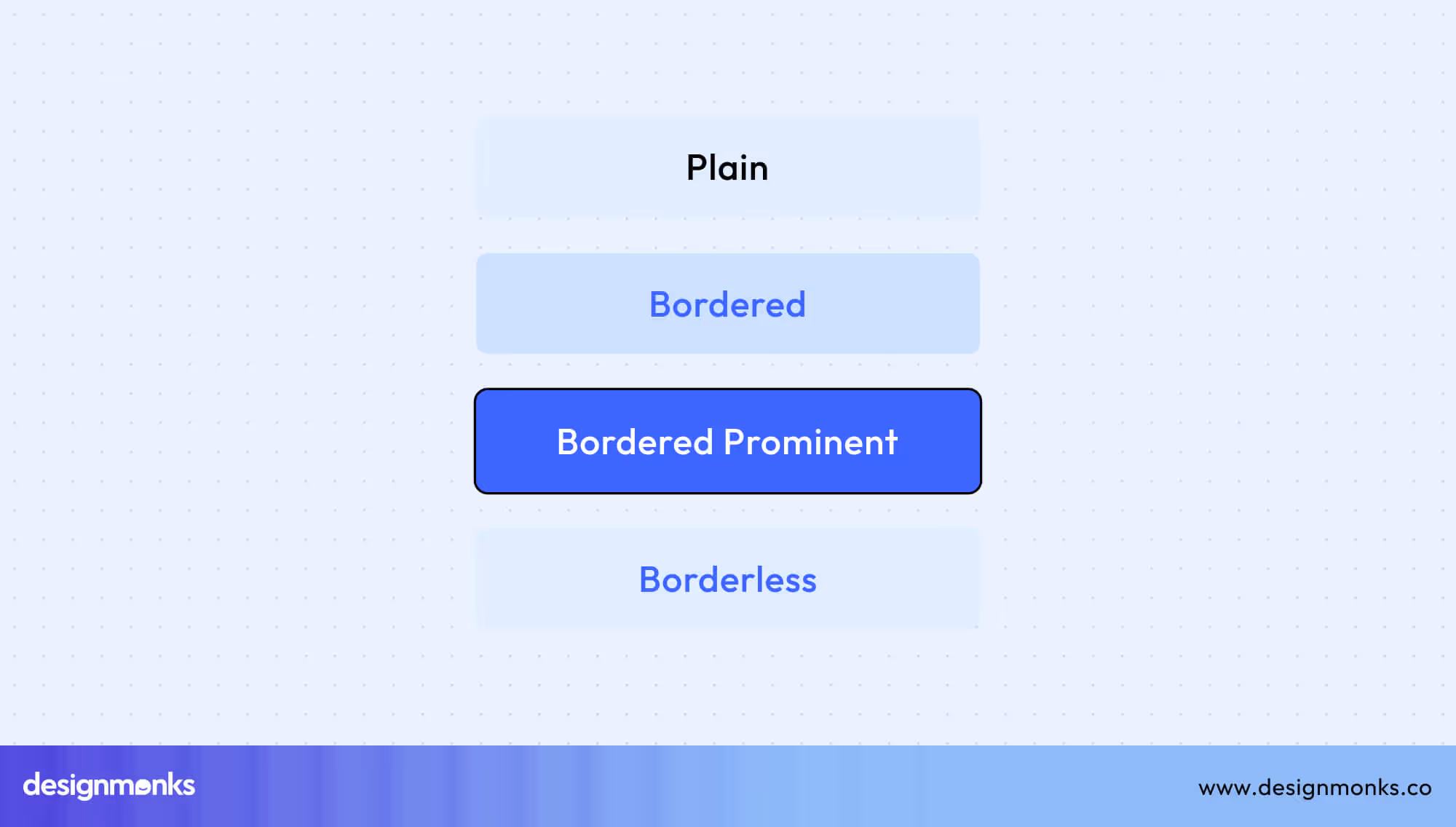
Buttons are usually rectangular or square with rounded corners. They are larger, so users can easily click or tap them. Tags are kept in small and subtle rectangles. Sometimes pill-shaped. They take up less space and don’t demand clicks.
Color and Style
Buttons use bold, contrasting colors so they stand out. They also show visual feedback like hover states (when your mouse is on them) or active states (when clicked). Tags blend more with content. They use soft or neutral colors. Tags don’t scream “Click me!”
Text and Iconography
Buttons contain action words like “Submit,” “Buy Now,” or “Create.” They may include icons like a trash bin for delete or a plus sign for add.
Tags use descriptive words like “Popular,” “Technology,” or “Pending.” They don’t usually have action verbs. Icons, if used, represent categories.
Hover and Active States
Buttons change color, shadow, or outline when hovered over or clicked. This feedback reassures users.
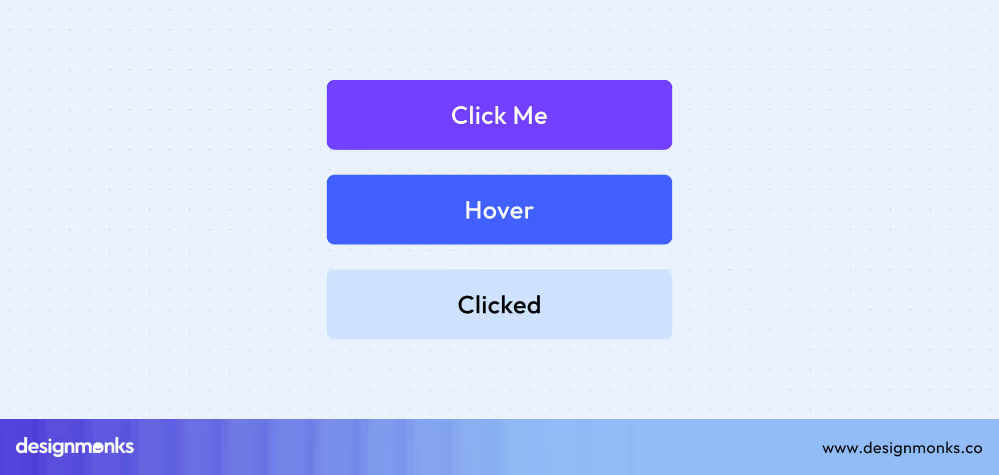
Tags may have a subtle hover effect, but nothing bold. They are not meant to distract from the main content.
Spacing and Placement
Buttons are often placed in key spots like the end of a form or the center of an action flow. They stand alone and demand attention.
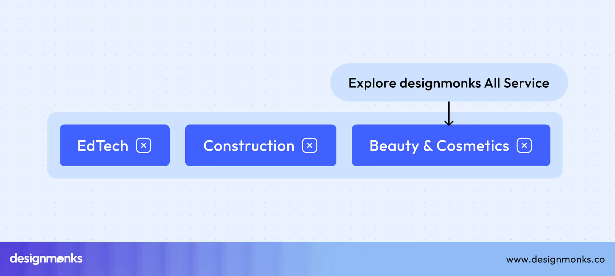
Tags are grouped together, often under or near content, like a set of categories. They support the main content instead of competing with it.
UX and Accessibility Considerations
Designing UI isn’t just about making it look attractive, it’s also about ensuring that users can easily understand and interact with your interface. Tags and buttons may look similar at first glance, but they play very different roles when it comes to user experience (UX) and accessibility. Understanding these differences can make your design more intuitive and inclusive.
User Perception
Users have certain expectations when interacting with digital interfaces. Buttons are immediately recognized as interactive elements as they invite clicks or taps. But if a tag is styled like a button but doesn’t perform any action, it can confuse users. It will also cause frustration and mistakes.
Conversely, buttons that look too much like simple tags may be overlooked and lead to users missing important actions. Clear visual differentiation is essential so users know exactly what can be interacted with.
Accessibility
Buttons must be coded properly to support assistive technologies. For example, ARIA (Accessible Rich Internet Applications) attributes help screen readers identify buttons and describe their functions. Buttons should also be fully navigable using a keyboard. This ensures users who cannot use a mouse or touchscreen can still interact effectively.
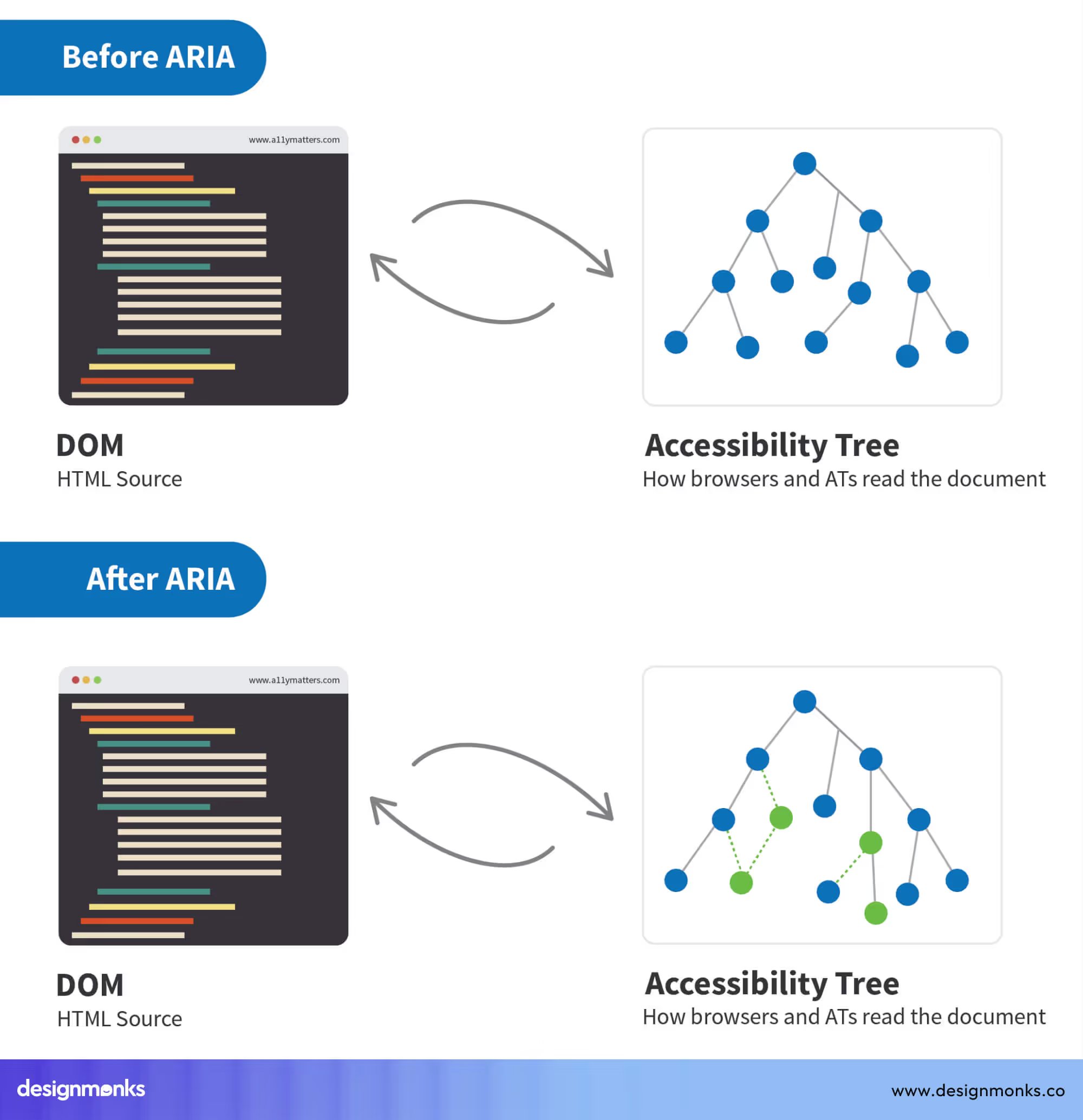
Since most tags are passive, they don’t require as much interactivity. However, if tags are clickable, like filter tags or tags used for navigation, they must also be accessible. This means implementing proper ARIA roles, focus states, and keyboard navigation to make them usable for everyone.
Best Practices for Clarity and Usability
To create a seamless UX:
- Ensure that clickable elements are visually distinct from non-clickable elements.
- Use consistent styling for buttons and tags across your interface.
- Include hover or focus states for interactive elements so users receive clear feedback.
- Test your design with a variety of users, including those relying on accessibility tools. This will confirm that it’s easy to navigate and understand.
By paying attention to both UX and accessibility, designers can ensure that tags and buttons not only look different but also function in ways users expect. This creates an interface that is clear, intuitive, and inclusive.
When to Use Tags vs. Buttons
Knowing the theory behind tags and buttons is important, but the real challenge lies in deciding when to use each one in a design. Misusing these elements can confuse users. Let’s look at practical scenarios.
Scenarios for Tags
Tags shine when you need to organize, categorize, or provide quick context. They don’t ask the user to do anything, they simply inform. You can use tags in:
- Content Categorization: Blog posts often include tags like “Travel,” “Food,” or “Technology” to group articles by topic. Similarly, a music app might use tags such as “Jazz,” “Pop,” or “Workout” to help users explore genres.
- Status Labels: Tags can display the state of a task or item, such as “Completed,” “In Progress,” or “Draft.” In project management tools, these tags give users instant context without requiring interaction.
- Filters (when clickable): In some cases, tags double as filter options (e.g., selecting “Shoes” or “Bags” on an e-commerce site). Even then, they should look visually different from buttons so users understand they’re for filtering, not triggering actions.
Scenarios for Buttons
Buttons are best used when the interface requires the user to take an action or move the process forward.
- Actions: Use buttons for tasks like submitting a form, saving changes, uploading a file, or deleting an item. These are critical steps where feedback and confirmation are essential.
- Navigation: Buttons such as “Next,” “Back,” or “Continue” guide users through flows like sign-up forms or checkout processes. They make the user journey clear and structured.
- Triggers: Buttons are also used to activate dynamic elements, such as opening a menu, expanding a section, or starting a download. These triggers make the interface interactive and responsive.
A Simple Rule of Thumb
Ask yourself this simple question: “Does the user need to take an action, or just see information?” From this answer, you can quickly decide whether to use a tag or a button in your design.
Common Design Mistakes and How to Avoid Them
Even experienced designers can sometimes blur the line between tags and buttons. This often happens because the two elements can look alike if not styled carefully. But when users can’t tell them apart, confusion sets in, and the overall experience suffers. Below are the most common mistakes and how to fix them.
1. Misusing Tags as Interactive Elements
Mistake: Treating tags as if they were buttons, such as making category tags clickable but styling them like action buttons. This creates a mismatch between what users expect and what actually happens.
Why It’s a Problem: Users click expecting an action (like submitting a form), but instead they just navigate or filter. This breaks trust and disrupts the flow.
Fix: If tags are clickable (for filtering or navigation), style them differently from action buttons. Keep them subtle in size and color, so they still look like labels but with a hint of interactivity (e.g., underline on hover or lighter background).
2. Designing Buttons That Look Like Tags
Mistake: Creating buttons that are too small, plain, or styled like passive tags. These buttons often blend into the content instead of standing out.
Why It’s a Problem: Users may overlook them, miss critical actions, or assume they aren’t clickable. This can stall tasks like submitting a form or completing a checkout.
Fix: Design buttons to be clear calls to action. Use bold colors, distinct shapes, larger sizes, and labels with action verbs like “Submit,” “Buy Now,” or “Continue.” Add hover and active states to provide visual feedback.
3. Overloading the UI with Tags or Buttons
Mistake: Adding too many tags or buttons in one interface. For example, using a long row of category tags or multiple buttons clustered together on the same screen.
Why It’s a Problem: A cluttered UI overwhelms users. Instead of helping them, it slows down decision-making and creates cognitive overload.
Fix: Use only the most essential tags and buttons. Prioritize what users actually need to see or click. Group similar tags neatly and limit buttons to one primary action per screen when possible. Simplicity not only looks better, it makes the interface more usable.
FAQs
Should tags be buttons or links?
Tags should usually stay as labels, but if they’re used for filtering or navigation, they can act like links. They should not be styled like main action buttons.
What distinguishes a radio button from a checkbox in UI design?
A radio button in UI design allows users to select only one option from a list, while a checkbox lets users select multiple options at the same time.
What are the different types of UI buttons?
The different types of UI buttons include primary buttons for the main action (like “Sign Up”), secondary buttons for supportive actions (like “Learn More”), icon buttons that show only an icon (like a heart or trash bin), and toggle buttons that switch between states (like On/Off).
Conclusion
By understanding how to distinguish between tags and buttons in UI design, you can create products that feel intuitive and effortless to use. Tags should guide and organize, while buttons should invite action.
When designers respect this balance and apply visual cues consistently, users never have to second-guess their choices. Give us a call at Design Monks to discuss more about tags and buttons, and let us help you create the perfect design!

.avif)
.avif)
.avif)
.avif)


.avif)
.avif)
.avif)
.avif)


.avif)
