.svg)


Key Takeaways
- Carets signal expansion or insertion, while chevrons guide navigation clearly.
- In coding, carets mark regex anchors, chevrons define HTML tags.
- In typography, carets act as proofreading marks, chevrons appear rarely.
- Dropdowns expect carets, while breadcrumbs and pagination rely on chevrons.
- Consistent symbol use prevents confusion, boosts clarity, and improves UX.
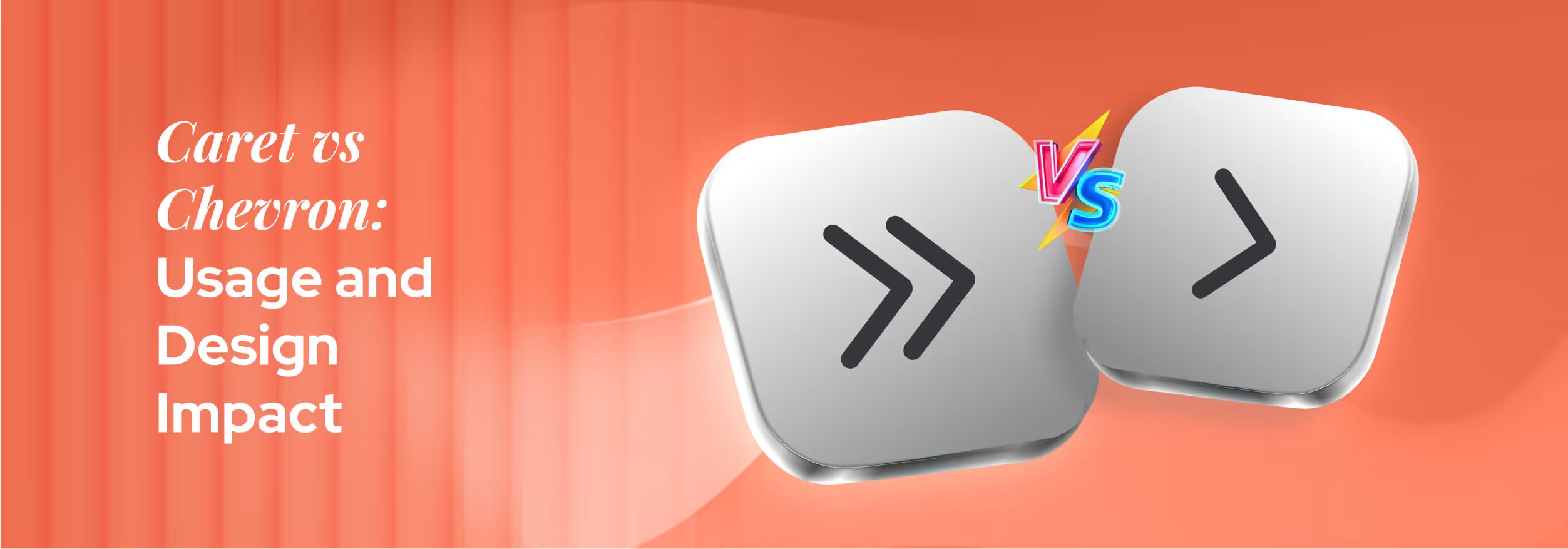
Icons may look small, but they play a huge role in guiding users through a design. When it comes to Caret vs Chevron, understanding their differences ensures your interface is clear, intuitive, and frustration-free. Pick the wrong icon, and even simple navigation can confuse users.
A caret (^) typically shows expandable content, like dropdowns or hidden menus, while a chevron (>/<) points the way, guiding users forward, backward, or through steps.
These symbols may seem similar, but their purpose in UI design is very different, and using them correctly improves user flow and trust.
In this guide, we’ll break down the difference between caret and chevron, highlight common mistakes, and share practical usage tips. By the end, you’ll confidently know which symbol to use in every design scenario.
Why Caret vs Chevron Confusion Exists
At first glance, the caret and chevron look almost like twins. Tiny, angular symbols that are easy to overlook but carry a lot of meaning. Because they’re so simple in shape, many people assume they serve the same purpose. That’s where the mix-up begins.
In reality, their jobs are very different. One often signals expansion or insertion, while the other points direction or hierarchy. Both caret and chevron appear across many fields. In UI/UX design, the caret often marks expandable menus or dropdowns, while chevrons show direction in breadcrumbs, pagination, or sliders.
In coding, carets are tied to operations like regex anchors, exponentiation, or bitwise math, while chevrons appear in HTML tags, comparisons, or generics. In typography and math, the caret acts as a proofreading mark or exponent symbol, while chevrons show inequalities or function as angled brackets.
With so much overlap, it’s no wonder confusion happens.
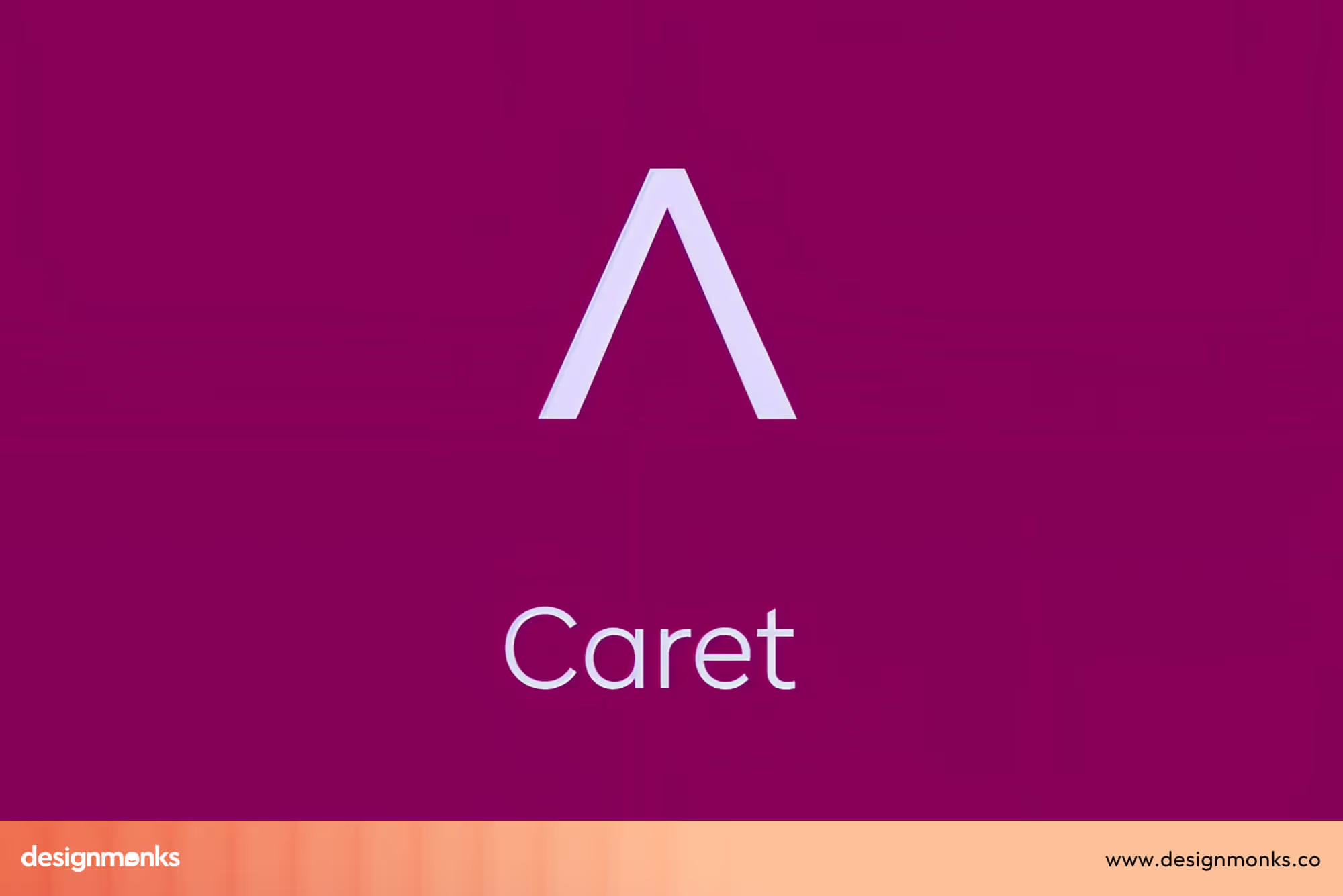
What is A Caret Symbol (^)?
The caret (^) is a tiny, pointed symbol that usually faces upward. Depending on the font or system, it can look slightly different. Sometimes it's slimmer in code editors, while other times it is wider in word processors, but its meaning stays clear.
Fun fact: the word caret comes from the Latin “caret,” meaning it is missing, which makes sense when you see how it’s used.
Use in Typography
Long before digital screens, proofreaders used the caret to mark spots where text was missing. If a word or letter needed to be added, the caret showed the writer exactly where to insert it. In other words, it was the editor’s way of saying, “Don’t forget, something belongs here!”
Use in Coding
The caret found a second life in programming:
- Bitwise XOR (Exclusive OR): a ^ b compares two numbers bit by bit.
- Exponentiation: In spreadsheets, 2^3 means 2 to the power of 3.
- Regex Anchors: A caret at the start of a regex pattern (^abc) means “match only if it’s at the beginning of the line.”
Use in UI/UX
In user interfaces, the caret often appears beside dropdown menus or toggles. When you see it, it’s a subtle signal that says, “Click me, there’s more hidden here.”
That tiny shape helps users discover more options without needing extra text, making interactions cleaner and faster.
What is a Chevron Symbol (< >)?
The chevron is a sharp, angled symbol that looks like this: < or >. Unlike the caret, which usually points up, the chevron points sideways and resembles a simple arrowhead.
It’s one of the oldest symbols we still use today; its name comes from the Old French word chevron. It refers to the rafters (the beams that support a roof). If you picture the shape of a rooftop, you’ll instantly see the resemblance.
Chevrons have been around for centuries. In heraldry (the art of coats of arms), they symbolized protection and building strength. Later, in military insignia, chevrons were used as stripes on uniforms to show rank.
This rich history explains why chevrons convey authority and direction, guiding people to their desired destinations.
Use in Navigation & UI
In digital design, chevrons are everywhere:
- Breadcrumb trails: Home > Shop > Shoes
- Sliders & carousels: Side chevrons let users move left or right.
- Pagination: Tiny chevrons help flip through pages quickly.
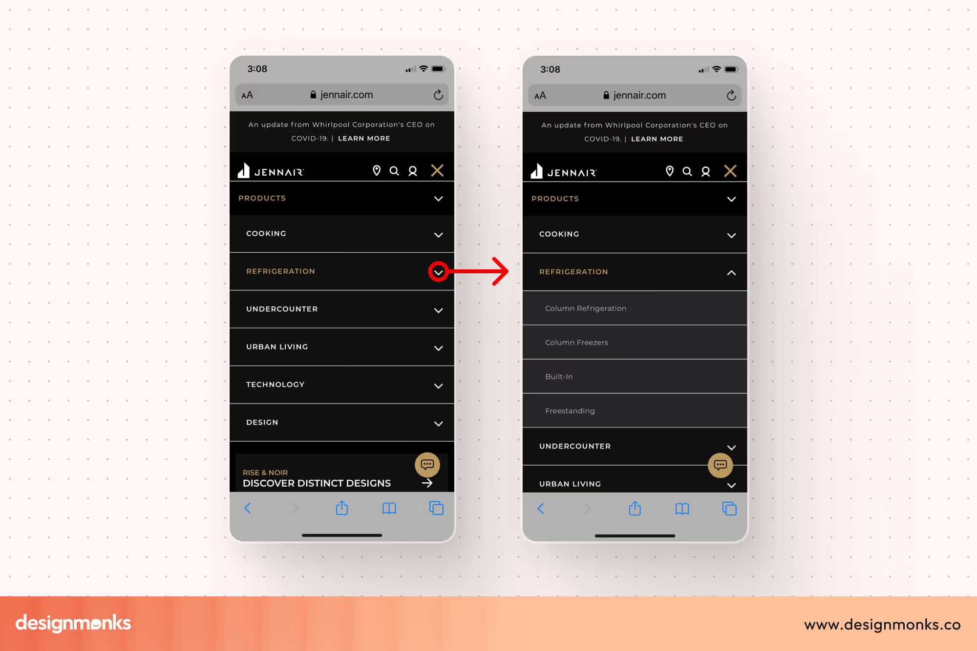
- Menus: Sometimes chevrons point down to reveal more content, often as an alternative to carets.
They’re a designer’s best friend for showing direction or movement without words.
Use in Design & Branding
Because of their bold, simple shape, chevrons show up in logos, road signs, and even sports team branding. They naturally suggest motion and progress, making them perfect for companies or products that want to feel fast, modern, or forward-thinking.
On roads and highways, chevrons point toward the curve’s direction, making their meaning instantly clear.
Key Differences Between Caret and Chevron
Even though the caret ( ^ ) and the chevron ( < > ) look similar, they play very different roles in writing, coding, and UI design. Here’s a quick breakdown:
Shape & Orientation
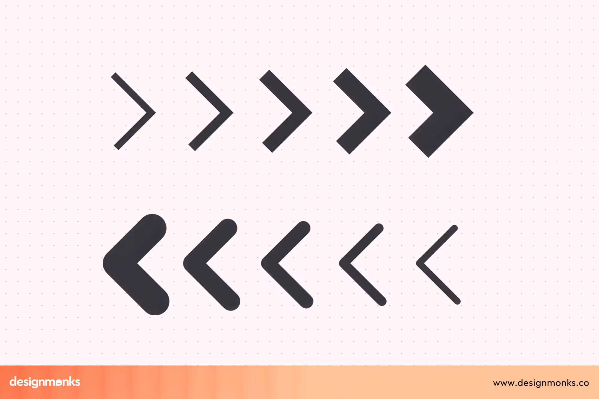
The caret ( ^ ) is a small, upward-pointing mark, shaped like a thin triangle or arrowhead. It usually points straight up and rarely rotates in typography or coding. The chevron ( < or > ) is a V-shaped symbol angled to the left or right. In digital design, it may also point up or down, depending on the navigation need.
Primary Role
The caret is mainly used to show expansion, insertion, or position. It tells users or systems where something new should appear or that hidden content can expand. The chevron is primarily used to guide navigation, show hierarchy, or indicate movement between levels, pages, or steps.
Typography Use
In typography, the caret is a proofreading mark. Editors use it to signal missing words or characters. This shows exactly where to add text. The chevron has little use in typography. When it appears, it usually functions as an angled bracket or enclosure.
Coding Use
In coding, the caret is versatile:
- It works as a bitwise XOR operator (a ^ b).
- It anchors a regex pattern to the start of a line (^pattern).
- It may also represent exponentiation (e.g., 2^3) in spreadsheets or some languages.
The chevron is central to programming syntax:
- It defines HTML tags (<div>).
- It is used for comparisons (x < y).
- It marks generics in languages like Java or C# (List<T>).
UI/UX Use
In UI/UX, the caret often appears in dropdowns or menus. A downward-facing caret (▾) indicates expandable content, while an upward one (▴) means content is open. It may also act as a text cursor.
The chevron in interfaces usually directs navigation: › for breadcrumbs, › for pagination, or ‹ › for sliders. For example:
- Breadcrumbs: Home › Products › Laptops
- Pagination: ‹ Prev 1 2 3 Next ›
Symbol History
The caret comes from print editing and proofreading, where editors marked text with it to show where to insert missing content.
The chevron has a longer history in heraldry and military insignia, where it represented rank or direction.
User Expectation
When users see a caret, they expect insertion, editing, or hidden content that can expand.
When users see a chevron, they expect guidance to move forward, backward, or deeper into navigation.
Misusing them causes real confusion. A dropdown with a chevron might look like a link to another page, while a breadcrumb with a caret could feel broken. The key is using the right one in the right place.
Quick takeaway: Caret = expansion. Chevron = direction.
Common Mistakes & Misinterpretations
Even with clear definitions, caret and chevron often get mixed up because they show up in similar places. A quick glance at their shapes makes them look interchangeable, but their functions are not. Let’s look at the most frequent mistakes designers and developers run into:
Dropdown Menus: Caret or Chevron?
Many dropdowns use a downward caret (▾) to signal expansion. But some design systems replace it with a downward chevron (⌄). While subtle, this choice changes meaning.
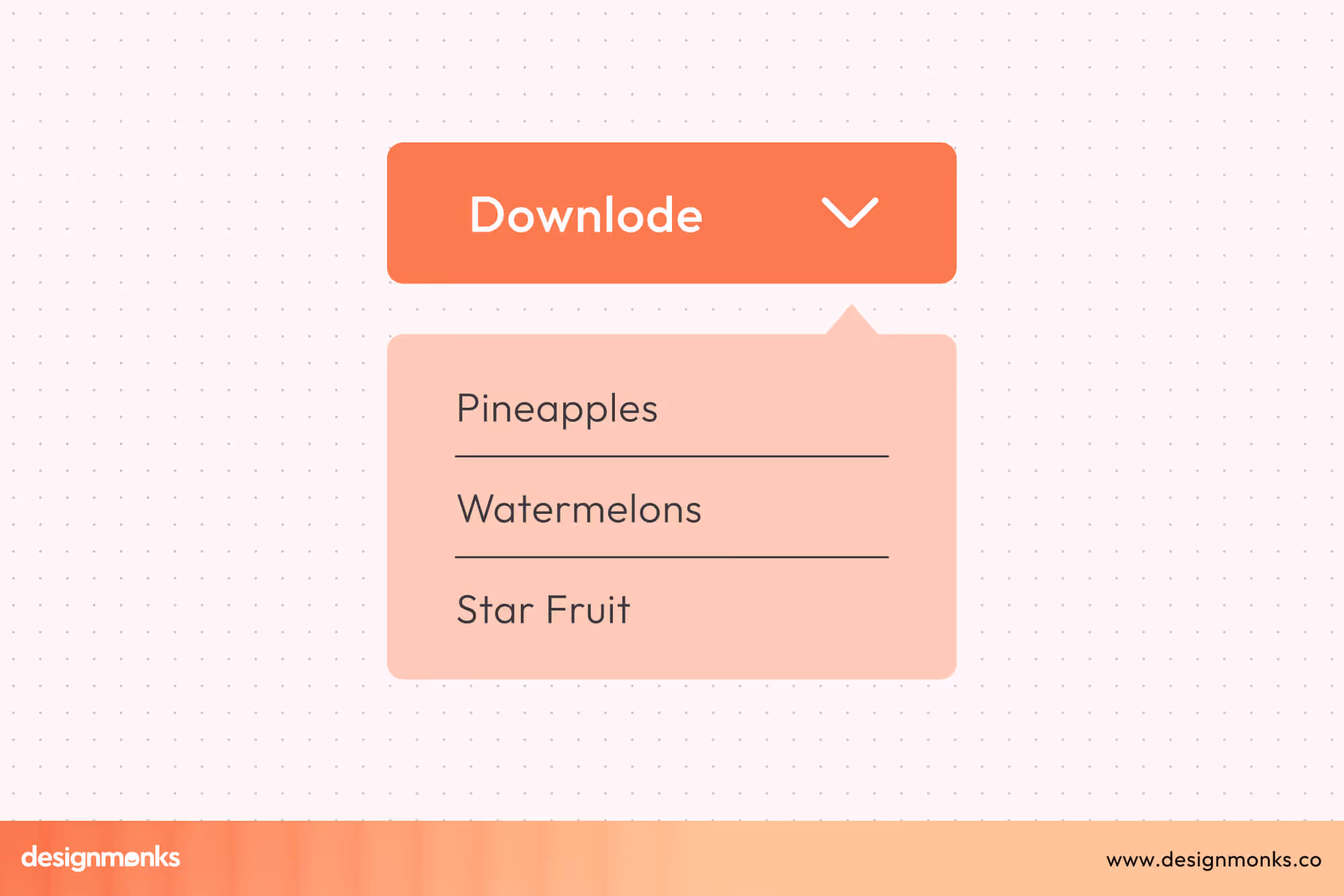
A caret says “expand to see more,” while a chevron implies “move deeper into this menu.” Mixing both in the same interface makes users pause and question what’s supposed to happen.
Code Editors: Caret vs Cursor Symbol
Text editors often call the blinking text cursor a “caret.” Meanwhile, programmers regularly use chevrons in HTML or XML tags (<div>).
New developers may confuse “caret” with “angle bracket,” especially when reading documentation. Mislabeling symbols in tutorials or guides makes collaboration more difficult.
Accessibility Confusion
If icons aren’t labeled, screen readers might skip them or announce them as “symbol.”
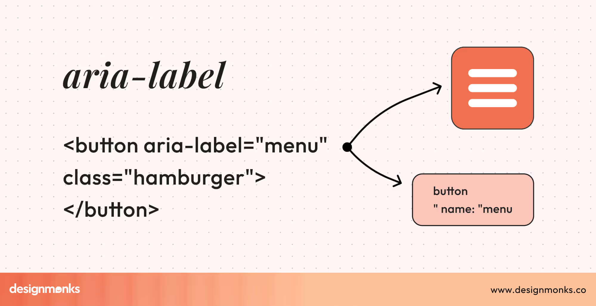
Without context, users may not know whether it’s expandable content (caret) or navigation (chevron). Adding ARIA labels like aria-label="Expand menu" ensures clarity.
Icon swapping in templates
Many UI kits or templates use carets and chevrons interchangeably, often due to lazy icon replacement.
A dropdown component may have a chevron icon simply because it was available in the icon set, even if the design intent was a caret. This spreads inconsistency across products.
Misuse in math/coding lessons
Beginners sometimes confuse the caret (^) with the chevron (< >) in math or programming. For example, a student might type < instead of ^ when trying to calculate exponents. This causes bugs, syntax errors, and wasted debugging time.
Practical Usage Guidelines
Before jumping into technical examples, it’s worth knowing how to choose the right symbol for your project. This section helps you apply caret and chevron correctly in design, development, and documentation.
Which one to use in UI design
Use carets when you want to show expandable or collapsible content, such as dropdowns, toggles, and disclosure menus.
Use chevrons when guiding movement or navigation. For example, breadcrumbs, sliders, back/next buttons.
The golden rule: carets reveal, chevrons direct.
Which one to use in coding/math
- Caret: regex anchors (^pattern), exponentiation (2^3), bitwise XOR (a ^ b).
- Chevron: HTML/XML tags (<div>), generics (List<T>), comparisons (x < y).
Sticking to these roles avoids syntax errors and miscommunication.
Examples from Design Systems
- Googe Material Design: Chevrons dominate navigation, carets show expansion.
- Bootstrap: Carets toggle dropdowns, chevrons control pagination.
- iOS: chevrons appear in menus/settings consistently as “go forward” arrows.
Technical Implementation Examples
Sometimes the confusion comes from not seeing how these symbols actually appear in real projects. Below are simple, language-only examples of how carets and chevrons are used in common technical contexts:
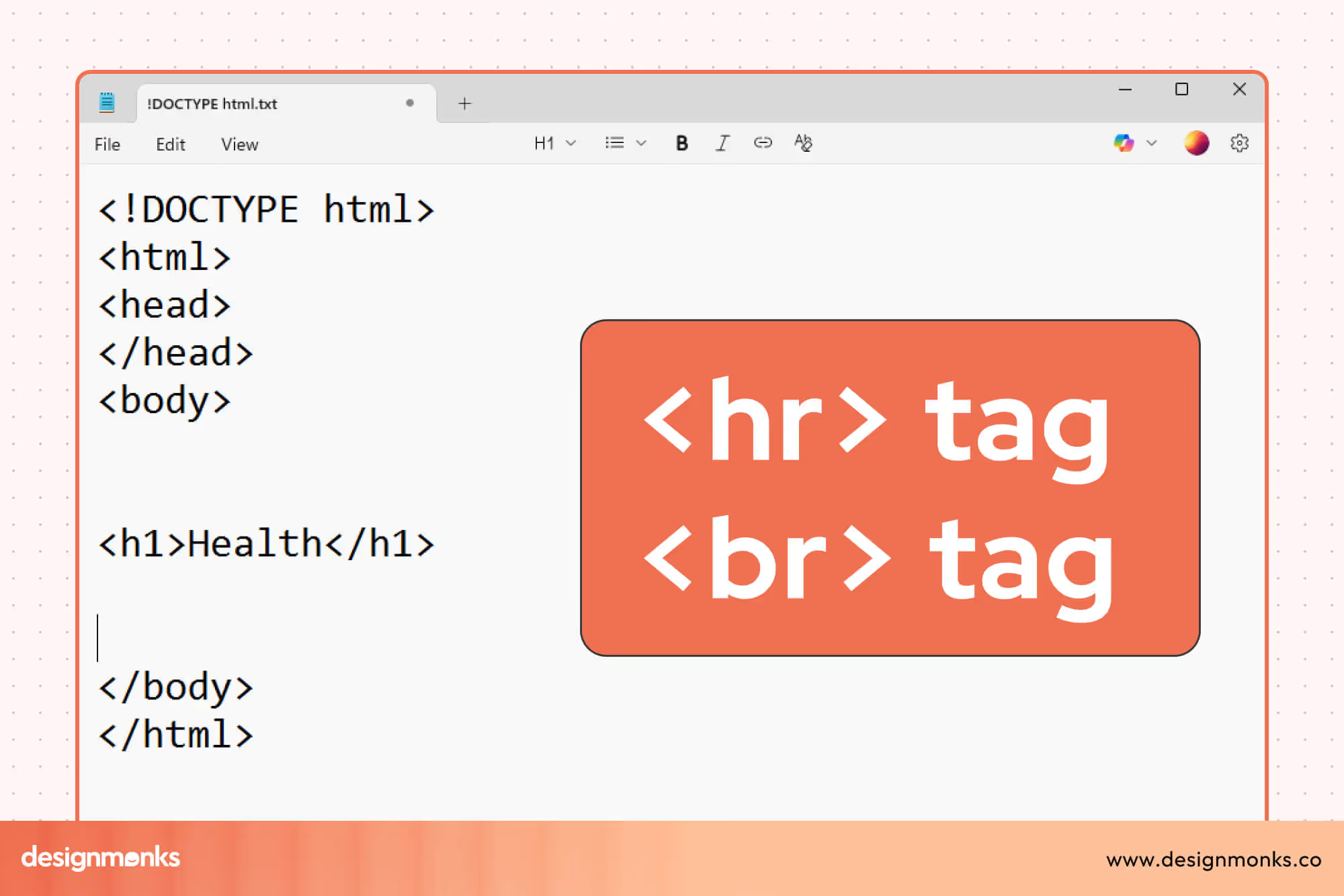
HTML / Web Interfaces
On websites, designers use the caret as a small marker next to a menu label to show that clicking will reveal more options (for example, a menu that shows “Menu” with a small caret next to it).
Chevrons often appear as part of navigation links or pagination, where a right-facing chevron appears beside the word “Next” and a left-facing chevron beside “Previous.”
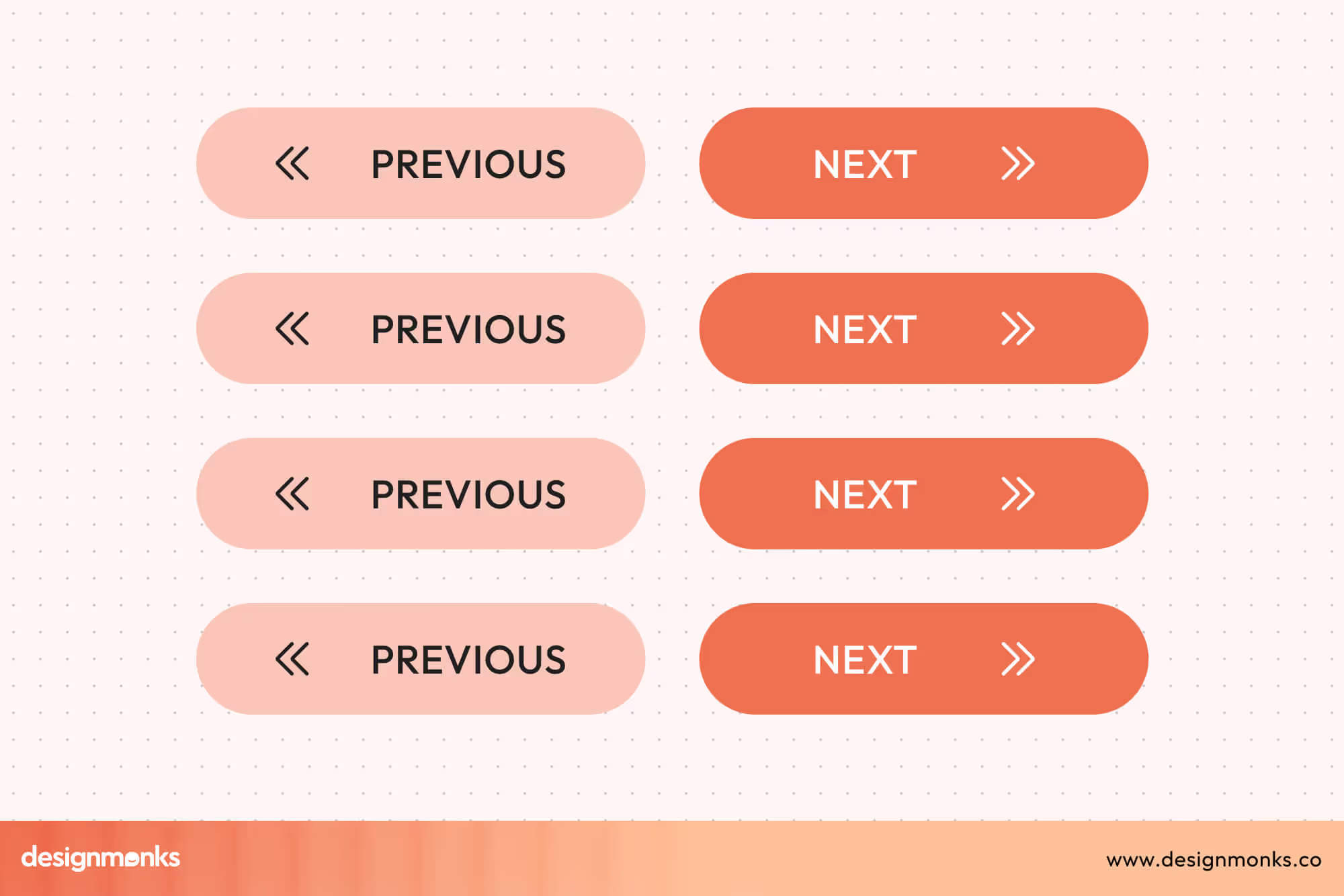
Programming & Search Patterns
In programming and search patterns, the caret plays different roles: at the start of a search pattern, it means “beginning of the line,” and in some contexts it represents a bitwise exclusive OR operation between numbers.
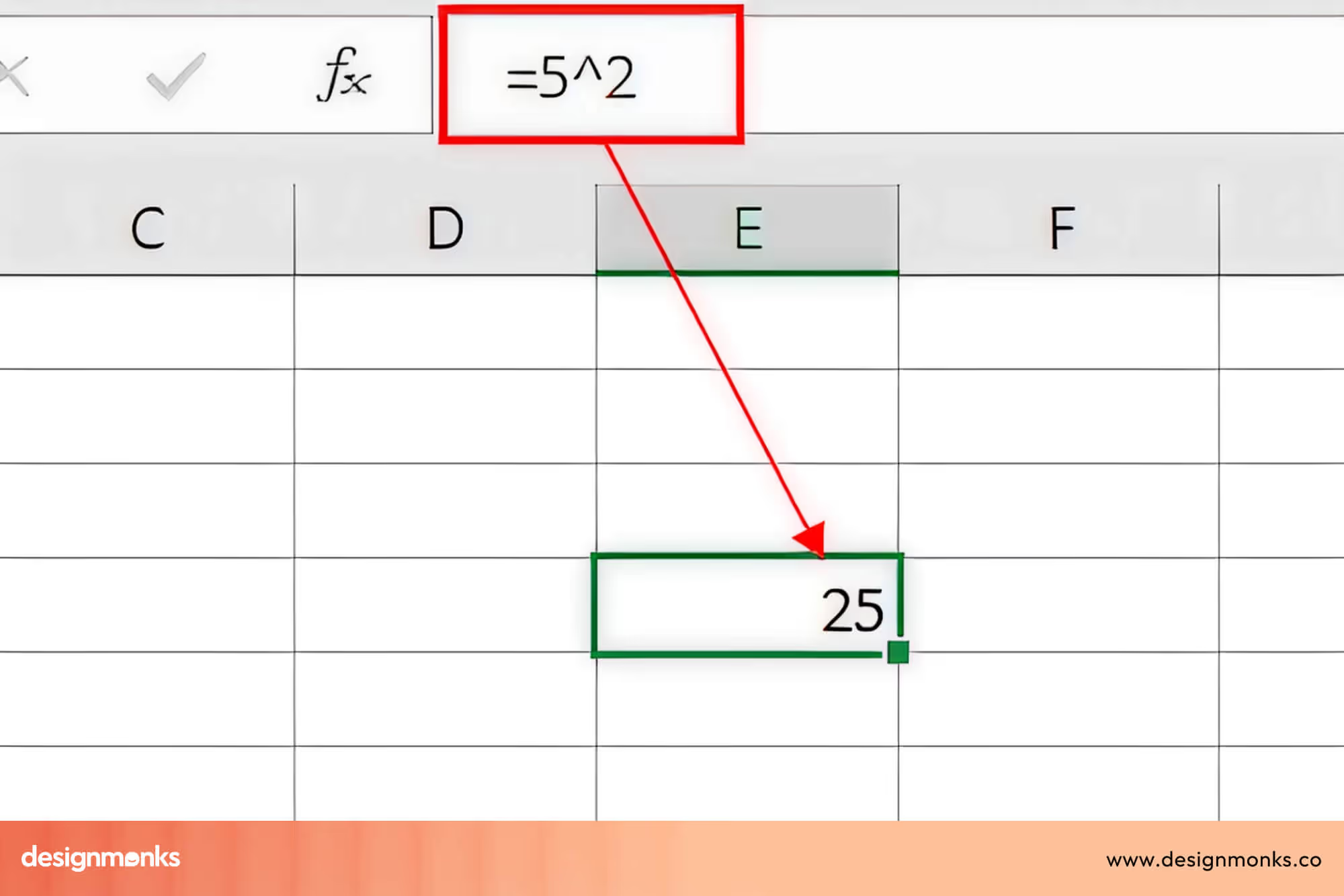
In spreadsheets and some simple tools, a caret is also used to show exponentiation (for example, two caret three reads “two to the power of three”).
Chevrons show up in programming languages as angle markers around tags or as comparison symbols meaning “less than” or “greater than.”
Text Editors & Input
In text editing or proofreading, the caret is used as an insertion mark to show where new text should go. In user interfaces, the text cursor (the blinking insertion point) is sometimes called a caret, though it looks different from the printed caret symbol.
Character Encoding (Unicode)
To ensure the symbols display correctly across systems, they have specific Unicode codes: the caret is U+005E, the single left-pointing chevron is U+2039, and the single right-pointing chevron is U+203A. Using the correct character ensures the symbol looks the same for all users and devices.
Best Practices for Designers/Developers
The rules for caret vs chevron might sound straightforward, but the real challenge is sticking to them consistently. A tiny symbol can make or break clarity, so here’s how to get it right:
- Stay consistent: Never use a caret in one place and a chevron in another for the same action. It confuses users instantly.
- Support accessibility: Always pair icons with labels or ARIA text so screen readers can explain what they mean.
- Follow platform patterns: On iOS, chevrons are the norm for navigation. On the web, carets are the go-to for dropdowns. Stick with what users already expect.
- Don’t cut corners: Just because the symbols “look alike” doesn’t mean they’re interchangeable. Choose the right one for the right job.
- Test in the wild: Watch users interact. You’ll be surprised how much difference a tiny arrow can make.
FAQs on Caret vs Chevron
Is the ^ symbol the same as >?
No. The caret (^) shows insertion or expansion, while the chevron (>) points or guides direction.
Why do dropdowns sometimes use a caret, sometimes a chevron?
Dropdowns should always use carets. But confusion arises because designers sometimes borrow chevrons for visual style, but this can mislead users.
Which symbol improves UX clarity?
Caret and Chevron can both improve UX clarity, but it depends on context. Carets improve content expansion clarity, chevrons improve navigation clarity. Use each appropriately for your interface.
Conclusion
The difference between caret vs chevron may seem small, but understanding it is crucial for good UI, coding, and design. Carets signal insertion or expansion, while chevrons guide direction.
Using each symbol correctly enhances usability, reduces confusion, and builds trust with users. By following these best practices, designers and developers can create clear, intuitive experiences that keep users engaged, confident, and satisfied.

.avif)
.avif)
.avif)
.avif)


.avif)
.avif)
.avif)
.avif)


.avif)
